Make Existing PowerPoints Accessible
Hard-to-read Text Contrast
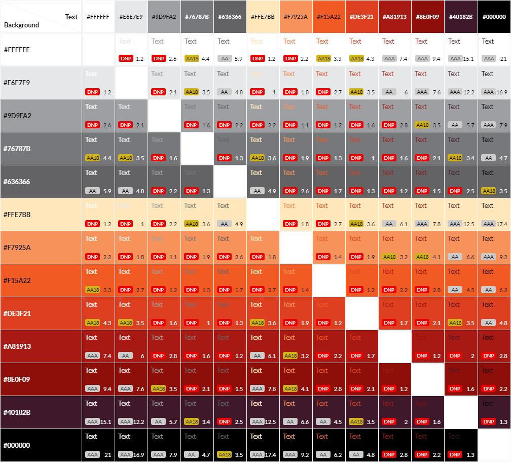 The PowerPoint Check Accessibility tool examines contrast between font and shape colours. Colour contrast is expressed as a ratio of the difference in saturation, brightness, and pigment of different elements relative to one another. To be accessible and inclusive, font colour must have a contrast ratio of at least 4.5:1[1] against background colours. Insufficient contrast will be flagged as Hard-to-read text contrast.
Who hard-to-read text contrast affects
Accessible colour is essential for:
- The 1 in 12 men and 1 in 200 women that have some form of colour vision deficiency.[2]
- Low vision users.
- Users experiencing eye fatigue and other mental strain.
- Those that print material in black and white.
- Users viewing in poor lighting or excess glare.
Learn more about accessible colour use.
The following video demonstrates why colour contrast and use of colour is important.
How to fix it
PowerPoint’s Check Accessibility tool will show Hard-to-read text contrast.

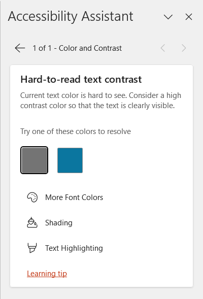 However, PowerPoint only checks shaded textboxes and table cells with coloured shading. PowerPoint does not analyze font colour against slide background, even if the slide background is a solid colour. To ensure fully accessible colour, some manual checks are required.
Select Hard-to-read text contrast to reveal some options for more accessible colour including font colour, shading or fill, and highlighting.
To check for accessible colour everwhere:
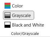 Simulate black and white by navigating to the View tab and selecting Grayscale in the Color/Grayscale group.
Use the WebAim Contrast Checker to verify contrast ratio.
To fix a contrast error either change the font or background colour.
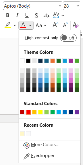 To change font colours, select the text and on the Home tab open the Font Color menu. Click on your desired colour.
PowerPoint’s Font Color menu can filter to show high-contrast colours only. However, like the Check Accessibility tool, this feature only works on coloured shapes and shaded table cells.
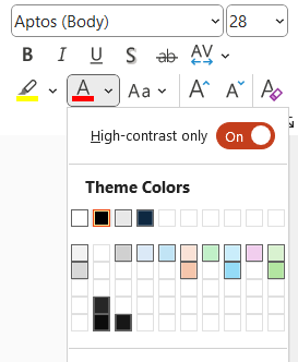
For more information, read change the color of text on a slide from Microsoft Support.
Instead of changing the font colour, you could change the background colour of your slide, the textbox or table cell.
To change the slide background color:
- Move to the Design tab.
- Select Format Background.
- Choose a colour in the color picker menu.
- Verify appropriate colour contrast using an external tool like the WebAIM Contrast Checker or Colour Contrast Analyzer.
- To apply the new colour to all slides, select Apply to all.
To change a shape background colour:
- On the slide select the textbox.
- Move to the Shape Format tab.
- Expand the Shape Fill menu and choose a colour.
To change cell shading colour:
- Select the table cell(s) on the slide.
- Move to the Table Design tab.
- Open the Shading menu and choose a colour.
In addition to ensuring text has sufficient contrast, it is essential that colour is not the only means to convey or emphasize information. Use colour plus a text or symbol indicator.
How to prevent it next time
Use dark text on light backgrounds or light text on dark backgrounds.
Build a grid of branded colours with Eightshapes Contrast Grid to see what colour combinations are accessible.
Next
Move to the next page to address Missing Audio or Video Subtitles or select the next error you want to fix.
- The requirement reduces to 3:1 for large (size 18 point or larger or 14 point or larger and bold) fonts ↵
- Colour Blind Awareness, "About Colour Blindness" ↵

