Make existing Brightspace pages accessible
Colour Contrast
 The Brightspace Accessibility Checker examines contrast between font and shape colours. Colour contrast is expressed as a ratio of the difference in saturation, brightness, and pigment of different elements relative to one another. To be accessible and inclusive, font colour must have a contrast ratio of at least 4.5:1[1] against background colours. Insufficient contrast will be flagged as Text must have a contrast ratio of at least 4.5:1 or Large text must have a contrast ratio of at least 3:1.
While the Accessibility Checker does not check for use of colour, it is important that colour is not used alone to make a distinction, a comparison, or to emphasize information.
Who accessible colour affects
Accessible colour is essential for:
- The 1 in 12 men and 1 in 200 women that have some form of colour vision deficiency.[2]
- Low vision users.
- Users experiencing eye fatigue and other mental strain.
- Those that print material in black and white.
- Users viewing in poor lighting or excess glare.
Learn more about accessible colour use.
The following video demonstrates why colour contrast and use of colour is important.
How to fix it
 Insufficient contrast will be flagged as Text must have a contrast ratio of at least 4.5:1 or Large text must have a contrast ratio of at least 3:1 in the Check Accessibility tool.
Select the issue to highlight the offending text. Move to the Select Color tool on the editor toolbar.

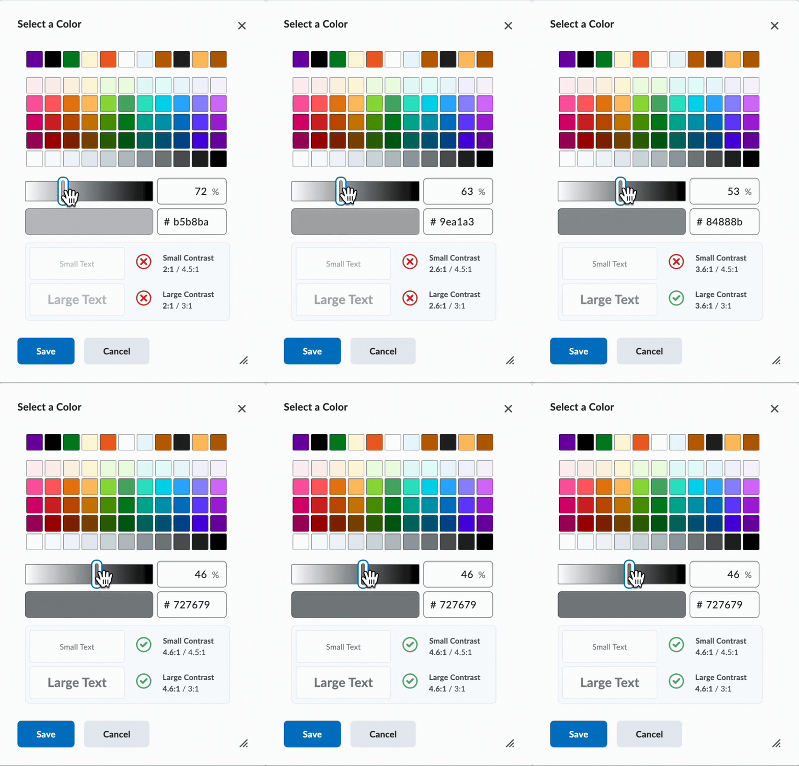
 Use the Select a Color tool to find accessible colour combinations. Choose a colour from the grid, use the slider to adjust colour, or enter a Hex colour code. Accessible colour contrast will be marked with a green checkmark.
How to prevent it next time
Use dark text on light backgrounds or light text on dark backgrounds. For Brightspace content, black font on a white background is an excellent choice. When customizing colours, always note the contrast ratio in the Select a Color tool.
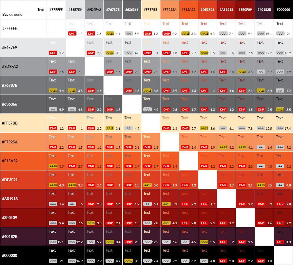
Build a grid of branded colours with Eightshapes Contrast Grid to see what colour combinations are accessible.
Next
Move to the next page to examine Accessible Links or select the next error you want to fix.
- The requirement reduces to 3:1 for large (size 18 point or larger or 14 point or larger and bold) fonts ↵
- Colour Blind Awareness, "About Colour Blindness" ↵

