Create Accessible PowerPoints
Accessible Fonts and Colour
![]() Choosing more readable fonts benefits all viewers and readers but can be essential for those with sight or reading impairments. Prefer sans-serif fonts in size 20 or larger for PowerPoint content.
Choosing more readable fonts benefits all viewers and readers but can be essential for those with sight or reading impairments. Prefer sans-serif fonts in size 20 or larger for PowerPoint content.
Colour contrast is expressed as a ratio of the difference in saturation, brightness, and pigment of different elements relative to one another. To be accessible and inclusive, font colour must have a contrast ratio of at least 4.5:1[1] against background colours.
Who accessible font and colour benefits
Font
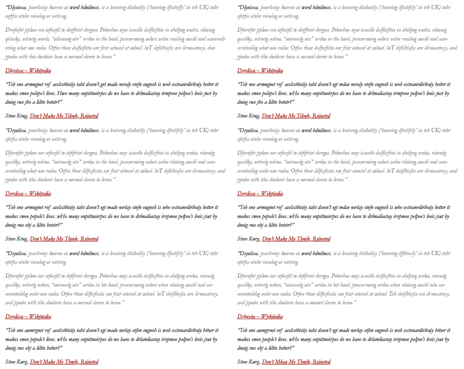
For people with low-vision or dyslexia, good font choices can make content easier to read. The animation below shows what dyslexia may look like to some individuals. Accessible font choices can minimize the effect.

Consult footnote[2] for an unmodified version of this text.
Colour
Accessible colour is essential for readers that are colour blind[3] and users with low vision, but good colour practice benefits users printing in black and white, viewing in the sun with screen glare, using custom contrast settings, or experiencing other vision impairments. Learn more about accessible colour use.
The following video demonstrates why colour contrast and use of colour is important.
How to ensure accessible font and colour use
Font Size
On the Home tab choose Font and Font size using the menus in the Font group of the Home tab.

Ensure fonts are size 20-24 minimum (slide numbers and footnotes are exceptions but should be at least 12 point). Learn more about changing the font size in PowerPoint.
If you find increasing the font size makes a slide overcrowded, move some content to a new slide. Having negative space on slides is an excellent design choice.
Consider your audience. If you wear glasses take them off and view your slides. If presenting in a lecture theatre view your presentation from the back of the room. If using a projector take note of how lighting or the sun could make your slides more difficult to see.
Font Style

Avoid overly decorative fonts and exaggerated serifs. Serifs—the small ticks and lines at the end of a character stroke—can bleed together for some readers, making it harder for them to differentiate between characters and read content. Generally sans-serif fonts like Aptos, Calibri, Franklin Gothic, Helvetica, Monserrat, Open Sans, and Verdana are considered more readable and accessible. When needing a serif font, prefer simple serifs like Sitka, Times New Roman, or Cambria.
Font Colour
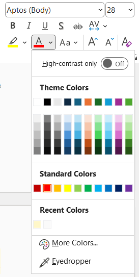
 To change font colours, select the text and on the Home tab open the Font Color menu. Click on your desired colour.
Best practice is to use dark text on light backgrounds or light text on dark backgrounds.
If using branded colours, build a grid of your colours with Eightshapes Contrast Grid to see what combinations are accessible.
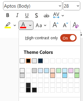
PowerPoint’s Font Color menu can filter to show high-contrast colours only. However, this feature only works on coloured shapes and shaded table cells, not against slide backgrounds.

For more information, read change the color of text on a slide from Microsoft Support.
Instead of changing the font colour, you could change the background colour of your slide, the textbox or table cell.
To change the slide background color:
- Move to the Design tab.
- Select Format Background.
- Choose a colour in the color picker menu.
- Verify appropriate colour contrast using an external tool like the WebAIM Contrast Checker or Colour Contrast Analyzer.
- To apply the new colour to all slides, select Apply to all.
To change a shape background colour:
- On the slide select the textbox.
- Move to the Shape Format tab.
- Expand the Shape Fill menu and choose a colour.
To change cell shading colour:
- Select the table cell(s) on the slide.
- Move to the Table Design tab.
- Open the Shading menu and choose a colour.
In addition to ensuring text has sufficient contrast, it is essential that colour is not used alone to make a distinction, a comparison, or to emphasize information. Use colour plus a text or symbol indicator.
Minor changes to font size, style, or colour can be made on slides. However, customization of the slide master will make changes to all slides and is a more efficient way to ensure consistent style.
Double Check
As the Check Accessibility tool does not examine fonts, manual checks are required. Use:
- Sans-serif fonts
- With a font size of 20 or larger
PowerPoint’s default font choices are accessible; however, some themes may not have accessible fonts. If you want to change the font and colour for all of your slides, it’s best to make changes to the slide master.
PowerPoint’s Check Accessibility tool will show Hard-to-read text contrast as a warning. However, PowerPoint only checks shaded textboxes and table cells with coloured shading. PowerPoint does not analyze font colour against slide background, even if the slide background is a solid colour. To ensure fully accessible colour, some manual checks are required.
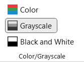
 One option is to simulate black and white by navigating to the View tab and selecting Grayscale in the Color/Grayscale group. Ensure no information is lost and that text is easy to read.
For a more robust check, compare colours using the WebAim Contrast Checker to determine exact contrast ratio. Remember, 4.5:1 is the minimum ratio.
Next
Move to the next page to understand Titles or select another accessibility practice to learn about.
- The requirement reduces to 3:1 for large (size 18 point or larger or 14 point or larger and bold) fonts ↵
- "Dyslexia, previously known as word blindness, is a learning disability ('learning difficulty' in the UK) that affects either reading or writing. Different people are affected to different degrees. Problems may include difficulties in spelling words, reading quickly, writing words, "sounding out" words in the head, pronouncing words when reading aloud and understanding what one reads. Often these difficulties are first noticed at school. The difficulties are involuntary, and people with this disorder have a normal desire to learn." Dyslexia - Wikipedia “The one argument for accessibility that doesn’t get made nearly often enough is how extraordinarily better it makes some people’s lives. How many opportunities do we have to dramatically improve people’s lives just by doing our job a little better?” Steve Krug, Don’t Make Me Think, Revisited ↵
- Colour Blind Awareness, "About Colour Blindness" ↵

