Packages
Plot Practice Exercises
Before starting these exercises, make sure you have added the tikz and pgfplots packages by following the instructions at the beginning of the section. Solutions are included after the exercises.
- First, we’ll make some modifications to the plot from the previous section to get more familiar with the code.
- Change the domain to between -2 and +2.
- Change the label on the y-axis to ‘y’.
- Change the color of the line to green.
- Add a second quadratic function. You may need to adjust the domain to see both functions.
Here is the code for the original plot:
[latex]
\begin{tikzpicture}
\begin{axis}[axis lines = left, xlabel = $x$, ylabel = $f(x)$]
\addplot [domain=-4:4, samples=100, color=blue]
{x^2 + 2*x + 1};
\end{axis}
\end{tikzpicture}
[/latex] - We’ll now make the plot more informative by adding a title and legend. Add a title to your plot by adding
title=Your Titleto the axes parameters. Add a legend by adding\legend{function 1, function 2}after the addplot commands.
Hint: If your legend covers up an important part of your plot, addlegend pos=north/south east/westto the axis parameters to move it. For example, to move the legend to the upper left uselegend pos=north west. - Change the color of the plot to a color mapping using by adding the parameters
colorbar, point meta rel=axes wide, point meta=yto the axis parameters, changing the parameters for each addplot tomesh, marks=none, and changing theaddplotcommand toaddplot+. What is the difference in color if you setpoint meta res=per plot?
Note: You need to change addplot to addplot+ because there are parameters for the plot in the axis parameters. Without the +, the style changes would override the axis parameters. - Change the function used in the 3D surface plot from the last section. Try the function
1/x + 1/yor come up with your own. Note that in pgf plots you usea/bfor division anda*bfor multiplication rather than the regular Latex functions.Depending on the function you choose, you might want to change the domain to see an interesting range for the function. For example, is most interesting near 0, so try a domain like -2:2.
Here is the code for the original plot:
[latex]
\begin{tikzpicture}
\begin{axis}
\addplot3[surf, domain=0:360, samples=40] {cos(y) + sin(x)};
\end{axis}
\end{tikzpicture}
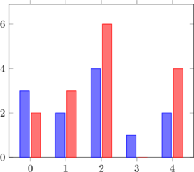
[/latex] - PGFPlots can also create bar graphs. Look at page 45 of the PGFplots documentation for some examples. Copy the first example from the top of page 45 and use a second instance of addplot coordinates to add red bars beside the blue, like in the plot below.

Hint: If you are having trouble having the bars start exactly on the x-axis, set the limits individually using
enlarge y limits={0.15,upper},instead of
enlarge x limits=0.15enlargelimits=0.15.

