Topic D: Circle Graphs (“Pie Graphs”)
Circle graphs show how the parts of something compare to each other. Circle graphs also give a good picture of each part compared to the whole thing. In a circle graph or pie graph, the complete circle is the whole thing. The parts of a circle graph may be identified with a percentage. The total of the parts must be 100%.
Graph 1
The circle represents each dollar the government spends. The information for the graph was found at the Department of Finance, April 2010.
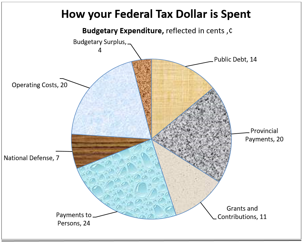
- What is the biggest expense of the federal government?
- How much of each federal dollar is spent in actually operating the government business?
- What part of the federal dollar is spent on defence?
- How much of each dollar is spent on Provincial Payments? Write this amount as a percent.
- What is the smallest expenditure of the federal government? Write this amount as a percent.
Answers to Graph 1
- Payments to Persons
- 20¢
- 7¢
- 20¢; 20%
- Budgetary Surplus, 4%
Graph 2
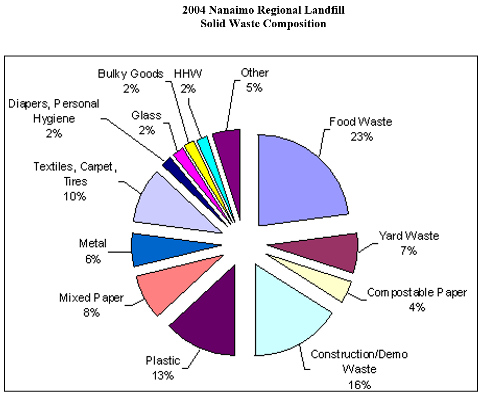
- What makes up the largest part of the waste in the landfill site?
- What four categories contribute equal weight to the landfill site?
- In a municipality of 139,000 people, the amount of waste going to a landfill site in one day is 150 tonnes.
- What is the mass of plastics?
- What is the mass of yard waste?
- What is the mass of construction/demo waste?
- If all the food waste were composted, how many tonnes of waste would not end up in the landfill each day?
The plastics category can be separated into these categories:
- 6% Non-recyclable mixed plastics
- 4% film plastic
- 3% recyclable rigid food containers
If all the 3% recyclable rigid food containers were actually recycled, how many tonnes of waste would not end up in the landfill?
Answers to Graph 2
- Food waste
-
- Diapers, Personal Hygiene
- Glass
- Bulky Goods
- HHW (Household Hazardous Waste)
-
- 19.5 tonnes
- 10.5 tonnes
- 24 tonnes
- 34.5 tonnes
- 4.5 tonnes
