14 Chapter 14 An Example Website with a Database Connection
Fred Strickland
Original Material to the textbook: Fred Strickland
Learning Outcomes
|
Computing Sub Discipline |
Document Code, Reference Code, and Page Number |
Text |
|
Computer Science |
CS2023 SPD Web: Web Platforms (Page 302)
|
KA Core 1. Web programming languages (e.g., HTML5, …, CSS) KA Core 4. Web standards such as document object model, accessibility. Non-core 6. Analyzing requirements for web applications. ILO KA Core 5. Discuss how web standards impact software development
|
Introduction to Chapter 14
We are taking a major detour with this chapter. As the writers of CS2023 noted, “students write code that either reads/writes to a file or is interactive” but “in industry, most data are obtained programmatically from a database.” In Chapter 13, we provided some non-GUI code snippets in Java and in C# for accessing a database. That was our beginning efforts to address the “mismatch between academic preparation and industry expectation.”
Our goal for this chapter is to develop a website that could interact with a database. We will learn about good design. We will be learning about Bootstrap 5. We will learn how to create a web form that could securely access a database. In Chapter 15, we will use Microsoft’s Visual Studio with the code behind approach to do the actual interaction with a database.
As for the Chapter 14 learning outcomes, there are no pure database related learning outcomes.
CS2013 has Platform-Based Development (PBD). PBD/Web Platforms had five learning outcomes that addressed web development:
1. Design and Implement a simple web application. [Usage]
- It is expected that web programming languages such as HTML5, JavaScript, PHP, and CSS would be covered.
2. Describe the constraints that the web puts on developers. [Familiarity]
3. Compare and contrast web programming with general purpose programming. [Assessment]
5. Discuss how web standards impact software development. [Familiarity]
6. Review an existing web application against a current web standard. [Assessment]
CS2023 renamed this knowledge area as “Specialized Platform Development (SPD).” In the SPD-Web: Web Platforms knowledge area, there are ten items. The core items are similar to the list in CS2013. In the non-core items, two specifically mention databases. SPD is where we will find some learning outcomes for this chapter. The SPD knowledge area has some topics that we will touch upon. Most of these topics are the non-core topics. See page 303 in CS2023.
The Third Edition Style Guide
This is the style guide that this book will follow for this chapter and for the other chapters.
|
Naming Convention:
Using the IE’s Notation with Crow’s Foot Notation. |
Figure 14.1 The database style guide. Adapted from https://vertabelo.com/blog/database-schema-naming-conventions/
The examples will conform to the style guide.
Examine Examples of Good Website Design
General Statements
There are website designer companies that showcase their fancy tools. Forbes has published articles about the best designed websites. So has Wix. Before you begin, you need to know the nature of your website. Then you can look at the various rated or graded lists for your industry.
As Kristina Tuvikene of WebsiteSetup1 pointed out, a good website design should be simple, functional, and consistent with your organization’s brand. The rest of the Tuvikene article addressed the various design approaches and a good example of each:
- Best 360-Degree Design
- Best Clean Design
- Best Website for video
- Best Unusual Content Structure
- Best Interactive Data Visualization
- Best User Interface
- Best Interactive Design
- Best Website for Filters and Effects
- Best Interactive Game Website
- Best Website for Typography (for an art portfolio)
- Best Parallax Scrolling Website (for a dynamic content portfolio)
- The parallax effect: This is where the position of an object appears different when viewed from different angles.
- Best Animated Website
- Best Single Page Website
- Best Minimalistic eCommerce Website
- Best Horizontal Layout Website
- Best Website for Storytelling
- Best Vector Graphics Design
- Best Big Background Image Design
- Best Minimalist Magazine Design
- Best Real Estate Website Design
- Best 3D Graphics Design
- Best Animated Magazine Design
- Best Interactive 3D Design
- Best Visual Design Functionality
- Best Use of Moving Images
- Best Interactive User Interface
- Best Aesthetic Visual Design
- Best Use of Photography
- Best Overall Experience
- Best Web Technology
- Best Data Visualization
- Best User Experience
- Best Interactive Design for Storytelling
- Best Design Structure
- Best Video for Storytelling
- Best 3D Path Transitions
- Best Event Website Design
- Best Simple Design
- Best Shopping Website Design
- Best Employment Website Design
- Best Corporate Communications Website
Paul Boag of WebsiteSetup wrote about the ten layout schemes:
- Single Column Layout
- Content Focused Layout
- Magazine Layout
- Grid Breaking Layout
- Full-Screen Layout
- Alternating Layout
- Card-Based Layouts
- Hero Layout
- Split Screen Layout
- Asymmetrical Layout
The Webby Awards website (https://www.webbyawards.com) showcases the best designs for each year. There are nine categories. Within the Websites and Mobile Sites category, there are five subcategories. Each subcategory has further groupings. The “School/University” grouping is inside the General Desktop & Mobile Sites subcategory. The Webby Awards Winner for 2024 was Moore College of Art & Design Digital Viewbook.
Unfortunately, the Webby Awards website, Spinx (https://www.spinxdigital.com/blog/best-website-design/), Webdesign Inspiration (https://www.webdesign-inspiration.com/), Hotjar (https://www.hotjar.com/web-design/examples/), and other reviewing websites do not explain why a website is noteworthy. And some websites are sublimely plugging their website designing services (Webdesign Inspiration and Hotjar are examples). At least Webflow (https://webflow.com/blog/web-design-inspiration) makes it clear that it is a website design company. Webflow does explain why its list of 18 websites are noteworthy.
Be mindful that fashion and things change. Carrie Sownie’s article is interesting, but it was written in 2020. Macy Storm published her article (https://www.webfx.com/blog/web-design/best-website-designs/) in 2022, but the title reflects “2024.”
So things are a bit of “Caveat Emptor” (“Buyer beware”) for reliable information about good website examples.
Specific Items: University and College Website Designs
We are narrowing our focus on designing a good college or university website. FounderJar (https://www.founderjar.com/inspiration/college-university-websites/) has a list of 21 great designs based on some commercial vendors. Martin Luenendonk dove right into his list and pointed out the name of the commercial vendor and the features of the website.
PremiumSchools is a website that helps visitors to find their perfect school. There are no plugs for a commercial product or service. The writer provided several reasons why a website needs to be well-designed.
- Builds institutional trust in current and potential students.
- Serves as an effective marketing tool.
- Gets the word out. (Brand awareness)
- Serves as an evaluation tool. (Helps to provide crucial information that families need.)
- Influences students’ application decisions. (Campus visits may not be possible.)
- Serves as the first contact point for students.
- Acts as a virtual counselor.
- Showcases the campus culture and identity.
- Allows students to make virtual visits.
While the lead paragraphs on the PremiumSchools web page addressed the reasons for having a good institution web design, Abhijeet Kaldate addressed the elements that should be considered.
Degree Programs

Figure 14.2 Markup of a possible web page for showcasing degree programs and courses. Source of image: https://wpastra.com/resources/college-websites/
Students visit an institution, because they wish to study an interesting area. If there are numerous academic offerings, then a navigation system is needed.
Courses
Students need to find out what courses are part of a degree program. For example, an institution has a cybersecurity degree, but that does not tell what is the disciplinary lens of the degree. The ACM explained in Cybersecurity Curricula 2017 that the disciplinary lens “drives the approach, depth of content, and learning outcomes.” And the cybersecurity program could have a disciplinary lens that is aligned with computer science, or with computer engineering, or with information systems or with information technology or with software engineering. The United States National Security Agency in its National Centers of Academic Excellence in Cybersecurity program defines a cyber defense program as either technical or non-technical2.
Teacher and Staff Profiles
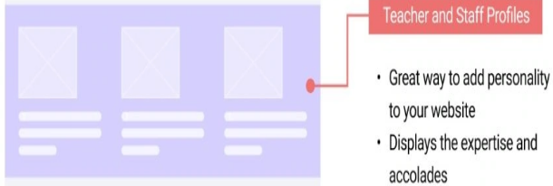
Figure 14.3 Markup of a possible web page for showcasing teacher and staff profiles. Source of image: https://wpastra.com/resources/college-websites/
Prospective students like to learn something about the institution’s teaching staff. How many have terminal degrees? Are there staffers that can help with various needs such as advising, housing, and internships?
Highlight the Campus in Your College Website
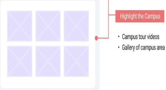
Figure 14.4 Markup of a possible web page for showcasing the buildings and landmarks. Source of image: https://wpastra.com/resources/college-websites/
Is the campus located in the mountains or near the beach? Does the campus have some interesting buildings or landmarks? These interesting features could be shared with videos or with photographs.
Statistics

Figure 14.5 Markup of a possible web page for showcasing the interesting statistics. Source of image: https://wpastra.com/resources/college-websites/
Numbers speak volumes to visitors. So it would be good to share financial and employment statistics. What percentage of students receive financial aid? How many entering students graduate? How many graduates land jobs within a year of graduating?
Anything that shows prospective students that attending your institution is worth the investment in time and in funds should be shared.
Student Experiences
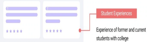
Figure 14.6 Markup of a possible web page for showcasing current students’ experiences. Source of image: https://wpastra.com/resources/college-websites/
The Marist Mindset List for the Class of 2024 (students that entered in 2020) has an item about smart devices and an item about social distancing:
- Incoming students will rely on smart devices for shopping, interactive wellness-centered consumer experiences, and engaging in the social good.
- Incoming students have never been more ready to embrace social distance by using technology to fill the distance gap. They are always looking for the newest upgrade.
The Marist Mindset List for the Class of 2027 (students that entered in 2023) has several items that pertain to the way these students receive information:
- Incoming students are just as likely to be listening to Led Zeppelin as Lana del Rey or Lil’ Bay on their phones.
- They “will get their news primarily from social media sites like Youtube (sic), Instagram and Tiktok (sic)….”
- They “will almost exclusively watch their video content on Youtube (sic) and similar sites online.”
- They “will engage in long-form content like books, video and podcasts that break through the noise of social media to capture their attention.”
Anything that has a social media element would be a great tool for promoting your institution.
Registration Forms
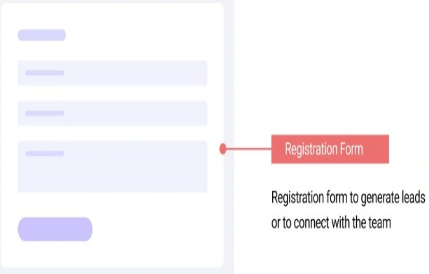
Figure 14.7 Markup of a possible web page for providing a web form. Source of image: https://wpastra.com/resources/college-websites/
This is a way of letting the prospective students ask for more information. This venue could provide a way for the prospective students to register for courses. Salespersons think of this as “closing the deal.”
After explaining what should be part of a good institution of higher education website, Abhijeet Kaldate worked through his list with a paragraph explaining the good points of the website.
- He has well-known institutions such as Harvard University, Princeton University Press, Massachusetts Institute of Technology (MIT), and Stanford University.
- He has small private liberal arts institutions such as Lafayette College (of Easton Pennsylvania), Bucknell University (of Lewisburg Pennsylvania), and Wheaton College (of Norton Massachusetts).
- He has institutions from outside of North America such as the University of Melbourne, Friedrich-Alexander-Universität Erlangen-Nürnberg (https://www.fay.eu)3, Istituto d’Arte Applicata e Design (https://www.iaad.it/ It comes up in the Italian language, but there is a link to the English version.), and Kanazawa University (Japan).
- He has government supported institutions such the University of North Carolina, the University of Michigan, Syracuse University, the University of Wisconsin-Milwaukee4, and the Virginia Commonwealth University.
- He has a religiously affiliated institution such as the University of Notre Dame. (of Notre Dame Indiana United States).
- He has an “avant garde” institution such as Brock University in St. Catharines Ontario Canada (https://brocku.ca).
Abhijeet Kaldate ends his article with a plug for using Astra for creating a nice educational website.
Specific Website: University of Notre Dame
If you have been faithful to work on a database project, chances are that you may have selected a non-profit organization such as a museum or a youth camp or a church or a religious educational institution. As I am writing this chapter, I have been asked to help to revise a small religious educational institution. Since I am working on an institution that is offering courses to individuals that are actively serving churches, it would be wise to look at the University of Notre Dame since it is a religious (that is, Catholic) institution of higher education.
|
Please do not view these lines about the University of Notre Dame as a subtle attempt to convert you to the Catholic faith. And please do not view the lines about the small religious institution as a subtle attempt to convert you to a Protestant faith. Various reviewing websites selected the University of Notre Dame, because it is an excellent example of a well-designed website. I elected to share my experience, because the website is an example of the challenges that you could face. |
Abhijeet Kaldate had this institution on his list for the following reason:
“As faith and service are important to the institution, they have a page explaining their values, which is linked to right in the top menu bar.”

Figure 14.8 The University of Notre Dame navigation menu bar. Source of image: https://www.nd.edu/
Abhijeet Kaldate further explained that affiliations with a particular religious or cultural group should be clearly stated on the home page, because many prospective students and parents are looking for institutions that align with their personal beliefs. In the above mentioned PremiumSchools article, this point was mentioned concerning the University of Notre Dame.
Kanopi Studios5 liked the University of Norte Dame for the following reasons:
- Best College Websites for Accessibility:
- A clear and consistent navigation system makes it easy for all users to find and access various sections of the website.
- All interactive elements, such as buttons and forms, can be accessed and activated using only the keyboard, which is vital for individuals who cannot use a mouse.
- Headers are organized logically and hierarchically, helping screen readers navigate through the content easily and improving overall readability.
Hubspot6 liked the University of Notre Dame, because the website would change its presentation based on what the visitors are using. Figure 14.9 shows the desktop view. Figure 14.10 shows the cell phone view. Bootstrap is a technology that supports this approach. We will explore Bootstrap later in this chapter.
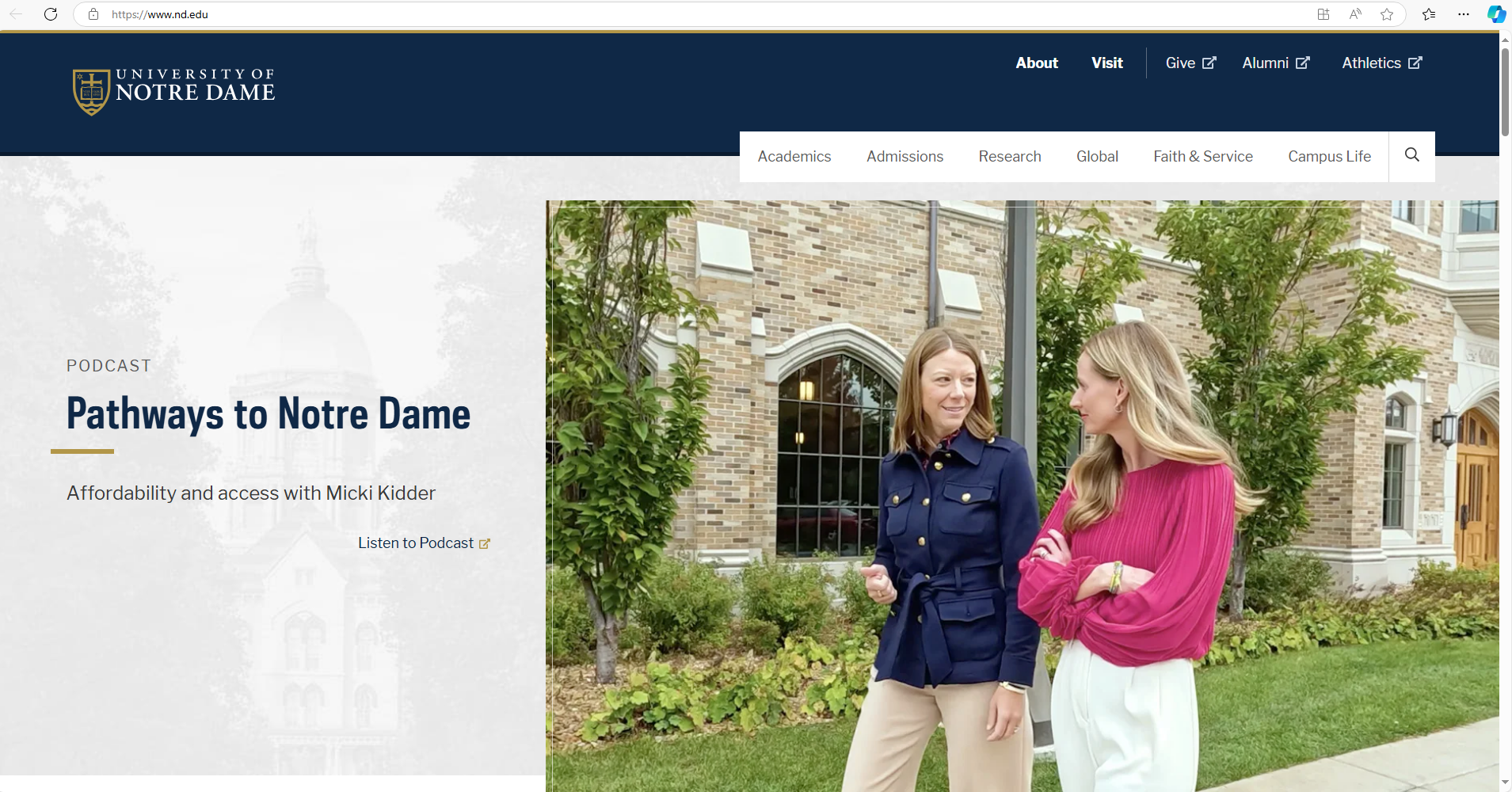
Figure 14.9 Desktop view of the University of Notre Dame home page.

Figure 14.10 Cell phone (small screen) view of the University of Notre Dame home page.
According to Lindsay Kolowich Cox, this approach has been used since 2012.
Morweb.org liked the University of Notre Dame website for two reasons:
- Strong branding. Web developers must use the school colors and the approved fonts plus other requirements.
- Responsive design. The same point was made by Hubspot and by Web Design Degree Center.
The Trends for Higher Education Websites
Cliff Persud of Kanopi Studies wrote about the trends for 2024. I have boiled down his lengthy article to the following outline:
- Optimized user experience and journey
- Use concise, powerful calls to action to help move visors through your site.
- Clean up your navigation.
- Make your site mobile-friendly.
- Offer clear next actions for each visitor segment.
- Use of [artificial intelligence] AI as an organizational practice.
- Students use of AI.
- Institutional AI policies.
- Research and development.
- More resources for underrepresented members of the student community.
- Inclusive contents
- Inclusive language.
- Strong, inclusive visuals
- Clarity on [diversity, equity, and inclusion] DEI initiatives.
- Rich interactive experiences
- Immersive virtual tours.
- Interactive design.
- Interactive timelines.
- Improved usability and accessibility.
- Follow the Web Content Accessibility Guidelines (WCAG) as you develop or redesign your website.
- Explore Kanopi’s list of best accessibility tools. (This is a plug for their web design services.)
- Test your website’s accessibility manually.
- Focus on mental health and wellness.
- Creating opportunities for personalization of the online experience.
- Public-facing personalization.
- Gated content personalization.
- Removing dark usability patterns. These are tricks or deceptive design elements that are used to make visitors take an action they did not intend to take such as signing up for something or paying for something they did not intend to purchase.
- Microinteractions.
- Real-time updates
Grant Proulx of Kanopi Studios wrote about the general top trends for 2024. He has an interesting take on AI. He pointed out that AI has a long way to go in the realm of writing like actual humans. The point being is that AI is really only effective for certain applications such as Grammarly and Vimeo. Grant Proulx referred the reader to an Eddie Shleyner article that explained why humans write better than “writing machines.” So do your own writing!
Concerning Cliff Persud’s last point, look at the screenshots for the University of Nortre Dame home page that Lindsay Kolowich Cox provided in her April 2022 revised article. Now compare with the screenshot used in the Wpastra July 26, 2024 article. Then look at Figure 14.9 and Figure 14.10, which were captured on October 25, 2024. If the in-house team continues the actions to keep the home page changing, then chances are that you will be viewing a different image.
The First Few Steps
Recall the early steps for designing a database. You spent time asking many questions of your client. This needs to be done for a website design.
For my project, I examined the current website. These were my quick observations:
- The home page is long. It has five leading paragraphs followed by many labeled sections. “AIM” is used, but is not defined. The person will have to figure out this abbreviation by looking at the title at the top of the web page.
- There is a section labeled “Home.” This makes no sense.
- There is a section labeled “Graduation.” There are four hyperlinks. These links take the visitor either to Facebook videos or to YouTube videos. There are other images and videos that could distract the visitors or could upset the visitors. Since the client is using an outside platform, there is no ability to control what is associated with the institution.
- There is a section labeled “Online Resources,’ It directs the visitor to return to the top and click on a tab in order to “access some tools for online education.” This tab is hidden behind the “Menu” button. The visitor will need to click on this button in order to display the “Resources” tab. Clicking on this tab brings the visitor to a web page that has nine paragraphs. The visitor has to read each paragraph, because there are no section labels. Six paragraphs are about using Zoom. The remaining paragraphs are about an introduction to the institution, about using a communications tool, and about using technology for building community.
- There is a Bible verse.
- There is a section labeled “About.” This has a link to a three-minute video about the institution. In slightly smaller font is a sub section with the label of “Here’s how we teach and train.”
- There is a section labeled “Current Courses.” In a different font from that used for the sub section in the “About” is a label “June 23, 2024.” This information is four months old. The next line reads “Here are our current offerings…” The font size is larger than the “Current Courses” label’s font size. There is a hyperlink (“Continue reading”) to those courses. This hyperlink has information about the registration form and about the admissions or enrollment form. There is a link for the registration form. On my cell phone, this link did not work. On my personal computer, the link displayed a PDF form. It is not a fillable-form. The visitor would need to print off the form and fill it out manually. The admissions form is stored elsewhere on the website. After this information paragraph, the web page lists courses for two academic programs. The first academic program has three courses. One is for Fall 2024 and the other two are for Spring 2025. There are no details about these courses. A prospective student does not know the name of the instructor, the credit amount, the location of the course, the meeting days and times, and the course materials. The second academic program does not have any details.
- There is a section labeled “Contact.” In slightly smaller font is a sub section with the label of “Find us.”
- The menu button displays, “Home,” “About,” “Current Courses,” “Admissions,” “Programs,” “Contact,” “Leadership,” “Administration,” and “Resources.”
- “Home” closes the drop-down menu and shows the home page.
- “About” takes the visitor to the “About” section on the home page.
- “Current Courses” takes the visitor to the above described “Current Courses” web page.
- “Admissions” takes the visitor to a new web page. Here are the links to the enrollment form (new web browser tab), to the course registration form (current web browser tab), and to the funding application form (new web browser tab). All forms are non-fillable PDFs. There is a paragraph that tells the visitor where to obtain the PDF reader.
- “Programs” provides the visitor with information about the three programs. One topic area is offered as two courses. These are numbered with Roman numerals. On the “Current Courses” web page, these two courses are numbered with Arabic numerals. The details on the other two programs are vague. For these two, the visitor is told to contact either an Area Dean or the “AIM Director.” This web page does not provide a link for reaching these individuals. The information is stored under “Leadership.”
- “Contact” takes the visitor to a separate web page. It has the same text as the “Contact” section on the home page, but without the other sections.
- “Administration” takes the visitor to a web page that contains links to three forms: “Invoice for Stipend – Dean,” “Invoice for Stipend – Instructor,” and “Student Course List Form.” The “Invoice for Stipend – Dean” opens a new web browser tab. It has a link to a Microsoft Word document that can be downloaded and typed on. The web page has a previous link, but it repaints the same web page. The “Invoice for Stipend – Instructor” goes to a new web page tab and straight to the Microsoft Word document. The “Student Course List Form” goes to a new web browser tab, but the form is labeled as “Student Course List Blank.” Clicking on the link takes the visitor to a new web browser tab with a Microsoft Word document that can be downloaded and typed on. The title is “Student Course List Form.” This form is used by the instructor. The landing page has a previous link that repaints the same web page.
- “Resources” takes the visitor to the resource web page. This was described earlier.
- There are some icons for taking the visitor to Yelp, to the WordPress information on Facebook, to the WordPress information on Twitter, to the WordCamp on Instagram, and to a bogus e-mail address.
- The behavior on the cell phone is different from the behavior on a desktop. The cell phone view has two individuals at the top. Scrolling down the home page is normal. The desktop view has six individuals at the top. The cell phone view dropped four of these individuals. In both views, scrolling the information covers up the photograph. On the cell phone, the second photograph is “bolted” to the scrolling text. On the desktop view, the home page breaks after the Bible verse. The second photograph is uncovered. The rest of the home page comes into view and covers up this photograph. On the cell phone, the third photograph is “bolted” to the scrolling text. On the desktop view, the second piece of the home page contains just the “About” section. It covers the second photograph and later uncovers the third photograph. This same behavior happens for the fourth photograph with the “Current Courses” section. The “Contact” section covers up the fourth photograph.
We have identified many problems with this website. In the next few sections, we will learn a bit about developing a website. This is at a high level. You will need to explore on your own or take some courses. We will explore Bootstrap.
Bootstrap

Figure 14.11 The new Bootstrap logo for version 5. Source of image: https://blog.getbootstrap.com/2021/05/05/bootstrap-5/
Bootstrap is a framework for building responsive, mobile-first websites. Older versions such as Bootstrap version 3 used HTML, CSS, JavaScript, and JQuery. Bootstrap 5 dropped support for JQuery. The W3 schools image shows how a web page might appear on three different screens.
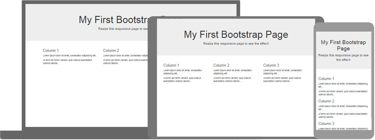
Figure 14.12 Three views of the same example web page. Source of image: https://www.w3schools.com/bootstrap/
The W3 schools has tutorials for 3.0, for 4.0, and for 5.0. If you enter the W3 schools website via a general search engine, it may take you to an older version. Version 5 has been out since 20217. Version 5.3.3 has been out since February 20, 2024 and this appears to be the most current8.
What is HTML?
Hyper Text Markup Language (HTML) is the standard way for creating web pages. It is different from a typical programming language such as C# or Java. A typical programming language has instructions that work with objects or with variables. HTML describes the structure of a web page and a web browser will implement the instructions. This is similar to an SQL command where we tell the data engine that we want something and data engine implements the instructions.
Figure 14.13 shows a simple HTML document with explanations.
|
Example HTML Lines |
Explanation |
|
<!DOCTYPE html> |
This states that this document is an HTML5 document. This is not a true HTML tag. It tells the web browser what to expect. Note: Comments are done in this fashion: <!– a comment -> |
|
<html lang> |
Root element of an HTML page. We are using United States English. |
|
<head> |
Used to contain the metadata items. This marks the beginning. |
|
<title> Page Title </title> |
Title of the HTML page. Notice how the end of field is done. This appears in the web browser’s title bar or in the web browser’s page tab. |
|
</head> |
End of the metadata items. |
|
<body> |
Holds the contents that will be displayed. |
|
<h1> Heading Content </h1> |
The HTML heading tag. There are six levels. |
|
<p> Paragraph Content </p> |
The HTML paragraph tag. There are HTML elements for tables, for lists, for images, for buttons, and for links. |
|
</body> |
End of the body items. |
|
</html> |
End of the HTML document. |
Figure 14.13 Simple HTML document with explanations.
HTML is used to create static pages that are black and white.
What is CSS?
Cascading Style Sheets (CSS9) are used to describe how HTML elements are to be displayed on a screen. CSS can control the layout of multiple web pages at the same time.
CSS uses rules for defining HOW the HTML code will behave. Using the heading tag and the paragraph tag from Figure 14.13 we can change the color of these two elements.
|
Example CSS Lines |
Explanation |
|
h1 { color: red; font-size: 5em } <h1> Heading Content </h1> |
Defining that any h1 line will have red coloring for the text and a font size of 5em. The term “5em” means that the font size is five times the font size of its parent element. It is a relative unit of measurement10. There are absolute font size measurements such as cm for centimeters, mm for millimeters, in for inches, px for pixels, pt for points, and pc for picas. |
|
p { color: blue; } <p> Paragraph Content </p> |
Defining that any p lines will have blue coloring for the text. |
Figure 14.14 Simple CSS lines with explanations.
There are three ways of applying CSS to a website. The most common approach is to store the CSS lines in a file. We could use the file name of styles.css or custom.css. This is defined by the programmer.
To link our web page to the styles.css file, we need to place the following line in the header part of the HTML file:
<link rel=”stylesheet” href=”styles.css” />
When the web browser reads the HTML file and it reaches this line, then it knows that some styling will be done to the final view of the web page.
CSS has options for changing elements based on HTML elements’ names. By using the class attribute, you can fine tune the appearance of the web page. Figure 14.15 shows how to change just the second bullet.
|
In the HTML Document |
|
|
<ul> <li>Item one </li> <li class=”special”> Item two </li> <li>Item <em>three</em> </li> </ul> |
<ul> Unnumbered list. That is a bullet list. <li> A bullet item. “class=”special”> This is the class field and “special” is a programmer’s selected word. <em> We are emphasizing the word “three.” |
|
In the CSS Document |
|
|
.special { color: orange; font-weight: bold: } |
The definition of a CSS class starts with a period. The details of the definition are enclosed between a pair of curved braces. |
Figure 14.15 Showing how to create and to use CSS based on a class definition instead of an element definition. Source: https://developer.mozilla.org/en-US/docs/Learn/CSS/First_steps/Getting_started
CSS can make changes based on the location of the element. CSS can make changes based on the state of an element. Recall how a link to a URL has a blue color before you click on a link, but after the visit, the link will have a different color.
As the MDN web docs writers noted, there are trade-offs for using CSS. CSS can make a web page very attractive. But CSS can make it hard for some individuals to read your web page.
As noted earlier in this section, there are three ways of working with CSS. For completeness, we will touch upon the other ways:
Internal stylesheet. This goes inside the header part of the HTML web page. The drawback is that each web page will need to repeat the CSS lines.
- Inline style. The CSS information is placed in the element. This is not a good practice, because the CSS information would need to be repeated for the same element throughout the web page.
- CSS supports functions and shortcuts. We will not go any further with this topic. The MDN web docs article entitled “How CSS is structured” goes into more detail.
One final word about CSS. The United States English spelling is the standard. “Colour” will fail. You must use “color11.”
What is JavaScript?
JavaScript is a scripting or programming language that supports complex features on web pages. JavaScript makes a web page dynamic. This could be stock market feeds, interactive maps, animations, and so on. Some programmers will talk about using JavaScript on the client side.
Think of this way:
- HTML is the plain looking web page.
- CSS dresses up the HTML so it is eye-pleasing.
- JavaScript adds functionality to any created buttons or other interactive pieces.
Figure 14.16 shows how these three appear on a web page.
|
HTML |
|
|
<button type=”button”>Player 1: Chris</button> |
We have defined the button and how it appears to the user.
|
|
CSS |
|
|
button { font-family: “helvetica neue”, helvetica, sans-serif; letter-spacing: 1px; text-transform: uppercase; border: 2px solid rgb(200 200 0 / 60%); background-color: rgb(0 217 217 / 60%); color: rgb(100 0 0 / 100%); box-shadow: 1px 1px 2px rgb(0 0 200 / 40%); border-radius: 10px; padding: 3px 10px; cursor: pointer; } |
The value pairs are straight forward. This is how the button now appears:
|
|
JavaScript |
|
|
const button = document.querySelector(“button”); button.addEventListener(“click”, updateName); function updateName() { const name = prompt(“Enter a new name”); button.textContent = `Player 1: ${name}`; } |
JavaScript is declaring a non-changing button object. We added a line that directs the button to “listen” for a button click. When the user clicks, then a method (a utility block of code) fires. We prompt the user to enter a name. The variable “name” captures the user’s typed in name. The button visible text is updated to include the person’s name. |
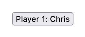
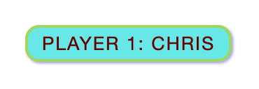
Figure 14.16 Showing how to create a web page button that will react to a button click. Source: https://developer.mozilla.org/en-US/docs/Learn/JavaScript/First_steps/What_is_JavaScript
The MDN web docs article entitled “What is JavaScript?” had “Chris” as the default name and the example of updating the name on the button reused the name of “Chris.”
JavaScript is a powerful language. We will not go any further with this topic. The MDN web docs article entitled “What is JavaScript” goes into more detail.
One final word about JavaScript. It is not the same thing as Java.
- Java is a compiled language. A person writes the code, then it is passed to a compiler. Different from C, C++, and other languages, the output from a Java compiler is bytecode. The bytecode is fed to a Java Virtual Machine (JVM). Each operating system has its own JVM. This takes the bytecode and executes the program. Java handles threads, which is a way of appearing to support two or more users or actions at the same time. There are three versions of Java: the standard desktop kit, the enterprise version, and the mobile version.
- JavaScript is an interpreted language, but it can use just-in-time-compilation. It runs through a web browser and about 98.8 percent of websites use JavaScript. It does not handle threads. By using the Node, it can be used to handle some “back room” activities.
The name of “JavaScript” was chosen as a marketing ploy. The intent was to encourage people to look at JavaScript. It has nothing to do with the Java programming language.
Getting Started with Bootstrap
As noted in the first paragraph under the heading of Bootstrap, it is a framework for building responsive, mobile-first websites that use HTML, CSS, and JavaScript. Bootstrap uses:
- The viewport meta data item.
- A link tag for accessing the CSS information
- A script tag for accessing the special JavaScript bundle.
Figure 14.17 shows how these pieces appear.
|
<!doctype html> |
|
|
<html lang”en”> |
|
|
<head> |
|
|
<meta charset=”utf-8”> |
This is more than the United States English or the keys available on an English keyboard.. UTF-8 can encode all Unicode 1,112,064 character code points. It does this by using variable coding. A character could be coded between one to four bytes. This is the standard encoding for the web. |
|
<meta name”viewport” content=”width=device-width, initial-scale=1”> |
Viewport tells the web page to scale based on the size of the viewing screen. The “width=device-width” piece sets the width of the web page to follow the screen-width of the viewing device. The “initial-scale=1” piece sets the initial zoom level when the web page first loads in the web browser. |
|
<title> Database Design Third Edition Welcome Web Page</title> |
This is the title that appears in the web page title bar. |
|
<link href=”https://cdn.jsdelivr.net/npm/bootstrap@5.3.3/dist/css/bootstrap.min.css” rel=”stylesheet” integrity=”sha384-QWTKZyjpPEjISv5WaRU9OFeRpok6YctnYmDr5pNlyT2bRjXh0JMhjY6hW+ALEwIH” crossorigin=”anonymous”> |
We are pulling the CSS from a website instead from a local file. The integrity field is optional. It is a way of ensuring that the file has not been tampered with. |
|
</head> |
The end of the header block. |
|
<body> |
The beginning of the information that will appear in the user’s web browser. |
|
<h1>Hello Database Design Third Edition Readers!</h1> |
|
|
<script src=”https://cdn.jsdelivr.net/npm/bootstrap@5.3.3/dist/js/bootstrap.bundle.min.js” integrity=”sha384-YvpcrYf0tY3lHB60NNkmXc5s9fDVZLESaAA55NDzOxhy9GkcIdslK1eN7N6jIeHz” crossorigin=”anonymous”></script> |
We are pulling the JavaScript lines from a website instead of within the current file. Note: The getbootstrap.com website placed the script source line here. The W3 schools website has this line in the header. |
|
</body> |
End of the body block. |
|
</html> |
|
Figure 14.17 Showing how to create a web page that uses Bootstrap. Adapted the example from: https://getbootstrap.com/docs/5.3/getting-started/introduction/
Figure 14.17 was a static web page. If we wish to work with dropdown menus, with popovers, with tooltips, or with other GUI pieces, then we would need to add support for Popper:
<script src=”https://cdn.jsdelivr.net/npm/@popperjs/core@2.11.8/dist/umd/popper.min.js” integrity=”sha384-I7E8VVD/ismYTF4hNIPjVp/Zjvgyol6VFvRkX/vR+Vc4jQkC+hVqc2pM8ODewa9r” crossorigin=”anonymous”></script>
The getbootstrap.com website has example web pages. These are complete versions for a person to explore and to use. This is good for those who learn by tearing into things. That is not everyone’s learning style. We will use information from W3 schools to understand better Bootstrap12. The starting page is https://www.w3schools.com/bootstrap/bootstrap_ver.asp
Learning Bootstrap Basics from W3 schools
As of this writing B5 is the latest version. It does not support Internet Explorer 11 or lower. According to Sean Lyndersay, General Manager for Microsoft Edge, an update to Windows 10 Microsoft Edge had a command to permanently disable Internet Explorer 11. This was done, because Microsoft had ended support on June 15, 2022. So working with the latest version such as B5 should not cause an issue for visitors to your website.
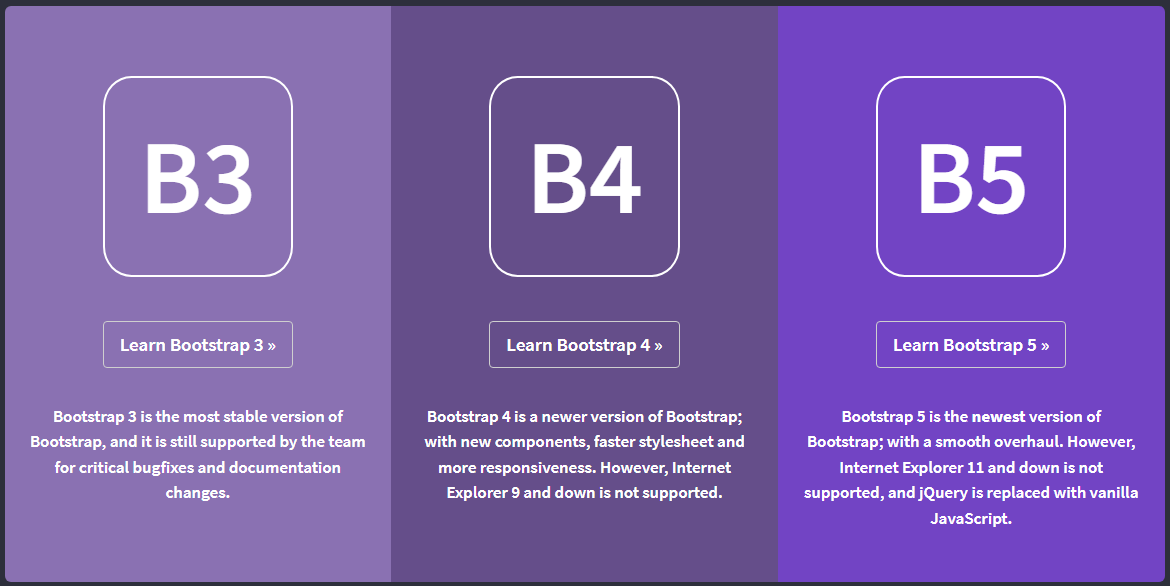
Figure 14.18 Opening screen for the three Bootstrap versions. Source of image: https://www.w3schools.com/bootstrap/bootstrap_ver.asp
W3 schools13 pointed out that W3.CSS is “smaller, faster, and easier to use” and “is an excellent alternative to Bootstrap 5.” Anna Fitzgerald in a 2020 article noted these points:
- Both are free.
- W3.CSS is a less widely used framework.
- W3.CSS uses only CSS whereas Bootstrap uses CSS and JavaScript.
- W3.CSS is easier to learn.
- W3.CSS adds a reference to the stylesheet in the index.html file. Bootstrap is more complicated, because it must load the BoostrapCDN locally or download it onto the web server.
- One can do more with Bootstrap, because it supports creating dropdowns, modals, popovers, and carousels plus more.
- In 2020, W3.CSS was found on over 70,000 websites whereas Bootstrap was found on over 20 million websites.
Bootstrap .Container Class
Bootstrap uses container classes. The .contrainer class14 provides a fixed width container whereas the .container-fluid class provides a full width container that spans the full width of the viewport.
Figure 14.19 shows an example of a responsive fixed width container. Notice that the script source line is in the header section and the title is the first line in the header section. Also, we are not including the SHA384 hash function piece15.
|
<!doctype html> |
|
|
<html lang”en”> |
|
|
<head>16 |
|
|
<title>Database Design Third Edition Welcome Web Page</title> |
This is the title that appears in the web page title bar17. |
|
<meta charset=”utf-8”> |
The character set |
|
<meta name”viewport” content=”width=device-width, initial-scale=1”> |
This tells the web page to scale based on the size of the viewing screen—the viewport. The “width=device-width” piece sets the width of the web page to follow the screen-width of the viewing device. The “initial-scale=1” piece sets the initial zoom level wen the web page first loads in the web browser. |
|
<link href=”https://cdn.jsdelivr.net/npm/bootstrap@5.3.3/dist/css/bootstrap.min.css” rel=”stylesheet”> |
We are pulling the CSS package from a website instead from a local file. |
|
<script src=”https://cdn.jsdelivr.net/npm/bootstrap@5.3.3/dist/js/bootstrap.bundle.min.js”></script> |
We are pulling the JavaScript package from a website instead from a local file. |
|
</head> |
|
|
<body> |
|
|
<div class=”container”> |
This marks the beginning of the fixed width container block. |
|
<h1>Hello Database Design Third Edition Readers!</h1> <p>This is your first Bootstrap web page.</p> <p>This part is inside a .container class.</p> <p>The .container class provides a responsive fixed width container.</p> <p>Resize the browser window to see that the container width will change at different breakpoints.</p> |
|
|
</div> |
This marks the end of the fixed width container block. |
|
</body> |
|
|
</html> |
|
Figure 14.19 Showing how to create a web page that uses a fixed width container by using the Bootstrap div block. Adapted the example from: https://www.w3schools.com/bootstrap5/bootstrap_get_started.php
Figure 14.20 shows the full screen view. Figure 14.21 shows the “cell phone” view.
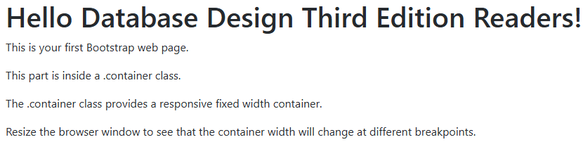
Figure 14.20 Simulated output from a full desktop view for the .container class.
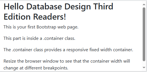
Figure 14.21 Simulated output from a cell phone view for the .container class.
If we replace the div class piece in Figure 14.19 with “container-fluid,” then the behavior would change.
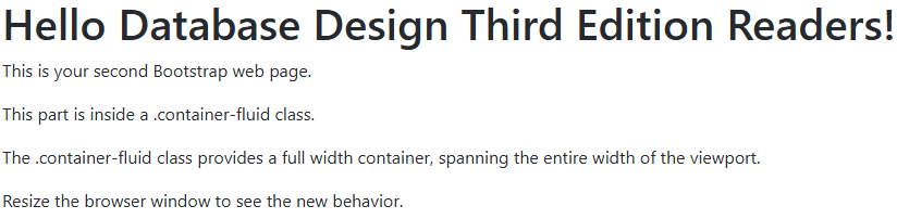
Figure 14.22 Simulated output from a full desktop view for the .container-fluid class.
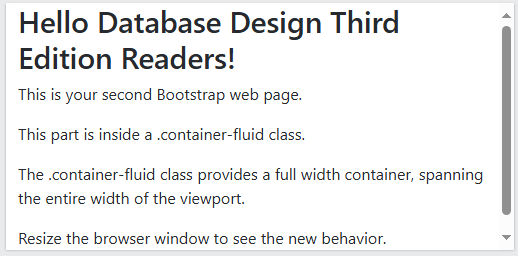
Figure 14.22 Simulated output from a cell phone view for the .container-fluid class.
With one container, the behavior is the same. We will see what happens when the web page has a second container. First things first. We need to understand what is “max-width.” The definition varies based on the available screen real estate:
|
Screen Size |
max-width |
|
Extra small (less than 576 px18.) |
100% |
|
Small (greater than or equal to 576 px) |
540 px |
|
Medium (greater than or equal to 768 px) |
720 px |
|
Large (greater than or equal to 992 px) |
960 px |
|
Extra large (greater than or equal to 1,200 px) |
1,140 px |
|
XXL19 (greater than or equal to 1,400 px) |
1,320 px |
Figure 14.23 Values for the max-width variable on different screen sizes.
There is a switch20 in the .container class that fine tunes the behavior at each screen size. Figure 14.24 illustrates the changes.
|
Class |
Extra small |
Small |
Medium |
Large |
Extra large |
XXL |
|
.container-sm |
100% |
540px |
720px |
960px |
1140px |
1320px |
|
.container-md |
100% |
100% |
720px |
960px |
1140px |
1320px |
|
.container-lg |
100% |
100% |
100% |
960px |
1140px |
1320px |
|
.container-xl |
100% |
100% |
100% |
100% |
1140px |
1320px |
|
.container-xxl |
100% |
100% |
100% |
100% |
100% |
1320px |
Figure 14.24 Changing the behavior of max-width. Source of table: https://www.w3schools.com/bootstrap5/bootstrap_containers.php
Bootstrap Grid System
You can have as many as 12 columns across the web page. If 12 columns are not needed then you could combine these columns similar to the examples shown in Figure 14.25:
|
span 1 |
span 1 |
span 1 |
span 1 |
span 1 |
span 1 |
span 1 |
span 1 |
span 1 |
span 1 |
span 1 |
span 1 |
|
span 4 |
span 4 |
span 4 |
|||||||||
|
span 4 |
span 8 |
||||||||||
|
span 6 |
span 6 |
||||||||||
|
span 12 |
|||||||||||
Figure 14.25 Illustrating how the Bootstrap 5 grid system could be configured. Source of table: https://www.w3schools.com/bootstrap5/bootstrap_grid_basic.php
Instead of working with the .container class for the width of one row, we would use the .col classes (short for column). Look at Figure 14.26 for the column labels and their values:
|
.col- |
Extra small devices (less than 576 px) |
|
.col-sm- |
Small devices (equal to or greater than 576 px) |
|
.col-md- |
Medium devices (equal to or greater than 768 px) |
|
.col-lg- |
Large devices (equal to or greater than 992 px) |
|
.col-xl- |
Extra large devices (equal to or greater than 1,200 px) |
|
.col-xxl- |
XX large devices (equal to or greater than 1,400 px) |
Figure 14.26 Column values. Source of table: https://www.w3schools.com/bootstrap5/bootstrap_grid_basic.php
On your web page, you would determine how many rows and columns that you need. You can control the width or you could let Bootstrap handle the layout.
|
Manually Controlling the Number of Columns |
|
|
<div class=”row”> |
The first asterisk is replaced by one of the column suffixes from Figure 14.26. The second asterisk is replaced by the number of desired columns. For the first row, the value would be 6. For the second row, the value would be 4. The number of column lines times the second field must equal to 12. |
|
Letting Bootstrap Handle the Layout |
|
|
<div class=”row”> |
This has three rows. So each column would be 33.33% wide of the available row space. |
Figure 14.27 Basic structure for the Bootstrap 5 grid-manual option or automatic option. Source of the text: https://www.w3schools.com/bootstrap5/bootstrap_grid_basic.php
Figure 14.28 shows how the manual approach plays out for four columns.
|
<div class=”row”> |
The use of “col-sm” would result in the appearance of columns for devices that are 576 px or larger such as tablets, desk top monitors, and large television sets. Anything less than 576 px wide such as a cell phone will not see the columns. Instead, the columns will be stacked on top of each other. |
Figure 14.28 An example of manually controlling when columns will display and when the columns will stack. Source of the text: https://www.w3schools.com/bootstrap5/bootstrap_grid_basic.php
Figure 14.29 is an example of columns that will stack when the screen is less than 576 px wide.
|
<!DOCTYPE html> <html lang=”en”> <head> <title>Bootstrap Example</title> <meta charset=”utf-8″> <meta name=”viewport” content=”width=device-width, initial-scale=1″> <link href=”https://cdn.jsdelivr.net/npm/bootstrap@5.3.3/dist/css/bootstrap.min.css” rel=”stylesheet”> <script src=”https://cdn.jsdelivr.net/npm/bootstrap@5.3.3/dist/js/bootstrap.bundle.min.js”></script> </head> |
|
|
<body> <div class=”container-fluid mt-3″> <h1>Database Design Third Edition: Responsive Columns</h1> <p>Resize the browser window to see the effect.</p> <p>The columns will automatically stack on top of each other when the screen is less than 576 px wide.</p> <div class=”row”> <div class=”col-sm-3 p-3 bg-primary text-white”>Database</div> <div class=”col-sm-3 p-3 bg-dark text-white”>Design</div> <div class=”col-sm-3 p-3 bg-primary text-white”>Third</div> <div class=”col-sm-3 p-3 bg-dark text-white”>Edition</div> </div> </div> </body> </html> |
Legend21 m for margin t for top margin 3 for $spacer as defined. P for padding 3 for $spacer as defined. bg for background. primary is blue. dark is black. text is for the characters |
Figure 14.29 Modified Bootstrap coding for responsive columns. Adapted from https://www.w3schools.com/bootstrap5/tryit.asp?filename=trybs_grid_ex1&stacked=h
Figure 14.30 shows the desktop view and Figure 14.31 shows the cell phone view.
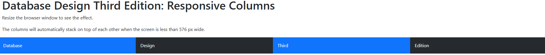
Figure 14.30 Simulated output from a desktop view for the responsive columns. Adapted from https://www.w3schools.com/bootstrap5/tryit.asp?filename=trybs_grid_ex1&stacked=h
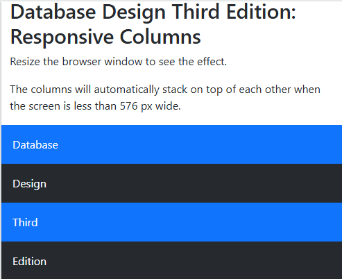
Figure 14.29 Simulated output from a cell phone view for the responsive columns. Adapted from https://www.w3schools.com/bootstrap5/tryit.asp?filename=trybs_grid_ex1&stacked=h
More About Bootstrap
The W3 schools tutorial on Bootstrap 5 covered many topics beyond containers and grid layout. The coverage in this chapter was enough to get you started. As we work on the example website, we will read and apply the appropriate Bootstrap 5 tool.
Working on a Website
This is not a website designing textbook. In this section, we will take a high-level approach to this topic. Recall the statements from the section entitled “General Statement.” We will go a bit further. WebsiteBuilderExpert has a good article and it does end with a plug for its service. Forbes has good advice too.
Writing for WebsiteBuilderExpert, Emma Ryan listed seven steps:
- Set Your Website Goals.
- Build Your Brand Identity.
- Select a Template.
- Customize Essential Pages
- Optimize Your Contents.
- Launch Your Website.
- Gather Feedback and Evolve.
Writing for Forbes, Christiana Jolaoso listed nine steps:
- Define the Site’s Purpose.
- Choose Your Platform.
- Gather Your Brand Elements
- Select a Template or Theme.
- Map Out Your Site.
- Design Each Site Element.
- Customize Your Web Pages.
- Test and Launch Your Website.
- Optimize Your Content.
We will be mimicking the arrangement used by the University of Norte Dame, because we are interested in updating a small educational website. If you wish to create an on-line store, Printitfy has some eCommerce specific advice.
We will come back to the Emma Ryan suggestions and to the Christiana Jolaoso suggestions when we enter the section entitled “Applying the Insights to the Douglas College Website.”
Storyboarding a Website
None of the writers mentioned in the previous section addressed using a storyboard, which is a simple representation of a design project. This is a tool that has been used by those working in cinema22, in design, in fashion, and in digital development. For a website, a storyboard would show how the website would appear and how it would behave.
Krystallin Baker explained how a storyboard is used in designing a website. Her viewpoint is from the client looking a web-designing company’s storyboard.
Kyle Deguzman explained storyboarding from the viewpoint of a person working on a website. It helps us to have a bird’s eye view of the website. See Figure 14.30 for an example:
Figure 14.30 An example of a high-level storyboarding of a website. Source of image: https://www.studiobinder.com/blog/storyboard-website-design/
Just like we did for our database project, the next step is to add some details. This is called wireframing. Figure 14.31 shows an example. We are beginning to think about the arrangement of the boxes on each web page.
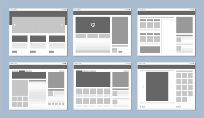
Figure 14.31 An example of wireframing a website. Source of image: https://www.studiobinder.com/blog/storyboard-website-design/
Kyle Deguzman listed the following steps:
- Gather data.
- Define the persona and scenario
- Put together the storyboard panels.
- Add captions.
Matt Crawford goes into more detail on the storyboarding process.
Examining Pieces of the University of Norte Dame Website
There is a quote that is attributed to Oscar Wilde:
Imitation is the sincerest form of flattery that mediocrity can pay to greatness.
So our examination of the University of Norte Dame means we are learning from a good website design. I wish to note that the University of Norte Dame has a full-time team devoted to the website.
Navigation Bar
At the top is a blue bar. It has the logo on the left side and five links to other locations. The last three go to completely different websites. Notice the icon (  ) after “Give,” “Alumni,” and “Athletics.”

Figure 14.32 The logo box with five links. Source of image: https://www.nd.edu
The color background is dark (blue: Pantone 28923) and the letters are white. This is known as an inverted navigation bar. Below the blue box is a white box overlapping part of the blue box.

Figure 14.33 The white box with six links plus a search icon button. Source of image: https://www.nd.edu
Douglas College uses a double navigation bars approach too.
 Figure 14.34 Screenshot of Douglas College’s double navigation bars.
The Douglas College school colors appear to be black, green, and silver.
We will mimic the University of Norte Dame approach and do it for Douglas College. To do this we need to understand the color naming scheme. Recall that Bootstrap works with classes and the classes are properly named with a leading period.
|
The Text Colors Classes |
Example Rendering |
NavBar Colors |
|
.text-muted Deprecated in v5.3.024 |
This text is muted. |
The naming scheme for the navbars was .navbar-<same wording as used for the text colors.>. In 5.2.0, .navbar-light was deprecated. CSS variables are now used with .navbar. The light color is the default color. In v5.3.0, .navbar-dark was deprecated. The replacement is data-bs-theme=”dark” and this is added to .navbar. Note: The data-bs-theme could be applied to the entire html element or just to a specific component.
Author Note: The Pressbooks.bccampus.ca color options are limited. The selected colors are best guess. Visit a Bootstrap website to see the actual color renderings. |
|
.text-primary |
This text is important. .text-primary |
|
|
.txt-primary-emphasis |
.text-primary-emphasis |
|
|
.text-success |
This text indicates success. .text-success |
|
|
text-success-emphasis |
.text-success-emphasis |
|
|
.text-info .text-info bg-dark |
This text represents some information. .text-info |
|
|
text-info-emphasis |
.text-info-emphasis |
|
|
.text-warning .text-warning bg-dark |
This text represents a warning. .text-warning |
|
|
text-warning-emphasis |
.text-warning-emphasis |
|
|
.text-danger |
This text represents danger. .text-danger |
|
|
.text-danger-emphasis |
.text-danger-emphasis |
|
|
.text-secondary |
Secondary text. .text-secondary |
|
|
text-secondary-emphasis |
.text-secondary-emphasis |
|
|
.text-dark .text-dark bg-white |
This text is dark gray. .text-dark |
|
|
.text-dark-emphasis |
.text-dark-emphasis |
|
|
.text-body |
Default body color (often black). .text-body |
|
|
.text-body-emphasis |
.text-body-emphasis |
|
|
.text-body-secondary |
.text-body-secondary |
|
|
.text-body-tertiary |
.text-body-tertiary |
|
|
.text-light .text-light bg-dark |
This text is light gray (on black background). .text-light |
|
|
.text-light-emphasis |
.text-light-emphasis |
|
|
.text-white .text-white bg-dark |
This text is white (on black background). .text-white |
|
|
.text-black .text-black bg-white |
.text-black |
|
Figure 14.35 Color naming scheme used in Bootstrap 5. Source: W3schools and Bootstrap. Note: The rendering of the colors in this figure is not accurate. Visit the actual websites to see the accurate rendering of the colors.
Open up a text editor25 and copy the lines from Figure 14.36. Name your file as “Chapter14Notepad.html26.”
|
<!DOCTYPE html> <!– This is used with Database Design Third Edition Chapter 14. –> <!– Notice how comments are written in this file. –> <html lang=”en”> <head> <meta charset=”utf-8″> <meta name=”viewport” content=”width=device-width, initial-scale=1″> <link href=”https://cdn.jsdelivr.net/npm/bootstrap@5.3.3/dist/css/bootstrap.min.css” rel=”stylesheet”> <!– Any custom CSS file reference must come after the Bootstrap CSS reference. –> <!– link rel=”stylesheet” type=”textcss” href=”custom.css” –> <title>Navbar Example Based on Douglas College</title> <script src=”https://cdn.jsdelivr.net/npm/bootstrap@5.3.3/dist/js/bootstrap.bundle.min.js”></script> </head> |
|
<body> <nav class=”navbar navbar-expand-sm bg-secondary data-bs-theme=”dark”> <div class=”container-fluid”> <a class=”navbar-brand” href=”#”> <img src=”https://coursetakers.com/img/uploads/school_images_temp/c1e6524f2ecaf24d9b745eaf0d185139.png” alt=”Douglas College Logo (White letters on black background)” style=”width:150px;” > </a> <a class=”navbar-brand” href=”#”> <img src=”https://www.douglascollege.ca/sites/default/files/styles/medium_auto/public/images/Douglas%20College%20coat%20of%20arms.png/” alt=”Douglas College Coat of Arms” style=”width:100px;”> </a> <ul class=”navbar-nav”> <li class=”nav-item”> <a class=”nav-link active” href=”https://www.douglascollege.ca/about-douglas”>About</a> </li> <li class=”nav-item”> <a class=”nav-link” href=”https://www.douglascollege.ca/future-students/explore-douglas”>Visit</a> </li> <li class=”nav-item”> <a class=”nav-link” href=”https://www.douglascollege.ca/givealumni/foundation”>Give</a> </li> <li class=”nav-item”> <a class=”nav-link” href=”https://www.douglascollege.ca/givealumni/alumni”>Alumni</a> </li> <li class=”nav-item”> <a class=”nav-link” href=”https://www.douglascollege.ca/student-services/student-life/athletics-recreation”>Athletics</a> </li> </ul> </div> </nav> <nav class=”navbar navbar-expand-sm bg-light data-bs-theme=”dark”> <div class=”container-fluid”> <ul class=”navbar-nav”> <li class=”nav-item”> <a class=”nav-link active” href=”https://www.douglascollege.ca/programs-courses”>Academics</a> </li> <li class=”nav-item”> <a class=”nav-link” href=”https://www.douglascollege.ca/future-students/general-college-admissions-requirements”>Admissions</a> </li> <li class=”nav-item”> <a class=”nav-link” href=”https://www.douglascollege.ca/about-douglas/learn-about-douglas/research-college”>Research</a> </li> <li class=”nav-item”> <a class=”nav-link” href=”https://www.douglascollege.ca/programs-courses/global-programs-and-exchanges”>Global</a> </li> <li class=”nav-item”> <a class=”nav-link” href=”https://www.douglascollege.ca/student-services/student-life/athletics-recreation”>Faith & Service</a> </li> <li class=”nav-item”> <a class=”nav-link” href=”https://www.douglascollege.ca/student-services/student-life”>Campus Life</a> </li> </ul> </div> </nav> <div class=”container-fluid mt-3″> <h3>Notes on the Navbar</h3> <p>When using the .navbar-brand class with images, Bootstrap 5 will automatically style the image to fit the navbar.</p> <p>Note: The links are real and will take you to a Douglas College web page.</p> <p>Douglas College’s colors are black, silver, and green.</p> </div> </body>
|
|
</html> |
Figure 14.36 Bootstrap 5 lines from the working “Chapter14Notepad.html” file.
Do a right mouse click on the file name and select a web browser. See Figure 14.37.
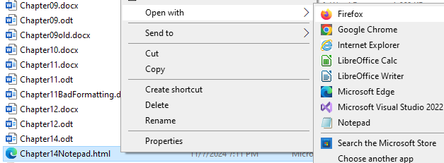
Figure 14.36 Screenshot of the execution of the Chapter14Notepad.html file.
Figure 14.37 shows the desktop view. Figure 14.38 shows the small screen view.
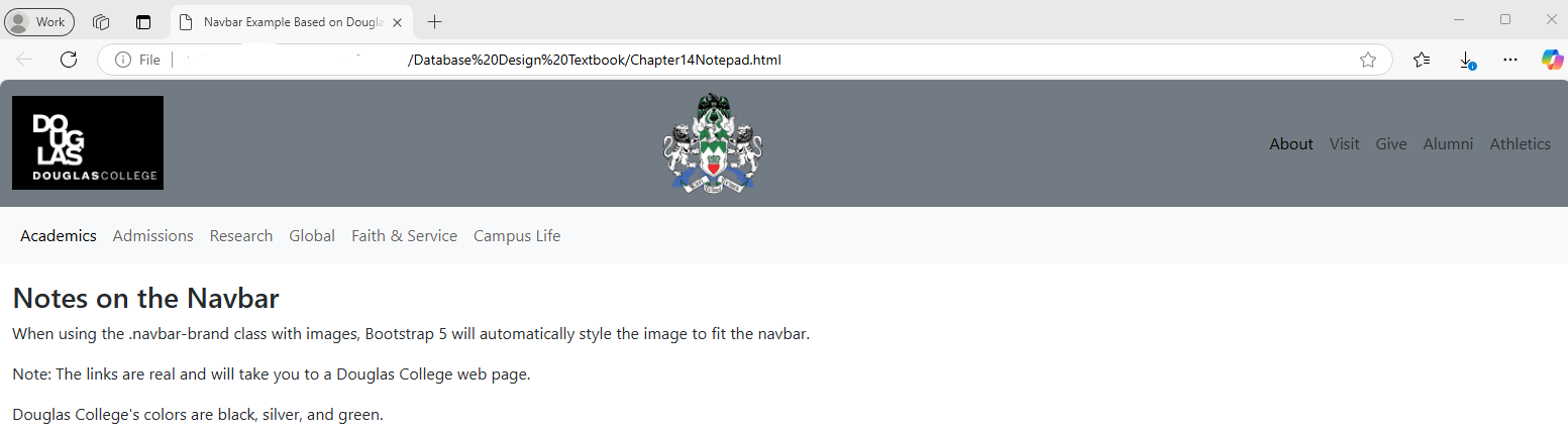
Figure 14.37 Screenshot of the desktop view.
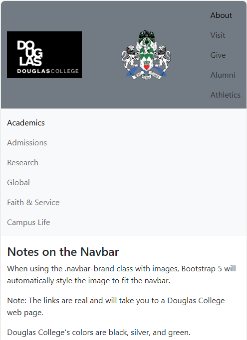
Figure 14.38 Screenshot of the desktop view.
Bootstrap supports the collapsing menu. Figure 14.39 shows what this would look like. The triple bar icon or as it is called in the Bootstrap users’ circle, the “hamburger menu icon.”
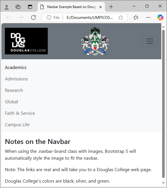
Figure 14.39 Screenshot of the triple bar icon
Figure 14.40 shows what happens when the user clicks on the icon.

Figure 14.40 Screenshot of the clicked triple bar icon.
Figure 14.41 contains the lines used to support the triple bar icon behavior.
|
<!– After the a class for the navbar brand, we would add the code for collapsing the menu when the screen size is reduced. –> <button class=”navbar-toggler” type=”button” data-bs-toggle=”collapse” data-bs-target=”#D1`ouglasCollegeCollapsingNavbar”> <span class=”navbar-toggler-icon”></span> </button> <div class=”collapse navbar-collapse” id=”DouglasCollegeCollapsingNavbar”> <ul class=”navbar-nav”> <li class=”nav-item”> <a class=”nav-link active” href=”https://www.douglascollege.ca/about-douglas”>About</a> </li> <li class=”nav-item”> <a class=”nav-link” href=”https://www.douglascollege.ca/future-students/explore-douglas”>Visit</a> </li> <li class=”nav-item”> <a class=”nav-link” href=”https://www.douglascollege.ca/givealumni/foundation”>Give</a> </li> <li class=”nav-item”> <a class=”nav-link” href=”https://www.douglascollege.ca/givealumni/alumni”>Alumni</a> </li> <li class=”nav-item”> <a class=”nav-link” href=”https://www.douglascollege.ca/student-services/student-life/athletics-recreation”>Athletics</a> </li> </ul> </div> <!– This is the end of the DouglasCollegeCollapsingNavbar block. –> </div> <!– This is the end of the class=”container-fluid” block. –> |
Figure 14.41 Snippet of HTML lines for creating the triple bar icon.
Note: The University of Notre Dame use of the triple bar icon is different. The two horizontal menus are moved into the triple bar icon menu and a new horizontal menu is displayed.
Column Arrangement of Information
From inspecting the next part of the website, it appears that there are three rows with two columns. The left column appears to be about a third of the width of the right column. This is the normal approach. But the University of Notre Dame may add a temporary row that has one cell.
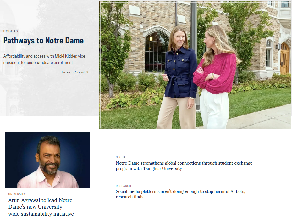
Figure 14.42 The three rows with two columns. Source of image: https://www.nd.edu
I had to zoom out to capture the image. I noticed that an empty column appeared on either side of the information.
On November 1, 2024, this part of the website has changed again. This time, these rows are about research.
The next three rows had a blue background. The picture in the first row and in the third row overlap beyond the borders of the rows. The first row is about research. The second row is about faith and service. The third row is about global issues.
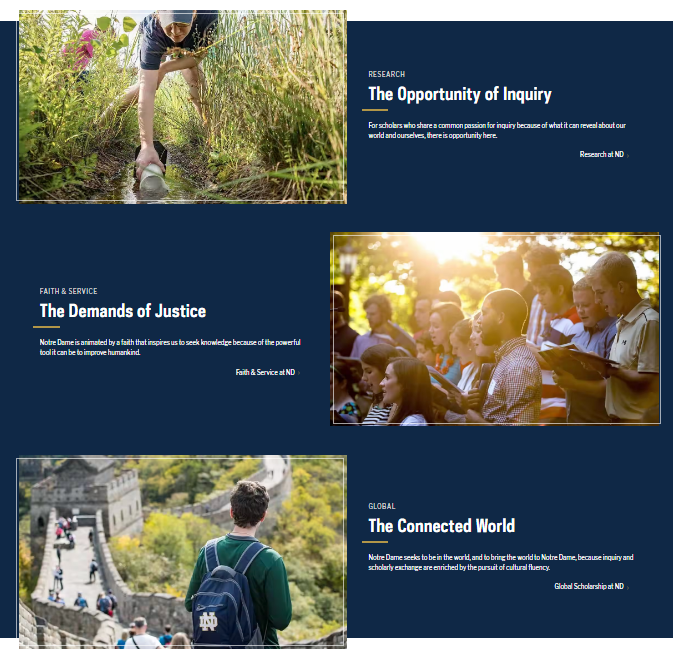
Figure 14.43 The next three rows with two columns. Source of image: https://www.nd.edu
The next row did not have a blue background. It is about news from the university. Prior to November 1, 2024, the title was “Latest News.” On November 1, 2024, a new row was added and the title was “University News.” The Figure 14.42 image went from two columns to three columns. The new column was added to the left and there are two titles: “Faculty and Staff” and “Centers and Institutes.” This resulted in changes to Figure 14.44.

Figure 14.44 The next row with two columns. Source of image: https://www.nd.edu
Prior to November 1, 2024, there was a row with two columns. The right-hand column had a photograph. On November 1, 2024, the photograph was removed and the remaining blocks were added to the previously row. So Figure 14.45 does not exist on the University of Notre Dame website.

Figure 14.45 The next row has two columns with the right hand column containing a photograph Note: This does not exist today.. Source of image: https://www.nd.edu
The next row has three columns. Each cell has a photograph and some text.
Next is the mission statement. It is in larger font than most text on this web page.

Figure 14.46 The next row has two columns. Source of image: https://www.nd.edu
The next section is about future events. It is in two columns. The paragraphs are links.
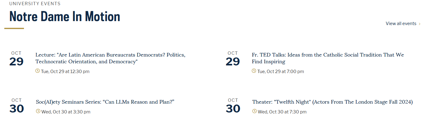
Figure 14.47 The next section appears to have three rows and two columns. Source of image: https://www.nd.edu
The last section has some links to other nd.edu resources, the logo again, media links, the copyright line, and contact information. There are links about accessibility and non-discrimination.

Figure 14.48 The last section. Source of image: https://www.nd.edu
To recap, the University of Notre Dame website has the following outline for its home page:
- White background: News or other “hot button” topic.
- Blue background:: Research, Faith & Service, and Global
- White background:: University News in one row. The other rows contain “Faculty and Staff,” “Latest News,” and “Centers and Institutes.”
- The arrangement may change. Around November 18, 2024, the arrangement was
- “Notre Dame At Work” with a button for viewing all news stories.
- Picture; “Faculty and Staff” and an article about dockworkers.
- Research articles
- “Latest News”
- White background: University Stories. Currently these are Research, Faith and Service, and Research.
- Blue background: Mission statement.
- White background: University events.
- Blue background: These are links to the bookstore, to employment, to a virtual tour, to InsideND, and to the academic calendar.
- White background: The logo, the links to social media, and the contact information (the address, the telephone number, and a link to a contact web form).
Applying the Insights to the Douglas College Website
Let’s apply the insights from the University of Notre Dame to the Douglas College website. As noted elsewhere in this chapter, the University of Notre Dame has a full-time staff for working on the website. Not every entity has a full-time team for doing this. So we will scale back for the Douglas College website. We will look at just the home page.
Let’s review the Emma Ryan and Christiana Jolaoso points for Douglas College. The first seven points are from Emma Ryan and the second nine points are from Christiana Jolaoso.
Emma Ryan’s list:
- Set Your Website Goals.
- It is to provide useful information to visitors.
- Build Your Brand Identity.
- It is a young college (1970) that has become the largest college in British Columbia Canada.
- It is named after Sir James Douglas who was a Governor of British Columbia.
- It has the British Columbia Education Quality Assurance Designation.
- The motto is “Do what you love.”
- The mascot is Roary Douglas, which is a loin.
- Select a Template.
- We are not using a commercial web-design company.
- Customize Essential Pages
- That is something that we would be doing along the way.
- Optimize Your Contents.
- That is something that we would be doing along the way.
- Launch Your Website.
- This is an academic effort and there are no plans to replace the current version of the Douglas College website.
- Gather Feedback and Evolve.
- This is an academic effort and there are no plans to replace the current version of the Douglas College website.
Christiana Jolaoso’s list:
- Define the Site’s Purpose.
- This is the same point as Emma Ryan’s first point.
- Choose Your Platform.
- This is closely related to Emma Ryan’s third point. We are not using a template and it appears that Douglas College is hosting its website internally and not on a web hosting site.
- Gather Your Brand Elements
- This is the same point as Emma Ryan’s second point.
- Select a Template or Theme.
- This is the same point as Emma Ryan’s third point.
- Map Out Your Site.
- This we need to do. We will follow what has been done on the University of Norte Dame website.
- Design Each Site Element.
- That is something that we would be doing along the way.
- Customize Your Web Pages.
- This is the same point as Emma Ryan’s fourth point.
- Test and Launch Your Website.
- This goes beyond Emma Ryan’s sixth point.
- Optimize Your Content.
- This is the same point as Emma Ryan’s fifth point.
The Header
I created a header that combines the modern logo, the shield, and a navigation bar. See Figures 14.37 through 14.40.
We want this header to appear on the top of each web page. Does Bootstrap support this? The answer is “No.” Recall that Bootstrap “is an open-source framework used for creating responsive, mobile-first websites.” There is a means to do this, but the approach is outside of Bootstrap. So for now, we will repeat the header on each web page.
|
Example Bootstrap Code |
|
|
<!DOCTYPE html> <html lang=”en”> <head> <title>Revised Douglas College Website</title> <meta charset=”utf-8″> <meta name=”viewport” content=”width=device-width, initial-scale=1″> <link href=”https://cdn.jsdelivr.net/npm/bootstrap@5.3.3/dist/css/bootstrap.min.css” rel=”stylesheet”> <script src=”https://cdn.jsdelivr.net/npm/bootstrap@5.3.3/dist/js/bootstrap.bundle.min.js”></script> </head> <body> |
|
|
<div class=”container-fluid mt-3″> <h1>Hot Button News</h1> <h2>Historic Project brings housing to Douglas College</h2> <p>Students at Douglas College will soon have access to affordable on-campus housing for the first time as construction stars on one of the Province’s largest capital investments in student housing.</p> <div class=”row”> <div class=”col-sm-3 p-3 bg-primary text-white”>Database</div> <div class=”col-sm-3 p-3 bg-dark text-white”>Design</div> <div class=”col-sm-3 p-3 bg-primary text-white”>Third</div> <div class=”col-sm-3 p-3 bg-dark text-white”>Edition</div> </div> </div> </body> </html> |
<div class=”container-fluid mt-3″> <h1>Hot News</h1> <p>Resize the browser window to see the effect.</p> <p>The columns will automatically stack on top of each other when the screen is less than 576px wide.</p> <div class=”row”> <div class=”col-sm-4 p-3 bg-primary text-white”>Students at Douglas College will soon have access to affordable on-campus housing for the first time as construction stars on one of the Province’s largest capital investments in student housing.</div> <div class=”col-sm-8″><img class=”img-responsive” src=”cinqueterre.jpg” alt=”Chania”></div> </div> </div> |
Figure 14.49 Some of the lines used to create the example home page.
The Header with Part of the Home Page
Here is the top half of the revised Douglas College home page:
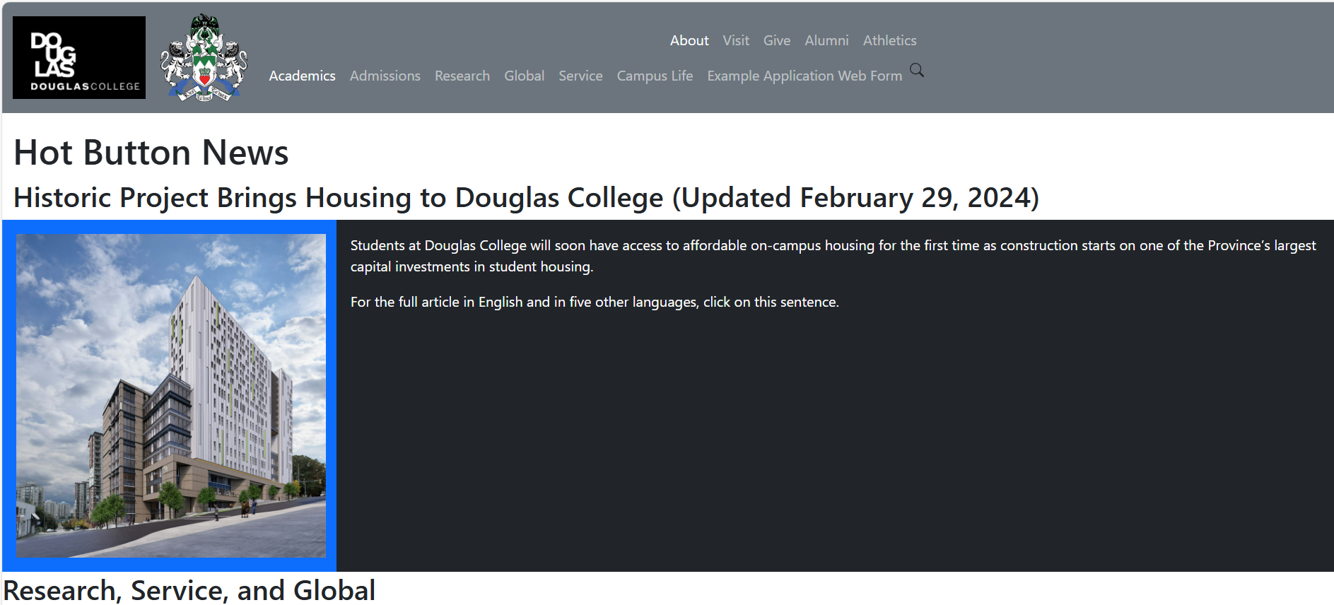
Figure 14.50 Desktop view of the revised Douglas College home page.
A Web Page Form
You can control how questions appear on a web page. You can have text in the box that disappears when the user types in something.

Figure 14.51 Desktop view of the revised Douglas College application page.
At the end of this chapter is the complete text files for the two example web pages.
Some Final Comments
Bootstrap 5 removed support for the Jumbotron. The Bootstrap 3 and Bootstrap 4 Jumbotron was a lightweight flexible content component that would appear at the top of a web page. The University of Notre Dame website appears to have this feature.
It is hard to find an answer about the removal. There are plenty of websites with suggestions on how to create a Jumbotron in Bootstrap 5. My educated guess is to make it easier for screen readers to read the information.
Bootstrap 5 has better support for accessibility standards. Bootstrap 5 supports a carousel. This is a slideshow that cycles through a series of content. In the instructions on how to use this feature is a note that carousels tend to be non-compliant with accessibility standards.
This chapter did not contain text on how to create buttons and other common form features. These are best present as a full example. See the end of this chapter for the complete example.
The example web pages do not contain any code for supporting form data capture. We did not show how to access a database. In Chapter 15, we will do that.
Key Terms
Bootstrap: This is a framework for building responsive, mobile-first websites. Version 5 uses HTML 5, CSS, and JavaScript.
carousel: This is a slideshow that cycles through a series of content. In the instructions on how to use this feature is a note that carousels tend to be non-compliant with accessibility standards.
Cascading Style Sheets (CSS): This describes how HTML elements are to be displayed on a screen.
container classes: These provide a means for arranging information on a web page. There are two types: fixed width container and container-fluid class. The proper way of addressing a Bootstrap class is with a leading period.
Hyper Text Markup Language (HTML): This is the standard way for creating web pages. SHA384 hash function is used. This is beyond the scope of this textbook.
integrity field: This is a way of ensuring that the file has not been tampered with
JavaScript: This is a scripting or programming language that supports complex features on web pages. JavaScript makes a web page dynamic.
Jumbotron: This is a lightweight flexible content component that would appear at the top of a web page. This was introduced in Bootstrap 3, but dropped in Bootstrap 5.
storyboard: This is a simple representation of a design project. For a website, a storyboard would show how the website would appear and how it would behave.
UTF-8: This can encode all Unicode 1,112,064 character code points. It does this by using variable coding. A character could be coded between one to four bytes. This is the standard encoding for the web.
viewport: This tells the web page to scale based on the size of the viewing screen.
W3.CSS: This is a competing framework. It does not have as widespread usage as Bootstrap.
wireframing: Adding details to a storyboard.
Exercises
1. Explain the following terms:
1. Bootstrap
2. Cascading Style Sheets (CSS) [CS2023 SPD Web: Web Platforms KA Core 1]
3. Container classes
4. Hyper Text Markup Language (HTML) [CS2023 SPD Web: Web Platforms KA Core 1]
5. JavaScript [CS2023 SPD Web: Web Platforms KA Core 1]
6. storyboard
7. viewport
8. wireframing
9. Responsive website
2. What is the difference between a fixed container and a fluid container?
3. Research what are the current web accessibility standards. Write a paragraph about how these were used in this chapter. [CS2023 SPD Web: Web Platforms KA Core 4 and KA Core 5]
4. Select a web page from the Douglas College website or from an instructor selected website. Analyze what changes could be made to conform with web standards and with Bootstrap 5 . [CS2023 SPD Web: Web Platforms Non-core 6]
5. Take the example home page and add some text and images.
6. Look at the example application web page. Explain from a security viewpoint why text boxes were not used more.
A Running Project
Storyboard how a website might be able to interface with your project.
Use the insights from this chapter to create a Bootstrap 5 website.
Attribution
This chapter of Database Design is a brand-new addition.
This chapter drew from many sources.
Image Attribution
No second edition images were used.
References
2020 CAE Cyber Defense (CAE-CD) Knowledge Units, National Security Agency, June 16, 2021. https://dl.dod.cyber.mil/wp-content/uploads/cae/pdf/unclass-cae-cd_ku.pdf
Krystallin Baker. “What Is a Storyboard in Web Design? A Beginner’s Guide,” Capterra, October 18, 2022. https://www.capterra.com/resources/what-is-a-storyboard-in-web-design/
Paul Boag. “10 Good Website Layout Ideas (with Examples),” WebsiteSetup, n.d. https://websitesetup.org/website-layouts/
“Bootstrap 5 Tutorial,” W3 schools, n.d. https://www.w3schools.com/bootstrap5/index.php
The getbootstrapcom website can be hard to find helpful information. On the left menu list is “Utilities.” Under this heading are several helpful web pages. For example, https://getbootstrap.com/docs/5.0/utilities/spacing/ has an excellent web page on the topic of spacing.
Lindsay Kolowich Cox. “14 of the Best Colelge Websites (And Why They’re So Awesome),” Hubspot, July 10, 2015 (Updated on April 1, 2022). https://blog.hubspot.com/marketing/best-college-websites
Matt Crawford. “Storyboard Website Design: Essential Guide [With Examples & Tips],” FilmLifeStyle, 2024. https://filmlifestyle.com/storyboard-website-design/
Cybersecurity Curricula 2017, ACM, December 31, 2017. https://www.acm.org/binaries/content/assets/education/curricula-recommendations/csec2017.pdf
See page 22 for the paragraphs on academic lens.
Kyle Deguzman. “Storyboard Website Design – How to Pre-Visualize Your Site,” Studiobinder, April 24, 2022. https://www.studiobinder.com/blog/storyboard-website-design/
Julia Fishman. “Marist Mindset List Class of 2024: New Approach to Examing What Defines First-Year College Students,” Marist, September 9, 2020. https://www.marist.edu/w/marist-mindset-list-class-of-2024
Anna Fitzgerald. “How to Edit, Customize, and Override Bootstrap CSS to Suit Your Brand,” Hubspot.com, October 8, 2021. https://blog.hubspot.com/website/how-to-override-bootstrap-css
Anna Fitzgerald. “W3.CSS vs. Bootstrap: A Head-to-Head Comparison,” Hubspot.com, June 11, 2020. https://blog.hubspot.com/website/w3-css-vs-bootstrap
“Get started with Bootstrap,” getbootstrap.com, n.d. https://getbootstrap.com/docs/5.3/getting-started/introduction/
“Getting started with CSS,” MDM web docs, July 25, 2024. https://developer.mozilla.org/en-US/docs/Learn/CSS/First_steps/Getting_started
There are interactive exercises where you can practice making changes to a web page.
“How CSS is structured,” MDM web docs, October 24, 2024. https://developer.mozilla.org/en-US/docs/Learn/CSS/First_steps/How_CSS_is_structured
“Java vs. JavaScript: what’s the Difference?” Coursera, February 23, 2024. https://www.coursera.org/articles/java-vs-javascript
Christiana Jolaoso. “How To Design A Website (2024 Guide),” Forbes, 2024. https://www.forbes.com/advisor/business/software/how-design-website/
Abhijeet Kaldate. “20 Best University and College Website Designs To Use as Inspiration in 2024,” Astra, July 26, 2024. https://wpastra.com/resources/college-websites
Amruth N. Kumar, Rajendra K. Raj, Sherif G. Aly, Monica D. Anderson, Brett A. Becker, Richard L. Blumenthal, Eric Eaton, Susan L. Epstein, Michael Goldweber, Pankaj Jalote, Douglas Lea, Michael Oudshoorn, Marcelo Pias, Susan Reiser, Christian Servin, Rahul Simha, Titus Winters, and Qiao Xiang. 2023. Computer Science Curricula 2023. ACM Press, IEEE Computer Society Press and AAAI Press. DOI: https://doi.org/10.1145/366419127
Sean Lyndersay. “Internet Explorer 11 has retired and is officially out of support—what you need to know,” Windows Experience Blog, June 15, 2022. https://blogs.windows.com/windowsexperience/2022/06/15/internet-explorer-11-has-retired-and-is-officially-out-of-support-what-you-need-to-know/
Martin Luenendonk. “21 Best College and University Websites For Design Inspiration,” FounderJar, November 25, 2023. https://www.founderjar.com/inspiration/college-university-websites/
“Mindset List: Class of 2027,” Marist, circa September 18, 2023. https://www.marist.edu/mindset-list/2027
Cliff Persaud. “Higher Ed Website Design: 12+ Trends and Tips for 2024,” Kanopi Studios, n.d. https://kanopi.com/blog/higher-ed-website-design/
Grant Proulx. “Top trends in content & design for 2024,” Kanopi Studios n.d. https://kanopi.com/blog/top-trends-in-content-design-for-2024/
Emma Ryan. “How To Design a Website in 2024: 7 Steps To Get Started,” WebsiteBuilderExpert, August 28, 2024. https://www.websitebuilderexpert.com/designing-websites/
Eddie Shleyner. “You against the writing machines,” Very Good Copy, February 13, 2023. https://www.verygoodcopy.com/verygoodcopy-blogs-11/writing-ai
Carrie Sownie. “39 best inspiring web designs to jump-start your creativity,” 99designs, circa 2020. https://99designs.com/blog/web-digital/inspiring-website-designs/
Kristina Tuvikene. “41 Websites with Great Design (Examples),” WebsiteSetup, n.d. https://websitesetup.org/website-planning/best-designed-websites/
“20 Colleges with the Best Website Designs (And What Makes Them Great,” PremiumSchools, November 5, 2023. https://www.premiumschools.org/best-college-website-designs/
“What is HTML? Geeks for Geeks, October 11, 2024. https://www.geeksforgeeks.org/what-is-html/
“What is JavaScript? MDN web docs, August 3, 2024. https://developer.mozilla.org/en-US/docs/Learn/JavaScript/First_steps/What_is_JavaScript
Graham Williams. “How to design a website for your online store – tips from an industry expert,” Printify, December 29, 2021. https://printify.com/blog/how-to-design-a-website/
The Example Code
This is the home page:
|
<!DOCTYPE html> <!– This is used with Database Design Third Edition Chapter 14. –> <html lang=”en”> <head> <!– Required meta tags. –> <meta charset=”utf-8″> <meta name=”viewport” content=”width=device-width, initial-scale=1″> <!– The Bootstrap CSS line –> <link href=”https://cdn.jsdelivr.net/npm/bootstrap@5.3.3/dist/css/bootstrap.min.css” rel=”stylesheet”> <!– Any custom CSS file reference must come after the Bootstrap CSS reference. –> <!– link href=”custom.css” type=”textcss” rel=”stylesheet” –> <title>Example Based on Douglas College</title> <!– W3 schools has the following line just before the closing head tag. –> <!– script src=”https://cdn.jsdelivr.net/npm/bootstrap@5.3.3/dist/js/bootstrap.bundle.min.js”></script –> <!– Having the js line here could cause a web page to load slowly. –> <!– The official Bootstrap 5 website has this line just before the closing body tag. See below. –> </head> <body> <nav class=”navbar navbar-expand-sm bg-secondary fixed-top” data-bs-theme=”dark” > <div class=”container-fluid”> <a class=”navbar-brand” href=”#”> <img src=”https://coursetakers.com/img/uploads/school_images_temp/c1e6524f2ecaf24d9b745eaf0d185139.png” alt=”Douglas College Logo (White letters on black background)” style=”width:150px;” > </a> <a class=”navbar-brand” href=”#”> <img src=”https://www.douglascollege.ca/sites/default/files/styles/medium_auto/public/images/Douglas%20College%20coat%20of%20arms.png/” alt=”Douglas College Coat of Arms” style=”width:100px;”> </a> <!– After the a class for the navbar brand, we would add the code for collapsing the menu when the screen size is reduced. –> <button class=”navbar-toggler” type=”button” data-bs-toggle=”collapse” data-bs-target=”#DouglasCollegeCollapsingNavbar”> <span class=”navbar-toggler-icon”></span> </button> <!– The code for the double row was adapted from https://forum.bootstrapstudio.io/t/2-navigation-rows-in-navbar/8576/5 –> <div id=”DouglasCollegeCollapsingNavbar” class=”collapse navbar-collapse” > <div class”row ms-auto> <div class=”col-12″> <ul class=”navbar-nav float-none float-md-end”> <li class=”nav-item”> <a class=”nav-link active” href=”https://www.douglascollege.ca/about-douglas”>About</a> </li> <li class=”nav-item”> <a class=”nav-link” href=”https://www.douglascollege.ca/future-students/explore-douglas”>Visit</a> </li> <li class=”nav-item”> <a class=”nav-link” href=”https://www.douglascollege.ca/givealumni/foundation”>Give</a> </li> <li class=”nav-item”> <a class=”nav-link” href=”https://www.douglascollege.ca/givealumni/alumni”>Alumni</a> </li> <li class=”nav-item”> <a class=”nav-link” href=”https://www.douglascollege.ca/student-services/student-life/athletics-recreation”>Athletics</a> </li> </ul> </div> <!– This is the end of the first navbar items. –> <div class=”col-12 order-md-first”> <ul class=”navbar-nav float-none float-md-end”> <li class=”nav-item”> <a class=”nav-link active” href=”https://www.douglascollege.ca/programs-courses”>Academics</a> </li> <li class=”nav-item”> <a class=”nav-link” href=”https://www.douglascollege.ca/future-students/general-college-admissions-requirements”>Admissions</a> </li> <li class=”nav-item”> <a class=”nav-link” href=”https://www.douglascollege.ca/about-douglas/learn-about-douglas/research-college/research-centres”>Research</a> <li class=”nav-item”> <a class=”nav-link” href=”https://www.douglascollege.ca/programs-courses/global-programs-and-exchanges”>Global</a> </li> <li class=”nav-item”> <a class=”nav-link” href=”https://www.douglascollege.ca/about-douglas/learn-about-douglas/careers-douglas-college/our-culture/community-involvement”>Service</a> </li> <li class=”nav-item”> <a class=”nav-link” href=”https://www.douglascollege.ca/student-services/student-life”>Campus Life</a> </li> <li class=”nav-item”> <a class=”nav-link” href=”./ExampleApplicationForm.html”>Example Application Web Form</a> </li> <li> <!– The following line came from https://getbootstrap.com/docs/5.3/forms/overview/ –> <svg xmlns=”http://www.w3.org/2000/svg” width=”16″ height=”16″ fill=”currentColor” class=”bi bi-search” viewBox=”0 0 16 16″> <path d=”M11.742 10.344a6.5 6.5 0 1 0-1.397 1.398h-.001q.044.06.098.115l3.85 3.85a1 1 0 0 0 1.415-1.414l-3.85-3.85a1 1 0 0 0-.115-.1zM12 6.5a5.5 5.5 0 1 1-11 0 5.5 5.5 0 0 1 11 0″/> </svg> </li> </ul> </nav> <div class=”container-fluid mt-5″> <h1 class=”mt-5″> .</h1> <h1 class=”mt-5″> Hot Button News</h1> <h2>Historic Project Brings Housing to Douglas College (Updated February 29, 2024)</h2> <div class=”row”> <div class=”col-sm-3 p-3 bg-primary text-white”> <img src=”https://grahambuilds.com/wp-content/uploads/2022/06/Douglas-College_R1-scaled.jpg” alt=”Artist’s rendering from the British Columbia government website showing the future high rise student housing.” style=”width:350px;” > </div> <div class=”col-sm-9 p-3 bg-dark text-white”> <p>Students at Douglas College will soon have access to affordable on-campus housing for the first time as construction starts on one of the Province’s largest capital investments in student housing.</p> <a class=”nav-link” href=”https://news.gov.bc.ca/releases/2024PREM0011-000260″>For the full article in English and in five other languages, click on this sentence.</a> </div> </div> </div> <h2> Research, Service, and Global </h2> <!– I adapted Ps Nidu’s answer on https://stackoverflow.com/questions/16390370/how-can-i-get-a-bootstrap-column-to-span-multiple-rows –> <!– The solution had an image that spanned two rows and three columns. –> <div class=”row”> <div class=”col-4 alert alert-primary”> <img src=”https://www.douglascollege.ca/sites/default/files/styles/card_landscape/public/images/research-and-innovation/pexels-thisisengineering-3861458.jpg” alt=”Generic image showing students doing research.” style=”width:500px;”> </div> <!– End of the first column. –> <div class=”col-8″> <div class=”row”> <!– This is a place holder just in case I wish to add another row opposite of the image. –> <div class=”col-12 alert alert-primary”> <!– If a second row was added, then that would need to be col-6 for the first row and col-6 for the second row. –> <h3> Research </h3> <p> Douglas College has research centres and hubs that are dedicated to advancing knowledge. </p> <a class=”nav-link” href=”https://www.douglascollege.ca/about-douglas/learn-about-douglas/research-college/research-centres”>To learn more, click on this sentence.</a> </div> <!– End of the col-* block. –> <!– The lines for the second row would need to go here. –> </div> <!– End of the place holder row. –> </div> <!– End of the col-8 block. –> </div> <!– End of the actual row. –> <div class=”row”> <div class=”col-8 alert alert-primary”> <h3> Service </h3> <p> Douglas College believes in socially responsible citizens. We encourage students to make a difference in the nearby communities. </p> <a class=”nav-link” href=”https://www.douglascollege.ca/about-douglas/learn-about-douglas/careers-douglas-college/our-culture/community-involvement”>To learn more, click on this sentence.</a> </div> <div class=”col-4 alert alert-primary”> <img src=”https://www.douglascollege.ca/sites/default/files/styles/medium_auto/public/images/human-resources/Community%20involvement%20-%20orange%20shirts%20495.jpg” alt=”Generic image showing students with their service t-shirts.” style=”width:500px;”> </div> <!– End of the second column. –> </div> <!– End of the row. –> <div class=”row”> <div class=”col-4 alert alert-primary”> <img src=”https://www.douglascollege.ca/sites/default/files/styles/card_landscape/public/images/Exchange%201.jpg” alt=”Generic image showing a student looking at an airport arrival and department screen.” style=”width:500px;”> </div> <div class=”col-8 alert alert-primary”> <h3> Global </h3> <p> Douglas College offers certificates, post-degree diplomas, and courses in various global topics. </p> <p> Douglas College offers opportunities for international experiences. </p> <a class=”nav-link” href=”https://www.douglascollege.ca/programs-courses/global-programs-and-exchanges”>To learn more, click on this sentence.</a> </div> </div> <p> —————————————</p> <h3> College News </h3> <h2> Douglas College at Work </h2> <div class=”row”> <div class=”col-4 alert alert-primary”> Big picture here </div> <div class=”col-8″> <div class=”row”> <div class=”col-6 alert alert-primary”> Faculty and Staff </div> <div class=”col-6 alert alert-primary”> 3 </div> <div class=”col-6 alert alert-primary”> Research </div> <div class=”col-6 alert alert-primary”> 5 </div> </div> </div> </div> <div class=”row”> <div class=”col-4 alert alert-primary”> Article with picture </div> <div class=”col-4 alert alert-primary”> Latest News with picture </div> <div class=”col-4 alert alert-primary”> Article </div> </div> <p> —————————————</p> <h1> College Stories </h1> <h2> Douglas College in Focus </h2> <h2> three pictures </h2> <h2> research faith and Service research </h2> <h2> three articles </h2> <p> —————————————</p> <h1> Mission Statement </h1> <p> —————————————</p> <h1> College Events </h1> <h2> Douglas College in Motion </h2> <h2> Calendar events in two columns </h2> <div class=”row”> <div class=”col-sm-3 p-3 bg-primary text-white”>Database</div> <div class=”col-sm-3 p-3 bg-dark text-white”>Design</div> <div class=”col-sm-3 p-3 bg-primary text-white”>Third</div> <div class=”col-sm-3 p-3 bg-dark text-white”>Edition</div> </div> <p> —————————————</p> <p> —————————————</p> <h1> the footer </h1> </div> <!– The Bootstrap 5 website and some web pages state that the following line needs to come just before the closing body tag. –> <script src=”https://cdn.jsdelivr.net/npm/bootstrap@5.3.3/dist/js/bootstrap.bundle.min.js”></script> <!– This bundle has Popper for tooltips and popovers. –> </body> </html> |
This is the example application web page:
|
<!DOCTYPE html> <!– This is used with Database Design Third Edition Chapter 14. –> <html lang=”en”> <head> <!– Required meta tags. –> <meta charset=”utf-8″> <meta name=”viewport” content=”width=device-width, initial-scale=1″> <!– The Bootstrap CSS line –> <link href=”https://cdn.jsdelivr.net/npm/bootstrap@5.3.3/dist/css/bootstrap.min.css” rel=”stylesheet”> <!– Any custom CSS file reference must come after the Bootstrap CSS reference. –> <!– link href=”custom.css” type=”textcss” rel=”stylesheet” –> <title>Example Based on Douglas College</title> <!– W3 schools has the following line just before the closing head tag. –> <!– script src=”https://cdn.jsdelivr.net/npm/bootstrap@5.3.3/dist/js/bootstrap.bundle.min.js”></script –> <!– Having the js line here could cause a web page to load slowly. –> <!– The official Bootstrap 5 website has this line just before the closing body tag. See below. –> </head> <body> <nav class=”navbar navbar-expand-sm bg-secondary fixed-top” data-bs-theme=”dark” > <div class=”container-fluid”> <a class=”navbar-brand” href=”#”> <img src=”https://coursetakers.com/img/uploads/school_images_temp/c1e6524f2ecaf24d9b745eaf0d185139.png” alt=”Douglas College Logo (White letters on black background)” style=”width:150px;” > </a> <a class=”navbar-brand” href=”#”> <img src=”https://www.douglascollege.ca/sites/default/files/styles/medium_auto/public/images/Douglas%20College%20coat%20of%20arms.png/” alt=”Douglas College Coat of Arms” style=”width:100px;”> </a> <!– After the a class for the navbar brand, we would add the code for collapsing the menu when the screen size is reduced. –> <button class=”navbar-toggler” type=”button” data-bs-toggle=”collapse” data-bs-target=”#DouglasCollegeCollapsingNavbar”> <span class=”navbar-toggler-icon”></span> </button> <!– The code for the doube row was adapted from https://forum.bootstrapstudio.io/t/2-navigation-rows-in-navbar/8576/5 –> <div id=”DouglasCollegeCollapsingNavbar” class=”collapse navbar-collapse” > <div class”row ms-auto> <div class=”col-12″> <ul class=”navbar-nav float-none float-md-end”> <li class=”nav-item”> <a class=”nav-link active” href=”https://www.douglascollege.ca/about-douglas”>About</a> </li> <li class=”nav-item”> <a class=”nav-link” href=”https://www.douglascollege.ca/future-students/explore-douglas”>Visit</a> </li> <li class=”nav-item”> <a class=”nav-link” href=”https://www.douglascollege.ca/givealumni/foundation”>Give</a> </li> <li class=”nav-item”> <a class=”nav-link” href=”https://www.douglascollege.ca/givealumni/alumni”>Alumni</a> </li> <li class=”nav-item”> <a class=”nav-link” href=”https://www.douglascollege.ca/student-services/student-life/athletics-recreation”>Athletics</a> </li> </ul> </div> <!– This is the end of the first navbar items. –> <div class=”col-12 order-md-first”> <ul class=”navbar-nav float-none float-md-end”> <li class=”nav-item”> <a class=”nav-link active” href=”https://www.douglascollege.ca/programs-courses”>Academics</a> </li> <li class=”nav-item”> <a class=”nav-link” href=”https://www.douglascollege.ca/future-students/general-college-admissions-requirements”>Admissions</a> </li> <li class=”nav-item”> <a class=”nav-link” href=”https://www.douglascollege.ca/about-douglas/learn-about-douglas/research-college/research-centres”>Research</a> <li class=”nav-item”> <a class=”nav-link” href=”https://www.douglascollege.ca/programs-courses/global-programs-and-exchanges”>Global</a> </li> <li class=”nav-item”> <a class=”nav-link” href=”https://www.douglascollege.ca/about-douglas/learn-about-douglas/careers-douglas-college/our-culture/community-involvement”>Service</a> </li> <li class=”nav-item”> <a class=”nav-link” href=”https://www.douglascollege.ca/student-services/student-life”>Campus Life</a> </li> <li class=”nav-item”> <a class=”nav-link” href=”ExampleApplicationForm”>Example Application Web Form</a> </li> <li> <!– The following line came from https://getbootstrap.com/docs/5.3/forms/overview/ –> <svg xmlns=”http://www.w3.org/2000/svg” width=”16″ height=”16″ fill=”currentColor” class=”bi bi-search” viewBox=”0 0 16 16″> <path d=”M11.742 10.344a6.5 6.5 0 1 0-1.397 1.398h-.001q.044.06.098.115l3.85 3.85a1 1 0 0 0 1.415-1.414l-3.85-3.85a1 1 0 0 0-.115-.1zM12 6.5a5.5 5.5 0 1 1-11 0 5.5 5.5 0 0 1 11 0″/> </svg> </li> </ul> </nav> <h1 class=”mt-5″> . </h1> <h1 class=”mt-5″> Douglas College Application Form </h1> <!– This is an adaptation of the Universal College Application for first-year students. See https://images.sampleforms.com/wp-content/uploads/2016/08/University-College-application.jpg –> <h2> Personal Information </h2> <p> Please enter your name as it appears on your passport or on other offical documents. </p> <form> <div class=”row”> <div class=”col”> <label for=”LastOrFamilyName”>Last or Family Name</label> <input type=”text” class=”form-control” placeholder=”Last or Family Name” id=”LastOrFamilyName” aria-describedby=”LastOrFamilyNameHelp” > <div id=”LastOrFamilyNameHelp” class=”form-text”> You must provide your last or family name. </div> </div> <div class=”col”> <label for=”FirstOrGivenName”>First or Given Name</label> <input type=”text” class=”form-control” placeholder=”First or Given Name” id=”FirstOrGivenName” aria-describedby=”FirstOrGivenNameHelp” > <div id=”FirstOrGivenNameHelp” class=”form-text”> You must provide your first or given name. </div> </div> </div> <div class=”row”> <div class=”col”> <label for=”MiddleName”>Middle Name</label> <input type=”text” class=”form-control” placeholder=”Middle Name” id=”MiddleName” aria-describedby=”MiddleNameHelp” > <div id=”MiddleNameHelp” class=”form-text”> You must provide your middle name or enter No middle name. </div> </div> <div class=”col”> <label for=”Suffix”>Suffix</label> <input type=”text” class=”form-control” placeholder=”Suffix” id=”Suffix” aria-describedby=”SuffixHelp” > <div id=”SuffixHelp” class=”form-text”> The suffix field is optional. </div> </div> </div> <div class=”row”> <div class=”col”> <label for=”PreferredName”>Preferred Name</label> <input type=”text” class=”form-control” placeholder=”Preferred Name” id=”PreferredName” aria-describedby=”PreferredNameHelp” > <div id=”PreferredNameHelp” class=”form-text”> The preferred name field is optional. </div> </div> <div class=”col”> <label for=”PreviousLastName”>Previous Last Name</label> <input type=”text” class=”form-control” placeholder=”Previous Last Name” id=”PreviousLastName” aria-describedby=”PreviousNameHelp” > <div id=”PreviousNameHelp” class=”form-text”> The previous last name field is optional. </div> </div> </div> </form> <hr> <h3>Gender Checkboxes</h3> <div class=”form-check”> <div class=”row”> <div class=”col”> <p> Legal Gender</p> </div> <div class=”col”> <p> Identified Gender (Optional) </p> </div> <div class=”col”> <p> Physical Gender at Birth </p> </div> </div> <div class=”row”> <div class=”col”> <input class=”form-check-input” type=”checkbox” value=”” id=”MaleLegalCheckBox” aria-label=”Legal labeled as a male checkbox.”> <label class=”form-check-label” for=”MaleLegalCheckBox”> Male </label> </div> <div class=”col”> <input class=”form-check-input” type=”checkbox” value=”” id=”MaleIdentifiedCheckBox” aria-label=”Identifying as a male checkbox.”> <label class=”form-check-label” for=”MaleIdentifiedCheckBox”> Male </label> </div> <div class=”col”> <input class=”form-check-input” type=”checkbox” value=”” id=”MaleAtBirthCheckBox” aria-label=”Male at birth checkbox.”> <label class=”form-check-label” for=”MaleAtBirthCheckBox”> Male </label> </div> </div> <div class=”row”> <div class=”col”> <input class=”form-check-input” type=”checkbox” value=”” id=”FemaleLegalCheckBox” aria-label=”Legal labeled as a female checkbox.”> <label class=”form-check-label” for=”FemaleLegalCheckBox”> Female </label> </div> <div class=”col”> <input class=”form-check-input” type=”checkbox” value=”” id=”femaleIdentifiedCheckBox” aria-label=”Identifying as a female checkbox.”> <label class=”form-check-label” for=”FemaleIdentifiedCheckBox”> Female </label> </div> <div class=”col”> <input class=”form-check-input” type=”checkbox” value=”” id=”FemaleAtBirthheckBox” aria-label=”Female at birth checkbox.”> <label class=”form-check-label” for=”FemaleAtBirthCheckBox”> Female </label> </div> </div> <div class=”row”> <div class=”col”> </div> <div class=”col”> <input class=”form-check-input” type=”checkbox” value=”” id=”OtherIdentifiedCheckBox” aria-label=”Identifying as neither gender.”> <label class=”form-check-label” for=”OtherIdentifiedCheckBox”> Other </label> </div> <div class=”col”> </div> </div> <hr> <h3> Address Information </h3> <p> Enter your permanent address and your current mailing address. </p> <form> <div class=”row”> <p> Permanent Address </p> <div class=”col”> <label for=”PermanentStreetAddress”>Street Address</label> <input type=”text” class=”form-control” placeholder=”Street Address” id=”PermanentStreetAddress” aria-describedby=”PermanentStreetAddressHelp” > <div id=”PermanentStreetAddressHelp” class=”form-text”> Enter the house number, the street name and the suffix (i.e., street, road, lane, court, blvd, etc.). </div> </div> <div class=”col”> <label for=”PermanentApartmentOrUnit”>Apartment or Unit</label> <input type=”text” class=”form-control” placeholder=”Apartment or Unit” id=”PermanentApartmentOrUnit” aria-describedby=”PermanentApartmentOrUnitHelp” > <div id=”PermanentApartmentOrUnitHelp” class=”form-text”> This is optional. Enter the apartment number or unit number or house trailer lot number. </div> </div> </div> <div class=”row”> <div class=”col”> <label for=”PermanentCity”> City</label> <input type=”text” class=”form-control” placeholder=”City” id=”PermanentCity” aria-describedby=”PermanentCityHelp” > <div id=”PermanentCityHelp” class=”form-text”> Enter the municipality’s name This could be the city, town, village, or similar defined area. </div> </div> <div class=”col”> <label for=”PermanentStateOrProvince”> State or Province </label> <input type=”text” class=”form-control” placeholder=”State or Province” id=”PermanentStateOrProvince” aria-describedby=”PermanentStateOrProvinceHelp” > <div id=”PermanentStateOrProvinceHelp” class=”form-text”> Enter the name of the next level above the municipality. This could be a state or a province or a territory. </div> </div> <div class=”col”> <label for=”PermanentCountry”> Country </label> <input type=”text” class=”form-control” placeholder=”Country” id=”PermanentCountry” aria-describedby=”PermanentCountryHelp” > <div id=”PermanentCountryHelp” class=”form-text”> Enter the name of the next level above the state or province. This would be one of the recognized nations. </div> </div> <div class=”col”> <label for=”PermanentPostalCode”> Postal Code </label> <input type=”text” class=”form-control” placeholder=”Postal Code” id=”PermanentPostalCode” aria-describedby=”PermanentPostalCodeHelp” > <div id=””PermanentPostalCodeHelp” class=”form-text”> Enter the postal code or zip code. This is a routing code used in the country for delivering mail. </div> </div> </div> </form> <form> <div class=”row”> <p> Current Address </p> <div class=”col”> <label for=”CurrentStreetAddress”>Street Address</label> <input type=”text” class=”form-control” placeholder=”Street Address” id=”CurrentStreetAddress” aria-describedby=”CurrentStreetAddressHelp” > <div id=”CurrentStreetAddressHelp” class=”form-text”> Enter the house number, the street name and the suffix (i.e., street, road, lane, court, blvd, etc.). </div> </div> <div class=”col”> <label for=”CurrentApartmentOrUnit”>Apartment or Unit</label> <input type=”text” class=”form-control” placeholder=”Apartment or Unit” id=”CurrentApartmentOrUnit” aria-describedby=”CurrentApartmentOrUnitHelp” > <div id=”CurrentApartmentOrUnitHelp” class=”form-text”> This is optional. Enter the apartment number or unit number or house trailer lot number. </div> </div> </div> <div class=”row”> <div class=”col”> <label for=”CurrentCity”> City</label> <input type=”text” class=”form-control” placeholder=”City” id=”CurrentCity” aria-describedby=”CurrentCityHelp” > <div id=”CurrentCityHelp” class=”form-text”> Enter the municipality’s name This could be the city, town, village, or similar defined area. </div> </div> <div class=”col”> <label for=”CurrentStateOrProvince”> State or Province </label> <input type=”text” class=”form-control” placeholder=”State or Province” id=”CurrentStateOrProvince” aria-describedby=”CurrentStateOrProvinceHelp” > <div id=”CurrentStateOrProvinceHelp” class=”form-text”> Enter the name of the next level above the municipality. This could be a state or a province or a territory. </div> </div> <div class=”col”> <label for=”CurrentCountry”> Country </label> <input type=”text” class=”form-control” placeholder=”Country” id=”CurrentCountry” aria-describedby=”CurrentCountryHelp” > <div id=”CurrentCountryHelp” class=”form-text”> Enter the name of the next level above the state or province. This would be one of the recognized nations. </div> </div> <div class=”col”> <label for=”CurrentPostalCode”> Postal Code </label> <input type=”text” class=”form-control” placeholder=”Postal Code” id=”CurrentPostalCode” aria-describedby=”CurrentPostalCodeHelp” > <div id=””CurrentPostalCodeHelp” class=”form-text”> Enter the postal code or zip code. This is a routing code used in the country for delivering mail. </div> </div> </div> </form> <form> <div class=”row”> <div class=”col”> <label for=”EmailAddress” class=”form-label”>Email Address</label> <input type=”email” class=”form-control” placeholder=”Email Address” id=”EmailAddress” aria-describedby=”EmailHelp” > <div id-“EmailHelp” Class=”form-text”> We will use this as your userID.</div> </div> </div> </form> <hr> <p> Enter your place of birth, date of birth, and citizenship. </p> <form> <div class=”row”> <div class=”col”> <label for=”BirthCity”> City </label> <input type=”text” class=”form-control” placeholder=”City” id=”BirthCity” aria-describedby=”BirthCityHelp” > <div id=”BirthCityHelp” class=”form-text”> Enter the municipality’s name where you were born. This could be the city, town, village, or similar defined area. </div> </div> <div class=”col”> <label for=”BirthStateOrProvince”> State or Province </label> <input type=”text” class=”form-control” placeholder=”State or Province” id=”BirthStateOrProvince” aria-describedby=”BirtyStateOrProvinceHelp” > <div id=”CurrentStateOrProvinceHelp” class=”form-text”> Enter the name of the next level above the municipality where you were born. This could be a state or a province or a territory. </div> </div> <div class=”col”> <label for=”BirthCountry”> Country </label> <input type=”text” class=”form-control” placeholder=”Country” id=”BirthCountry” aria-describedby=”BirthCountryHelp” > <div id=”BirthCountryHelp” class=”form-text”> Enter the name of the next level above the state or province where you were born. This would be one of the recognized nations. </div> </div> </div> </form> <div class=”input-group mb-3″> <div class=”row”> <div class=”col”> <label class=”input-group-text” for=”MonthInput”>Month</label> <select class=”form-select” id=”MonthInput” aria-label=”Select form for the birth month in digits.”> <option selected>Choose your birth month</option> <option value=”1″>1</option> <option value=”2″>2</option> <option value=”3″>3</option> <option value=”4″>4</option> <option value=”5″>5</option> <option value=”6″>6</option> <option value=”7″>7</option> <option value=”8″>8</option> <option value=”9″>9</option> <option value=”10″>10</option> <option value=”11″>11</option> <option value=”12″>12</option> </select> </div> <div class=”col”> <label class=”input-group-text” for=”DateInput”>Date</label> <select class=”form-select” id=”DateInput” aria-label=”Select form for the birth date.”> <option selected>Choose your birth date</option> <option value=”1″>1</option> <option value=”2″>2</option> <option value=”3″>3</option> <option value=”4″>4</option> <option value=”5″>5</option> <option value=”6″>6</option> <option value=”7″>7</option> <option value=”8″>8</option> <option value=”9″>9</option> <option value=”10″>10</option> <option value=”11″>11</option> <option value=”12″>12</option> <option value=”13″>13</option> <option value=”14″>14</option> <option value=”15″>15</option> <option value=”16″>16</option> <option value=”17″>17</option> <option value=”18″>18</option> <option value=”19″>19</option> <option value=”20″>20</option> <option value=”21″>21</option> <option value=”22″>22</option> <option value=”23″>23</option> <option value=”24″>24</option> <option value=”25″>25</option> <option value=”26″>26</option> <option value=”27″>27</option> <option value=”28″>28</option> <option value=”29″>29</option> <option value=”30″>30</option> <option value=”31″>31</option> </select> </div> <div class=”col”> <label class=”input-group-text” for=”YearMillenniumInput”>Millennium (1 or 2)</label> <select class=”form-select” id=”YearMillenniumInput” aria-label=”Select form for the birth year millennium digit only.”> <option selected>Choose your birth millennium (1 or 2)</option> <option value=”1″>1</option> <option value=”2″>2</option> </select> </div> <div class=”col”> <label class=”input-group-text” for=”YearCenturyInput”>Century</label> <select class=”form-select” id=”YearCenturyInput” aria-label=”Select form for the birth year century digit only.”> <option selected>Choose your birth century</option> <option value=”0″>0</option> <option value=”1″>1</option> <option value=”2″>2</option> <option value=”3″>3</option> <option value=”4″>4</option> <option value=”5″>5</option> <option value=”6″>6</option> <option value=”7″>7</option> <option value=”8″>8</option> <option value=”9″>9</option> </select> </div> <div class=”col”> <label class=”input-group-text” for=”YearDecadeInput”>Decade</label> <select class=”form-select” id=”YearDecadeInput” aria-label=”Select form for the birth year decade digit only.”> <option selected>Choose your birth decade</option> <option value=”0″>0</option> <option value=”1″>1</option> <option value=”2″>2</option> <option value=”3″>3</option> <option value=”4″>4</option> <option value=”5″>5</option> <option value=”6″>6</option> <option value=”7″>7</option> <option value=”8″>8</option> <option value=”9″>9</option> </select> </div> <div class=”col”> <label class=”input-group-text” for=”YearUnitInput”>Unit</label> <select class=”form-select” id=”YearUnitInput” aria-label=”Select form for the birth year unit digit only.”> <option selected>Choose your birth unit</option> <option value=”0″>0</option> <option value=”1″>1</option> <option value=”2″>2</option> <option value=”3″>3</option> <option value=”4″>4</option> <option value=”5″>5</option> <option value=”6″>6</option> <option value=”7″>7</option> <option value=”8″>8</option> <option value=”9″>9</option> </select> </div> </div> <!– End of the row. –> </div> <div class=”form-check”> <div class=”row”> <div class=”col”> <input class=”form-check-input” type=”checkbox” value=”” id=”CanadianCitizenCheckBox” aria-label=”Canadian Citizen Checkbox.”> <label class=”form-check-label” for=”CanadianCitizenCheckBox”> Canadian Citizen </label> </div> <div class=”col”> </div> </div> <div class=”col”> <input class=”form-check-input” type=”checkbox” value=”” id=”USCitizenCheckbox” aria-label=”United States Citizen Checkbox.”> <label class=”form-check-label” for=”USCitzenCheckBox”> United States Citizen</label> </div> <div class=”col”> </div> <div class=”col”> </div> <div class=”col”> </div> </div> <div class=”row”> <div class=”col”> <input class=”form-check-input” type=”checkbox” value=”” id=”DualCitizenCheckBox” aria-label=”Dual Citizen Checkbox.”> <label class=”form-check-label” for=”DualCitizenCheckBox”> Dual Citizen (Select from above Canada or US plus list other Country.) </label> </div> <div class=”col”> <label for=”dualCitizenCountry”> Country </label> <input type=”text” class=”form-control” placeholder=” Dual Citizen Country” id=”DualCitizenCountry” aria-describedby=”DualCitizenCountryHelp” > <div id=”DualCitizenCountryHelp” class=”form-text”> If you hold dual citizenship and one of these is Canada or the United States, then enter the name of the second country here. </div> </div> <div class=”col”> </div> </div> <div class=”row”> <div class=”col”> <input class=”form-check-input” type=”checkbox” value=”” id=”PermanentVisaHolderCheckBox” aria-label=”Permanent Visa Holder checkbox.”> <label class=”form-check-label” for=”PermanentVisaHoderCheckBox”> Permanent Visa Holder (List the other country and the registration number.) </label> </div> <div class=”col”> <label for=”PermanentVisaHolderHomeCountry”> Country </label> <input type=”text” class=”form-control” placeholder=”Permanent Visa Holder Country” id=”PermanentVisaHolderHomeCountry” aria-describedby=”PermanentVisaHolderHomeCountryHelp” > <div id=”PermanentVisaHolderHomeCountryHelp” class=”form-text”> You must provide the name of your home country. </div> </div> <div class=”col”> <label for=”AlienRegistrationNumber”> Alien Registration Number </label> <input type=”text” class=”form-control” placeholder=”Alien Registration Number” aria-label=”Alien Registration Number” id=”AlienRegistrationNumber” aria-describedby=”AlienRegistrationNumberHelp” > <div id=”AlienRegistrationNumberHelp” class=”form-text”> You must provide the Alien Registration Number. </div> </div> </div> <div> <hr> <p> I am applying for: </p> <div class=”form-check”> <div class=”row”> <div class=”col”> <input class=”form-check-input” type=”checkbox” value=”” id=”FallCheckBox” aria-label=”Fall term checkbox.”> <label class=”form-check-label” for=”TallCheckBox”> Fall </label> </div> </div> <div class=”row”> <div class=”col”> <input class=”form-check-input” type=”checkbox” value=”” id=”SpringCheckBox” aria-label=”Spring term checkbox.”> <label class=”form-check-label” for=”SpringCheckBox”> Spring </label> </div> </div> <div class=”row”> <div class=”col”> <input class=”form-check-input” type=”checkbox” value=”” id=”SummerCheckBox” aria-label=”Summer term checkbox.”> <label class=”form-check-label” for=”SummerCheckBox”> Summer</label> </div> </div> </div> <hr> <p> Your e-mail address will be used as your userID. Create your own password. </p> <form> <div class=”form-group”> <label for=”InputPassword”>Password</label> <input type=”password” class=”form-control” placeholder=”Password” id=”InputPassword” aria-describedby=”InputPasswordHelp” > <div id=”InputPasswordHelp” class=”form-text”> Create your own password. </div> </div> </form> <button type=”submit” class=”btn btn-primary”>Submit</button> </form> <!– The Bootstrap 5 webiste and some web pages state that the following line needs to come just before the closing body tag. –> <script src=”https://cdn.jsdelivr.net/npm/bootstrap@5.3.3/dist/js/bootstrap.bundle.min.js”></script> <!– This bundle has Popper for tooltips and popovers. –> </body> </html> |
- Best College Website Designs
- Best Virtual College Tours
- Best Mobile College Websites
- Best College Website Admissions Pages
- Most Unique College Websites
Kanopi Studios has a list of the best nonprofit websites at https://kanopi.com/blog/best-nonprofit-websites/