Frequency Distributions and Visualizing Data
Histograms, Boxplots and Ogives
Learning Objectives
Create and interpret Histograms, Boxplots and Ogives
Histograms:
|
 |
Box Plots:
|
 |
Ogives:
|
 |
Creating a Histogram in Excel (video)
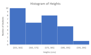
Example 12.1.1
Problem Setup: Again, we are working with the 30 students’ heights from BCIT (click here to download as Excel sheet) and see the table of values below.
| 173 | 153 | 172 | 191 | 173 | 167 | 156 | 169 | 175 | 169 |
| 159 | 163 | 177 | 155 | 152 | 178 | 172 | 188 | 152 | 171 |
| 174 | 183 | 192 | 151 | 159 | 184 | 170 | 186 | 155 | 156 |
Question: Can you create a histogram of these heights?
Solution: Click here to view the Excel solutions shown in the above video.
Creating a BOXPLOT in Excel (video)
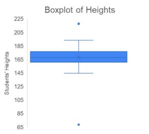
Example 12.1.2
Problem Setup: Again, we are working with the 30 students’ heights from BCIT (click here to download as Excel sheet) and see the table of values below.
| 173 | 153 | 172 | 191 | 173 | 167 | 156 | 169 | 175 | 169 |
| 159 | 163 | 177 | 155 | 152 | 178 | 172 | 188 | 152 | 171 |
| 174 | 183 | 192 | 151 | 159 | 184 | 170 | 186 | 155 | 156 |
Question: Can you create a boxplot of these heights?
Solution: Click here to view the Excel solutions shown in the above video.
Understanding Outliers in Boxplots and Histograms (video)
Example 12.2.1
Problem Setup: We will now revisit the student survey data inputted by students in 2019 (Click here to download).
Question: Can you create an explain the values in the boxplot created for the students’ heights?
Solution: Click here to view the Excel solutions shown in the above video.
Creating Ogives in Excel (video)
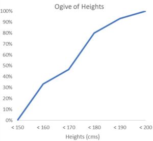
Example 12.1.3
Problem Setup: Again, we are working with the 30 students’ heights from BCIT (click here to download as Excel sheet).
| 173 | 153 | 172 | 191 | 173 | 167 | 156 | 169 | 175 | 169 |
| 159 | 163 | 177 | 155 | 152 | 178 | 172 | 188 | 152 | 171 |
| 174 | 183 | 192 | 151 | 159 | 184 | 170 | 186 | 155 | 156 |
Question: Can you create an ogive of these heights?
Solution: Click here to view the Excel solutions shown in the above video.
Key Takeaways (EXERCISE)
Key Takeaways: Histograms, Boxplots and Ogives
Your Own Notes (EXERCISE)
- Are there any notes you want to take from this section? Is there anything you’d like to copy and paste below?
- These notes are for you only (they will not be stored anywhere)
- Make sure to download them at the end to use as a reference
- https://byjus.com/maths/ogive/#:~:text=The%20word%20Ogive%20is%20a,calculated%20using%20a%20frequency%20table. ↵
