Frequency Distributions and Visualizing Data

Shapes of Distributions

 Learning Objectives

Understand and recognize skewness or symmetric shapes in data sets.

  • Data can be symmetric or skewed left or right
  • Skewed left implies the mean is less than the median and there is a larger ‘spread’ of the data on the left side
  • Skewed right implies the mean is greater than the median and there is a larger ‘spread’ of the data on the right side
  • See the detailed explanations and videos in the sections below.

Symmetric Distributions

  • The mean and median are roughly equal
  • The histogram should have equal length ‘tails’ above and below the median/mean
  • If the shape of the histogram is the ‘bell-shaped‘ we can infer that it follows a Normal Distribution (more on this distribution type to come in later sections)
  • The boxplot should have roughly equal length halves of the box above/below the median
  • There should be roughly the same length of the whiskers above/below the median
  • If there are outliers, they should be roughly the same distance above/below the median

SKewed Right Distributions

  • The mean is greater than the median
  • The histogram should have longer ‘tail’ on the right
  • Ie: there are more extreme upper values than lower values in the data
  • The upper half of the box should be longer than the lower half
  • The whisker might be longer on the upper end (above Q3)
  • If there are outliers, there should be more outliers on the upper end (above Q3)

Skewed Left Distributions

  • The mean is less than the median
  • The histogram should have longer ‘tail’ on the left
  • Ie: there are more extreme lower values than upper values in the data
  • The lower half of the box should be longer than the upper half
  • The whisker might be longer on the lower end (below Q1) than the upper end (above Q3)
  • If there are outliers, there should be more outliers on the lower end (below Q1)

Analyzing Skewness in Excel Graphs (video)
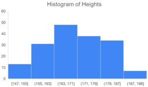
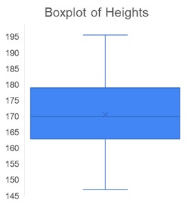
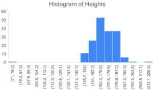
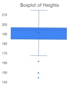
Example 13.1.1

Problem Setup: Again, we are working with the student survey data (click here to download).

Question: How can we tell from the boxplot and histogram that the students’ heights are skewed left? .. Watch the video below to find out!

Solution: Click here to view the Excel solutions shown in the above video.

Key Takeaways (EXERCISE)

Key Takeaways: Shapes of Distributions

Your Own Notes (EXERCISE)

  • Are there any notes you want to take from this section? Is there anything you’d like to copy and paste below?
  • These notes are for you only (they will not be stored anywhere)
  • Make sure to download them at the end to use as a reference

License

Icon for the Creative Commons Attribution-NonCommercial 4.0 International License

An Introduction to Business Statistics for Analytics (1st Edition) Copyright © 2024 by Amy Goldlist; Charles Chan; Leslie Major; Michael Johnson is licensed under a Creative Commons Attribution-NonCommercial 4.0 International License, except where otherwise noted.

Share This Book