Unit 5: Statistics
Topic B: Bar Graphs
Bar graphs compare quantities. Bar graphs are commonly used to illustrate information in newspapers, in magazine articles, and so on. Bar graphs may be written with the bars arranged vertically or horizontally. Graph One is shown both ways – first with vertical bars and second with horizontal bars.
Steps to Follow When Reading a Bar Graph
- Read the title and subtitles so you know what you are looking at.
- Read the information on the vertical and horizontal axes. Notice that each bar represents a different item.
- Look carefully at the scale. What unit of measure is being used? The unit of measure will be the same for each bar so that you can compare them.
- Compare the length or height of each bar to find the information that you want.
Graph 1
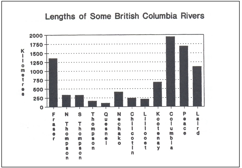
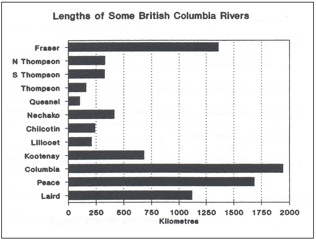
- How many rivers are shown on this graph?
- What is the title of the graph?
- What is the unit of measure?
- Look at the scale for kilometres. How many kilometres are represented by each division on the page?
- Which river is the longest? What is its length?
- Which river is the shortest? What is its length?
- Name two rivers which are approximately the same length.
- Compare the Columbia River and the Fraser River.
- Which is the longer?
- Give the approximate difference in their lengths.
- Give the approximate length of the North Thompson, South Thompson, and Thompson Rivers combined.
Answers to Graph 1
- 12 rivers
- Lengths of some British Columbia Rivers
- Kilometres
- 250 km
- Columbia; ~1,950 km
- Quesnel; ~100 km
- North Thompson & South Thompson
-
- Columbia
- ~600 km (1,950 – 1,350)
- ~750 km
Graph 2
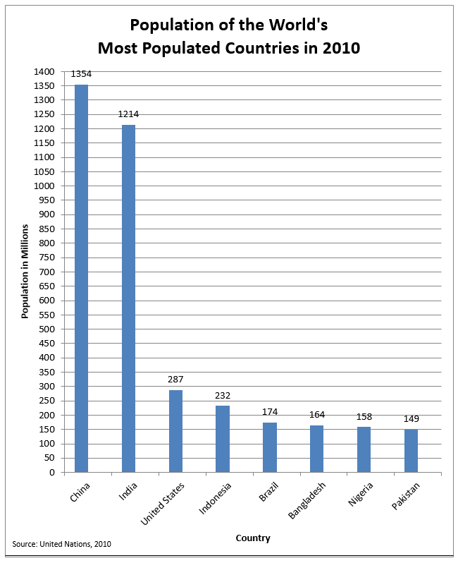
- Give the source of the information for this graph.
- What is the unit of measure for the population scale?
- What number of people is represented by each section on the scale?
-
- Which country had the largest population?
- What was the approximate population of this country?
- Name the two countries which were the closest in population size.
- What was the approximate population of Bangladesh?
- What was the approximate population of India?
Answers for Graph 2
- United Nations
- In the Millions
- 50 million
-
- China
- 1,354,000,000
- Nigeria and Bangladesh
- 164,000,000
- 1,214,000,000
Bar graphs can show more than one type of information for each item. These graphs are useful for making comparisons. The bars are usually shaded or coloured differently and a legend will be placed near the graph. The bar graphs must still all use the same unit of measure.
Graph 3
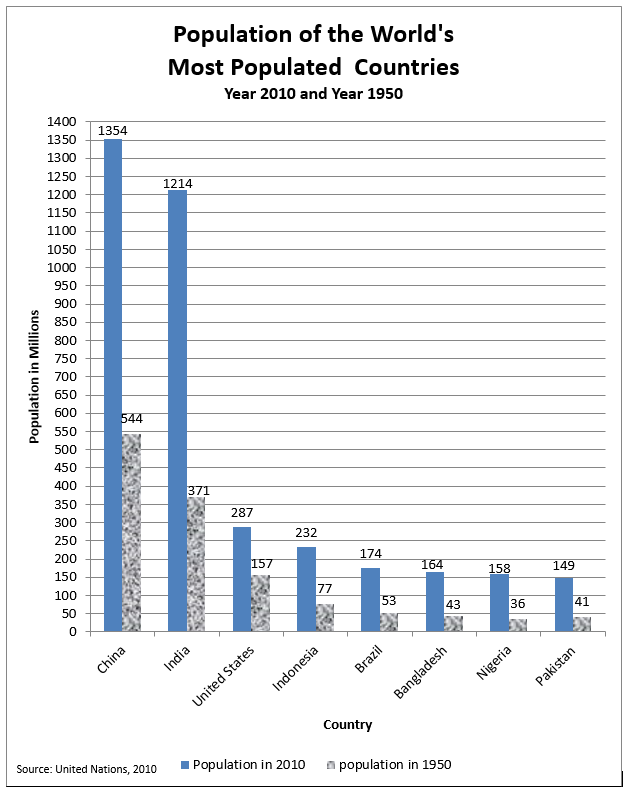
- What is the subtitle?
- Look at the legend. The grey bars give each country’s population for what year? The patterned bar gives the population for these same countries in what year?
- What trend does the graph show?
-
- Which country had the largest increase in population? (this means, which country’s population went up by the highest number)
- About how much was that increase?
-
- Which country had the least change in population?
- About how much was that change?
Answers for Graph 3
- Year 2010 and Year 1950
- 2010, 1950
- That countries around the world are growing in population
-
- India
- The increase was 843 million
-
- Pakistan
- The increase was 108 million
Image Descriptions
Graph 1.1 (Bar Graph)
A bar graph showing the lengths of some British Columbia rivers.
- The vertical axis is kilometres and has the numbers 0 to 2,000 in increments of 250.
- The horizontal axis is the names of the following British Columbia rivers: Fraser, North Thompson, South Thompson, Thompson, Quesnel, Nechako, Chilcotin, Lillooet, Kootenay, Columbia, Peace, and Laird.
The bar graph data is represented in the following table:
| British Columbia Rivers (Horizontal Axis) | Kilometres (Vertical Axis) |
|---|---|
| Fraser | ~1,350 |
| N. Thompson | ~300 |
| S. Thompson | ~300 |
| Thompson | ~150 |
| Quesnel | ~100 |
| Nechako | ~400 |
| Chilcotin | ~250 |
| Lillooet | ~200 |
| Kootenay | ~675 |
| Columbia | ~1,950 |
| Peace | ~1,675 |
| Laird | ~1,100 |
Graph 1.2 (Bar Graph)
A bar graph showing the lengths of some British Columbia rivers.
- The vertical axis is the names of the following British Columbia rivers: Fraser, North Thompson, South Thompson, Thompson, Quesnel, Nechako, Chilcotin, Lillooet, Kootenay, Columbia, Peace, and Laird.
- The horizontal axis is kilometres and has the numbers 0 to 2,000 in increments of 250.
The bar graph data is represented in the following table:
| British Columbia Rivers (Vertical Axis) | Kilometres (Horizontal Axis) |
|---|---|
| Fraser | ~1,350 |
| N. Thompson | ~325 |
| S. Thompson | ~325 |
| Thompson | ~150 |
| Quesnel | ~100 |
| Nechako | ~400 |
| Chilcotin | ~250 |
| Lillooet | ~200 |
| Kootenay | ~675 |
| Columbia | ~1,950 |
| Peace | ~1,675 |
| Laird | ~1,100 |
Graph 2 (Bar Graph)
A bar graph showing the population of the world’s most populated countries in 2010.
- The vertical axis is population in millions, and has the numbers 0 to 1,400 in increments of 50.
- The horizontal axis is countries, and contains the following: China, India, United States, Indonesia, Brazil, Bangladesh, Nigeria, and Pakistan.
The bar graph data is represented in the following table:
| Country (Horizontal Axis) | Population in Millions (Vertical Axis) |
|---|---|
| China | 1,354 |
| India | 1,214 |
| United States | 287 |
| Indonesia | 232 |
| Brazil | 174 |
| Bangladesh | 164 |
| Nigeria | 158 |
| Pakistan | 149 |
| Source: United Nations, 2010 | |
Graph 3 (Bar Graph)
A bar graph showing the population of the world’s most populated countries in 2010 and 1950.
- The vertical axis is population in millions, and has the numbers 0 to 1,400 in increments of 50.
- The horizontal axis is countries, and contains the following: China, India, United States, Indonesia, Brazil, Bangladesh, Nigeria, and Pakistan.
- The legend denotes that each country is associated with two different bars – one referring to its population in 2010, and the other referring to its population in 1950.
The bar graph data is represented in the following table:
| Country (Horizontal Axis) | Population in Millions in 2010 (Vertical Axis) | Population in Millions in 1950 (Vertical Axis) |
|---|---|---|
| China | 1,354 | 544 |
| India | 1,214 | 371 |
| United States | 287 | 157 |
| Indonesia | 232 | 77 |
| Brazil | 174 | 53 |
| Bangladesh | 164 | 43 |
| Nigeria | 158 | 36 |
| Pakistan | 149 | 41 |
| Source: United Nations, 2010 | ||
