Writing a Report
32 Graphics, Tables, and Images
Incorporating graphics into reports is an important skill in developing quality professional documents. The more formal the report you are writing, the more likely the need for non-text material, such as tables, graphs, charts, maps, drawings, and photographs.

These visual elements can take many different forms, but they all have the same basic purpose: to help clarify information presented in the report. They also help break up a text-heavy report, making it more visually appealing.
The key concept to remember here is that visuals clarify, illustrate, and augment your written text. They are not a replacement for written text. Similar to when you present facts from an outside source to the reader in your writing, you are responsible for interpreting your graphics for your reader. Any time you include a chart, graph, or table, you should tell your reader what key point(s) they should understand from it.
The old adage, “a picture is worth a thousand words” does not hold true in professional writing, but adding visuals may save you a hundred words of additional explanation and clarification. If you have visual elements in your document, they must be based on and supplement your written content. Throwing in “gratuitous graphics” just to decorate or take up space can confuse your reader (and the reader knows what you’re doing).
Choose the right kind of visual to convey the story you want your reader to understand. If visuals are poorly chosen or poorly designed for the task, they can actually confuse the reader and have negative consequences. For example, the first point you noticed when you opened this page was the image above. Did you wonder why it is there? Has it distracted you? Our eyes are naturally drawn to visuals that stand out, so make sure the ones you pick for your reports are essential to your purpose.
Deciding which graphics to include
As you review your research and consider possible visuals to include in your report, the first step is to think about which graphics are most appropriate given the data you wish to convey.
Table #4 below provides some general guidelines on the kinds of graphics most suitable for different types of information:
Table #4: General guidelines for graphics
| Information to Convey | Visual Type |
| Numbers, percentages, categories | Tables, charts |
| Processes | Flow charts |
| Geographic data | Maps |
| Chronological or prioritized lists | Numbered lists |
| Non-ordered lists | Bulleted lists |
For more specific reasoning for using individual types of graphics, see table #5 below:
Table #5: Common types of illustrative graphics
| Type of Visual | Description and Purpose | |
| Tables | Places detailed data/information in categories formatted into rows and columns for comparison; use when exact figures are important. Label column headings and/or rows. | |
| Graphs | Bar graph | Compares and contrast two or more subjects at the same point in time or compare change over time. |
| Column graph | Reveals change in a subject at different points in time. | |
| Line graph | Shows the degree and direction of change relative to two variables, compare items over time, show frequency or distribution, or show correlations. | |
| Charts | Pie chart | Displays the number and relative size of the divisions of a subject; show relation of parts to a whole (parts must add up to 100% to make sense). |
| Org. chart | Maps the divisions and levels of responsibility or hierarchy within an organization. | |
| Flow chart | Shows the sequence, steps, and/or options in a process or procedure. | |
| Gantt chart | Indicates timelines for multi-stepped projects, especially used in proposals and progress reports. | |
| Illustrations | Diagram | Identifies the parts of a subject and their spatial flow or functional relationship; emphasizes detail or shows dimensions. |
| Photo | Shows what a subject looks like in realistic detail or shows it being used. | |
| Animation | Simulates a process, operation, or incident. | |
| Film clip | Depicts a process, operation, or incident in realistic detail. | |
Formatting graphics
Once you have selected the correct graphic for your report, you will need to create it. Unfortunately, there is no universal way to format graphics. However, your employer may have an in-house style guide that you are expected to use.
Use the rules outlined in APA Style (7th Edition) for citing your tables and figures.
The key takeaway here is to always aim for consistency—especially if you are ever in a situation where you do not have a style guide. This means that elements such as titles, numbers, and headings should be formatted the same across the entire document. Small inconsistencies may not seem like a big deal, but they can suggest to a supervisor or client that you are not thorough or paying attention to details.
Placement and context
As you develop visuals for your report, you will want to also consider two points:
- Where the visuals should be placed
- What information you need to provide in your report to adequately prepare your readers for the message within that graphic
While there are different requirements depending on the visual you choose, there are five main rules you should follow to integrate your graphics.
Five Rules For Integrating Graphics into your Document
- Give each visual a numbered caption that includes a clear descriptive title.
- Refer to the caption number within the body text and discuss its content.
- Label all units (x and y axes, legends, column box heads, parts of diagrams).
- Provide the source of the data and/or visual image if you did not create it yourself.
- Avoid distorting the data or image.
In addition, visual elements should also be surrounded with sufficient passive space to emphasize the image and enhance its readability. If copying and pasting an image, make sure all elements are clear and the print size is readable. A visual that has been shrunk down to an unreadable size does not help the reader understand your ideas.
Exercise #1: Examine and Compare the Figures
Examine Figure #1.1 below. Do you understand what the information conveys? What is missing? Use the five rules above to determine where this figure goes wrong.
If you look carefully, you might be able to guess what story the graph above is telling. However, the lack of a descriptive caption and labeling of axes makes it impossible to know for sure.
Compare that figure to Figure #1.2 below using the same five rules.
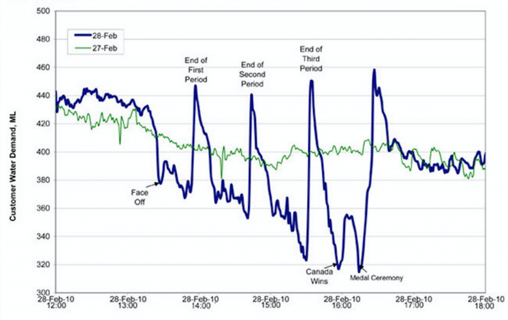
Figure #1.2 Water Consumption in Edmonton during the 2010 Gold Medal Hockey Game (Flowingdata).
Figure #1.2 has a numbered caption, a descriptive title, and it has properly labelled x and y axes and legends. It also cites the source the graph was retrieved from in the caption using an in-text citation. The original image has not been distorted in any way. Thus, it follows the five key rules listed above.
Using graphics ethically
As with everything discussed, the graphics you use can have an impact on your overall presentation. If the graphics are misleading in any way, and your audience realizes this, it can negatively impact how credible or trustworthy they consider you.
Exercise #2: The Ethics of Graphics
Watch the video below on misleading graphics. After watching, answer the following questions:
- Why might a person trying to persuade you toward their point of view use a graph to present information?
- How can graphs present an opinion?
- List three methods of “cherry picking data” and the advantages each provides.
Link to Original Video: tinyurl.com/spotbadgraphs
The next time that you feel persuaded by a graphic representation of data, check the labels, numbers, scales and context and ask yourself what story the picture is trying to tell. As you edit your own report, check to make sure your own use of graphics is ethical and complete.
Creating graphs in MS Excel
Creating charts in MS Excel is one of the easiest ways of incorporating graphic data into a document, especially an MS Word document.
If you’re not familiar with how to create charts in Excel, I recommend, for your viewing pleasure, starting with this video tutorial.
That video does a great job of showing the features of creating one type of chart in Excel. You should also know that you can make a pie chart or a line graph just as easily and using the exact same process. The type of chart you choose will depend on the type of data you want to present. (Hint: percentages are usually best shown in a pie chart; events over time are usually best shown in a line graph; raw counts are usually best shown in a bar graph.)
Another point that video doesn’t show is that you can simply copy a chart you’ve created in Excel and paste it right into an MS Word document. It’s that simple to do.
My advice if you’re new to this: create a simple table in Excel and play around until you can get it to work. When you’ve figured out how to get the results you want, put some time into formatting it to match the rest of your document. If you’re using somebody else’s data for your information, cite the data (even though you made the chart).
Chart examples
Finally, I’m posting this list of examples of charts. These are mostly for comic relief, but they all do aptly demonstrate which formats of charts work best for which purposes. (I couldn’t find a really good pictograph, but perhaps that’s because there really aren’t many good pictographs out there for professional reports.)
Line graph: https://i.chzbgr.com/full/4652666368/h640C8678/more-sunshine-more-problems
Bar graph: https://www.deviantart.com/trustinlies/art/Fun-Bar-Graph-305503243
Venn diagram: https://images.template.net/wp-content/uploads/2015/12/09193556/Funny-Clever-Venn-Diagrams-Template-Download.jpg
Pie chart1: https://images2.memedroid.com/images/UPLOADED53/528aad71e0df9.jpeg
Pie chart2: http://flowingdata.com/wp-content/uploads/2011/09/yoda-625×468.jpg
(If you don’t get that one, watch this 25 second clip: https://www.youtube.com/watch?v=BQ4yd2W50No)
Infographic map: https://d3ui957tjb5bqd.cloudfront.net/uploads/2014/01/Screen-Shot-2014-01-27-at-9.10.55-AM-560×488.png
Flow chart: https://cacoo.com/wp-app/uploads/2018/12/engineering-flow-chart.png
As a final thought in this chapter, remember to put the needs of your audience first when preparing graphics. The charts above are silly and marginally funny; they wouldn’t be appropriate for a professional audience.
Think about what information your audience needs in the image to gain an understanding of the information you want to convey. Step back from your first draft of your graphics and think about whether they would make sense out of context or if they could be misunderstood and revise as needed.
Also, good professional documents provide some text interpreting the graphics they provide; tell the reader what they should notice about the charts. If the chart is too simple to need such an interpretation, why not simply explain the information in one sentence? Graphic aids simplify complex information, not simple information. The audience doesn’t need a chart to visualize, for example, the difference between two numbers.
References
Flowingdata. (2010, March 9). Canada: The country that pees together stays together. https://flowingdata.com/2010/03/09/canada-the-country-that-pees-together-stays-together/
TED-Ed. (n.d.). How to spot a misleading graph – Lea Gaslowitz [Video]. Youtube. https://www.youtube.com/watch?v=E91bGT9BjYk
Attributions
This chapter was adapted from Effective Professional Communication: A Rhetorical Approach by Rebekah Bennetch, Corey Owen, and Zachary Keesey, which is licensed under a Creative Commons Attribution-NonCommercial-ShareAlike 4.0 International License, except where otherwise noted.
Bennetch, Owen, and Keesey adapted their chapter from “Technical Writing Essentials” by Suzan Last (on BCcampus) and is licensed under Creative Commons Attribution 4.0 International License.
Bennetch, Owen, and Keesey also adapted their chapter from “Technical Writing” by Allison Gross, Annemarie Hamlin, Billy Merck, Chris Rubio, Jodi Naas, Megan Savage, and Michele DeSilva (on Open Oregon) and is licensed under Creative Commons Attribution-NonCommercial-ShareAlike 4.0 International License.
Figures #2 – 4 are in the Public Domain from openclipart.org.
an account of your investigation into a subject, presented in a written document or oral presentation that has conventional formatting
a quality that allows others to trust and believe you
