3 Images
In this section, we provide recommendations to guide your inclusion of accessible, image-based content.
What are images?
Images are non-text elements that include photographs, illustrations, diagrams, pictures, charts, graphs, and maps.
File types used: GIF, JPG, PNG
Why are you including the images you have selected?
Before you can determine what to do to make an image accessible, you must identify its purpose or value to your textbook. Consider the following questions:
- Does your image serve a functional purpose? In other words, is it conveying non-text content to students? If so, you should:
- Does your image serve more of a decorative purpose? In other words, is it primarily a design element that does not convey content? If so, you should:
- avoid unnecessary text descriptions
Who are you doing this for?
This work supports students who:
- Have poor contrast vision
- Are colour blind and cannot differentiate between certain colours
- Use a device with monochrome display
- Use a print copy that is in black and white
- Have limited Internet access and cannot download images
- Have a form of cognitive disability
What do you need to do?
Determine the role of each image used in content as either functional or decorative. Once that has been decided, select how each image will meet accessibility needs by providing descriptive text in a variety of ways. Figures, such as charts and graphs that rely on colour to convey information, should also be evaluated for accessibility by students who are unable to distinguish between or see colour.
Functional images
Consider what your content page would look like if the images didn’t load. Now try writing alternative text for each image that would work as a replacement and provide the same information as the image.
There are three ways to provide alternative text descriptions for images:
- Describe the image in the surrounding text.
- Describe the image in the alt tag.
- Create and link to a long description of the image.
As you work on developing your alternative text descriptions, keep the following recommendations and guidelines in mind:
- Remember that alternative text must convey the content and functionality of an image, and is rarely a literal description of the image (e.g., “photo of cat”). Rather than providing what the image looks like, alternative text should convey the content of the image and what it does.[3]
- For relatively simple images (e.g., photographs, illustrations), try to keep your text descriptions short. You should aim to create a brief alternative (one or two short sentences) that is an accurate and concise equivalent to the information in the image.
- For more complex images (e.g., detailed charts, graphs, maps), you will need to provide more than a one- or two-sentence description to ensure all users will benefit from the content or context you intend to provide.
- Leave out unnecessary information. For example, you do not need to include information like “image of…” or “photo of…”; assistive technologies will automatically identify the material as an image, so including that detail in your alternative description is redundant.
- Avoid redundancy of content in your alternative description. Don’t repeat information that already appears in text adjacent to the image.
Descriptions in surrounding text
You can use the surrounding text to provide the same information as conveyed by the image. This is often the best option for complex images because it makes the information available for everyone, not just those using the alt tags.
If you are editing someone else’s work for accessibility, you are probably not at liberty to start adding to the main text. However, if you are the author, this is the best and easiest option.
If an image has been adequately described in the surrounding text, you can either provide a few-word description of the image in the alt tag or follow the procedures for decorative images.
Alt tags
An alt tag refers to the alt attribute (alt is short for alternative) within an IMG tag. Alt tags are used in two cases:
- When an image doesn’t download due to slow Internet, the alt tag content will display instead of the image.
- For people who are visually impaired and use screen readers, when a screen reader finds an image, it will read out the content of the alt tag.
Alt tags should be no longer than 125 characters, including spaces and punctuation.[4] This is because when a screen reader finds an image, it will say “Graphic” before reading out the alt tag. If the alt tag is longer than 125 characters, the screen reader will interrupt the flow of text and say “Graphic” again, before continuing to read out the alt tag. This can be confusing. For images that require descriptions longer than 125 characters, see the section on long descriptions.
Adding Alt Tags in VIU Tools
Alt Tags in VIULearn
When you upload a new image to VIULearn, you will be prompted to add Alternative Text.
To edit the alt tag of an existing image, click on the image and choose Image options from the menu.
Add the alt tag to the Image Description field.
Alt Tags in VIUBlogs
When you add an image to a blog post you will be given the option to add Alt Text as shown in the screen shot below.
Alt Tags in Word
Learn how to add Alt Tags in Microsoft Office products (e.g. Word and Powerpoint) by accessing the the Microsoft Office support website.
Alt Tags in Google Docs
Learn how to add Alt Tags in Google Suite (e.g. Docs and Slides) by accessing the Google Docs Help Center.
Decorative images
If an image does not add meaning, i.e., if it’s included for decorative or design purposes only, or if the image is adequately described in the caption and/or surrounding text, it doesn’t need an alt tag. Including alternative text descriptions for decorative images “simply slows the process down with no benefit because the screen-reading software vocalizes the content of the [alternative text description], whether that alternative text adds value or not.”[5] However, this doesn’t mean that you should leave an alt tag blank.
When a screen reader detects an image with a blank alt tag, it will read out the image file location. If the above picture about the The Wong-Baker Faces pain scale didn’t have an alt tag, a screen reader would say, “Graphic: https://opentextbc.ca/accessibilitytoolkit/wp-content/uploads/sites/184/2017/06/2049201506_0f9b17182a_o.jpg.”
When an image doesn’t require an alt tag, place two double-quotation marks (“”) in the Alternative Text field; this step will prompt the screen reader to say “Graphic” and move on to the caption.
Using colour
Consider what your images would look like if they only displayed in black and white. Would any necessary context or content be lost if the colour was “turned off?” Images should not rely on colour to convey information; if your point requires colour, you may need to edit or format the image so the concepts presented are not lost to those who are colour blind or require high contrast between colours.
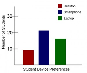
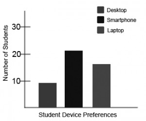
Example 1: Inaccessible Bar Chart
In Chart 1, colour is the only means by which information is conveyed. For students who are colour blind, have poor contrast vision, or are using a black-and-white print copy (see Chart 2), relevant information is lost.
 |
 |
.
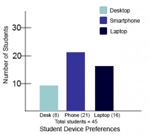
Example 2: Accessible Bar Chart
Students who are colour blind can distinguish between high-contrast shades. In Chart 3, contextual labels have been added to each bar at the bottom of the chart. Note that the chart will still require an alt tag.
- "Web Content Accessibility Guidelines (WCAG) 2.0: Guideline 1.1," W3C, accessed March 27, 2018, http://www.w3.org/TR/WCAG20/#text-equiv. ↵
- "Web Content Accessibility Guidelines (WCAG) 2.0: Guideline 1.4.1," W3C, accessed March 27, 2018, http://www.w3.org/TR/WCAG20/#visual-audio-contrast. ↵
- "Alt text blunders," WebAIM, accessed March 27, 2018, http://webaim.org/articles/gonewild/#alttext. ↵
- All screen readers are different, so a 125-character max is a recommendation. Other sources may provide a different number. ↵
- "Top 10 Tips for Making Your Website Accessible," UC Berkeley: Web Access, accessed March 27, 2018, https://webaccess.berkeley.edu/resources/tips/web-accessibility#accessible-alt. ↵
