5 Tables
In this section, we provide guidelines and recommendations for formatting tables.
What are tables?
In this context, tables refer to data tables, which include row and/or column header information to categorize content. (Tables that do not have headers are called layout tables.)
File types include: DOCX, HTML, PDF
Are your tables simple or complex?
A simple table includes a maximum of one header column and/or one header row. A complex table includes more than one header column and/or header row, and may include merged or split cells.[1]
We recommend you make every effort to keep data tables as simple in structure as possible. The more complex the design of a data table, the less accessible it will be for some students using screen-reading technology to access their learning materials. Screen readers move left-to-right, top-to-bottom, one cell at a time, and because a screen reader does not repeat a cell, merging or splitting cells can affect the reading order of a table.
However, you can use merged or split table cells if they are formatted correctly. Check out this web page to learn more: Tables Concepts
Who are you doing this for?
This work supports students who:
- Have a form of cognitive disability,
- Are blind or have low vision
What do you need to do?
In the same way that your content hierarchy needs headings and structure (see Organizing Content), tables need a properly defined structure to be accessible. This means that you must add row and column headers to define the different sections of data. Screen readers read tables horizontally—cell by cell, row by row—and row and column headers help give context to the data in each cell for students who are blind, have low vision, or have a cognitive disability.
The following video shows a screenreader reading different table layouts and demonstrates the importance of reading order when creating accessible tables.
Screen reader reading different table layouts
Create simple tables
A simple table includes:
- A table title or caption
- Maximum of one row of column headers and/or maximum of one column of row headers, with the appropriate scope assigned
- Avoid using merged or split cells
- Adequate cell padding for visual learners
Example 1: How to Create a Simple Table in VIULearn
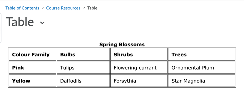
The table below is a simple table created in VIULearn. Reviewed against the preceding requirements list, this table:
- Includes a caption (Spring Blossoms)
- Has one row in which cells are tagged as column headers (Colour Family, Bulbs, Shrubs, Trees), and one column (beginning on the second row) in which the cells are tagged as row headers (Pink, Yellow)
- Avoids the use of merged or split cells wherever possible
- Has adequate cell padding to provide space buffering around the data in each cell. (Cell padding in this table is set at “10”).

For a student accessing the table through a screen reader, the first row of data following the column headers will be presented along the lines of:
- Row 2, Colour family, column 1, Pink
- Bulbs, column 2, Tulips
- Shrubs, column 3, Flowering currant
- Trees, column 4, Ornamental plum
Marking cells in the first row and/or column of a table as header cells allows a screen reader to interpret the structure of a table and how cells relate to each other. This, in turn, ensures that someone using a screen reader can navigate through a table and understand what column/row a given cell is in. If a table doesn’t have headers, the screen reader will recite cell information starting in the upper left corner and continuing left to right, top to bottom.
How to mark cells and rows as headers
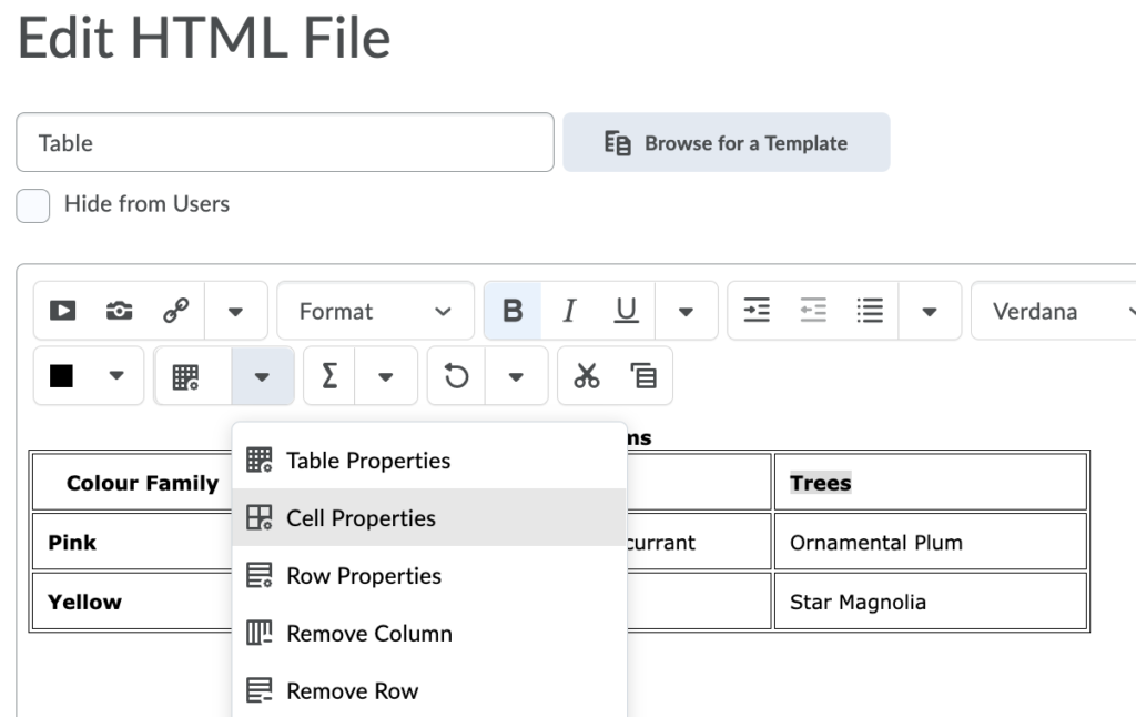
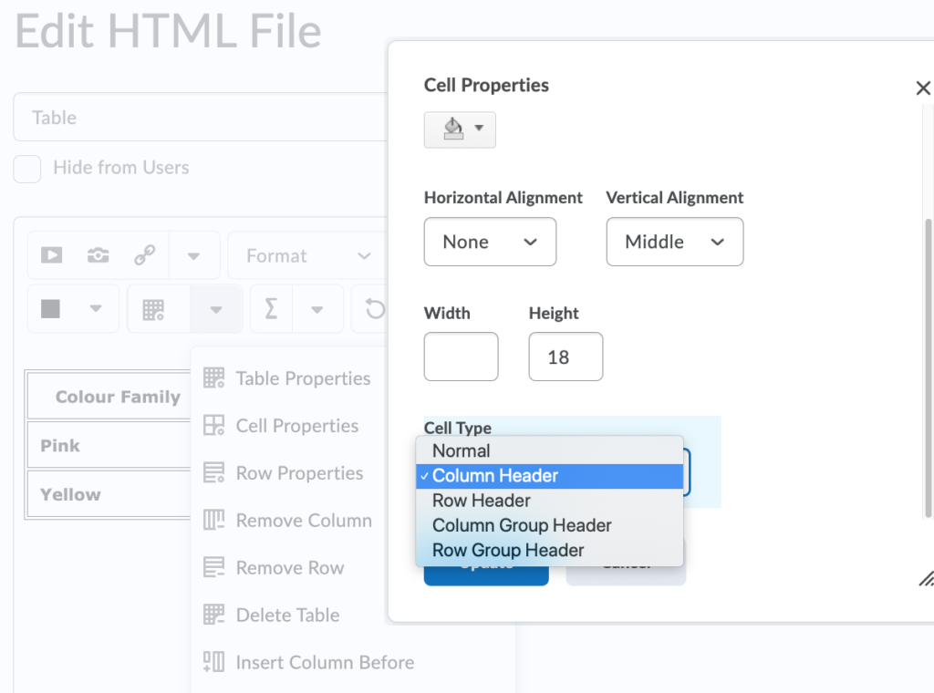
As with section headings, it is not enough to bold or enlarge text in table cells that you want to be marked as headers.
The following screenshots will show you how to identify column and row headers in a table created in VIULearn.
Examples: How to add column and row headers in a table created in VIULearn.


How to create a table caption and add cell padding
Example 3: Captions and cell padding in VIULearn

Add a [Skip Table] option
For large data tables, it can be a good idea to add a link which will allow people to skip the content of the table. See the image below for an example.

As shown, this link is best placed in a row preceding the column headers. That way, someone using a screen reader will hear the caption of the table before being given the option to skip the table.
In this case the link will take the user to the next piece of content in the VIULearn course.
- Penn State, "Tables," Accessibility, accessed March 28, 2018, http://accessibility.psu.edu/tables. ↵

