Chapter 12: Presentation Aids
12.1 – What Are Presentation Aids?
When you give a speech, you are presenting much more than just a collection of words and ideas. Because you are speaking “live and in person,” your audience members will experience your speech through all five of their senses: hearing, vision, smell, taste, and touch. A public speaking event can be greatly enriched by appealing to multiple senses: this is the role of presentation aids.
Typical presentation aids include pictures, diagrams, charts and graphs, maps, and the like. Audible aids include musical excerpts, audio speech excerpts, and sound effects. Short video clips are also popular. A speaker may even use fragrance samples or food samples as aids. Finally, presentation aids can be three-dimensional objects, animals, and people.
To be effective, each presentation aid needs to legitimately add value to the presentation and be used when presenting the relevant, related ideas.
For example, if you are speaking about coral reefs and one of your supporting points is about the location of the world’s major reefs, it would make sense to display a map of these reefs while you’re talking about location. If you display it while you are explaining what coral actually is or describing the kinds of fish that feed on a reef, the map will not serve as a useful visual aid—in fact, it’s likely to be a distraction.
12.2 – Functions of Presentation Aids
While impressive presentation aids will not rescue a poor speech, a good speech can often be made even better by the strategic use of presentation aids.
Presentation aids can improve your audience’s understanding and retention of the message, add variety and interest, and enhance your credibility.
Improving Audience Understanding
As a speaker, one of your basic goals is to help your audience understand your message. To reduce misunderstanding, presentation aids can be used to clarify or to emphasize.
If the information you convey is unclear, your listeners will come away puzzled or possibly even misled. Presentation aids can help clarify a message if the information is complex or if the point being made is a visual one. Another aspect of clarifying occurs when a speaker wants to help audience members understand a visual concept.
When you use a presentational aid for emphasis, you impress your listeners with the importance of an idea. Another way of emphasizing that can be done visually is to “zoom in” on a specific aspect of interest within your speech.
Aiding Retention and Recall
The second function that presentation aids can serve is to increase the audience’s chances of remembering your speech. An article by the U.S. Department of Labor (1996) found that “83% of human learning occurs visually, and the remaining 17% through the other senses—11% through hearing, 3.5% through smell, 1% through taste, and 1.5% through touch.”
For this reason, exposure to an image can serve as a memory aid to your listeners. When your graphic images deliver information effectively, and when your listeners understand them clearly, audience members are likely to remember your message long after your speech is over. Moreover, people often are able to remember information that is presented in sequential steps more easily than if the presentation is disorganized. Using a presentation aid to display the organization of your speech will help your listeners to observe, follow, and remember the sequence of information. This is why some instructors display a lecture outline for their students to follow during class and why a slide with a preview of your main points can be helpful as you move into the body of your speech.
An added benefit of using presentation aids is that they can boost your memory while you are speaking. Using your presentation aids while you rehearse your speech will familiarize you with the association between a given place in your speech and the presentation aid that accompanies that material.
Adding Variety and Interest
A third function of presentation aids is simply to make your speech more interesting. For example, wouldn’t a speech on varieties of roses have greater impact if you accompanied your remarks with a picture of each rose? You can imagine that your audience would be even more enthralled if you had the ability to display an actual flower of each variety in a bud vase. Similarly, if you were speaking to a group of gourmet cooks about Indian spices, you might want to provide tiny samples of spices that they could smell and taste during your speech.
Enhancing a Speaker’s Credibility
Presentation aids alone will not be enough to create a professional image. As mentioned earlier, impressive presentation aids will not rescue a poor speech. Even if you give a good speech, you run the risk of appearing unprofessional if your presentation aids are poorly executed. Conversely, a high quality presentation will contribute to your professional image. This means that, in addition to containing important information, your presentation aids must be clear, clean, uncluttered, organized, and large enough for the audience to see and interpret correctly. Misspellings and poorly designed presentation aids can damage your credibility as a speaker.
In addition, make sure that you give proper credit to the source of any presentation aids that you take from other sources. Using a statistical chart or a map without proper credit will detract from your credibility, just as using a quotation in your speech without credit would.
If you focus your efforts on producing presentation aids that contribute effectively to your meaning, that look professional, and that are handled well, your audience will most likely appreciate your efforts and pay close attention to your message. That attention will help them learn or understand your topic in a new way and will thus help the audience see you as a knowledgeable, competent, and credible speaker. With the prevalence of digital communication, the audience expectation of quality visual aids has increased.
Avoiding Problems with Presentation Aids
Using presentation aids can come with some risks.
One principle to keep in mind is to use only as many presentation aids as necessary to present your message. The number and the technical sophistication of your presentation aids should never overshadow your speech.
Another important consideration is technology. Keep your presentation aids within the limits of the working technology available to you (and know exactly what will be available beforehand).
What will you do if the computer file containing your slides is corrupted? What will you do if the easel is broken? What if you had counted on stacking your visuals on a table that disappears right when you need it? Or the Internet connection is down for a YouTube video you plan to show?
You must be prepared to adapt to an uncomfortable situation. This is why speakers should go to the venue well ahead of time to test the equipment and ascertain the condition of items they’re planning to use. As the speaker, you are responsible for arranging the equipment, props, or other supports you need to make your presentation aids work as intended. Carry a roll of masking tape so you can display your poster even if the easel is gone. Test the computer setup. Have your slides on a flash drive AND send it to yourself as an attachment or upload to a Cloud service. Have an alternative plan prepared in case there is some glitch that prevents your computer-based presentation aids from being usable. And of course, you must know how to use the technology.
More important than the method of delivery is the audience’s ability to see and understand the presentation aid. It must deliver clear information and it must not distract from the message. Avoid overly elaborate presentation aids. Instead, simplify as much as possible, emphasizing the information you want your audience to understand.
Another point to remember is that presentation aids do not “speak for themselves.” When you display a visual aid, you should explain what it shows, pointing out and naming the most important features. If you use an audio aid, such as a musical excerpt, you need to tell your audience what to listen for. Similarly, if you use a video clip, it is up to you as the speaker to point out the characteristics in the video that support the point you are making—but probably beforehand, so you are not speaking over the video. At the same time, a visual aid should be quickly accessible to the audience. This is where simplicity comes in. Limit the categories of information in a visual aid, just as in the organization of a speech.
12.3 – Types of Presentation Aids
Now that we’ve explored some basic hints for preparing visual aids, let’s look at the most common types of visual aids: charts, graphs, representations, objects/models, and people.
Charts
A chart is commonly defined as a graphical representation of data (often numerical) or a sketch representing an ordered process. Whether you create your charts or do research to find charts that already exist, match the specific purpose in your speech.
Statistical Charts
For most audiences, statistical presentations must be kept as simple as possible and they must be explained.
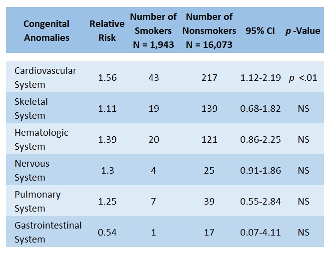
When visually displaying information from a quantitative study, you need to make sure that you understand the material and can successfully and simply explain how one should interpret the data. If you are unsure about the data yourself, then you should probably not use this type of information. This is definitely an example of a visual aid that, although it delivers a limited kind of information, does not speak for itself. As with all other principles of public speaking, remember rule number one of communication: know your audience and put them first.
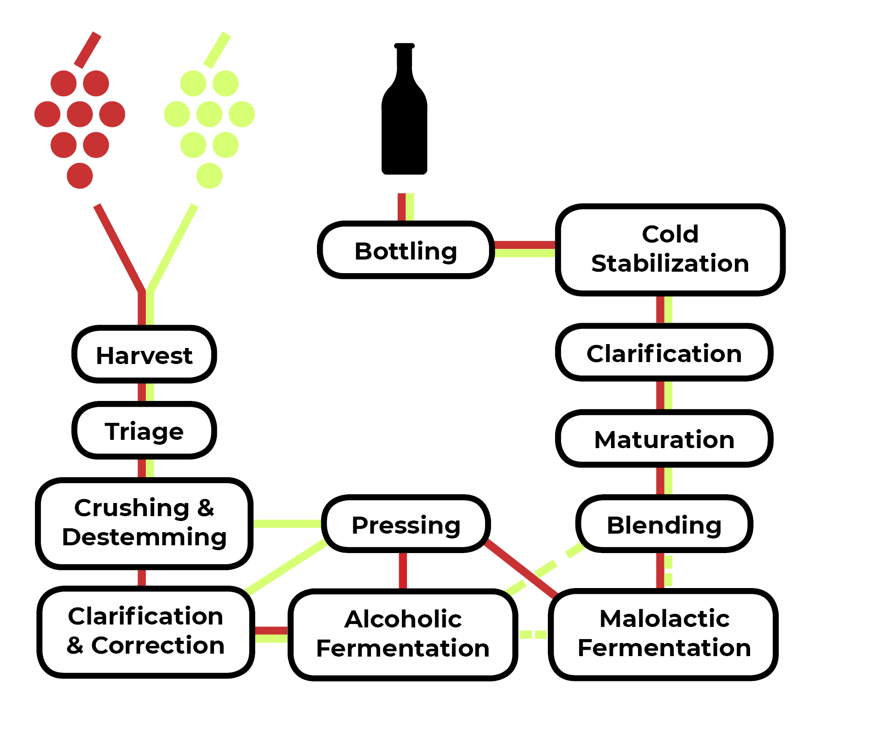
Decision Trees and Sequence-of-Steps Charts
Sequence-of-steps charts are also useful when you are trying to explain a process that involves several steps. Decision trees are useful for showing the relationships between ideas. As with the other types of charts, you want to be sure that the information in the chart is relevant to the purpose of your speech and that each question and decision is clearly labeled. Here, the sequence for making red and white wine—which are very similar, but not identical—can be seen as a flow from the grapes to the bottle, with red wine and white wine taking slightly different routes (and white wine not necessarily going through malolactic fermentation).
Graphs
Strictly speaking, a graph may be considered a type of chart, but graphs are so widely used that we will discuss them separately. A graph is a pictorial representation of the relationships of quantitative data using dots, lines, bars, pie slices, and the like. Graphs show how one factor (such as size, weight, number of items) varies in comparison to other items. Whereas a statistical chart may report the mean ages of individuals entering college, a graph would show how the mean age changes over time. A statistical chart may report the number of computers sold in the United States, while a graph will use bars or lines to show their breakdown by operating systems such as Windows, Macintosh, and Linux.
Public speakers can show graphs using a range of different formats. Some of those formats are specialized for various professional fields. Very complex graphs often contain too much information that is not related to the purpose of a speaker’s speech. If the graph is cluttered, it becomes difficult to comprehend. In this section, we’re going to analyze the common graphs speakers utilize in their speeches: line graphs, bar graphs, pie graphs, and pictographs.
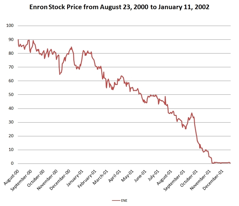
Line Graph
A line graph is designed to show trends over time. In Figure 10.3 (“Enron’s Stock Price”), we see a line graph depicting the fall of Enron’s stock price from August 2000 to January 2002. Notice that, although it has some steep rises, the line has an overall downward trend clearly depicting the plummeting of Enron’s stock price. This is far more effective in showing the relationship of numbers than a chart (as in Figure 10.1) or reading the numbers aloud.
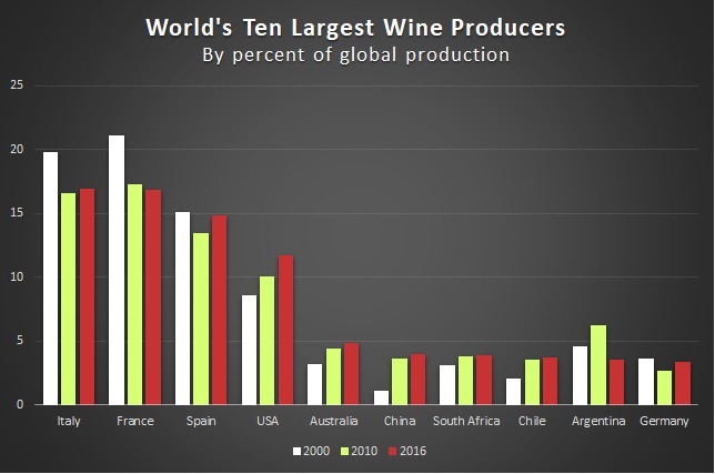
Bar Graph
Bar graphs are useful for showing the differences between quantities. They can be used for population demographics, fuel costs, and many other kinds of data. The graph in Figure 10.4 (World’s Ten Largest Wine Producers) is well designed. It is relatively simple and is carefully labeled, guiding the audience through the changes in market share. The bar graph is designed to show how the three largest wine-producing nations are losing market share to the others. When you look at the chart, you can see Italy, France, and Spain decreasing in market share, while Chile, China, and the USA are gaining global market share.
Pie Graph
Pie graphs are usually depicted as circles and are designed to show proportional relationships within sets of data; in other words, they show parts of or percentages of a whole. They should be as simple as possible without eliminating important information.
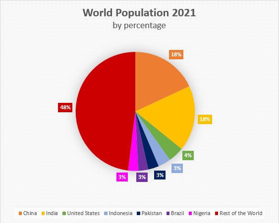
As with other graphs, the sections of the pie need to be plotted proportionally. In the pie graph shown in Figure 10.5, we see a clear and proportional chart that has been colour-coded. In this graph, audience members can see very quickly that more than half of the world’s population lives in the seven largest countries.
Pictograph
Similar to bar graphs, pictographs use numbers and/or sizes of iconic symbols to dramatize differences in amounts. These are seldom used in professional documents and require a great deal of graphic design skill to do well. Without due care (and skill), they can come off as amateurish.
Diagrams
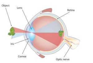
Diagrams are drawings or sketches that outline and explain the parts of an object, process, or phenomenon that cannot be readily seen. Like graphs, diagrams can be considered a type of chart, as in the case of organizational charts and process-flow charts.
When you use a diagram, be sure to explain each part of the phenomenon, paying special attention to elements that are complicated or prone to misunderstanding. In the example shown in Figure 10.6, you might wish to highlight that the light stimulus is inverted when it is processed in the brain.
Maps
Maps are extremely useful if the information is clear and limited. There are all kinds of maps, including population, weather, ocean current, political, and economic maps, so you should find the right kind for the purpose of your speech. Choose a map that emphasizes the information you need to deliver.
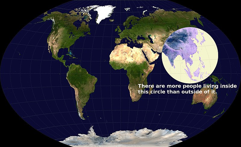
The map shown in Figure 10.7 is simple, but may be surprising to many, as it is shows the intense population density of southern and eastern Asia by demonstrating how half of the world’s population lives in a circle that is only a fraction of the world’s total land area.
Photographs and Drawings
Sometimes a photograph or a drawing is the best way to show an unfamiliar but important detail. Audiences expect high quality photographs now and, as with all presentation aids, they should enhance the speech and not just “be there.” Avoid stock images for the sake of an image and never use clip art. Make your images relevant.
Video or Audio Recordings
Another very useful type of presentation aid is a video or audio recording. Whether it is a short video from a website, such as YouTube or Vimeo, a segment from a song, or a piece of a podcast, a well-chosen video or audio recording may be a good choice to enhance your speech. Imagine, for example, that you’re giving a speech on how crowd surges can injure people at concerts or protests. One of the sections of your speech could explain what you’re talking about, but then you could easily show a short video of what a crowd surge looks like.
There is one major warning to using audio and video clips during a speech: do not forget that they are supposed to be aids to your speech, not the speech itself. In addition, be sure to avoid these five mistakes that speakers often make when using audio and video clips:
- Avoid choosing clips that are too long for the overall length of the speech. At most, 10% of your presentation should be clips.
- Practice with the audio or video equipment prior to speaking. If you are unfamiliar with the equipment, you’ll look foolish trying to figure out how it works. This fiddling around will not only take your audience out of your speech but also have a negative impact on your credibility. It also wastes valuable time. Finally, be sure that the speakers on the computer are on and at the right volume level.
- Cue the clip to the appropriate place prior to beginning your speech. We cannot tell you the number of times we’ve seen students spend valuable speech time trying to find a clip on YouTube or a DVD. You need to make sure your clip is ready to go before you start speaking.
- In addition to cuing the clip to the appropriate place, the browser window should be open and ready to go. If there are advertisements before the video, be sure to have the video cued to play after the ad. The audience should not have to sit through a commercial.
- The audience must be given context before a video or audio clip is played, specifically what the clip is and why it relates to the speech. At the same time, the video should not repeat what you have already said, but add to it.
Objects or Models
Objects and models are another form of presentation aid that can be very helpful in getting your audience to understand your message. Objects refer to anything you could hold up and talk about during your speech. If you’re talking about the importance of not using plastic water bottles, you might hold up a plastic water bottle and a stainless steel water bottle as examples.
Models, on the other hand, are re-creations of physical objects that you cannot have readily available with you during a speech. Major real estate development projects are often displayed as scale models to help potential customers, investors, governments, and other stakeholders visualize what the project will look like after completion.
People and Animals
The next category of presentation aids are people and animals. We can often use ourselves or other people to adequately demonstrate an idea during our speeches.
Animals as Presentation Aids
Many are tempted to bring an animal to serve as a presentation aid. While this can sometimes add a very engaging dimension to the speech, it carries some serious risks that you need to consider. Generally speaking, it’s a bad idea.
The first risk is that animal behaviour tends to be unpredictable. With a confined animal, such as a goldfish or a bird in a cage, this will not be a problem. However, even caged animals can be very distracting to your audience if they run about, chirp, or seem agitated. The chances are great that an animal will react negatively to an unfamiliar situation with a large number of new people. Additionally, the animal’s behaviour may not only affect audience attention during your speech, but potentially during other speeches, as well.
The second risk is that some audience members may respond negatively to a live animal. In addition to common fears and aversions to animals like snakes, spiders, and mice, many people have allergies to various animals.
The third risk is that some locations may have regulations about bringing non-service animals onto the premises. If animals are allowed, the person bringing the animal may be required to bring a veterinary certificate or may be legally responsible for any damage caused by the animal.
For these reasons, before you decide to use an animal as a presentation aid, ask yourself if you could make your point equally well with a picture, model, diagram, or other representation of the animal in question. (Stuffed animals go over surprisingly well.)
Speaker as Presentation Aid
Speakers can often use their own bodies to demonstrate facets of a speech. If your speech is about ballroom dancing or ballet, you might use your body to demonstrate the basic moves in the cha-cha or the five basic ballet positions.
Other People as Presentation Aids
In some cases, such as for a demonstration speech, you might want to ask someone else to serve as your presentation aid. You should arrange ahead of time for a person (or persons) to be an effective aid—do not assume that an audience member will volunteer on the spot. If you plan to demonstrate how to immobilize a broken bone, your volunteer must know ahead of time that you will touch them as much as necessary to splint the break.
You must also make certain that they will arrive dressed presentably and that they will not draw attention away from your message through their appearance or behaviour. The transaction between you and your human presentation aid must be appropriate, especially if you are going to demonstrate something like a dance step.
12.4 – Using Presentation Slides
Ever since the 1990s and the mainstreaming of personal computer technology, speakers have had the option of using slide presentation software to accompany their speeches and presentations. The most commonly known one is PowerPoint, although there are several others that are popular:
- Prezi
- Slide Rocket
- Google Slides
- Keynote
- AdobeAcrobat Presenter
These products, some of which are offered free for trial or basic subscriptions (called a “freemium”), allow you to present professional-looking slides. Each one is “robust,” a word used to mean it has a large number of functions and features, some of which are helpful and some of which are distracting. For example, you can use the full range of fonts, although many of them are not appropriate for presentations because they are hard to read.
The Advantages and Disadvantages of Using Presentation Slides
In some industries and businesses, there is an assumption that speakers will use presentation slides. They allow visualization of concepts, are easily portable, and can be embedded with videos and audio. You will probably also be expected to have slide presentations in future assignments in college. Knowing how to use them, beyond the basic technology, is vital to being a proficient presenter.
But why not use them? Franck Frommer, a French journalist and communication expert, published the book How PowerPoint Makes You Stupid (2012); the title says it all. He criticizes the “linearity” of PowerPoint and similar presentation software, meaning that audiences are not encouraged to see the relationship of ideas and that PowerPoint hurts critical thinking in the audience. Slide follows slide of bulleted information without one slide being more important or the logical connections being clear.
As recently as the mid-2000s, critics such as well-known graphics expert and NASA consultant Edward Tufte (2005) charged that PowerPoint’s tendency to force the user to put a certain number of bullet points on each slide in a certain format was a serious threat to the accurate presentation of data. As Tufte put it, “the rigid slide-by-slide hierarchies, indifferent to content, slice and dice the evidence into arbitrary compartments, producing an anti-narrative with choppy continuity.”
Prezi helps address one of the major criticisms of PowerPoint. Because Prezi, in its design stage, looks something like a mind map on a very large canvas with grid lines, it allows you to show the relationship and hierarchy of ideas better. For example, you can see and design the slides so that the “Big Ideas” are in big circles and the subordinate ideas are in smaller ones.
In addition to recognizing the truth behind Frommer’s and Tufte’s critiques, we have all sat through a presenter who committed the errors of putting far too much text on the slide. When a speaker does this, the audience is confused—do they read the text or listen to the speaker? An audience member cannot do both.
Creating Quality Slide Shows
Unity and Consistency
In terms of unity, the adage, “Keep It Simple, Speaker” definitely applies to presentation slides. Each slide should have one message, one photo, one graphic. The audience members should know what they are supposed to look at on the slide. A phrase to remember about presentation slides and the wide range of design elements available is “Just because you can, doesn’t mean you should.”
Never was this more true than with animation on slides. There are a number of ways to animate a slide, most of which is not helpful. Having text appear line by line could be helpful, but using this tool too much demands too much attention (and you shouldn’t have that much text anyway).
Animation demands audience attention; that’s not good. The audience should be focused on you, drawing on your visual aids as an aid. They support you; they don’t share the stage with you or distract the audience.
Slide transitions animate the movement from one slide to the next. In PowerPoint you can have the slides appear automatically or as blinds, as little checkerboards, from different sides of the screen, in opening circles, or other methods, but using one simple transition is best. The less jarring, the better. (You can also use sound effects, but that is strongly discouraged.) In Prezi, the slides transition by zooming in and out, which is a clever effect, but does make some audience members experience motion sickness.
With animation, less is more and more is awful.
Emphasis, Focal Point, and Visibility
Several points should be made about how to make sure the audience sees what they need to see on the slides.
- Make information is large enough for the audience; since the display size may vary according to the projector you are using, this is another reason for practicing with the equipment in advance.
- The standard rule is for text is 6 X 6. Does this mean 36 words on the slide? No. It means that you should have no more than six horizontal lines of text (this does not mean bullet points, but lines of text, including the heading) and the longest line should not exceed six words.
- Following the 6 X 6 rule will keep you from putting too much information on a slide and you should also avoid too many slides. Again, less is more. There is no “rule,” but a ten-minute speech probably needs fewer than ten slides, perhaps as few as three.
- Do not assume that all the templates feature visible text. In fact, be warned that many templates are terrible. Text should not be smaller than 22 point font for best visibility and some of the templates use much smaller fonts than 22 point. This is especially important in those situations where the speaker creates handouts. Text smaller than 22 is very difficult to see on handouts of your slides. (However, handouts are not recommended for most situations.)
- High contrast between the text and slides is extremely important. White fonts against very dark backgrounds and black fonts against very light backgrounds are probably your safest bet here. Avoid words on photos.
Rhythm in Presenting
The rhythm of your slide display should be reasonably consistent—you would not want to display a dozen different slides in the first minute of a five-minute presentation and then display only one slide per minute for the rest of the speech. Timing them so that the audience can actually take them in is important. Presenters often overdo the number of slides, thinking they will get a better response, but too many slides just causes overkill.
If you can obtain a remote mouse to change slides, that can help you feel independent of the mouse attached to the computer. However, you have to practice with the remote “clicker.” But if you have to use the mouse to change slide, keep your hands off of it between clicks. We have seen speakers wiggle the little arrow all over the screen. It is extremely annoying.
Fonts
Graphic designers love to loathe certain fonts and justifiably so. Some fonts are simply not professionally acceptable, Comic Sans, Papyrus, Bradley Hand, and Brush Script being among the worst offenders. Other fonts were once acceptable, but now look like a relic of another age or have been used to death, such as Times New Roman, Courier New, Lucida Console, and Trajan Pro.
Some of the best fonts must be purchased and beware of free font websites; those can be a quick way to install viruses or other malware into your computer.
However, a variety of free fonts that are generally acceptable are available, such as Avenir, Garamond, Helvetica, Cambria, Tahoma, and Calibri.
A good font is easy to read both digitally and in print, provides no distraction to the reader, and is aesthetically consistent with the content.
For a more in-depth discussion of fonts and typefaces, this is a useful primer.
In your design, use a single font for your visuals so that they look like a unified set. Alternately, you can use two different fonts in consistent ways, such as having all headings and titles in the one font and all body text and bullet points in a second font. Additionally, the background should probably remain consistent, whether you choose one of the many design templates or if you just opt for a background colour.
Colour palettes
Choosing an aesthetically appealing colour palette is also necessary for slides. There are a wide variety of websites that offer technical assistance in producing an appealing palette, such as Canva or Adobe. An image search of “colour palettes” will also yield a wide selection of pre-made palettes to choose from. Ultimately, colour selection is a subjective decision, but that doesn’t mean every colour choice is merely “a matter of opinion.” Pretty much everybody finds the combination of lime green, neon pink, silver, and brown to be a hideous colour palette. Give care and thought to your selections and, especially if art and design are not your forte, take advantage of the attractive colour palettes that others have already assembled and published.
12.5 – Low-Tech Presentation Aids
One reason for using digital media is that they aren’t prone to physical damage in the form of smudges, scratches, dents, and rips. Digital images don’t suffer the effects of weather or accidents. However, there are times when “low-tech” media could work best for a presentation.
Dry-Erase Board
If you use a chalkboard or dry-erase board (a.k.a. “whiteboard”), you are not using a prepared presentation aid. Your failure to prepare visuals ahead of time can be interpreted in several ways, mostly negative. If other speakers carefully design, produce, and use attractive visual aids, yours will stand out by contrast.
However, numerous speakers do use whiteboards effectively. Typically, these speakers use the whiteboard for interactive components of a speech. For example, maybe you’re giving a speech in front of a group of executives. You may have a PowerPoint all prepared, but at various points in your speech you want to get your audience’s responses. (More recent technologies, such as on iPads, allow you to do the interaction on the screen, but this would have to be supported by the environment.) Whiteboards are very useful when you want to visually show information that you are receiving from your audience. If you ever use a whiteboard, follow these four simple rules:
- Write large enough so that everyone in the room can see (which is harder than it sounds; it is also hard to write and talk at the same time).
- Print legibly; don’t write in cursive script.
- Write short phrases; don’t take time to write complete sentences.
- Be sure you have markers that will not go dry and clean the board afterward.
- If possible, have a scribe do the writing for you. (This also applies to flipcharts below.)
Flipchart
A flipchart is useful for situations when you want to save what you have written for future reference or to distribute to the audience after the presentation. As with whiteboards, you will need good markers and readable handwriting, as well as a strong easel to keep the flipchart upright.
Posters
You may have the opportunity in your college years to attend or participate in a “poster session.” These are times during an academic conference where visitors can view a well-designed poster depicting a research project and discuss it one-on-one with the researcher. These kinds of posters are quite large and involve a great deal of work. Posters are probably not the best way to approach presentation aids in a speech. There are problems with visibility and portability.
Handouts
Handouts are appropriate for delivering information that audience members can take away with them.
First, make sure the handout is worth the trouble of making, copying, and distributing it. Second, make sure to bring enough copies of the handout for each audience member to get one.
If you need your listeners to refer to the handout during your speech, place a copy of the handout at each seat before the speech or ask a volunteer to quickly distribute them right before you begin speaking. If the handout is a “takeaway,” leave it on a table near the exit and remind the audience to take one as they leave. Avoid distributing handouts during your speech; doing so is distracting and time consuming.
Attribution
This chapter was adapted from Exploring Public Speaking, 4th Edition by Barbara Tucker and Matthew LeHew, which is licensed under a Creative Commons Attribution-NonCommercial-ShareAlike 4.0 International License.
