6. USER EXPERIENCE DESIGN AND TECHNICAL COMMUNICATION
6.1 What is User Experience Design?
Justin Lewis
Jesse James Garrett defines user experience (UX) as “the experience the product creates for people who use it in the real world.”[1] Simple enough on the surface, but the phrasing matters: the focus is on experience, not the product. A website can be beautifully designed and still confuse everyone who visits it. An application can be packed with features and still overwhelm anyone trying to use it for the first time. Technical impressiveness doesn’t guarantee a good experience. UX design is about shaping how people actually perceive and interact with what you’ve built.
User Experience (UX) Design addresses all aspects of a product or service as perceived by users. This includes not just the interface itself but the user’s initial awareness, discovery, learning, use, support, and eventual discontinuation of the product. UX design extends traditional Human-Computer Interaction (HCI) by considering the total experience rather than only the moments of direct interaction.
Have a look at Jakob Nielson’s 10 Usability Heuristics for User Interface Design to get a sense of the many apects of the user’s experience that we need to consider.
UX design often gets lumped in with nearby disciplines of UI and product design, so it helps to draw some lines.
User Interface (UI) design is the part you can point to on the screen. It’s the buttons and menus, the typography choices, spacing, color, layout, icon styles, or, all the visual and interactive pieces people directly use. UI is important, and it’s usually part of UX work, but it’s only one slice of it.
Product design is another neighbour term. Products can be physical or digital, or both, with an emphasis on what the thing is and how it’s built: features, form, function, constraints, tradeoffs. UX design overlaps with that, but it keeps pulling you back to a different question: what does this product actually feel like to use in real life? You can ship something that’s feature-complete and looks great and still make people miserable if you didn’t account for how they behave, what they expect, or the situation they’re in when they’re using it.
UX stretches across the whole relationship a person has with a product. It starts before they ever sign up: how they hear about it, what they assume it does, what the first few minutes are like. It includes discovery and learning and day-to-day use: can people get their job done without wrestling with the tool?
And it doesn’t stop there. UX also covers what happens when something breaks, how user support systems work, how errors are explained, and even how someone leaves—canceling, exporting data, switching to something else. Every one of those moments can either feel smooth and respectful or turn into a source of friction.
EXERCISE 6.1 Defining Boundaries
The boundaries between UX design, UI Design and Product design can be a bit fuzzy at times. Try sharpening your understanding of the distinctions by applying them to a real world example. Choose a digital product you are very familiar with, such as a banking app, a streaming service, your university’s course registration system, or a social media platform.
Identify at least one specific example for each category below, and provide a 1-2 sentence rationale for why it belongs in that category.
UI Design (Visual and interactive elements that users directly touch)
Product Design (features, forms, functions, technical constraints)
UX Design (the overall experience across the full relationship with the produce)
Discuss: Where did you find it most difficult to “draw the line” between categories? What does that difficulty tell you about how UX, UI, and Product Design relate to each other in practice?
UX Design and Technical Communications: Shared Foundations
You might be thinking, “Why is UX design showing up in a technical communication textbook?” The short answer is that the two fields are closer than they look.
Both grew out of the same basic realization: communication works well only when you understand the people on the other end. Clarity beats cleverness. And the best results usually come from doing a version, getting feedback, and improving it. UX design is, in a lot of ways, technical communication applied to interactive digital spaces.
Take audience analysis, for example. In Chapters 1 and 2, you looked at questions like: Who’s going to read this? What do they already know? What are they trying to do? UX designers ask the same things, just with “users” instead of “readers.” They conduct interviews, surveys, and observation to figure out what people need, what they expect, and what gets in their way. If you’re comfortable with task and audience analysis from Chapter 2, you already have a mental model that fits neatly with UX research.
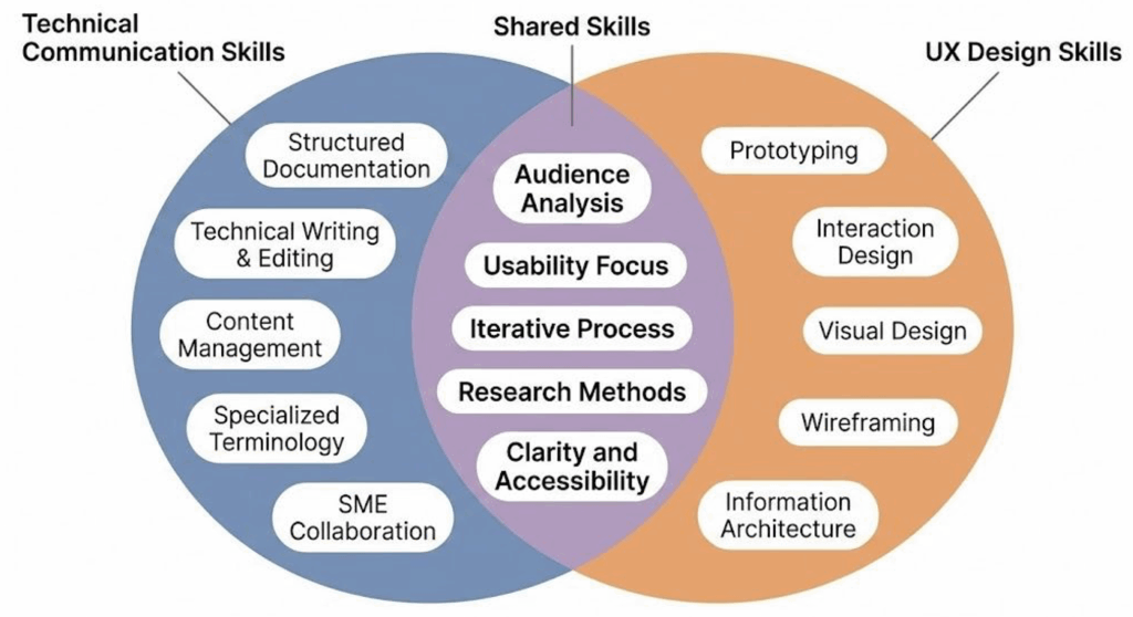
The overlap shows up again in document design. The principles from Chapter 3—readability, visual hierarchy, purposeful formatting—don’t stop working just because the content is on a screen. Headings, spacing, and consistency help someone scan a report; the same ideas help someone find their way through an app or a website. Good interfaces rely on the same kind of structure and cueing that good documents do (see Figure 6.1.1).
The key connection, though, is the process. Technical communication is iterative: you plan, research, draft, revise, and edit based on feedback. UX follows a similar loop: research, design, test, refine. In both cases, the first pass is rarely the final one, and “done” usually means “good enough for now, with a plan to keep improving.”
This overlap matters in practical, career-shaping ways. A lot of technical communicators now work in jobs that mix “classic” documentation with UX work, especially in companies building digital products. Job titles like Content Strategist, UX Writer, Information Architect, and UX Researcher lean heavily on the same skills you develop in technical communication: figuring out what people need, organizing information so it’s easy to use, and testing whether the result actually works.
Learning UX principles isn’t about leaving technical communication behind. It’s more like adding range. You’re still doing the core work (e.g., making complex things understandable and usable) but you’re doing it in environments where the “document” might be an onboarding flow, a settings screen, an error message, or an in-app help article. As more work moves into digital systems, employers want people who can think about communication as part of the product itself, not just something that sits beside it.
EXERCISE 6.2 Examine the Overlap in Document Design and Interface Design
Technical Communications and UX design share a set of core competencies: audience analysis, document design, iterative revision, and research. Test that claim against your own experience:
Think of a digital product you used today (e.g., an app, a website, a self-service kiosk, a registration portal, anything interactive). Then think of a document you’ve read or written recently in this course (an email, a set of instructions, a report draft). In a short paragraph for each, answer the following:
- What was the purpose of the product or document? Who was it designed for?
- Where did the design help you accomplish what you needed? Where did it create friction?
- What design choices (layout, language, structure, visual cues) seemed intentional? What seemed like an afterthought?
Share your examples with a partner or small group. As you compare, look for patterns: which kinds of design strengths and weaknesses showed up in both the digital product and the document? Where do the overlaps between technical communication and UX design feel strongest to you? Where do the two seem to diverge?
A Brief History of UX in Technical Communication
The phrase “user experience” started circulating in the 1990s, especially after cognitive scientist Don Norman joined Apple and pushed for a more big-picture way of thinking about design. Norman (and his book The Design of Everyday Things,[2] which people still recommend constantly) argued that designers shouldn’t stop at technical specs or a good-looking interface. They needed to pay attention to how products fit into real human behaviour: how people understand them, stumble through them, and make them part of their routines. That idea may sound modern, but a lot of what we now call UX has been building inside technical communication for decades.
A major piece of that history is the usability movement in technical communication, which picked up speed in the 1980s and 1990s. Scholars and practitioners like Janice Redish helped make the case that “expert review” wasn’t enough. If you want documentation to work, you have to put it in front of actual users and see what happens. Watching real people try real tasks, paying special attention to where they hesitate, what they misread, what they skip, what they assume, became a practical method, not an academic luxury. That approach sits at the center of usability studies, and it later became one of the standard pillars of UX work.
Then the web changed the scale of the problem. In the mid-1990s, websites moved from novelty to necessity, and soon after, mobile computing made digital interfaces even more constant and personal. Suddenly, products weren’t being used by a narrow group of trained users. They were being used by everyone: people with different levels of experience, different devices, different access needs, and wildly different expectations. The methods that once mattered mostly for specialized software or workplace documentation started to matter for basically any organization trying to communicate online. Today, UX thinking reaches beyond apps and websites into physical products, services, and the larger systems people have to navigate.
For students of technical communication, this background is useful because it reframes UX as less of a “new field you have to learn” and more of a continuation of work you already recognize. UX designers ask questions that technical communicators have asked all along: Who is this for? What are they trying to do? What’s getting in their way? How do we help them succeed? The difference is the setting and the number of ways you can respond—screens, flows, microcopy, support content, onboarding, and more.
In the next sections, we’ll connect rhetorical ideas to UX practice, look at a widely used framework for thinking through user experience, and walk through research methods you can start using right away. The goal isn’t to toss out what you’ve learned so far, but to build on it and run basic UX research in your own projects.
