6. USER EXPERIENCE DESIGN AND TECHNICAL COMMUNICATION
6.2 The Rhetorical Foundations of UX Design
Justin Lewis
If you’ve worked through the earlier chapters, you’ve already met one of the most useful tools in the book: the rhetorical situation (Ch. 2.2). It’s introduced as a way to break down any communication event: who’s doing the communicating, who they’re trying to reach, what’s being communicated, the medium or form it takes, and the purpose behind it.
What isn’t always obvious at first is how well that same framework fits UX design. Designing a digital product is still a communication problem. The “speaker” might be an app, a website, a service, or the organization behind it. The “message” shows up in labels, flows, prompts, and defaults. The “how” is the interface, the interaction design, the content, the timing. And the “why” is the outcome you’re trying to help the user achieve (alongside whatever goals the organization has). Look at it that way and UX starts to resemble applied rhetoric: using familiar principles of clarity, emphasis, and audience awareness, then translating them into interactive environments where people aren’t just reading—they’re doing.
The Rhetorical Situation in UX Contexts
The rhetorical situation is usually described as five connected pieces: purpose, writer, audience, message, and context/culture. When you write a document, you’re constantly balancing those elements against each other. What are we trying to get done? What knowledge, constraints, or biases do we bring as the writer? Who’s going to use this, and what are they trying to accomplish? What information belongs here, and how should it be organized? What situational or cultural expectations shape how it will be read?
UX designers work through the same set of questions, even if the labels shift a bit (see Figure 6.2.1). Put another way, a screen is never “just a screen.” It’s a response to a rhetorical situation, shaped by purpose, people, content, and context. These are exactly the same forces you’ve already been trained to notice in written communication.
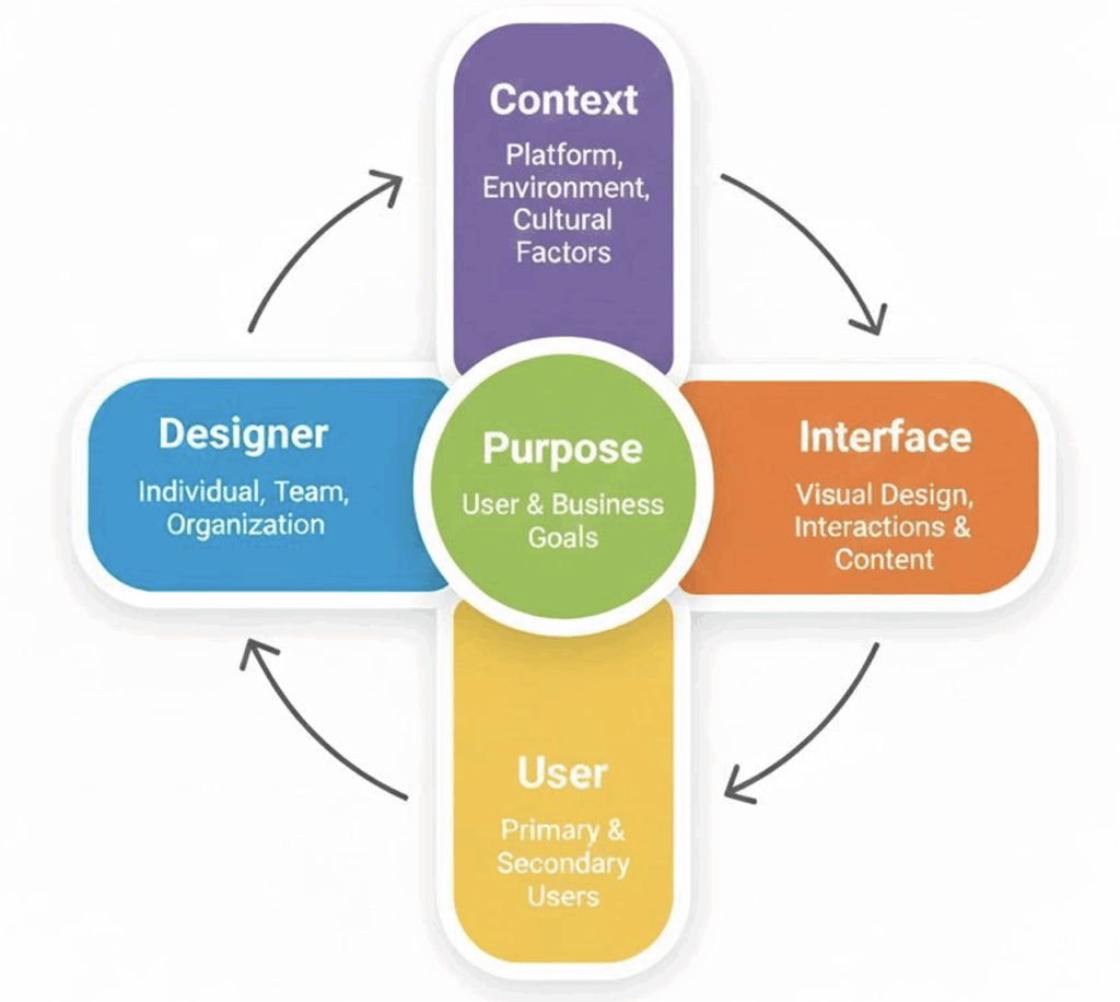
PURPOSE, in UX design, usually has two layers:
The user’s purpose is the reason someone showed up in the first place. They open a banking app to check a balance, move money, deposit a check. They go to a library site to find a title, renew items, reserve a study room. Getting clear on those goals takes the same kind of task analysis you’d do before writing instructions or a user guide: what are people trying to accomplish, what steps do they expect, where do they get stuck?
The organization’s purpose is what the company or institution wants the product to achieve. Maybe it’s higher engagement, fewer support calls, more completed applications, better retention, stronger brand trust. Good UX is often about negotiating the overlap. When the product helps users succeed quickly and confidently, it usually helps the organization too. When those goals fight each other, people feel it immediately.
THE WRITER in a rhetorical situation maps pretty cleanly to the designer in UX, with one wrinkle: in product work, “the designer” is rarely a single person. Decisions come from teams of designers, engineers, product managers, content producers, legal, and marketing. That mix of labor shapes what gets built. Still, the same self-awareness applies. Designers bring their own habits, assumptions, and technical comfort into the work, and those can quietly steer the design. A core UX lesson is simple, but sometimes hard to keep in mind: you are not your user. What feels obvious after months inside a project can be baffling to someone seeing it for the first time. This is why user testing is so important.
AUDIENCE becomes users, but UX tends to treat user diversity as unavoidable rather than optional. One product can serve people with very different levels of experience, physical abilities, languages, cultural expectations, and constraints. The same banking app might be used by a twenty-year-old who lives on their phone and a seventy-year-old who finds touchscreens finicky. The same library site might be used on a large monitor in a quiet room and on a phone while someone is juggling a coffee and a backpack. That’s why UX research (which you’ll get into later in 6.4) leans on systematic ways of learning about users instead of guessing.
THE MESSAGE in UX is the interface itself. It’s the words, yes, but also the whole system of cues: layout, buttons, icons, navigation, confirmations, error states, animations, and feedback. Every choice communicates something about what’s possible, what’s important, and what happens next. The document design skills you already know transfer well here. Interfaces also rely on hierarchy, consistency, and spacing to help people scan, orient themselves, and make decisions. Clear, user-centred writing still matters too: keep it tight, stay consistent, anticipate confusion, and assume people will misread things when they’re moving fast or stressed.
CONTEXT and CULTURE shape everything around that interface. Context includes where someone is using the product (quiet office vs. noisy train), what device they’re on (desktop, phone, watch), and the conventions they’ve learned from the platform (iOS vs. Android patterns, web vs. native expectations). Culture is broader than nationality: it can mean workplace norms, industry expectations, accessibility norms, privacy expectations, even generational attitudes toward technology. If you ignore context, you can end up with designs that look great in a lab and fall apart in real life, when someone’s using them one-handed, on poor Wi-Fi, with three distractions competing for attention.
Table 6.2.1 Mapping the Rhetorical Situation to UX Design
| Rhetorical Component | Traditional Tech Comm | UX Design Context |
|---|---|---|
| Purpose | Inform, instruct, persuade through documents | Enable users to accomplish goals through interaction |
| Writer/Creator | Technical writer, documentation team | UX designer, product team, organization |
| Audience | Readers with varying expertise levels | Users with diverse abilities, contexts, and goals |
| Message | Content of document (text, visuals, structure) | Interface elements, interactions, feedback systems |
| Context/Culture | Workplace, discipline, organizational norms | Platform, device, cultural expectations, use environment |
Audience Analysis as User Research
Chapter 2.2 gave you a practical set of questions for building an audience profile: Who are the primary readers? What’s their relationship to you? What do they already know? What situation created the need for this communication? If you swap “readers” for “users,” you can see how naturally that framework slides into UX research. The main difference is that UX teams often answer those questions with more structured, evidence-based methods: interviews, surveys, observation, and usability tests, rather than relying mainly on inference.
When UX designers study users, they’re looking at many of the same dimensions you’d cover in audience analysis, just with a wider lens. They pay attention to users’ goals and expectations: the specific tasks people are trying to complete, and the assumptions they bring from using similar products. They consider physical abilities and limitations, because real users have different motor skills, vision, hearing, and cognitive capacities. Based on these factors, they develop designs that work across that range of accessibilities. They think about perception and attention, too. People don’t read screens the way they read essays; they scan, they look for cues, and they miss things when the page is crowded or the wording is vague. And they don’t ignore enjoyment. If something technically “works” but feels annoying or slow, users will avoid it when they can.
A key UX insight that’s worth holding onto is that users never arrive empty-handed. People bring a lifetime of learned patterns, or “conventions,” to every new interface. They expect settings to be in a familiar place, common icons to mean familiar things, and standard gestures to behave the way they’ve behaved everywhere else. When a design leans into those conventions, users can borrow their existing knowledge instead of relearning basics. When a design breaks them, it can still succeed; however, there’s a design price to pay: more effort, more mistakes, and a higher chance the user quits. That’s why UX designers treat convention as a tool, not a lack of creativity. Familiar patterns reduce cognitive load and make the experience feel “obvious” in the best sense.
Culture adds another layer, and it’s where simple demographic checklists stop being enough. Researchers such as Huatong Sun have argued that usability is culturally situated: what feels straightforward in one context can feel confusing or even inappropriate in another, even when the language is translated correctly.[1] Jennifer Sano-Franchini’s work (including analysis of Asian eyelid surgery apps[2]) is a good reminder that interfaces aren’t neutral; rather, they can quietly bake in cultural assumptions about bodies, identity, and “normal” users. Taken together, this line of research pushes UX beyond “design for age group X” and toward something more reflective: noticing how identity, culture, and context shape what people expect from technology, and being honest about the limits of the designer’s own viewpoint.
EXERCISE 6.3 Assumption Audit: “You are not your user”
Designers bring their own habits, assumptions, and comfort levels into the work, and those can quietly steer the design. This activity asks you to examine those assumptions in yourself
Think about the last time you helped someone use a piece of technology—a family member, a friend, a coworker. What did they struggle with that seemed obvious to you? Write a brief account of the situation: what was the task, where did they get stuck, and what did you have to explain?
Now flip it. Think about a piece of technology that you find frustrating or confusing, even though other people seem fine with it. Describe the friction: what do you expect to happen, and what actually happens?
Compare your experiences with a partner’s. What patterns emerge? When you helped someone else, what assumptions were you making about what “should be obvious”? When you were the frustrated user, what assumptions did the designer seem to be making about you? How does this connect to the audience analysis work you practiced in Chapter 2.2?
Technology as Rhetorical Genre
One more rhetorical concept turns out to be especially handy for thinking about UX: genre. In rhetoric, genres aren’t just categories based on shape or format. As Carolyn Miller argues, genres are “typified responses” to recurring situations.[3] A job application letter counts as a genre less because it has a standard structure and more because it’s a recognized way of handling a familiar social moment: someone asks to be hired, and both sides have expectations about what that request should include and how it should sound.
You can take that same idea and apply it to digital products. A mobile banking app, a social media feed, a search results page: these are all responses to situations that keep coming up. People need to manage money without going to a branch. They want to share updates and keep tabs on friends or communities. They need to look things up quickly. Over time, designers build common solutions to those needs, and those solutions harden into patterns users come to expect. A new banking app doesn’t start from zero; it gets compared to everything else people have used. If it can’t do the basics, or if it hides them in weird places, users feel that friction immediately.
Seeing technology as genre gives you a few useful angles.
First, it makes it harder to pretend products are neutral. A technology is built to solve certain problems in certain settings. What it makes easy, what it makes annoying, what it requires you to do in what order, those are design decisions. They reflect assumptions about who the “normal” user is, what they want, what they’re willing to tolerate, and what the organization wants from them.
Second, genre helps explain why design conventions repeat. The shopping cart icon shows up across e-commerce sites because it’s become a shared response to the recurring situation of buying online. It’s not a law of nature; it’s a convention that stuck because it works well enough and users learned it.
Thinking this way turns “interface critique” into something broader. You’re not just judging whether a screen looks clean; you’re asking what kind of social situation the technology is built for, what expectations it relies on, and what it nudges people to do.
Analyzing Technology as Rhetorical Genre
When examining a digital product as a rhetorical genre, consider:
Structural: What recurring design elements characterize this type of technology? What interface patterns appear consistently?
Substantive: What social actions does this technology enable? What purposes does it serve for users and organizations?
Contextual: When, where, and under what circumstances do people use this technology? What situational factors shape its use?
Critical: What assumptions about users does this technology embed? Whose needs does it serve well, and whose does it neglect?
That last question of whose needs a technology serves well, and whose it ignores gets at the part of rhetorical analysis that’s hardest to dodge. Technologies aren’t neutral. Every design choice helps some people and makes things tougher for others. It can privilege certain workflows, certain bodies, certain languages, certain levels of time and attention. It can quietly assume a “default” user and treat everyone else as an edge case. Even decisions that seem purely technical (e.g., what gets prioritized, what’s buried, what’s required, etc.) end up reflecting values.
Noticing these issues isn’t a reason to be cynical about design. It’s a reason to take design seriously. When you see technologies as rhetorical artifacts, as objects shaped by human choices inside real organizational, economic, and cultural constraints, you also see that they can be changed. The current version isn’t inevitable. It’s a set of decisions that could have gone differently, and that can be revisited. That’s where agency comes in: designers can push for alternatives, and users can demand better ones.
The rhetorical concepts in this section give you a vocabulary for doing that kind of analysis without drifting into vague criticism. They let you talk concretely about purpose, audience, message, context, and genre, and about what gets left out when those elements are defined too narrowly.
EXERCISE 6.4 Analyze familiar technology through the lens of Genre
We have used Caroline Miller’s concept of genre to argue that digital products are “typified responses to recurrent situations.” Let’s put that to the test.
- Pick a common type of digital product: a search engine, a social media feed, an e-commerce checkout flow, a messaging app, a calendar tool, or anything else you use regularly.
- Identify three to five design conventions that are shared across most products of this type. (For example: most e-commerce sites use a cart icon; most messaging apps put the newest messages at the bottom.) These are the genre’s structural patterns.
- Now find one place where a specific product breaks or modifies a convention. Describe the departure. Does it work? Does it create confusion? What might have motivated the designers to depart from the pattern?
- Technologies are not completely “neutral” in that every design choice helps some people and makes things harder for others. Pick one of the conventions you identified and consider: whose needs does it serve well? Whose needs might it overlook?
Next, we’ll move from that vocabulary to a more structured UX framework: Jesse James Garrett’s five planes of user experience. It’s a useful model for tracing how high-level goals and strategy turn into the actual screens, interactions, and content people deal with day to day.
- H. Sun and G. Getto, “Localizing user experience: Strategies, practices, and technique for culturally sensitive design,” Technical Communications, vol. 64 (2), May 2017. ↵
- J. Sano-Fanchini, “What can Asian eyelinds teach us about User Experience Design? A culturally reflexive framework for UX/I Design,” Rhetoric, Professional Communication and Globalization, vol. 10(1), 2017. ↵
- C. R. Miller, "Genre as social action." Quarterly Journal of Speech, 70(2), pp.151–167, 1984. https://doi.org/10.1080/00335638409383686 ↵
