3. INFORMATION DESIGN
3.3 Figures and Tables
Visual elements such as graphs, charts, tables, photographs, diagrams, and maps capture your readers’ attention and help them to understand your ideas more fully. They are like the illustrations that help tell the story. These visuals help to augment your written ideas and simplify complicated textual descriptions. They can help the reader understand a complicated process or visualize trends in the data.
The key concept to remember here is that visuals clarify, illustrate, and augment your written text; they are not a replacement for written text. The old adage, “a picture is worth a thousand words” may not always not hold true in technical writing, but adding a visual may save you a hundred words or so of additional explanation or follow-up clarification.
If you have visual elements in your document, they must be based on and supplement your written content. Throwing in “gratuitous graphics” just to decorate or take up space can confuse your reader.
 It is important to choose the right kind of visual to clearly convey the story you want your reader to understand. If visuals are poorly chosen or poorly designed for the task, they can actually confuse the reader rather than clarify ideas. For example, it’s very likely that the first thing you noticed when you opened this page was the image above. Did you wonder why is it there? Has it distracted you?
Conventions for Integrating Visuals
Each style of visual has its own conventions that you will recognize after you have seen enough of them. In addition, different publications have different style guides that dictate the specifics of how to format and integrate visual elements. In general, however, whenever you integrate any kind of visual, you should adhere to five key conventions.
- CAPTION: Give each visual a numbered caption that includes a clear descriptive title (For example, if the image above had a caption, it would be something like this: Figure 1. Yin Yang image as example of a gratuitous graphic element)
- DISCUSS: Refer to the caption number within the body text and discuss its content (don’t leave a figure or table to “speak for itself”). For example, in the body paragraph, I might add Figure 1 is meant to be an example of a gratuitous graphic that serves no purpose.
- LABLEL: Clearly label all units (x and y axes, legends, column box heads, parts of diagrams, etc.)
- CITE: Provide the source of the data and/or visual image if you did not create it yourself. You can include the citation in the body text where you refer to the image or at the end of the caption.
- ACCURACY: Make sure you are not misrepresenting or distorting the data or image. Represent data accurately and use high quality images.
In addition, visual elements should be surrounded with sufficient passive space to emphasize the image and enhance its readability. If copying and pasting an image, make sure all elements are clear and the print size is readable. A visual that has been shrunk down to an unreadable size does not help the reader understand your ideas. Similarly, a poor quality image that pixelates when expanded will seem amateurish. Whenever possible, try to orient the visual image in the same direction as the body text.
Examine Figure 3.3.1 below. Do you understand what information it conveys? What story it’s trying to tell? What is missing? Which of the five conventions have not been followed?
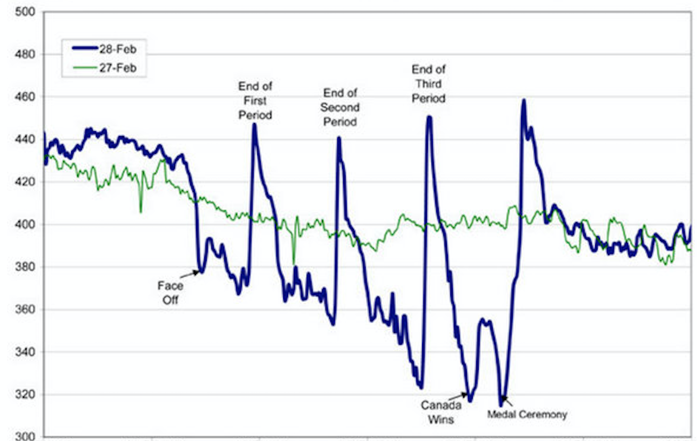
If you look carefully, you might be able to guess something about the story this graph is telling. However, the lack of a descriptive caption and labelling of axes makes it impossible to know the full context. It also lacks a citation, so the reader cannot go to the source or know where the data came from. Compare it to Figure 3.3.2 below.
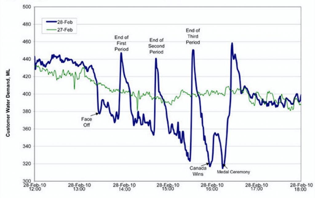
Figure 3.3.2 has a numbered caption (which I have just referred to in my paragraph), a descriptive title indicating what the data visualization is about, and properly labelled x and y axes and legends. With this added information, the story starts to take shape. The graph tells the story of the fluctuating water demand in Edmonton during the 2010 Olympic gold medal hockey game. If you add some context that flushing of toilets is one of the main drivers of water demand, the story comes into focus. We can imagine hockey fans enjoying beverages during each period, and “holding it” until until the end of the period so they don’t miss an exciting play. Then they all go to the bathroom between periods. The figure also cites the source the graph was retrieved from in the caption using an in-text citation, which is linked to a full reference below. Therefore, if you want to assess the credibility of the source or need more information about this data, you can find it. The original image has not been distorted in any way and all elements are clearly readable. Thus, Figure 3.3.2 follows the five conventions listed above.
In addition to those five conventions, there are specific guidelines for implementing them.
Terminology
Visual elements are referred to as either Tables or Figures. Tables are made up of rows and columns and the cells usually have numbers in them (but may also have words or images). Figures refer to any visual elements—graphs, charts, diagrams, photos, etc.—that are not Tables. They may be included in the main sections of the report, or if they contain supplemental material they may be contained in an appendix. Try to ensure that figures and tables are not broken over two pages. If a table require a full page, consider whether it might be better placed in an appendix.
Labelling Tables and Figures
Tables and figures must all be labelled with numbered captions that clearly identify and describe them. Table captions must be placed above the tables. This is because we conventionally read tables from the top down, and therefore want to see the caption at the top. Figure captions are generally placed below the figures, as these are not always read top down; however, you have some choice here. When you open a page and see a figure, the first thing you want to know is “what is that?” The caption below it should immediately identify what the figure represents for the reader. If you choose to place figure captions above the figures, do so consistently throughout your document. If you use Word’s “insert caption” function, it will automatically place table captions above and figure captions below.
Use the following conventions to assist the reader in understanding your graphics:
- Numbering: Table and Figures are numbered sequentially, but separately
e.g. Table 1, Table 2, Figure 1, Figure 2, Table 3, etc.
- Captioning: After the Figure or Table number, add a descriptive caption that clearly indicate what the figure or table illustrates without having to read anything else on the page.
There are two systems for numbering figures and tables within your document:
- Simple Consecutive Numbering: All figures and tables are numbered consecutively (Figure 1, Figure 2, Figure 3, Table 1, Table 2, Table, 3 etc.) throughout the document regardless of which section they are in.
- Section-based Numbering: Within each section, figures and tables may be numbered sequentially through each section (e.g. Table 1.1 refers to the first table in section 1, Table 2.4 refers to the fourth table in section 2). This textbook uses the section-based system.
If a large number of illustrations are presented, and your document has numbered sections, then the latter option is the better choice. This can become confusing, however, when using sub-sections.
If you did not create table or figure that you present in your report, but copied it from other sources, you must include a reference for the original source in your caption: e.g.: Figure 1. Sample Network Design [3]. You must ensure that all figures and tables represent data accurately and ethically, and that they do not distort data to create bias.
Using the Insert → Caption function will allow Word to keep track of the Figure and Table numbering for you, and allow you to auto-create a List of Figures and Tables at the beginning of your document.
If you don’t use the Insert Caption function, then you should manually change the font of your captions to distinguish them from body text. Caption font is usually slightly smaller than body font and is often italicized or in a slightly different colour. The numbered portion is often bolded in both the caption and in the in-paragraph reference to the figure or table for ease of cross-referencing.
Referring to Tables and Figures in your Text
Any figures or tables you use in your document must be discussed in your text. Use the following guidelines when discussing and referring to tables and figures:
- Place the table/figure close to where it is first referred to in the text (preferably immediately below the paragraph in which it is mentioned or discussed).
- Refer to tables and figures in your text by their numbers, not their placement in the text. E.g, “See Figure 9 for a detailed schematic” (not “see the figure below”); “the test results are summarized in Table 1.”
- When referring to a figure or table in your body text, it is helpful to place the reference in bold font.
Selecting the Right Visual
Table 3.3.1 lists common kinds of visual elements used in technical writing, along with their general purpose or description (for a more detailed discussion of how and when to use these kinds of visuals, see Graves and Graves.[2] Notice the “box head” on the top and “stubs” on the left are bolded and centred to enhance readability, and the box head is shaded. Tables that have text in the cells instead of numbers can also be referred to as figures as you can think of them as a type of chart. Thus, Table 3.1.1 could have been captioned as Figure 3.3.3 instead.
| [Skip Table] | ||
| Type of Visual | Description and Purpose | |
|---|---|---|
| Tables | Place detailed data/information in categories formatted into rows and columns for comparison; use when exact figures are important. Label column headings (box heads) and/or rows (stubs). | |
| Graphs | Bar Graph | Compare and contrast two or more subjects at the same point in time, or compare change over time. |
| Column Graph | Reveal change in a subject at regular intervals of time. | |
| Line Graph | Show the degree and direction of change relative to two variables; compare items over time, show frequency or distribution, or show correlations. | |
| Charts | Pie Chart | Display the number and relative size of the divisions of a subject; shows relation of parts to a whole (parts must sum to 100% to make sense). |
| Org. Chart | Map the divisions and levels of responsibility or hierarchy within an organization. | |
| Flow Chart | Show the sequence of steps in a process or procedure. | |
| Gantt Chart | Indicates timelines for multi-stepped projects, especially used in proposals and progress reports. | |
| Illustrations | Diagram | Identify the parts of a subject and their spatial or functional relationship; emphasize detail or show dimensions. |
| Photo | Show what a subject looks like in realistic detail or show it being used. | |
| Animation | Simulate a process, operation, or incident. | |
| Film clip | Depict a process, operation, or incident in realistic detail. | |
When constructing tables, consider that you may need to adjust the default column widths to balanced the information in the table aesthetically, and depending on the style you choose, you may need to define the headers. Table 3.3.2 has a poor balance of text and passive space (and thus seems unbalanced, even though the columns are the same width). The text in the top row does not clearly signal that this is header text.
| CONVENTION | Description |
| CAPTION | Give each visual a numbered caption that includes a clear descriptive title (For example, if the image above had a caption, it would be something like this: Figure 1. Yin Yang image as demonstration of a gratuitous visual) |
| DISCUSS | Refer to the caption number within the body text and discuss its content (don’t leave a figure or table to “speak for itself”). For example, Figure 1 is meant to be an example of a gratuitous graphic that serves no purpose. |
| LABEL | Clearly label all units (x and y axes, legends, column box heads, parts of diagrams, etc) |
| CITE | Provide the source of the data and/or visual image if you did not create it yourself. You can include the citation in the body text where you refer to the image or at the end of the caption. |
| ACCURACY | Avoid misrepresenting or distorting the data or image. Represent data accurately and use high quality images. |
Note how the adjustments made in Table 3.3.3 enhance readability.
| CONVENTION | DESCRIPTION |
|---|---|
| CAPTION | Give each visual a numbered caption that includes a clear descriptive title (For example, if the image above had a caption, it would be something like this: Figure 1. Yin Yang image as demonstration of a gratuitous visual) |
| DISCUSS | Refer to the caption number within the body text and discuss its content (don’t leave a figure or table to “speak for itself”). For example, Figure 1 is meant to be an example of a gratuitous graphic that serves no purpose. |
| LABEL | Clearly label all units (x and y axes, legends, column box heads, parts of diagrams, etc) |
| CITE | Provide the source of the data and/or visual image if you did not create it yourself. You can include the citation in the body text where you refer to the image or at the end of the caption. |
| ACCURACY | Avoid misrepresenting or distorting the data or image. Represent data accurately and use high quality images. |
Adjust the columns as needed to make efficient use of space and enhance aesthetic appeal, but avoid making columns so narrow that words break in awkward places. If necessary, text size in tables can be made slightly smaller (e.g. 9-10 pt font) to avoid this problem.
Visualizing Data to Suit your Need
Figure 3.3.3 shows 4 different ways to visualize the same data comparing the annual revenues of 3 different stores over time (2023-2025). What are the strengths and weaknesses of each method of visualization? Are some better at highlighting specific ideas that might help the viewer make decisions about where to allocate resources?
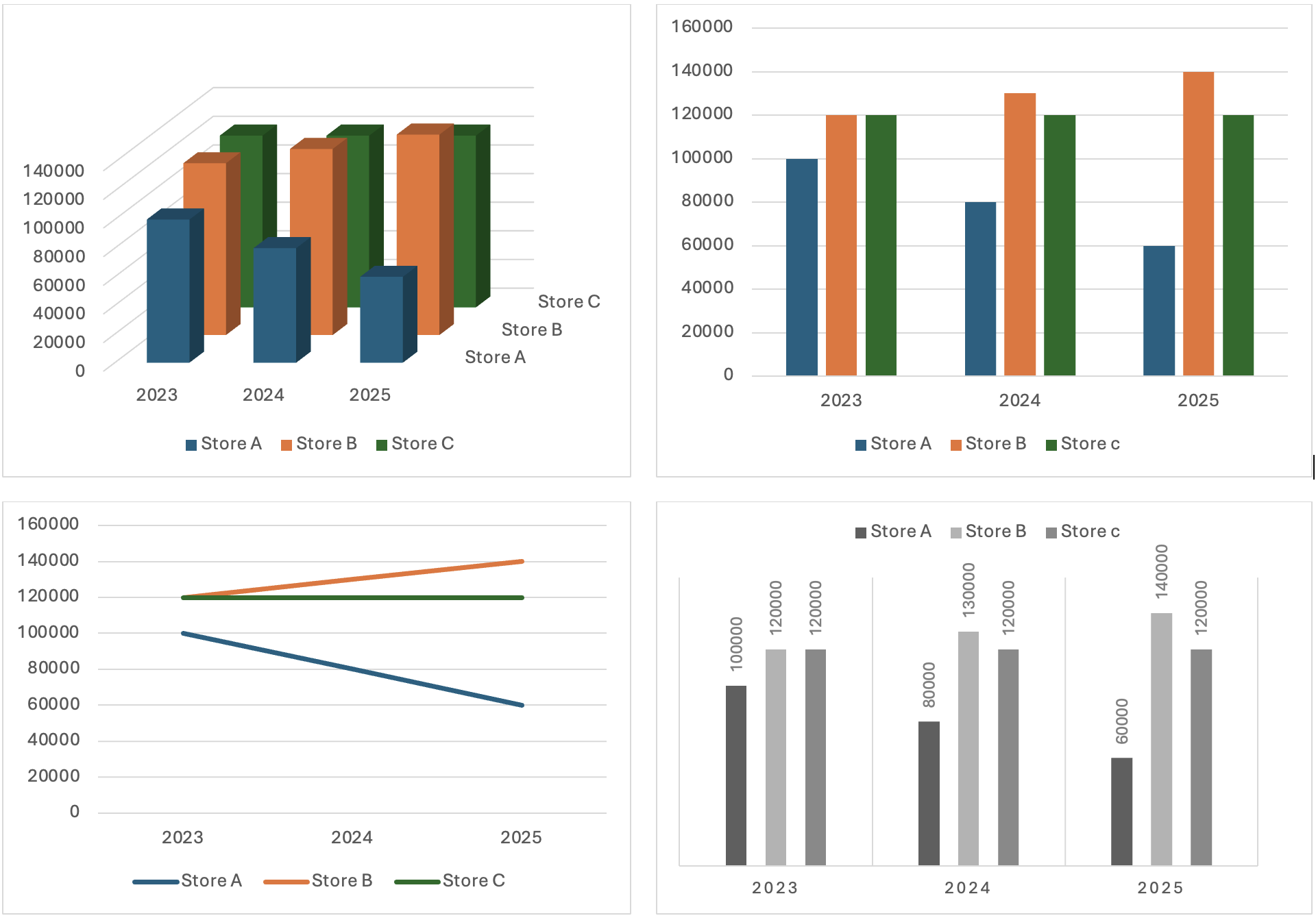
The 3D visualization may seem fancy, but it actually make it difficult to pick out specific data, forcing the viewer work too hard to figure out what is going on. The simple bar graph on the top right makes it much easier to compare how each store’s revenue performed in each of the 3 years. The line graph in the bottom left shows clear trends for each store, but does not focus on specific data. The bar graph on the bottom right uses shades of grey instead of colours to distinguish data sets, making this more accessible for people who don’t see colour. It also reverses the year and store data orientation to highlight the comparison of how each store has performed over the 3 year time period. Your choice of data visualization style will depend on what data you want to emphasize for your audience.
EXERCISE 3.8 Design a figure to match the data
Using what you have learned about figures and tables, create two different visual representations of the data described in the following paragraph, and caption appropriately with a number and a descriptive title. Explain why you chose those forms you did, and list the pros and cons of each:
We surveyed the students in 3 sections of ENGR 240 (total of 100 students) to gauge which aspect of the writing process they found most challenging: Pre-writing, Drafting, or Revising. The results among the 3 sections were consistent. Overall, 50% of students said that they found the Pre-writing stage to be the most challenging, while 28% found the Drafting stage most difficult and 22% said the Revision stage was most challenging (see Figure 1). These results suggest that we should place more emphasis on teaching and practicing pre-writing strategies during the course.
Create a Figure 1 and a descriptive caption that describes the purpose of the data visualization. Input the data into an Excel spreadsheet and have it create a visualization for you (highlight the data and use the “Insert” option to have Excel recommend a visualization style). Try a few different methods to see which will best serve your purpose.
Additional Resources
For excellent examples of professional data visualizations, check out the following videos:
David McCandless: The Beauty of Data Visualization (TED, YouTube)
Hans Rosling, The Joy of Stats (YouTube)
The Perceptual Edge site offers examples of poorly designed data visualizations, with an explanation for why they are poorly designed, and a suggestion for improving them.
Image descriptions
Figure 3.4.1 image description:
A graph with no figure number or caption and no x or y axis labels, so it is difficult to determine what point it is trying to make. It shows something rising and falling during a hockey game. This thing spikes at the end of each period and drops dramatically when Canada wins.
Figure 3.4.2 image description:
A graph charting water consumption in Edmonton during the 2010 Gold Medal Hockey Game. The graphs shows spikes in water consumption at the end of each period, followed by very low usage periods, especially near the end of the 3rd period, and between the end of the game and the medal ceremony. It also has a line depicting water usage the previous day, which was fairly steady throughout the day.
- EPCOR, Edmonton’s Water Utility. “Water Consumption in Edmonton during 2010 Gold Medal hockey game,” Cited on Flowing Data[Online] Available:https://flowingdata.com/2010/03/09/canada-the-country-that-pees-together-stays-together/ ↵
- H. Graves and R. Graves, “Communicating through visuals,” in A Strategic Guide to Technical Communications, 2nd ed. Peterborough, ONT: Broadview Press, 2011, pp. 137-148. ↵
