22 Canvas Design Considerations
This section provides suggestions and examples of how you could design the content of pages in your Canvas course.
Home Page
Banner Image

Home Page Banner:
Download the original file: File examplebanner.ai could not be included in the ePub document. Please see separate zip file for access. (5.1MB, Abobe illustrator)
Dimensions: 1000px x 200px (to fit Canvas Home Page dimensions)
Download copyright-free images:
The following web sites give access to images that are free for commercial use with no attribution required. You can search for images to illustrate course topics or concepts.
UBC Science Flickr: https://www.flickr.com/photos/ubcscience/albums
UBC Brand Marketing Flickr: https://www.flickr.com/photos/134760388@N08/
UBC Media Relations Flickr: https://www.flickr.com/photos/ubcpublicaffairs/albums
Pixabay: https://pixabay.com/
Freepik: https://www.freepik.com/
Formatting: creating structure on a page
Presenting information in Canvas is quite easy and allows you to create visual hierarchies within a page, assignment or other element within their course. This page highlights some ways to create this hierarchy to present information in a way that is accessible to all learners.
Headings
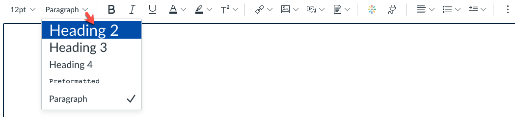
By using text styling in the canvas rich-text editor, you can create a visual hierarchy of text, which can be read by most screen readers in place to assist learners who may be visually impaired. To use these, just select a Heading size you’d like to use – usually you can use Heading 2 for major sections, and Heading 3-5 for subsections. This also helps to create a visual structure for all students, to let them know that content is broken into sections. All sections on this page are broken up in this way.
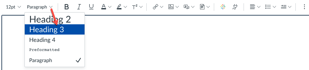
Sub-headings
Sub headings are also encouraged, as these will allow learners to skip through content to see major sections, with minor sub-sections both visually and through screen reading software.
Sub-Headings and Accessibility
Using heading tags is important as it allows those using screen reader software who many have visual challenges to ‘read’ text in a hierarchical fashion, so structuring content around major topics with sub-topics can help learners jump to specific areas of a page and focus on what they want to. The below structure outlines how this may work.
- H2: Animals
- H3: Mammals
- H4: Gibbons
- H3: Reptiles
- H4: Iguanas
- H3: Mammals
- H2: Plants
Indenting
Text can be indented…
…like this, to bring attention to a quote or other important line of text. Text can even be made bold or italicized to bring extra emphasis to written content.
Tip
Do not underline text. Underlined text typically indicates a link, so non-linked, but underlined text can create confusion for students.
Bullets
Just as in other word processing applications, the use of bullets to provide concise and stratified information is a great way to present information.
- Dotted bullets
- provide a great way to provide
- hierarchy
- provide a great way to provide
- Numbered bullets
- could be used to list the
- steps involved in completing a task
- within Canvas
Emojis
Use of emojis (characters that express emotions or emotional reactions) are very common in day to day online discourse, so using them within the context of Canvas is completely fine – even encouraged 🎉.
Emojis can be used anywhere text is present, including module headings (use a ✅ a ➜ to mark current modules), rubrics (for assessment criteria levels – 🙁 😑 🙂 😃), etc. They are also a good way to highlight text for attention (like the heading above) or to liven up some text.
Blended Course?
Tables
Tables should primarily used to share data, not for design purposes. Tables within Canvas can provide an opportunity to present information in a clean and structured manner.
White Space
Define, and explain how it improves reading and ability to focus, and process the information.
Explain that default formatting doesn’t allow for the formatting conventions we are used to in print, and Canvas behaves inconsistently with white space before/after paragraphs and other elements….
Tips
- When in doubt, it’s better to add more white space, rather than less.
- Add a space at the bottom of the Canvas pages, that way when they are viewed in the course, the content is not running to the horizontal line at the bottom of the page.
References
Many online readings pages will include references to academic articles, book chapters or websites. To keep these in the hierarchy of the page, use heading style H2 for the word “References”, but to visually separate them, it’s recommended to use a horizontal rule hr tag followed by a heading and each reference in APA format (if that is what you want to model for the students). Example below with sample text:
The items below are listed for your reference only, and you are not required to read them.
- Hartley, James. (2004). Designing instructional and informational text. Handbook of research on educational communications and technology.
- The power of white space
Colour Use for Learning
The Basics
For online learning content, the use of a limited number of colours is best practice. This evidence-based suggestion is rooted in cognitive load theory, and research which shows that:
- “readers like additional color; and
- color can help learning (see Dwyer, 1978); but
- extra colors have to be used sparingly and consistently if they are not to confuse the readers;
- some colors stand out more than others, so it is unhelpful to use a range of colors on the same page” (Hartley, p.921)
Limiting extraneous visual information, such as colour, can help learners focus on learning.
UBC Canvas Colours
Most often you will see that the Learning Management System (LMS) have adopted institutional colours. The UBC Canvas LMS uses the following UBC brand colours.
These colours are used in the main navigation menu, bread crumbs, visited links and other areas in the Canvas learning environment. The colours selected are versatile and the contrast ratio of these colours is in compliance with the Web Content Accessibility Guidelines.
Using black for text and standard dark blue for buttons and other shapes ensures that your course looks professional and part of the UBC brand.
In addition to the UBC Canvas colours above, you may be interested in the web colour for Faculty of Science:
Science Canvas Template Recommendations
Limiting the additional colours to neutral shades of grey helps learners as it reduces visual complexity. A light grey and a dark grey are used in the template and samples pages so that the text and background colour combos with be readable; background combos using medium tones can often reduce legibility.
Literature on the design of online learning materials also supports the need for consistency, as students may feel lost as they navigate from course to course if colour schemes or even course layouts change.
Universal Design for Learners
This colour scheme is designed with consideration to students with visual disabilities, cognitive challenges caused by ADHD, anxiety, etc… and it will benefits all learners.
Source: page developed by Parm Gill, ETS, UBC.