6. USER EXPERIENCE DESIGN AND TECHNICAL COMMUNICATION
6.3 The Five Planes of User Experience
Justin Lewis
When you’re told to design a digital product, it’s tempting to start with the obvious stuff: what it should look like, what features it needs, maybe a quick list of screens. The problem is that starting there can produce a product that’s nicely polished but oddly hollow. The UI might be attractive, the feature set might look impressive on paper, and people still end up feeling lost because no one sorted out, early on, who and what the product is really for, and how it’s supposed to fit into a user’s life.
That’s why experienced UX designers lean on frameworks. A good framework keeps you from treating design as a pile of disconnected decisions. It forces you to work from the inside out: define the purpose, clarify what success looks like, and make sure each layer supports the one beneath it.
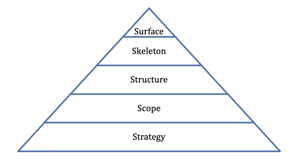
Jesse James Garrett’s “five planes” model, laid out in The Elements of User Experience,[1] is one of the most widely used ways to do that. Garrett describes five levels of UX decisions, moving from the most abstract to the most concrete:
- Strategy (what we’re trying to achieve, for users and for the organization)
- Scope (what the product will and won’t include)
- Structure (how the experience is organized and how users move through it)
- Skeleton (the arrangement of interface elements: layout, navigation, information design)
- Surface (the final look and feel: visual design, styling, micro-interactions)
Each plane builds on the one below it. If you’re unclear at the strategy level, everything above becomes guesswork. If the scope is bloated or inconsistent, structure turns into a maze. And if structure is shaky, no amount of surface-level polish will fix the experience. The value of the model is that it gives designers a shared map: a way to talk about where a problem really lives, and a way to keep “make it prettier” from becoming the default solution to deeper confusion.
Before you dig into the five planes, Garrett asks you to notice a basic split in how digital products work: functionality and information:
Functionality: the product is basically a tool for completing a task. People show up to do something: write in a word processor, build a spreadsheet, manage tasks in a project tool. Success looks like completing work efficiently, with as little friction as possible.
Information: the product is mainly about information. News sites, library catalogues and corporate intranets help people find, understand, and use content. Here, success is about clear organization, easy discovery, and content that’s legible and trustworthy.
Most real products are a blend. A banking app is a functional tool (pay bills, transfer funds) and an information source (check balances, review transactions). A university website provides information (program details, faculty pages) and also enables actions (registering for courses, submitting forms). Garrett’s model still holds in mixed cases, but the way each “plane” shows up can look a little different depending on whether you’re focusing on the product’s tool side or its information side. As we move through the planes, it helps to keep both in view.
Understanding the Five Planes
Garrett’s five planes work like a stack from an abstract foundation (strategy) to concrete surface.
 A house-building analogy fits well if you don’t push it too hard. You start with the reason for the house and who will live there (strategy). Then you decide what rooms you need and what features matter (scope). Next you plan how the rooms connect and flow (structure). After that you figure out the placement of doors, windows, and major fixtures (skeleton). Only then do you pick paint, materials, and finishes (surface). If you jump straight to paint colours before you know whether you need two bedrooms or four, you end up with a lot of expensive rework . . . or a house that looks fine but functions badly.
The STRATEGY Plane: What is our Purpose?
Strategy is the foundation: why the product exists, who it’s for, and what success means. Think Purpose, Audience, and Goals, but in two connected contexts: What do users need from this product, and what does the organization need from it?
Those answers aren’t always compatible, and a lot of UX work is the process of finding a workable overlap: an experience that helps people accomplish what they came for while also supporting the organization’s goals.
User needs are the reasons people show up. What are they trying to get done? What problem are they trying to solve, or what information are they trying to confirm? You can’t guess your way to reliable answers here. You need research like interviews, surveys, field observation, and usability testing. You also need the discipline to see the product from the user’s point of view instead of your own. People don’t use products the way teams imagine they will; they use them in the middle of messy lives, with limited patience and divided attention.
Organizational objectives (business goals) are the other half of the picture. These might be revenue, fewer support tickets, higher retention, increased sign-ups, improved completion rates, stronger trust in the brand, the list goes on. The important thing is that objectives have to be specific enough to steer decisions. “Make the product better” doesn’t help anyone decide what to build. “Reduce checkout time by 20%,” “cut password-reset requests in half,” or “increase successful account onboarding” gives you something you can test and measure.
This is where the strategy plane connects directly to the rhetorical idea of purpose from Section 6.2. Just as a document without a clear purpose tends to wander, a product without a clear strategy tends to sprawl. It tries to satisfy every possible user and every internal business request, and it ends up feeling scattered. It has lots of features, no clarity, and no strong reason for anyone to stick with it.
The SCOPE Plane: What are We Building?
Once you’ve nailed down strategy, the next step is scope: turning those big goals into a concrete list of what the product will actually deliver – and what it won’t! Every project has limits: time, budget, technical constraints, staffing. If you try to include every feature someone suggests or cover every possible edge case, you usually end up with a product that feels bloated and harder to use. Good scope work means saying no (or “not yet”) to ideas that are interesting but don’t serve the strategy.
Scope is where “we want to help users do X” turns into features, content, and requirements. On the functionality side, scope shows up as functional requirements, or, what the product will do. On the information side, it shows up as content requirements, or, what the product will contain, what topics it covers, what information users can expect to find.
The STRUCTURE Plane: How Does it Fit Together?
The structure plane is where the things you decided to include (scope) get organized into a system that makes sense. It answers a basic question: how do all these pieces relate? It organizes the user experience and determines how things are arranged, and how the users will move through tasks (functionality) or information.
Functionality: structure is about designing the user interactions. If someone taps a button, what happens next? Do they get immediate feedback? Is there a confirmation step? What does the system do when something goes wrong, or when the user tries an unexpected path? Interaction design is basically the rules of the conversation: what the product “says” in response to what the user does.
Information architecture: The structure determines the underlying organization of content: categories, labels, navigation, and relationships between pages or sections. Information architecture asks questions like: What belongs together? What needs to be separated so it doesn’t get confusing? What are the main pathways users will follow? If you’ve ever been stuck clicking around a site that seems to hide the one thing you need in a random menu, you’ve felt what weak information architecture looks like. Good information architecture is often invisible! Users simply find the content intuitive to navigate. Poor information architecture forces users to think about the system rather than their goals.
The SKELETON Plane: Where Does Everything Go?
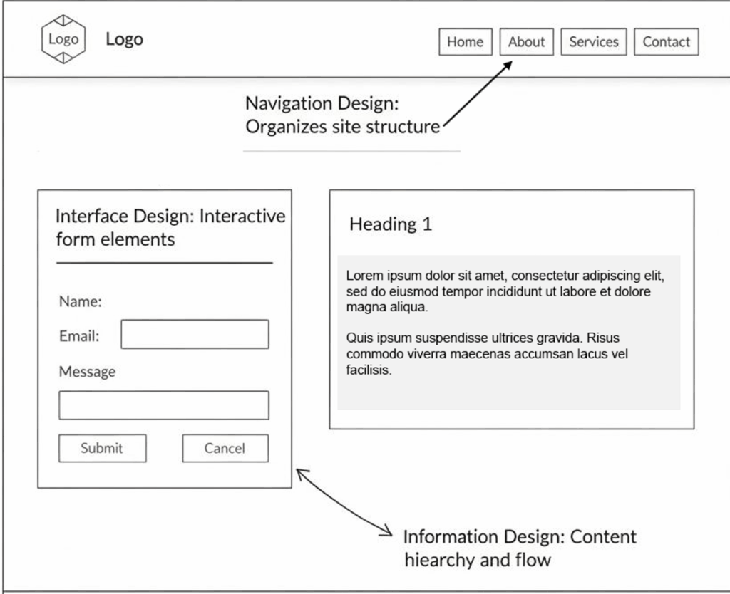
The skeleton plane is where that theoretical blueprint of the structural plane gets translated into an actual screen layout. It’s still not “final design,” but it’s concrete enough that you can point to where things like navigation and interface elements will live and how people will use them.
Three kinds of design work come together here:
Interface design is about the controls people use to take action: buttons, form fields, dropdowns, toggles, sliders, and the other pieces that make functionality usable. Strong interface design makes it obvious what’s clickable, what’s editable, what’s required, and what will happen next. It usually leans on patterns users already know, and it only introduces new ones when there’s a real payoff.
Navigation design is about movement through the product’s content and sections: menus, links, tabs, breadcrumbs, search, site maps, and any “you are here” cues that keep people oriented. There’s always a tradeoff here. You want users to be able to reach everything, but you don’t want to throw twenty options at them on every screen and call it clarity.
Information design is about how content is presented so it’s easy to understand and act on. That includes the layout of text, the formatting of numbers and dates, the way data is visualized, what gets emphasized, and how the interface signals meaning. This is where a lot of document-design skills transfer directly: hierarchy, chunking, alignment, consistency, and using visuals with a purpose.
Designers often capture the skeleton plane with wireframes (see Figure 6.3.1). These simple page diagrams show layout and placement without the “surface” details like colours, photography, or polished typography. The point is to keep the conversation focused on whether the arrangement supports user tasks before the team spends time perfecting the look.
The SURFACE Plane: What Do Users See?
At the top of Garrett’s model is the surface plane, the part of the experience users actually perceive: the visual design, typography, colour palette, spacing, imagery, and sensory layer of the interface. In some products, this might also include motion, sound, and haptics (touch).
It’s easy to treat the surface as “the important part” because it’s what people notice first. Garrett puts it last on purpose. Surface design sits on top of everything else and depends on it. A gorgeous interface can’t rescue a product with a muddled strategy or a structure that sends users in circles. On the flip side, when the foundation is solid and includes clear strategy, disciplined scope, sensible structure, a workable skeleton, etc., the product can still succeed even if the visuals are a bit rough around the edges. Function can carry you farther than people expect.
Still, surface design isn’t decoration. It’s part of the visual rhetoric that shapes how people move through the product moment to moment. Visual hierarchy tells users what to look at first and what can wait. Consistent styling helps people build trust in the interface: if two elements look the same, users assume they behave the same. Typography affects readability and scanning. Color can set mood and also communicate meaning (errors, warnings, success states). The same layout principles you’ve learned for documents, including contrast, alignment, proximity, repetition, show up here too, just translated into screens.
And “surface” can mean more than sight. Motion matters: do animations feel smooth and informative, or do they slow users down and pull attention away from the task? Sound matters in some contexts: is it helpful feedback or unwanted noise? On a mobile device, haptics can either reassure users (“your action registered”) or annoy them if overused. These details don’t replace good structure, but they do change the feel of the experience. They’re often the difference between a product that seems carefully made and one that feels slightly sloppy, even if the features are the same.
Working with the Five Planes
Garrett is careful to say the five planes are a way of thinking, not a step-by-step recipe. Real projects don’t move neatly from strategy to surface in a straight line. Work overlaps, and you often learn things “late” that force you to go back and adjust earlier decisions.
That’s normal. A designer building wireframes at the skeleton level might suddenly notice that a key task takes too many steps, which points back to a structure problem: the information architecture isn’t supporting what users are trying to do. Or a visual exploration at the surface level might expose something more fundamental: there are simply too many features to present clearly. Based on this feedback, the team has to revisit scope and cut or postpone work.
The value of the model is that it gives you a grounding rule: decisions at each level should make sense given the levels underneath. Before you lock in surface design, you should have confidence in the skeleton. Before you lock in the skeleton, you should understand the structure. Before you finalize structure, you need a clear scope. And before you commit to scope, you need strategy: why this product exists and who it’s meant to serve.
That discipline is what helps teams avoid a classic trap: picking solutions early (a layout, a feature, a visual style) before they’ve really understood the problem they’re trying to solve.
Strategy: User research reveals that students primarily need to find and access resources quickly, often on mobile devices between classes. The library’s goal is to increase digital resource usage and reduce in-person reference questions.
Scope: The redesigned site will include: search (books, articles, databases), account management (renewals, holds), research guides by subject, and library hours/locations. Features like event calendars and staff directories are deprioritized.
Structure: Information architecture organizes content around user tasks (Find, Borrow, Get Help) rather than library departments. Search is integrated across resource types.
Skeleton: Wireframes place a prominent search box at the top of every page. Mobile layouts prioritize search and account functions, with secondary content accessible through a menu.
Surface: Visual design uses university brand colors, clear typography optimized for screen reading, and minimal decoration to keep focus on functionality.
From Framework To Practice
Garrett’s five planes work in two directions at once. They’re a thinking tool, because they help you sort decisions by level and keep you from treating UX as a grab bag of screens and features. And they’re a communication tool, because they give teams a shared set of terms. This is especially useful when you’re talking with colleagues, clients, or stakeholders who don’t speak “design” fluently but still need to weigh in on what’s being built.
For students of technical communication, the model should feel familiar. It reinforces the same basic discipline you’ve practiced in writing: you start by getting clear on purpose and audience, then you make choices about what to include, how to organize it, and how to present it. And the process is likely iterative, forcing you to revisit previous steps as needed. Working from strategy through surface mirrors the process of working from task analysis through document design. In both cases, the aim is the same: build something that fits what people actually need, not what the creator assumes they need.
EXERCISE 6.5 – Diagnosing Problems within the 5 Planes
Garrett’s model argues that problems at lower planes (strategy, scope) can’t be fixed by work at higher planes (skeleton, surface). This exercise asks you to practice diagnosing where a problem really lives.
Read each scenario below. For each one, identify
(a) which plane the core problem belongs to
(b) explain your reasoning in one to two sentences.
Some scenarios may involve more than one plane; if so, identify the deepest one (the one closest to strategy), since fixing it there will likely resolve the higher-level symptoms.
- A university’s course registration portal lets students add courses to a cart, but there’s no clear way to see whether a course conflicts with their existing schedule until after they try to enroll.
- An employee onboarding app has a clean, modern visual style but organizes content by department rather than by task, so new hires can’t figure out the sequence of steps they need to complete.
- A city transit app shows real-time bus locations, but the icons and text are so small on mobile that riders can’t read route numbers without zooming in.
- A hospital patient portal was designed to help patients manage prescriptions, but it was never tested with elderly users, who make up 60% of the patient base. The team only realized this after launch.
- A nonprofit’s website has a prominent “Donate” button and an elegant donation flow, but the organization’s actual goal for the site was volunteer recruitment. Donations aren’t the problem—nobody can find the volunteer sign-up page.
Compare your answers with a partner. Where did you disagree? What made certain scenarios harder to pin to a single plane? How does this exercise change the way you might approach giving feedback on a design?
EXERCISE 6.6 – Defining a UX Problem
Use the Hyman Problem Formulation framework, applied to the Strategy Plan to define a UX problem.
Choose a real digital product or service you’ve found frustrating: Your university’s website, a government services portal, a workplace tool, an app you’ve given up on—anything you have firsthand experience with. Define the UX problem using the Hyman framework below (remember, you are defining the problem; do not propose solutions yet).
- Need/Unsatisfactory Situation: What is the current experience like? What’s going wrong for users? Be specific about what you’ve observed or experienced.
- User Goals: What are users trying to accomplish when they use this product?
- Organizational Goals: What does the organization behind the product likely want the product to achieve?
- Measurable Objectives: If you were going to improve this product, what specific, measurable outcomes would tell you the improvement was working? (e.g., “reduce average task completion time,” “increase successful form submissions,” “decrease support requests about X”)
- Constraints: What limits would any solution have to respect? Consider budget, technology, legal requirements, accessibility standards, existing user expectations, and organizational politics.
EXERCISE 6.7 – Negotiating Scope: What gets cut?
Garrett emphasizes that scope is as much about what you leave out as what you include. This exercise gives you practice with that tradeoff.
Imagine you are redesigning your school’s library website. The team has brainstormed the following feature and content ideas. However, due to budget and timeline constraints, you can only include 6 of the 10 items in the first release. The rest will have to wait. Here are the 10 features:
- Search the full catalog by keyword, title, author, or subject
- Real-time availability for each item (checked out or on the shelf)
- User account page showing items checked out, holds, and due dates
- Online reservation system for study rooms
- Interactive floor map showing where each call number range is shelved
- Integration with the campus course management system so students can see items on reserve for their courses
- Blog with librarian-curated reading recommendations
- FAQ and help documentation for using library databases
- Event calendar for workshops, guest speakers, and exhibits
- Accessibility checker that lets users report barriers on any page
Your task: Choose the 6 items you would keep for the first release.
For each item you keep, write one sentence explaining why it belongs in the first release, connected to what you understand about user needs and organizational goals.
For each item you cut, write one sentence explaining why it can wait.
Compare your choices with a partner or group. Did you make the same cuts? What principles guided your decisions? How did you weigh user needs against organizational goals? Did anyone argue for keeping the accessibility checker as a first-release priority, and if so, on what grounds?
Of course, a framework is only helpful if you can use it. That’s where methods come in. Research methods are the hands-on techniques that let you learn about users, test ideas, and improve what you’ve made. In the next section, we’ll look at research methods that support the UX process. Many of these approaches come straight from qualitative research traditions in technical communication, adapted for the realities of interactive digital products.
- J.J. Garrett, The Elements of User Experience: User-Centred Design for the Web. New York: American Institute of Graphic Arts, 2003 ↵
