6. USER EXPERIENCE DESIGN AND TECHNICAL COMMUNICATION
6.4 UX Research Methods
Justin Lewis
The frameworks and principles we’ve covered so far on the rhetorical situation and the Five Planes of User Experience are useful ways to think about UX design. But thinking only gets you so far. If you want to design products that actually work for people, you have to understand those people: who they are, what they’re trying to do, how they behave in real situations, and what trips them up. You don’t get that understanding from gut instinct. You get it from research.
If you’ve already worked through Chapter 5, you’re not starting from zero here. The habits you’ve been practicing like finding and evaluating sources, narrowing a research focus, setting boundaries, and doing ethical research with human participants carry directly into UX. This section builds on that foundation by introducing a set of research techniques UX designers use to learn about users and make better design decisions: User Personas, Interviews, Contextual Inquiry, and Surveys
None of these methods belong exclusively to UX. Many come from social science, anthropology, and technical communication research. What UX has done is adapt them to the realities of interactive products, where “understanding” isn’t just about what people say they need, but what they actually do when they’re trying to use the design to complete a task.
The Role of Research in UX Design
Research shows up in different ways depending on where you are in the design process.
Early on, it’s mostly about empathy: getting a grounded sense of users’ lives, goals, constraints, and everyday frustrations, along with the context in which they’ll use the product. That kind of work feeds directly into the strategy plane. It helps teams define user needs and set product goals that actually connect to those needs, instead of guessing or designing for an imaginary “average user.”
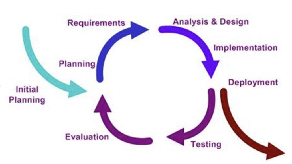
UX folks often talk about a design lifecycle, and the names vary by organization, but the rhythm is pretty consistent: learn about users and their context, define the problem, create and refine possible solutions, test those solutions with users, then iterate based on what you learned (see illustration in Figure 6.4.1). The important point is that research isn’t a one-time “discovery phase” you check off at the beginning. It comes back throughout the project, with different methods depending on what you’re trying to find out.
User Personas
One of the most common ways UX teams capture and share what they’ve learned about users is developing a “persona.” A persona is a research-based portrait of a user type. In other words, it is a fictional composite character that represents a real segment of your audience. The point isn’t to invent a cute character. It’s to make research findings easier to remember and easier to use when the team is making decisions.
The “research-based” part is doing a lot of work there. Strong personas are derived from interviews, observation, surveys, support logs, analytics, and anywhere else you can gather evidence about actual users. When a persona is created without that grounding, it usually turns into a stereotype of bundled assumptions dressed up with a name and a headshot. Research-backed personas do the opposite. They keep the team oriented toward real needs and real constraints, even when the users aren’t in the room.
A solid persona usually includes a few standard pieces:
- Name and photo (often a stock image or AI-generated picture) to make it memorable. The persona isn’t a real person, but the human framing helps the team talk about user needs in concrete terms.
- Basic background details like age range, role/occupation, location, and relevant context. Useful for setting the scene, but rarely the main driver of design decisions.
- Goals: what this user is trying to accomplish with the product, and what “success” looks like for them.
- Pain points: what gets in their way: confusing steps, missing information, accessibility barriers, time pressure, anxiety about making mistakes, and so on.
- Often, you’ll also see behaviours (how they currently do the task), motivations (what matters to them and why), and a short quote written in a natural voice that captures their mindset.
Used well, personas are less about pretending you “know” a user and more about keeping the team honest: reminding everyone that every feature, label, and workflow lands on a person with a goal, a context, and a limited amount of patience. You can find and create Persona templates , like the one in Figure 6.4.2, in various online platforms such as Canva and Figma.
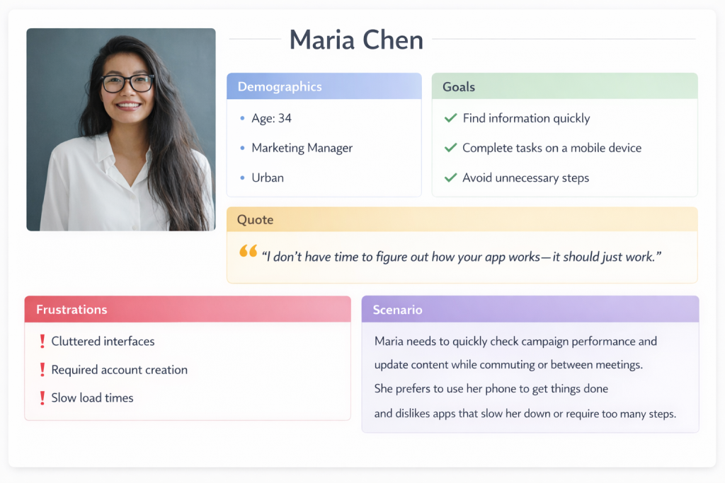
Personas only pay off if a team actually uses them, not if they get filed away in a slide deck and never mentioned again. In design discussions, they give you a simple way to stay grounded: “How would Maria approach this? Would she understand what this button does? Would this flow help her finish the task, or would it add friction?”
They’re also useful when new ideas start flying around. If someone proposes a new feature, personas let you respond with something more concrete than opinion: “Which persona is this for?” “What goal does it support?” “Does it solve a problem we’ve actually seen, or are we designing for a hunch?” That shift away from “I think users want…” and toward “Our research suggests…” can defuse a lot of unproductive debate.
Most products need more than one persona, because different groups come to the same system for different reasons. A university site is a good example: prospective students, current students, parents, faculty, and community members all show up with different questions, time pressures, and levels of familiarity. At the same time, more personas aren’t automatically better. Three to five strong, research-backed personas usually beat a dozen thin ones. The goal isn’t to cover every demographic category; it’s to capture the differences that actually change what the design needs to do.
EXERCISE 6.8 – Build a Persona from Observation
You are part of a team that has been asked to improve the self-checkout system at your campus bookstore. Your job is to start creating a user persona. You will begin this task by using direct observations and experience following these steps:
- Observe three to five people using the self-checkout system. Note their approximate age range, how confidently they approached the machine, where they hesitated, and whether they needed help.
- Based on those observations, draft a single persona using the format described above. Include a name and brief background, goals (what they’re trying to accomplish), pain points (where the current system makes things harder), and a short quote capturing their mindset.
- Write a brief paragraph (three to five sentences) explaining what additional research you would need to do to strengthen this persona. What are you guessing about that you’d want evidence for?
Share your persona with a partner. How do your personas differ? What assumptions did you catch yourself making? How does this connect to the audience profile questions from Chapter 2.2?
Interviews and Contextual Inquiry
INTERVIEWS are one of the best ways to understand users because they not only tell you what people do, they also instead help you uncover why they do it. A good interview can surface motivations, workarounds, mental models, and small frustrations users have gotten so used to that they don’t even think to report them in a survey. It also gives you something you can’t get from a fixed questionnaire: the ability to follow the conversation where it needs to go, especially when a participant says something unexpected or reveals a problem you didn’t know to ask about.
Most UX interviews are semi-structured. You might have a list of key topics, a rough sequence, a few must-hit questions, etc.; however, you don’t treat it like a script. If the participant brings up something important, you pause and dig in. That flexibility is where a lot of the value comes from.
The best interview questions are open-ended and grounded in real events. You’re trying to get participants to describe what actually happened, not to agree with your framing. “Tell me about the last time you tried to…” will usually get you a story: what they were doing, what they expected, where they got stuck, what they did next. A question like “Do you find it easy to…?” tends to produce a quick yes/no (or a polite answer) and doesn’t give you much to work with. The goal is simple: get people talking about their experience in their own terms, then listen for the details that reveal needs, assumptions, and pain points.
Crafting Effective Interview Questions
Ask about specific experiences: “Walk me through the last time you renewed a library book online.”
Avoid leading questions: Instead of “Was the checkout process confusing?” ask “How did you find the checkout process?”
Probe for details: “You mentioned that was frustrating—can you tell me more about what happened?”
Ask about workarounds: “When the app doesn’t do what you need, what do you do instead?”
Explore the context: “Where are you usually when you use this? What else is going on around you?”
CONTEXTUAL INQUIRY is basically what happens when you stop relying on people’s memory and watch them work in real life. Instead of interviewing someone in a conference room and asking them to describe what they usually do, you observe them doing the task in their actual environment. If you’re studying how nurses use an electronic medical records system, you learn far more by being at the nursing station during a shift than by showing them screenshots in a quiet room. The real setting exposes the stuff people forget to mention: interruptions, time pressure, noisy surroundings, handoffs between coworkers, and the little workarounds they’ve built to cope.
The mix of observation and interview is what makes it so useful. You can see what someone does and then ask about it right away. When a participant takes an unexpected path, you can follow up in the moment: “I noticed you clicked there instead of using the menu. What were you looking for?” Those quick questions often uncover the best insights, because they reveal the user’s logic and expectations, not just the “official” workflow.
Interviews and contextual inquiry also raise the ethical stakes, especially when you’re in workplaces or other sensitive environments. The basics from Chapter 5.5 Engagement and Consultation apply directly: you need to consider issues like informed consent, confidentiality, and participant welfare. People should know what they’re agreeing to, how recordings or notes will be used, and that they can stop at any time. Researchers also need to be careful about privacy both in terms of the participants and anyone else who might appear in the background. Making a better product is a good goal, but it doesn’t outweigh the responsibility to treat participants with respect.
EXERCISE 6.9 – Mini Contextual Inquiry: Observe, then Ask
Contextual inquiry is a method where you observe someone performing a task in their real environment and then ask follow-up questions in the moment. Try this simplified classroom version.
Setup: Form into pairs where one person is the “user” and one person is the “researcher.” The user will attempt a task on a real digital product while the researcher observes and takes notes. After five minutes, switch roles with a different task.
Suggested User Tasks:
- Find the office hours and email address for a specific instructor on your university’s website or LMS.
- Figure out how to request a transcript through your school’s student portal.
- Find and compare two products on an e-commerce site using only the site’s filtering tools.
- Locate the return policy for a specific online retailer without using the site’s search bar.
Researcher Instructions: Watch silently for the first two minutes. Note where the user clicks, pauses, backtracks, or shows signs of frustration. Then, during the remaining time, ask short follow-up questions in the moment: “What were you expecting to find there?” “What made you click that link?” “What would you try next?”
After both rounds, discuss:
- What did you notice as a researcher that the user didn’t mention on their own?
- What did you learn as a user from being observed—did the experience make you more aware of your own habits or assumptions?
- How does this compare to the kind of audience analysis you’d do before writing a document (Chapter 2.2)? What can observation reveal that inference alone cannot?
Surveys
Interviews are great for depth, but they don’t tell you how common something is. That’s where surveys shine. With a well-built survey, you can reach hundreds or thousands of users and start seeing patterns you’d never pick up from a dozen interviews: how many people are primarily on mobile, whether satisfaction differs by user segment, which features matter most, where people tend to drop off, and so on.
The catch is that surveys are easy to do badly. A vague question produces vague data. A leading question produces the answer you were hoping for. A long survey produces half-finished responses as people bail. Keep questions clear and specific, avoid loaded wording, make response options cover the full range without overlapping, and keep the survey as short as you can while still getting what you need. Here are 10 Best Practices for writing good survey questions.
In UX work, surveys tend to show up in a few common roles:
- Screeners to recruit the right participants for interviews or usability tests (e.g., “Have you done X in the last month?” “What device do you use most?”).
- Satisfaction surveys to track attitudes over time, often using standardized scales so results are comparable.
- Feature prioritization surveys to help teams make tradeoffs when they can’t build everything at once.
- Post-task surveys given right after someone completes a task, when their reaction is immediate and specific.
Used well, surveys don’t replace interviews; rather, they complement them. Interviews help you discover what to ask. Surveys help you find out how widespread the answers are.
The System Usability Scale (SUS)
One widely used survey instrument in UX research is the System Usability Scale, a ten-item questionnaire that provides a quick, reliable measure of perceived usability. Developed in 1986 and validated across thousands of studies, the SUS yields a score from 0 to 100 that can be compared against established benchmarks. A score above 68 is considered above average; scores above 80 indicate excellent usability. The SUS is freely available and can be administered after any user interaction with a product.
Surveys are strongest when they’re part of a mixed-method approach. They’re good at telling you what is happening at scale (e.g, what people use, where they struggle, how satisfaction differs across groups) but they usually can’t tell you why.
So when a survey shows that users are abandoning a feature or rating it poorly, you bring in interviews, contextual inquiry, or usability testing to figure out why that is happening. Conversely, when interviews uncover a need or a frustration, a survey can help you answer the next question: is this a niche issue, or something many users experience?
That’s why mature UX research programs rarely lean on a single method. They combine approaches so the weaknesses of one method get covered by the strengths of another: breadth plus depth, numbers plus stories, patterns plus explanations.
From Research to Design
Research gives you raw material. Design asks you to make choices. The bridge between the two is analysis and synthesis: figuring out what the data is really telling you and turning it into something a team can act on. This is where the qualitative research skills you’ve built in technical communication start to matter a lot.
After interviews, researchers usually go back through recordings and notes looking for patterns. What comes up again and again across participants? Which problems show up independently in multiple conversations? Where do people seem to share the same mental model, and where do they interpret the product in totally different ways? That pattern-finding work, often called thematic analysis, is what turns a pile of individual stories into insights you can design around.
Those insights can be captured in a few common formats:
- Personas, which condense patterns into a handful of user types.
- Journey maps, which lay out the steps users take to reach a goal and spotlight friction points and missed opportunities.
- Empathy maps, which organize what users say, think, feel, and do so the team keeps the user’s perspective in view.
These artifacts aren’t just “research deliverables.” They’re reference points the team can come back to when discussions around design choices drift toward assumptions or personal preference.
One of the most important outcomes of synthesis is a clear statement of user needs and design requirements. The best requirements are specific and tied to evidence. If research shows that users abandon checkout because they don’t see shipping costs until the end, a requirement might be: Show estimated shipping costs before checkout begins. If research shows mobile users are squeezing tasks in between other activities, a requirement might be: Make core tasks completable in under 60 seconds on mobile. These become criteria you can use to judge design solutions: does the new flow meet the requirement or not?
SYNTHESIS EXERCISE: From Research to Requirements
The information above describes how research findings get turned into personas, journey maps, and design requirements. This exercise asks you to practice that synthesis step.
Scenario: Imagine you’ve just completed five interviews with students who use your university’s online financial aid portal. Here are condensed findings from those interviews:
- Student A: “I never know where I am in the process. Did I submit everything? Is something missing? I just get silence until there’s a problem.”
- Student B: “I filled out the FAFSA on my phone because I was at work, and half the form didn’t display right. I had to go home and redo it on my laptop.”
- Student C: “My parents don’t speak English well, and they had to verify some of the financial information, but the portal doesn’t offer anything in Spanish.”
- Student D: “Every time I call the financial aid office, they tell me something different than what the portal says. I don’t know which one to trust.”
- Student E: “I got an email saying my aid was adjusted, but when I logged in, nothing looked different. I still don’t know what changed or why.”
Your Task:
Identify three to four themes or patterns across these responses.
Write two concrete, evidence-based design requirements that address the most critical user needs. Follow the format described above: each requirement should be specific and tied to something you observed in the data. (For example: “Provide a visible status tracker showing each step of the financial aid process and its current state.”)
Identify one question you’d want to investigate further, either through more interviews, a survey, or contextual inquiry. Explain what method you’d choose and why.
Discussion: Compare your themes and requirements with a partner. Did you prioritize the same issues? How did you decide what was most critical? This is where the “learn, build, test, revise” cycle from Section 6.1 starts to become concrete.
Taken together, the research methods in this chapter give you a practical way to move from guesswork to understanding. They help you see users more clearly, identify the problems that actually matter, and translate what you learn into personas, maps, and concrete design requirements a team can use. That’s the through-line of UX research: creating user-centred decisions grounded in evidence, not assumptions.
