6.6 Visualizing Data
Natalie Boldt and Loren Gaudet
Although much writing in the social sciences is heavily text-based (and later in this chapter we’ll outline some of the common writing assignments you’ll encounter), sometimes it can be more helpful to explain data and relationships within data with visuals in addition to words. Generally speaking, data is often summarized and communicated in text, tables, or figures. Using graphics and images can help readers understand relationships within data that might not otherwise be obvious, or might be difficult to explain in text alone. The use of graphics and images to explain data is called data visualization.
The most common kinds of data visualization that you’ll be encountering in your writing are tables and figures. There are many “how to” guides on creating tables and figures—the Writing Centre at University of North Carolina at Chapel Hill has an excellent resource on tables and figures—but the purpose for this section is to emphasize the importance of audience when using tables and figures.[1]
Tables
Tables present data—usually numbers or text—in columns. They can make a paper easier to read because they take data that’s listed and remove it from the written text. Tables are a tool for communicating data, and a well organized table can really make a difference in terms of readability. So, it’s important to consider how you want to organize your data so that your reader can appreciate its significance.
The elements you might want to consider when organizing your data include legend or title, column titles, and the table body. Tables are usually read from top to bottom, so the title should be placed above the table body, at the top. Column titles simplify and clarify a table, giving the reader tools to understand the table components. The table body is where you present your data. Reflect on what you want your readers to understand about your data, and try to organize that data in a way that facilitates readability (remember, tables are read from top to bottom, so group like elements so they read up and down instead of across). In Table 6.1, for example, the author is trying to communicate the similarities and differences between two different coffee chains. You can see that they’ve identified several key points of comparison—features that might help a coffee-drinker recognize, choose between, and maneuver in each establishment—and have listed these points across the top of the table. These features are the aforementioned “like elements” (elements common to both coffee chains) that should be read up and down.
Table 6.1
Cafe Comparison
| Restaurant type | Branding | Sizing | Price | Drive-through option? | |
| Tim Hortons | cafe | brown and red | small, medium, large, extra large | $ | almost always |
| Starbucks | cafe | green and white | short, tall, grande, venti | $$ | often |
Figures
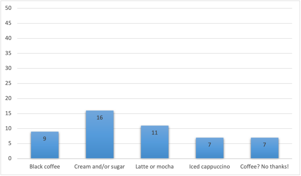
Figures are images or graphics of results (that is, what the data means) and are often depicted in the form of graphs, charts, drawings, or maps. It’s important, then, to think critically about what you're trying to communicate to your reader, and whether or not a figure would be helpful. If you’re struggling to convey in words a relationship between your different data points, then a figure might be the right choice. Which kind of figure you choose often depends on the kind of relationship you want to highlight. For example, pie charts and bar graphs (like the ones in Figures 6.3 and 6.4) usually illustrate proportions or comparisons, whereas maps and photographs are often good choices for spatial relationships.
Figure 6.3
Coffee Preferences Based on a Voluntary Survey of 50 Undergraduate Students at the University of Victoria
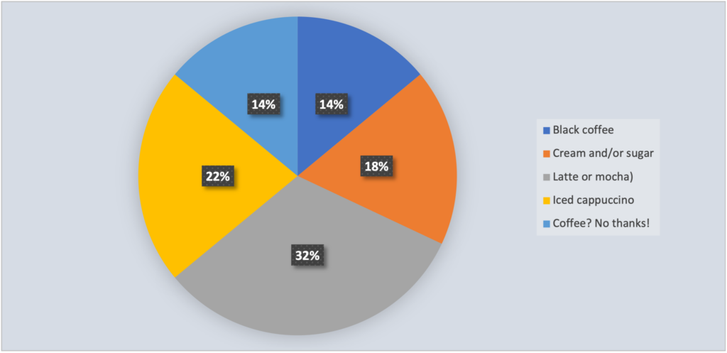
Figure 6.4
Coffee Preferences Based on a Voluntary Survey of 50 Undergraduate Students at the University of Victoria
Figures typically include a caption, the image or figure itself, and contextual information. Whereas tables are read top to bottom, figures are usually read from bottom to top, so captions should appear below the figure. When including contextual information, try to capture relevant information that will make the figure as simple, clear, and accurate as possible for your reader. Remember, a figure is just another tool that you have to help your reader be the best reader they can be! By keeping your figures simple, clear, and accurate, you’ll be able to more effectively communicate your data and their relationships to your audience, and help them to more fully appreciate your point.
Five General Tips
Regardless of whether you’re using a table or a figure, your reader will likely expect certain elements when presenting your data visualization. Think of these as some of the generic conventions of data visualization:
- Give each visual a numbered caption that includes a clear descriptive title.
- Refer to the caption number within the body text and discuss its content.
- Label all units (x and y axes, legends, column box heads, parts of diagrams, etc.).
- Provide the source of the data and/or visual image if you did not create it yourself.
- Avoid distorting the data or image.[2] [3]
Suzan Last, author of Technical Writing Essentials (an open-access textbook on technical writing), outlines these five guidelines for integrating data visualizations into your paper. But, it’s always important to check with your instructor or TA if you have any questions. Remember, genre provides us with some of the common features of communication, but there are no hard and fast rules. If you’re unsure, ask!
Consider Your Audience, Consider Your Data
When deciding how to present your data, consider how numerous and complex your data are. If you can present your results clearly in a sentence or two, then you probably don’t need a table or a figure. But, if you find it difficult to capture your data in this space, tables and figures can be good resources for communicating lots of information in a condensed manner.
This advice from Kieran Healy (whose book, Data Visualization: A Practical Introduction, is available for free in its draft form) reminds us of the importance of considering our audience when making choices about data visualization. Healy also explains that there is considerable debate about the benefits and uses of visualizing data, and that at times this visual work can be superfluous and even misleading.[5]
If we can emphasize any one point when it comes to data visualization, it’s crucial to consider the audience, purpose, and topic. (For a refresher on the Rhetorical Triangle—audience, topic, and speaker—go to Chapter 3.3.) This also means knowing who your audience is! (For more on this, see Chapter 3.4.) In fact, audience, purpose, and topic are crucial elements of all the writing you’ll do in a social science course.
- On a related note, because we know that our audience for this chapter is made up primarily of students in the social sciences—or, at the very least, students enrolled in a social science course or two!—we’ve opted to format the tables and figures in this section in APA style, even though the rest of the chapter is in Chicago. ↵
- Susan Last, Technical Writing Essentials: Introduction to Professional Communications in the Technical Fields (University of Victoria, 2019), chap. 3, sec. 4, https://pressbooks.bccampus.ca/technicalwriting/chapter/figurestables/ ↵
- Note that what Last refers to as a “caption” is different from what the APA Manual calls a “note.” A note is clarifying information (e.g., clarifications, definitions, copyright information, etc.) that appears below a table or figure. A caption, here, means the figure or table number and title. For additional information about how to format visual data in APA, see Chapter 7 of the association’s manual. ↵
- Kieran Healy, Data Visualization: A Practical Introduction (Princeton University Press, 2019), chap. 1, https://socviz.co/lookatdata.html. ↵
- Healy, Data Visualization, chap. 1. ↵
