Part 3: The Medium
3.9 Visual Aids for Communication
Learning Objectives
- To understand the role of visuals in risk communication.
- To appreciate the variety of visual aids that could be used to communicate scientific information.

When used thoughtfully, visuals can help to engage an audience and clarify a message that may be unclear with words alone. Because visualization is a useful tool for communication, it can also be applied to risk communication. But how do you include visuals in a meaningful way?
Example
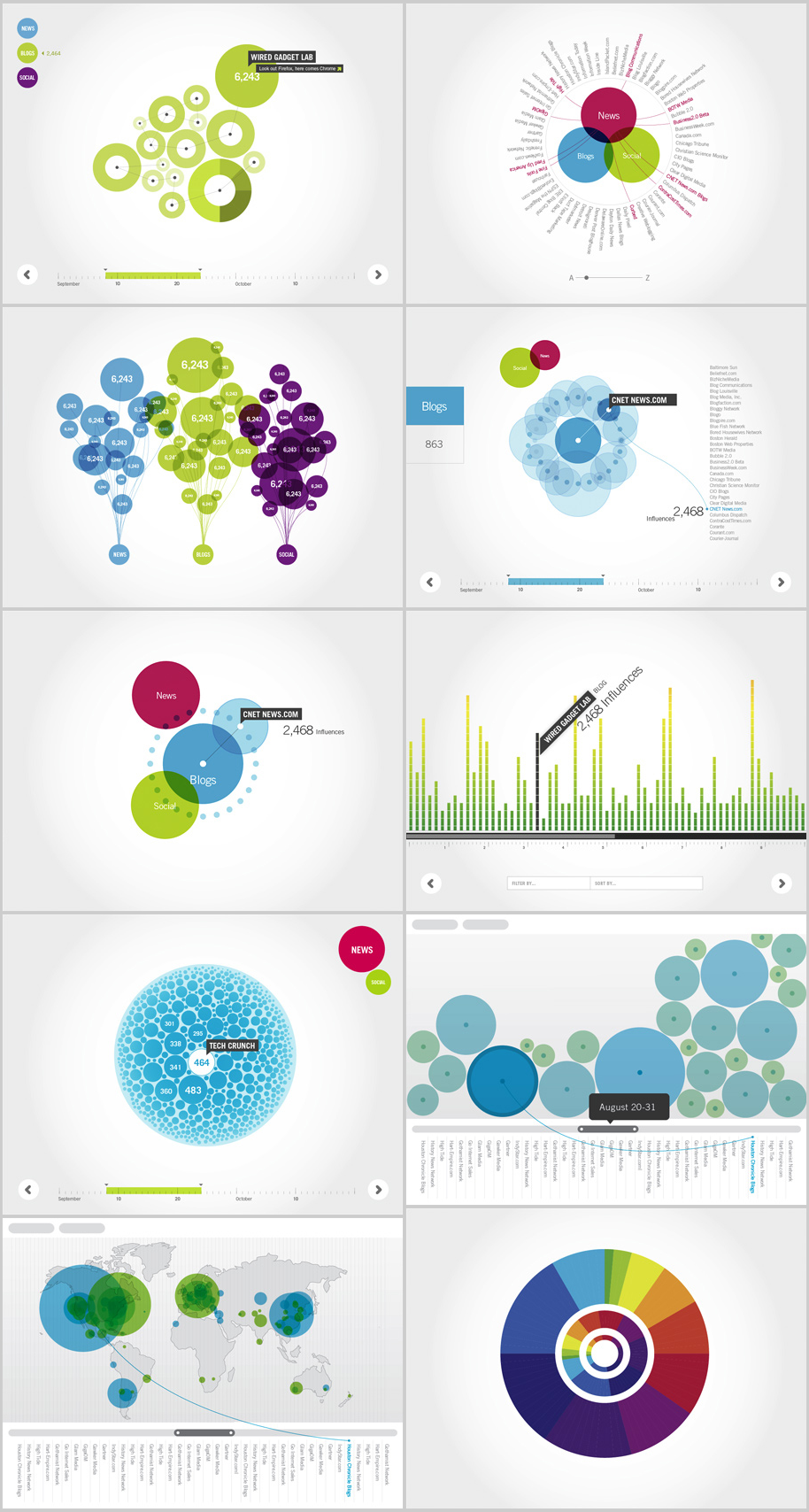
Visualization in Public Health
For examples of how data can be displayed using visuals in an engaging and digestible way see:
Principles from information visualization
Information visualization, also called ‘infovis’, is an emerging discipline in computer science that combines aspects of computer science, human-computer interaction and psychology. Infovis is used to help a viewer (i.e. the audience) find patterns in data and discover new questions or avenues of inquiry. This kind of visualization summarizes data in a more intuitive, easily interpreted manner. There are a number of principles from infovis that can be applied when considering using visuals to enhance risk or science communication:
- Use visuals when data are needed to communicate a message but, on their own, the data is difficult to understand. Visuals can help to highlight the most important trends in the data while de-emphasizing less important information.
- When developing visuals, first identify your problem (why do you need visuals?), then break down the solution into domains that each require a data visual.
- When using tables to display data, use rows for items and columns for dimensions. Dimensions could be quantitative (e.g. age), ordered (e.g. shirt size), or categorical (e.g. favourite food).
- Visual encoding is the process of assigning a graphical representation to a specific item and dimension.
- The graphical representations of items are called marks—the symbols we use to indicate a data point. A mark might be a dot, a line, or 3D volume.
- The graphical representations of dimensions are called visual channels. These are things like size, colour, shape and spatial position. We can use multiple visual channels to encode multiple dimensions on a single mark. Different channels are effective for different types of dimensional data.
- In choosing visual channels, ensure they are distinguishable (i.e. the value can be clearly identified in the graph) and separable (i.e. the marks can be accurately perceived).
- When using volume and 3D visualizations, be mindful of occlusion and perspective distortion. Occlusion occurs when a chunk of 3D data blocks the view of another piece of data, while perspective distortion occurs because the most distant point in a 3D visualization can’t be seen as easily as a closer point.
- Colour occupies three separate visual channels: hue (what we think of when we think colour), saturation (a scale from greyish to full hue), and lightness (a scale from black to white, with the full hue in the middle). Hue works well for categorical data when there are fewer than eight categories, while saturation and lightness work well for ordered data. Avoid rainbow maps for qualitative data and try to stick to colour maps that use continuous gradients of saturation or lightness.
- Remember that your audience may include some people who perceive colour in different ways. Consider using colour pallets that can be viewed by persons with colourblindness.
- Choose the right chart for the type of data you’re trying to visualize. And for any chart you use, remember the remove to improve principle: your chart should contain no redundant ink.
Communicating risk using visuals
Displaying risk using visuals can be an effective way to distill complex probabilities into intuitive symbols. The book “Risk Communications: A Handbook for Communicating Environmental, Safety, and Health Risks” by Lundgren and McMakin (2018) makes several recommendations for communicating risk using visuals. For instance, they recommend using visuals to:
- Display the risk and its effects. Where possible, show visuals of the risk or use symbols to represent things like health effects (e.g. a skull and crossbones to indicate death).
- Show the size and significance of the risk. Use visuals to demonstrate “who” is at risk or “how” risk changes with time. These types of information can be displayed using lines or bar graphs. When using numbers, remember that those numbers should be comparable (i.e., use denominators).
- Display the likelihood of the risk. Flowcharts, tables, charts, and numbers can be used to demonstrate the probabilities of a risk as well as show uncertainties. For example, Lundgren and McMakin (2018) demonstrate how health risks can be visualized by illustrating a group of people and indicating how many of these people have acquired an illness (e.g., a probability of 1/10 people acquiring X disease could be indicated by drawing the outlines of 10 people and indicating one person with the illness by either using a symbol or by filling in the outline of 1 person).
- Personalize the risk. When communicating about risk, people ultimately want to know how this risk might affect them, their family, and friends. To provide a visualization people can connect with, communicators can use photos that show some of the symptoms/warning signs of certain health conditions. To depict magnitude, risks can also be visualized in terms of “lifetime” or “annual” risk (i.e., how many people are affected per lifetime or per year).
- Provide comparisons and a scale. Visuals are especially useful for comparing the effects and magnitudes of risk. Consider using visuals to compare and contrast risks (e.g., for lung cancer risks, you could compare risks from radon exposure versus smoking). You can also use analogies where appropriate to help make the risk relevant. One way to draw comparisons (while using an analogy) is to use a ‘risk ladder’. A ‘risk ladder” can be used to provide the upper and lower levels of a risk, and a viewer can look at the ladder and place themselves at the appropriate level, which can help contextualize their risk in relation to other people. One issue with risk ladders as identified by Lundren and McMakin (2018) is that those who see themselves at “lower on the ladder” can become complacent.
- Show as many aspects of the risk as possible. Where there are multiple contributors to risk, consider using multiple (but simplified) visuals as compared to fewer complex visuals.
Adapting risk visuals for different media
How risk is displayed will also depend on the medium. While the above principles about communicating risk using visuals apply generally, it is important to remember that different media will be digested differently by the audience. You can use social media or polling as a tool to understand which visuals might be received best by your target audience. Below are some recommendations for visuals depending on the medium.
Printed materials (newsletters, fliers, fact sheets, brochures, etc.)
Because an audience can grab printed materials to read at their leisure, these materials can often contain more content and be more comprehensive than other forms of communication. For this reason, they are often the only medium where number-intensive graphs, charts or flowcharts can be incorporated appropriately.
Posters
Posters are designed to draw in an audience’s attention and highlight a few key messages. For this medium, make sure text and visuals are visible from at least a couple of feet away and the message is immediately evident.
Presentations
Similar to posters, consider distance—will everyone in the room be able to see what is on the slide? Try to tailor any visual content to the background, knowledge, and interest of the audience. See the section below on slide design.
News Media
As discussed in previous sections, news media can be a quick way to reach a large audience. As such, graphics shared in this medium should grab attention quickly and be kept uncluttered and simple. For television, consider drawing on emotion by showing images of people or things affected by the risk, where appropriate.
Social Media
Social media products can be interactive and tailored towards specific interests of the audience. This is a suitable medium for animations and short videos that people will want to share.
Slide design
Before you begin making presentation slides, jot down what you want to say before you open your slideware and begin designing. To do this, reflect on your audience, motivation for presenting and the overall narrative. Once you have your script, identify the key messages and sections of your presentation in order to see where slides can support our messaging.
When you’re ready to design your slides, keep the following in mind:
- Don’t fall into the standard template trap. Break out of the mold by trying a new tool like Keynote or Prezzi or by beginning your Powerpoint deck with blank white slides. You can also use alternative fonts—try fontsquirrel.com. Be aware though that if you aren’t using your computer to present, some of these features or fonts won’t show up on another device, so you may first need to save your presentation as a PDF to preserve the formatting.
- Say a duck, show a duck. Have a visual to support each key idea you present. This might be actual data, or it could be an image that reflects an abstract concept. For royalty-free images, try Freeimages.com, compfight.com, and thenounproject.com. Tweak your images using apps that apply colour and lighting effects, and don’t be afraid of making full-screen graphics.
- Apply a consistent colour theme. Use the eyedropper tool to pull a colour out of an image you’ve used on a slide and use that colour to accent text you want to highlight.
- Keep text to a minimum. Instead of writing full sentences on your slides, prompt yourself with keywords and key phrases. Try the 5 x 3 rule to limit the text: 5 lines x 3 words per line, or 3 lines x 5 words per line.
For more on slide design and presenting, check out Nancy Duarte’s book Slideology, and Garr Reynolds’ sites presentationzen.com and garrreynolds.com.
Infographics
A visualization is a single static or interactive representation of some data, while an infographic is a textual narrative supported by multiple visualizations.
An infographic has three parts: 1) the visual (the graphical elements, colour scheme, etc…); 2) the content (the underlying numbers, statistics and data); 3) and the knowledge (the main insight you want to communicate).
When designing an infographic, consider:
- First identify your key message, or the knowledge you want to convey, before collecting support data.
- Some of the data you use can be represented visually while others may need to be written out into a brief text.
- Placing elements in an orientation that leads the viewer through the data and the text to a big a-ha! moment.
- Use online tools like piktochart.com, canva.com, and venngage.com to easily create infographics.

Takeaways
Key Takeaways
- Visuals can serve as an engaging and concise medium by itself (e.g. infographic, poster) or to enhance another medium (e.g. presentation slides, graphs and diagrams in reports).
- Visuals can help communicate complex ideas about risk by making the scale and significance of the risk more cogent, personalized and tangible for the audience.
Media Attributions
- Data visualization project for Google © Push and Play is licensed under a CC BY (Attribution) license
- Your Fridge + Food Safety infographic © U.S. Department of Agriculture is licensed under a CC BY (Attribution) license
