2.1 Design Patterns
Branding is creating a personification of a company with a distinct personality, style, attitude and culture. The persona should be relatable to the target audience (i.e. ideal customer). Creating a brand with authenticity is often touted as the chief focus for marketers when thinking of creating images, such as a logo, for a business.
Branding, then, ultimately becomes directly tied to the employees or staff members who maintain customer relations, marketing, communications and the visual integrity of the company.
Use these guidelines and ask yourself the following questions:
- Who is my target audience? Who is the company trying to reach? What are their primary, most primitive needs that this company meets? What actions do I want them to take? (Think of primitive needs such as time, money, reputation, etc.)
- What are my customers’ perspectives on this type of business topic? What is my role and relationship to the potential customers?
- What colours are associated with this type of business? For example, blue represents calmness and peace vs. red which represents energy and passion[1]
Getting a clear understanding of a target audience is important to be able to communicate a brand effectively. It also enables you to imagine your audience as you design and re-design. Keep asking yourself whether the design is clear to your audience. How could it be better?
Creativity and freedom of design choices make designing often overwhelming for beginners. As you start out, it is helpful to know the rules and principles that effective designs use to capture attention and clearly communicate ideas.
C.R.A.P Design Principles
The following principles of design are described by Robin Williams in The Non-Designer’s Design Book and summarized below. The term C.R.A.P is an easy-to-remember acronym that stands for Contrast, Repetition, Alignment, and Proximity.
Contrast
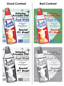
This principle states that contrast makes things easy to read and helps important things stand out. Think of black on white: It is easy to read, and there is no question as to why it is the default text colour. Creating contrast in designs makes your images and text pop-off the page. The image below shows how the best contrast (images on the left) comes from using lighter colours and opacity behind the text.
Alignment
This principle states that every elemental design choice should be made explicitly with a visual connection to other elements.
Aligning elements to the area of focus and ensuring padding and margins are aligned will significantly increase the legibility of content in a document or web page. Proper alignment also creates an aura of prestige around the design. Proper, consistent line spacing and use of active "white space" in design work are critical to a design’s success. Active white space helps individual’s eyes to be drawn to the most important elements of a design. In web design, proper use of active white space prevents cluttering of the screen and helps individuals focus on the main ideas being communicated.
A good example of this can be seen on the website CSS Grid Garden[2]. Even though the background is not white, effective use of space between elements helps draw the eye to the various components on the page. Less clutter means the average individual will spend more time browsing the important content.
Repetition
This principle states that using the same shape elements or repetitive linking styles and fonts on a website creates consistency. Website menus, for example, have hyperlinks grouped together repeated with the same design (font, font size, font weight, ect.). This pattern helps you understand that these parts of the web page are links used to navigate the site. In creating an effective website, Robin Patricia Williams believes repetition is the single most important principle of the four. (Williams, R., 2008)
Another good example of repetition is bullet lists. Each bullet represents another idea in the list.
Repetition in user interface (UI) design reinforces the context of your language or particular style. For example, the template used to design this textbook uses the same styles for Headings (font, size, boldness, alignment). This visually shows the structure of the document and helps to navigate the content.
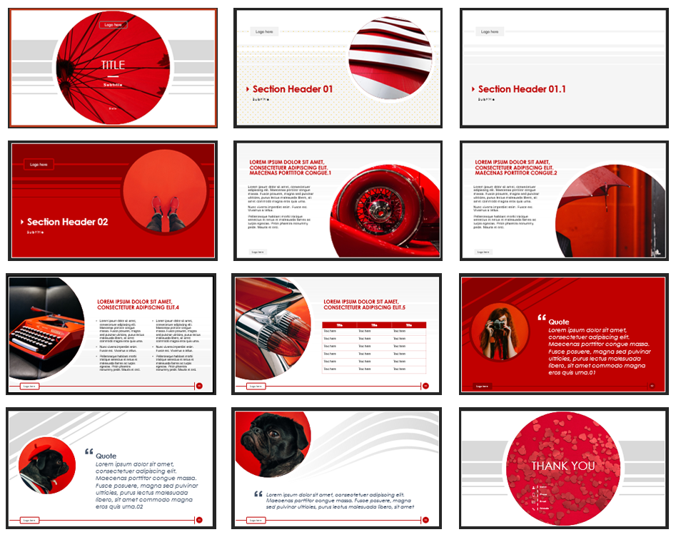
In branding, repetitive lines or colour schemes are critical. Deciding on a shape or line angle and repeating it throughout your design will help a brand gain recognition. Name recognition will be enhanced, and the individual will come to see particular colours, shapes or fonts as a direct indicator of a brand’s product/services. The image below shows consistent font, colour and style choices for a presentation.
Proximity
This principle states that related elements should be positioned closely together.
For example, a tag-line for a business typically comes directly underneath the logo or brand name. Another example would be address lines: the street number, street name, city, postal code and country should all be stacked one under the other for readability: You will not have to scan the entire design looking for pieces of related information.
In web design, proximity, like alignment, plays a very important role in the look and feel of your site. Intuitive themes and website layouts will be easy to read and scan. These will utilize the two principles of alignment and proximity to the fullest extent. For example, ensuring that headings, which should be designed to be easily scanned, would be placed directly above paragraphs that provide more information about that heading.
We will use these principles throughout this course as you build your own project websites.
If you are interested in more of the psychology behind visual marketing and branding, I highly recommend skimming the 41 Top Visual Content Statistics For 2025 [3], by Adam Connell.
EXERCISE 2.2 Business Graphic Logo
A friend has asked you to review their new business logo. What revisions to contrast, alignment, repetition and proximity would you suggest?
Note: This logo was recreated from an outdated logo of a famous hotel chain, can you guess which?
Media Attributions
- contrast
- repetition
- not-effective-design
- Color Psychology. (n.d.) Color Psychology. https://www.colorpsychology.org ↵
- Codepip. (n.d.) https://cssgridgarden.com/ ↵
- Connell, A. (2025 January 1). 41 Top Visual Content Statistics For 2025. https://adamconnell.me/visual-content-statistics/ ↵
The effective use of blank space around elements in (web)design. For example, space between an image and text on a web page.
