xtine burrough and Michael Mandiberg
Before touching the pencil or mouse, one can exercise these design principles as lessons in weight distribution.
The grid is created by the x-axis along the hips and the y-axis from the toes to the head.
- Standing straight, with perfect posture, and your body weight equally balanced on two feet (with legs hip-width apart and a slight bend in the knee, if we might be so specific), puts a body in a stable, symmetric position.
- Now that you have achieved symmetry, lift one foot off of the floor. Bend the lifted leg at the knee as much as possible without falling over. You may feel somewhat less stable and off-balance. Your body has achieved asymmetry.
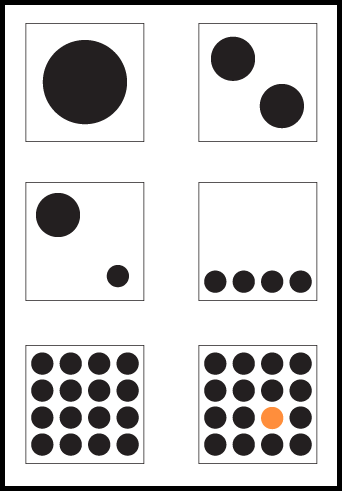
Preview of the completed exercises

In the following Chapter 3 exercises (2 – 7) the compositions will each be created within one of six individual squares (illustrated here). All of the exercises are created in one single document. For these compositions the grid is simple: the horizontal and vertical intersection at the middle of each square is the grid. See and “feel” the visual weight that is constructed between the four quadrants (upper left, right, lower left and left) in each composition.

