22 3.4 Organizational Principles
Alex Hass
Compositional organization is complex, but even more so when applied to typography. Typography is a complicated medium to work with as it contains two levels of information (display and content), and requires its components to be read in proper sequence with proper emphasis, good legibility, and strong contrast to the substrate. Many elements need to be organized to allow the reader a seamless experience when reading the content. Designing with type requires adept handling of the hierarchy, refining and designing the display elements for focal emphasis and also refining the quiet details of the text block so it sits perfectly and quietly in its space.
Think of these organizational systems as ‘large picture’ constraints. Constraints (rules) allow a designer to focus on the other aspects of a project. Designers make myriad decisions about concept, style, visuals, form, font, size, spacing, colour, placement, proportion, relationships, and materials. When some factors are determined in advance, the designer is able to spend time with the other parts of the project. A well-defined constraint can free up the thought process by taking some decisions off the table. The following eight organizational systems cover composition for type (but can also be applied to general composition), including the traditional ordering system of the grid.
Grid
A grid is a network of lines that structure the placement of elements and create relationships between them. A grid divides a design space into vertical and horizontal divisions. The grid is a bridge between a design rationale and the beginning of implementation for each project, converting a concept into a structured space. It is an exceptional tool for composing, arranging, and organizing every kind of visual element. The grid usually works invisibly in the background, but it can become an active, visible element as well. Designers use grids in a variety of ways. They can be very disciplined about adhering to their grid structure from the beginning of a project, or use it as a starting point for composition and order.
Grid systems create a formal composition in comparison to more casual compositional approaches like transitional or random structures. Grids are often used in publication and web design because they introduce consistency and guide hierarchy. Consistent margins and columns create an underlying structure that unifies the multiple pages of a document or website, and makes the layout process more efficient.
The plan for the grid comes from the content and concept of the design project. The objective in creating a grid is to set up the relationships between elements in a way that stays true to the concept. For instance, if your publication is a book of poetry, the grid must have generous amounts of negative space and generous leading. If, on the other hand, your publication is a daily newspaper, the spacing relationships cannot be so generous, and have to clearly show which article relates to which image. Hierarchy of information must be very clear as well, and should reveal which news item is most important and which is least important. A well-made grid will naturally allow the designer generous scope for variation in image style, text size, and graphic style. Often, a grid that is complex allows for some freedom where the designer can introduce a new element or effect.
A grid activates the entire surface of a project by making all of it available for active elements. It helps create both stable symmetrical and dynamic asymmetrical compositions. By breaking down space into smaller units, grids encourage designers to leave some areas open rather than fill up the whole page.
Types of Grids
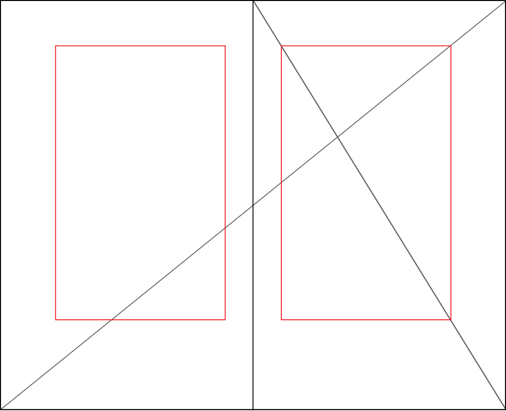
The golden section is also known as the golden ratio, golden mean, or divine proportion, and it is found in mathematics, geometry, life, and the universe — its applications are limitless (see Figure 3.30)
The golden section is a ratio — a relationship between two numbers — that has been applied as an organizational system in art, design, and architecture for centuries. Expressed numerically, the ratio for the golden section is 1 : 1.618. The formula for the golden section is a : b = b : (a+b). In other words, side a is to side b as side b is to the sum of both sides.
Graphic designers use the golden section to create grids and layouts for websites and books. Photographers use it to compose the focal point of an image and also to compose the elements found in an image.
Single-Column Grid
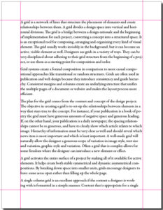
A single-column grid is an excellent approach if the content a designer is working with is formatted in a simple manner (see Figure 3.31). Content that is appropriate for a single-column grid consists of main text for the text block, a few levels of display type, possibly some images, and finally page numbers.
The main column of this style of grid must sit properly on the page, held in place by the negative space that surrounds it. To determine the right amount of negative space on the top, bottom, and sides of the page, a designer usually considers facing pages as a spread. In books and magazines, the two-page spread, not the individual page, is the main unit of design. The designer determines the right amount of negative space on the top and bottom, gutter (inside margin), and outside edge. The spread is often symmetrical, and the pages mirror one another.
Multi-Column Grid
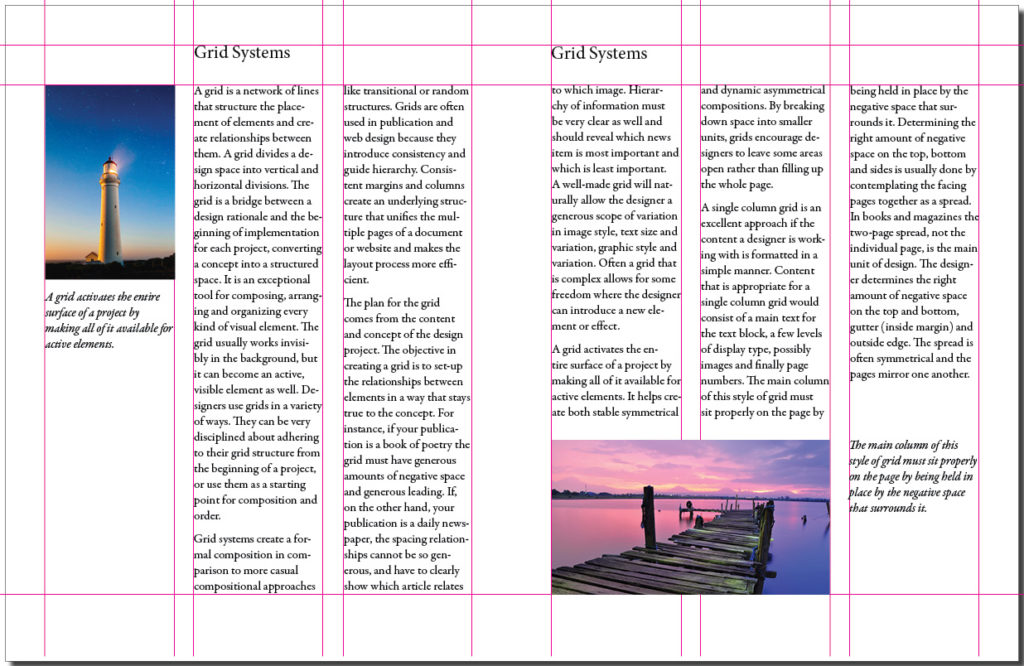
When a designer creates a grid for a document that is complicated, he or she may use multi-column grids because they allow for a complex hierarchy and provide more options for integrating text and visuals (see Figure 3.32). The more columns you create, the more flexible your grid will be. You can use the grid to articulate the hierarchy of the publication by creating zones for different kinds of content. The columns act as visual units that can be combined or kept separate. A photo can span several columns or be reduced to the width of only one. A text can also occupy a single column or span several.
Hang Lines
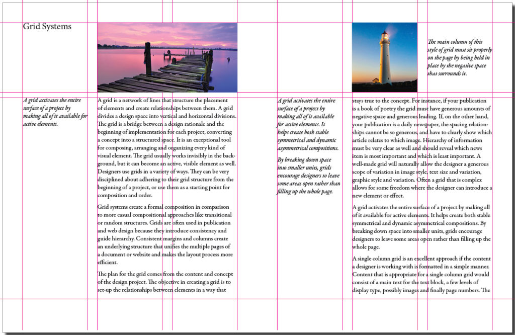
In addition to creating vertical columns in a grid, you can also divide the page horizontally. Often, a designer determines the placement of hang lines (see Figure 3.33) by applying the rule of thirds (breaking up the horizontal plane into three equal parts). This compartmentalization allows the designer to reserve certain sections for images and others for the text block.
Modular Grid
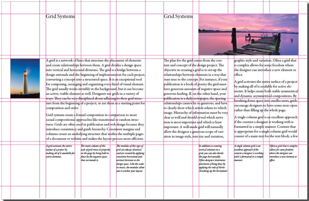
The modules of this type of grid are always identical and are created by applying consistent horizontal and vertical divisions to the design space. Like the written notes in a musical score, the modules allow you to anchor your layout elements and typography to a specific rhythm. With a modular grid, the horizontal guidelines are tied to the baseline grid that governs the whole document. Baseline grids serve to anchor most of the elements to a common leading (typographic line spacing). See Figure 3.34.
Baseline Grid
A baseline grid is the horizontal grid that determines where all of the type will sit. You can also use it to determine the placement and edges of your visual and graphic elements. To create a baseline grid, determine the right font, size, and leading for your text block, then go to your baseline grid settings (found with the other grid preferences) and change the baseline grid default (usually 12 pt) to the leading you will be using in your text block.
Axial
The axial system has a simple premise — all elements are arranged on either side of an axis or line. You can centre the axis itself in the composition or, for a more energetic asymmetrical composition, place the axis off centre to either the right or left. This compositional strategy creates a dynamic negative space on the opposite side. To create a more complex composition, designers often employ an axial system combined with another — like the radial or dilatational system (see below). They may also use double-axis compositions with the axes either parallel to each other, or intersecting to create a strong focal point. There are many instances of the axial system in nature — tree trunks, roots, and vines are good examples. Like these organic examples, an axis does not need to be a straight line — it can be curved, zigzag, or circular.
Modular
Modular organization is a compositional method that utilizes rigour (by constraining the shape) and freedom from structure (modules can be any size and placed anywhere in the space). Modules can also be uniform and contained within a structure (a grid). A module is a fixed element used within a larger system or structure. For example, a pixel is a module that builds a digital image.
Bilateral
The bilateral system is based on mirrored symmetry and is therefore both classic and ubiquitous. Because of its predictability, it is a challenge for designers to work with. Nature exhibits many examples of bilateral composition — the bodies of mammals, the points of a snowflake, and the fractal symmetry of plants are all quickly understood, appreciated, and then dismissed by the viewer. To create a composition based on the bilateral system, a designer must make some part of the composition unusual. The designer can achieve this by moving the axis to a diagonal, off-centre location, which allows the negative space on either side of the bilateral composition to be varied. A second method is to introduce a double axis: the designer uses two columns of bilateral information and varies the size of each.
Radial
The radial system takes its name from the sun — all elements are arranged like rays coming from a central focal point. This is a dynamic compositional strategy as it references dynamic action. Examples of the radial form from the natural world, such as explosions, flowers, spiders, stars, and so on, are all exciting and dynamic. Much like it is difficult to handle the natural objects, reproducing a radial composition is not that easy. There are problems with legibility unless type is very carefully placed and scaled. Every line of type starts and ends in a different place, so continuity is also hard to control. For example, a designer may take a traditional approach so the text reads from top to bottom, or an inverse approach so the text reads from bottom to top. Arranging the text on either side of centre may also be effective. It is important to try placing the type in different positions and in different relationships until it works with the composition and is easy to read.
As in the organizational systems we have discussed, designers can add radial points for a more complex composition or combine a radial system with one that adds stability, such as a grid, axial, or modular system.
Dilatational
Dilatational systems mimic the look of still water when a pebble is dropped into it, creating rings of greater and greater size as they move away from the centre. Like the radial system, this composition has a strong focal point, but unlike the radial system, the composition creates rings, not rays, that expand from the centre. Other examples of this system are the iris of the eye or representations of sound waves.
Random/Spontaneous
Creating a composition that does not follow any compositional principle is not as easy as it sounds. Finding examples of randomness is also one of the most difficult exercises for design students. Random design does not follow any rule, method, direction, or pattern. If a project calls for randomness, it is best to start with materials that are conducive to spontaneity like Jackson Pollock’s paint throws. Allow the elements that fall to organize themselves naturally — eventually, a dynamic and fresh composition should emerge. Random compositions exhibit visual qualities that are not patterned, aligned, or horizontal. Instead, they tend toward compositions that exhibit overlapping, cropping, angling, and textures.
Transitional
The transitional typographic system is defined by the layering of lines of text into informal textured planes and shifting tonal bands. The shapes and bands created with this layering approach are not aligned with one another, and create an overall organic atmosphere. This visual approach is often used in Post Modern design where the clear legibility of text is not as important as the visual atmosphere of the design. Text planes in Post Modernist works point the viewer to the main theme of the message rather than articulate the message in clean, concise text arrangements.
Compositions using the transitional approach have a light, airy look that abstractly imply cloud formations or wood grain patterns rather than solid concrete shapes created by using the grid or axial systems. A transitional composition has lively and active negative space, and can create an excellent ground for a vital focal point if it is in sharp contrast to the rest of the composition.
Attributions
Figure 3.32
Image includes: Photo by Stefanus Martanto Setyo Husodo used under a CC0 license and Cape Nelson Lighthouse, Portland, Australia by Joshua Hibbert used under a CC0 license.
Figure 3.33
Image includes: Photo by Stefanus Martanto Setyo Husodo used under a CC0 license and Cape Nelson Lighthouse, Portland, Australia by Joshua Hibbert used under a CC0 license.
Figure 3.34
Image includes: Photo by Stefanus Martanto Setyo Husodo used under a CC0 license and Cape Nelson Lighthouse, Portland, Australia by Joshua Hibbert used under a CC0 license.

