8.4 Exercise 4: Targeting saturation levels
xtine burrough and Michael Mandiberg
Image > Adjustments > Hue/Saturation can be used to increase or decrease the saturation of specific hues within the image. This adjustment is often used to make a dominant color appear more vibrant within an image, but the result can hard to notice if the image is not being viewed at 100 percent. Even then, sometimes it is easier to see the results of this image adjustment in the final print. Follow the steps below on your ch8-lastname-flower_curves.psd file to demonstrate this concept.
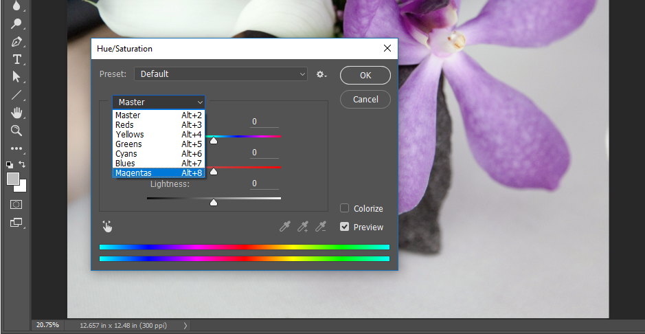
- Click Image > Adjustments > Hue/Saturation. Use the pull-down menu on the word, “Master,” to work specifically on the magenta areas of the image.

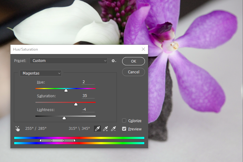
- Use the Saturation and Lightness sliders to modify the image. The image below demonstrates our settings, but remember that our monitors may be calibrated differently. It is best to eyeball these numbers, rather than follow our specific settings. Remember, be sure the image is showing at 100 percent (use the Zoom Tool to zoom in or out) before making any adjustments.

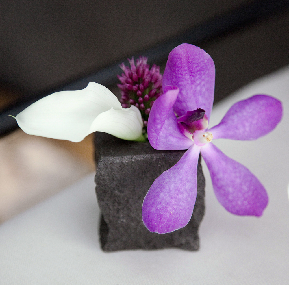
- When you are satisfied with your adjustments, click OK. The result should be similar to the image below. Save your work and you’re finished with this exercise and this chapter!

Attribution
“Digital Foundations – Intro to Media Design” by Xtine Burroughs and Michael Mandiberg is licensed under CC BY-NC-SA 3.0 / This is a derivative from the original work. Content is available under Creative Commons Attribution Non-Commercial Share Alike unless otherwise noted.
![]()

