4.4 Exercise 4: Creating body copy with the Type Tool
xtine burrough and Michael Mandiberg
Body copy is the content of an article, a book chapter, an essay on a web page, and so on. Body copy should be set within a text box in all of the Creative Cloud® programs. As body copy is usually set within rectangles, consider the overall shape of text to normally create a rectangular shape on the page. By utilizing a grid system, the production artist controls how many columns of text appear in the final layout.
The artist should be interested in creating legible body copy. Legible body copy is not too big, too small, too lengthy, too short, too light, or too dark. For a considerable amount of body copy (a full article, for example), the copy should be set in columns between 3.5 and 4 inches in length or 35 – 65 characters. This is the point at which many readers begin to read back over the words that they have already read. Instead of re-reading the same words, a 3.5 inch line of body copy encourages the reader to move to the next line of type at about the time that she is ready to move her eyes from right to left.
Assessing body copy is easy: squint your eyes while looking at the printed body copy. The overall grayscale value of the printed rectangle (body copy) should be about 40 – 50%. It should not read as stripes of black against the page. In this exercise we will consider adjustments that can be made if the copy is too light or dark.
- Create a new vertical guide at the end of the last “s” in Systems.
- The type tool will create a type box when you click and drag with the Type Tool instead of clicking one time and entering text. Create a type box at about 7.25 inches (vertically), between the two vertical guides. If you want to you can set a guide at 7.25 inches.In the example we have used a paragraph of “dummy” (or placeholder) text that graphic designers have been using since the 1500s. The text begins with the two words, Lorem ipsum, and is often simply referred to as “Lorem ipsum” (ie. “Put some Lorem ipsum in there for now, we should be receiving the copy in a couple of days.”). Lorem ipsum is used as placeholder body copy when the actual text is not available, as the letters within the Lorem ipsum text are more or less evenly distributed. Looking at “dummy text inserted here, dummy text inserted here” repeated enough times to create a block of body copy draws attention to itself as the repetition of such few amount of letters becomes a noticeable pattern. http://www.lipsum.com/ offers dummy text by the word count, paragraph count, and byte count. The text generator is at the bottom right of the web page. Generate two paragraphs of text.
- In the Control panel set your character fonts to Gill Sans (regular) was used at 11 points in this exercise. Copy and paste the Lorem ipsum text from the text file into the new text box.
- The body copy pasted into the new text box should be left-justified by default; but if it is not, use the Control or Character Palette to set the justification to the left. While the text is left justified, there is a sharp line created by the single letters in a column on the left side. This line extends to the headline, as it is aligned with the S in Systems. By the property of continuation, a line is made from the S to the body copy on the page. While this “line” created by the left margin is not as literal or heavy as the black line made in Exercise 2, it is just as relevant to the layout as it provides an intersection with the black line, further defining the grid on the page.
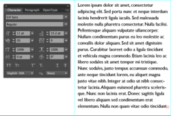
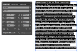
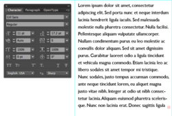
- Leading is the space between lines of type. The body copy is set at 11 points, and the leading is set at 15.2 points. This is traditionally referred to as 11/15.2. Insert the Type Tool into any area of the body copy and then press CMD + A on the keyboard to select all of the type within this type box. With all of the type selected, press OPT + Down Arrow to open the leading. In the following two images, the leading has been adjusted and the text box has been resized in consideration of the margin space at the right and bottom of the composition. Notice how opening or loosening the leading creates a slightly lighter grayscale value when you squint your eyes and look at the block of text. Be sure to save your work!

Example 1 – Leading is set to 15.2 pt (points) 
Example 2 – Leading is set to 15.2 pt (points) with line highlighted in black. 
Example 3 – Leading is set to 17.2 pt (points) to increase the line spacing Although this did not occur in our exercise, two other typographic problems to look out for are orphans and widows. An orphan is a single word that dangles on the last line of body copy, and a widow is a single word at the top of a new column of text, before a paragraph break. These are undesirable type happenings that create imbalance and draw attention to a place on the page where you don’t necessarily want the viewer to focus.

