ACC Chapter 13: Multiple Pages: Unity
Download Materials for Chapter 13
There are no files needed to complete this chapter.
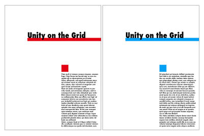
The results of the exercises are shown below.
Results of Chapter 13 Exercises
When you complete all of the Chapter 13 Exercises, you will have an INDD (InDesign) document and a PDF document. The two pages in the documents are illustrated here.

Multiples: Creating Unity
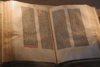
When creating multi-page documents, the grid is the principle way of organizing page elements. A grid divides a page into columns. An artist can follow the columns strictly, or use them as a rough guide to work within. The Gutenberg Bible visual example follows a very rigid grid structure: the two columns of text have the same line length, which is a measurement of how long a line of text is before it breaks to a new line (Fig 13.#) The two columns of text also have the same vertical length. When two pages are viewed together in an open book such as this, the pages are read together as a spread. The pages in this spread follow the grid in exactly the same manner.
However, the grid can also be used with much flexibility. In the visual reference example of the New York Times layout from 1918, the grid is more complex and versatile. This grid divides the page into eight columns.
Counting the columns on the page is easy: find the smallest column and measure its width. Then divide the width of the page with the width of the smallest column. An eight-column grid creates a very flexible layout. Instead of eight even columns of text flowing down the front page of the newspaper, some larger graphic elements like the headline at the top of the page expand across all eight columns. Other text blocks are given visual emphasis, or create visual hierarchy on the page by spanning multiple columns. Also notice the distribution of negative space on the page. Since there is a lot of text on this front page, contrast is created by increasing the leading in some areas of the page and by allowing some of the text blocks to expand beyond one column.
Visual References


