Chapter 6. Topographic Maps
Overview of Topographic Maps
In this chapter you will learn how to read and use topographic maps. This is a critical skill to prepare you to learn about more complex geologic maps.
Map Parts, Orientation, & Scale
A map is a plan view (viewed from above, also known as map view) representation of an area on Earth’s surface. Topographic maps are maps that illustrate the topography (vertical shape, such as hills) of the mapped region. Geological maps are maps that illustrate the rock types, rock ages and other geological features of the mapped area.
Every map has the following elements:
- Map area or data frame: the part of the map illustrating the map area itself;
- Legend: a guide to the different symbols used on the map, such as lines representing roads and streams;
- Scale: this defines the relationship of distances on the map to real distances in the area that the map represents;
- North arrow: indicates the direction of geographic north; and
- Title: a name that generally describes the location of the map area.
The topographic and geological maps produced by Natural Resources Canada (NRCan, which includes the Geological Survey of Canada, GSC), and the United States Geological Survey (USGS) are oriented with north at the top of the map. Therefore if you move towards the top of the map you are moving in a northerly direction, and if you are moving towards the bottom of the map, you are moving towards the south. Any movement to the right or left will be towards the east or west, respectively.
Coordinate Systems
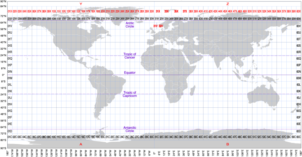
There are two coordinate systems commonly used to define positions on Earth’s surface: geographic (latitude and longitude, abbreviated lat/long) and universal transverse mercator (UTM). Latitude and longitude coordinates are used on NRCan and USGS maps; they are simpler to interpret and plot on a map than UTM coordinates. UTM coordinates are more accurate and are used in navigation and field work. Often geologists will report coordinates of important features using both coordinate systems.
Geographic Coordinates: Latitude & Longitude
The longitude is an imaginary line that circles the globe and is oriented so that it passes through the north and south geographic poles (Figure 6.2, top label). Starting with the 0° longitude line (zero degrees, known as the Prime Meridian) that passes through the town of Greenwich, England, the lines of longitude increase to 180° in both directions east and west of the Prime Meridian, meeting at a line of 180° longitude that passes through the Pacific Ocean. Lines of longitude converge as you move north or south of the equator, eventually intersecting at the geographic poles.
It may help to visualize longitude lines if you think of an orange, which when peeled will show the sections of orange oriented like longitude lines that section the Earth into segments.
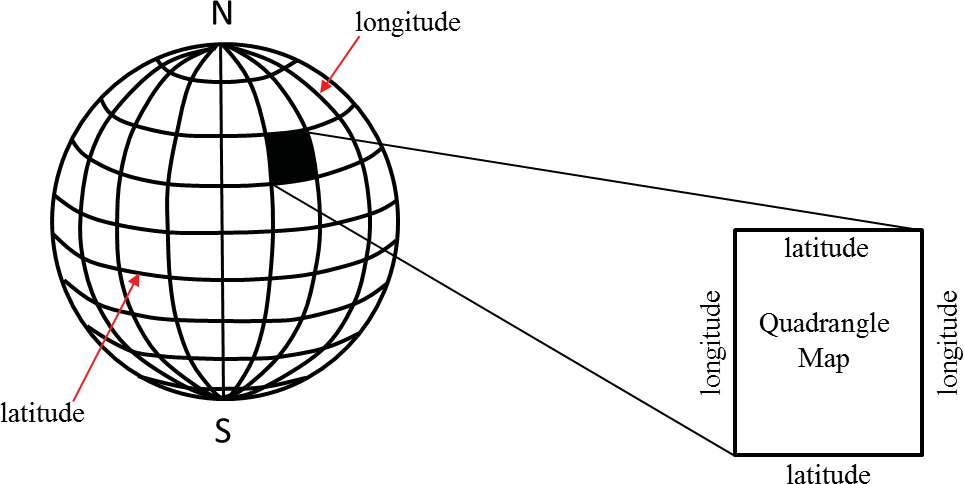
Lines of latitude are imaginary lines that circle the globe parallel to Earth’s equator (Figure 6.2, lower label). The 0° latitude line is the Earth’s equator, and latitude lines increase up to 90° north or 90° south of the equator. The North Pole has a latitude of 90°N, and the South Pole has a latitude of 90°S.
This grid system allows a position on Earth to be uniquely defined with a set of longitude and latitude values. The values for latitude are always identified by their position N or S of the equator, and the longitude is identified as E or W of the Prime Meridian.
A degree of latitude or longitude (abbreviated with the ° symbol) represents a large distance on Earth, therefore degrees are further subdivided into minutes, which are further subdivided into seconds. Note that a minute or second of distance is not the same as a minute or second of time. There are 60 minutes (abbreviated 60’) of distance in 1° of latitude or longitude, and there are 60 seconds (abbreviated 60”) of distance in one minute. An example of a precise location on Earth’s surface would be 52°07′ 59.00″N, 106°40′ 12.00″W (the coordinates for Saskatoon, SK). This is read as “52 degrees, 7 minutes, 59 seconds north latitude, and 106 degrees, 40 minutes, 12 seconds west longitude.”
These coordinates are often converted into decimal notation. For the example above, the decimal notation coordinates are 52.133° N, 106.67° W. To convert between decimal degrees and degrees/minutes/seconds notation, use the formula: Decimal Degrees = Degrees + (Minutes / 60) + (Seconds / 3600) or use a converter on the internet (for example, on the US Federal Communications Commission website).
Note that the distance between two degrees of longitude is not the same when you are at the equator as when you are at a location in northern Canada. As the lines of longitude approach the poles of Earth, they are closer together (as illustrated in Figure 6.2), and the distance each degree, minute, and second covers is smaller. Longitudinal distances in degrees, minutes and seconds are not absolute distances like metric units are (e.g., metres).
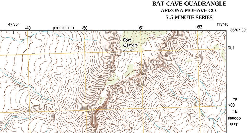
The latitude and longitude coordinates of NRCan maps are found along the edge of a map. On USGS topographic maps the latitude and longitude coordinates are found at the corners of the map (Figure 6.3). Often, topographic and geological maps represent an area of Earth that is smaller than one degree of distance. UTM grid co-ordinates are also present along the edges of the map (e.g., the values written as 4001 and 252 in the upper right).
The top and bottom edges of USGS topographic maps are oriented parallel to lines of latitude. This is also broadly the case for NRCan maps, however, the closer the map area is to the North Pole, the more the curve of the lines of latitude will influence the distances between points on the map (since the closer to the pole, the smaller the regions defined by the lines of latitude and longitude). Near the north pole, the map may have very different distances at the top and the bottom, particularly for maps that cover large areas. In some maps the lines of latitude curve to prevent distorting the distances between the lines of longitude (Figure 6.4).
In Figure 6.3, the top edge of the map is a latitude line, so the coordinates that change as you move along the top of the map (to the east or to the west) must be longitude coordinates, since the latitude does not change.
Projections
A projection is the result when a three-dimensional surface is converted so that it can be represented on a two-dimensional surface, such as a map. Whenever a 3D object is rendered in 2D, there is distortion. In other words, distances between positions will not always be accurate, especially for positions closer to Earth’s poles. There are different methods of rendering regions of Earth onto maps that attempt to deal with such distortion, but distortion cannot be eliminated.
The typical global map of Earth is generated by wrapping a cylinder around a globe representation of Earth, with the edges of the cylinder oriented vertically, so that the edge of the cylinder touches the globe along the equator (Figure 6.5). We then imagine a light source at the centre of the globe that casts shadows of all of the globe’s features onto the inside surface of the cylinder. These shadows are then traced onto the inner surface. Unwrapping the cylinder then shows a two dimensional map of Earth. This type of projection is called a Mercator projection.
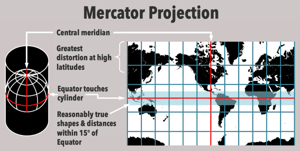
Since the equator was in contact with the inner surface of the cylinder, there is no distortion of features along the equator. But the further away from the equator you move, the more distorted the map becomes. This can see this distortion by examining a typical world map, which are usually created using a Mercator map projection. On this kind of map, Greenland will appear to be a similar size to South America, but in reality, South America is nine times larger than Greenland. (You can view an animation comparing the actual size of landmasses with their Mercator projection here.)
Also note that maps with this kind of projection never reach 90° latitude, either north or south. This is because light emanating from the globe will be moving almost parallel to the edges of the cylinder when it escapes from the globe at and near the geographic poles. Another distortion in these maps is the appearance of Antarctica as a continuous land mass that runs along the southern edge of the map. Antarctica is a circular land mass centred around the south geographic pole, rather than a long narrow island as seems to be indicated on the map.
The scale of the map is another factor that leads to distortion on maps of Earth. As you move north or south from the equator, the scale of the map expands. For example, if you use a ruler to measure 1 cm of distance at the equator, this will convert to a certain distance on the ground. But 1 cm measured further north or south of the equator will convert to larger and larger distances on the ground, depending upon how far north or south you go.
A strategy used to minimize distortion on maps is to zoom in and only render a small region of Earth’s surface into the 2D map. The smaller the region, the less distortion will occur on the map.
UTM Co-ordinates
The UTM co-ordinate system is another system for determining points on Earth’s surface. You will not use the UTM system in the lab exercises in this chapter, but it is important to be aware that this other coordinate system exists since it is broadly used by geoscientists in the field and in navigation. The reason the UTM system was developed was to allow for more precise calculations of positions on Earth’s surface for navigational purposes. Longitudinal degree distances change as you approach the poles of the Earth due to the curvature of Earth’s surface, resulting in distortion of distances on maps in these regions. This makes it difficult to accurately calculate positions for navigation using latitude/longitude coordinates in northern regions. The UTM system uses a slightly different approach to map out regions on Earth’s surface to decrease the amount of distortion on maps using this grid system.
The UTM system divides the Earth into 60 zones that are 6° of longitude wide (Figure 6.6). Zones 7 to 22 cover Canada. The polar regions of Earth’s surface are not included in the UTM system, so points north of 84°N do not have UTM coordinates (note that this is further north than the most northerly islands in the Canadian Arctic).
Within each zone, there is a central meridian (line of longitude) and there are 3° of longitude on either side of this central meridian. Positions within each zone are defined by how far north of the equator they are (the northing value), and their position relative to the central meridian of each zone (the easting value). The central meridian of each zone is given a value of 500,000 m. In practice, points east of a zone’s central meridian will have easting values that are less than 500,000, and points west of the central meridian will have easting values greater than 500,000.
The most important thing to remember when using UTM coordinates is that you must specify the zone for any position you are reporting; the easting position is not measured relative to the Prime Meridian, so without knowing the zone, you will not be able to accurately find the position on Earth’s surface (for example, the UTM coordinate position for the University of Saskatchewan, Saskatoon, SK is UTM Zone 13U, 388107.09 E, 5776949.85 N).
Map Scale
All maps are a scaled-down version of the region of the world that they depict; if this were not the case, then the map that a person must carry would be the exact same size as a city (if it is a city map) or the size of a province (if it is a provincial map). The word “scale” refers to the amount of reduction the map represents. All maps include at least one type of map scale to indicate the relationship between the area on the map and the area of the region it represents in reality.
Map scales are provided so that a map reader can determine exactly how much distance is actually represented on their map, or to measure the distance between two points on a map, or even to calculate the gradient (slope) of a hill or river. The two commonly used map scales on a topographic map are the bar scale (or graphical scale) and the fractional scale (also known as the ratio scale). When interpreting maps, you might also find it convenient to use a scale that relates the units you use on a ruler with the units in the map region (e.g., 1 cm = 10 km). This is called a verbal scale.
In Figure 6.7 there are three bar scales; each bar is a graphical representation of distance on the map, and it is up to the map reader to decide if they want to measure distances in kilometers, meters, miles, or feet. Notice that each bar scale has the starting point (zero) within the interior of the scale, and not on the end of each scale.
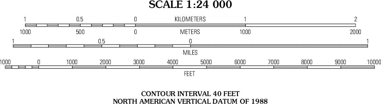
At the top of Figure 6.7 there is also a fractional scale of 1:24,000. No units are reported for fractional scales because the ratio of a fractional scale is valid for any unit of measure, provided that it is the same unit on both sides of the ratio. For example, if we use centimetres, then at this map scale, 1 cm on the map is equivalent to 24,000 cm on the ground that the map represents (i.e., the distance between two locations in the real world). If our map was the same size as the area that it is representing (say for example, a map of the room you are currently sitting in), then the fractional scale of your map would be 1:1 and the map would be the exact same size as the room.
This is, in essence, the definition of a map: a scaled-down version of the region it represents. Maps that are greatly scaled down (greatly reduced) are called small scale maps even though they represent large sections of Earth. For example, a 1:500,000 map will show a large section of Earth, but small details are lost (such as building locations or small streets), whereas a 1:12,000 map is a large-scale map even though it shows a much smaller region of Earth’s surface, but greater detail can be seen (such as buildings, roads, and other landmarks).
Converting Between Scales
If your map only has a ratio scale and you want to measure distances from the map, you’ll need to convert the ratio scale to a verbal scale. You can do this in a few easy steps:
1. Pick convenient units. Choose a unit that will be easy to work with on a map. If you will be making measurements using a cm ruler, then choose cm.
2. Write the ratio scale with your selected units on either side. A scale of 1:500,000 becomes 1 cm = 500,000 cm.
3. Convert the right-hand side (the bigger number) to the largest unit you can without having a decimal value.
![\[ \mbox{500,000 cm} \times \frac{\mbox{1 m}} {\mbox{100 cm}} \times \frac{\mbox{1 km}} {\mbox{1000 m}} = \mbox{5 km} \]](https://pressbooks.bccampus.ca/geolmanual/wp-content/ql-cache/quicklatex.com-c82c510e065b8283616dfdb6b2b254f3_l3.png "Rendered by QuickLaTeX.com")
4. Check: Make sure your units cancel out except for the largest unit.
5. Done! You have converted the ratio scale of 1:500,000 to a verbal scale of 1 cm = 5 km.
Using Contour Lines to Interpret Topographic Maps
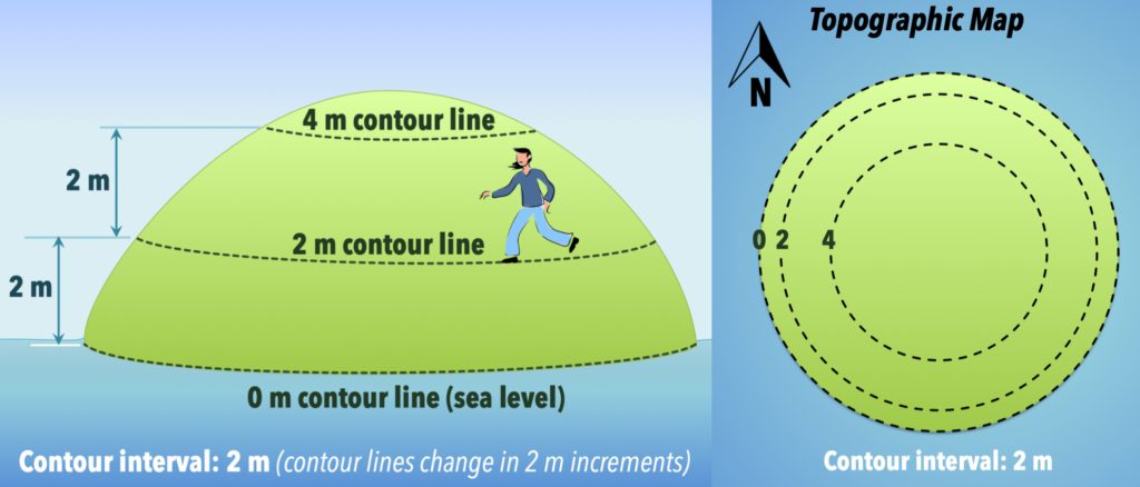
Contour lines allow us to add a vertical dimension to a plan view map. Contour lines represent elevations above sea level at specific intervals within a map area. Since each individual contour line connects points of equal elevation, if you were to follow a contour line across a map area in the real world you would be walking at the same elevation while walking along that imaginary line. If you were to move off that line, you would be either walking up or down in elevation.
Let’s explore the concept of contour lines with a thought experiment. Imagine if you are on a small circular island in the ocean, and you walk from the shore up to 2 m above the shoreline (Figure 6.8, left). If you were to walk around the island and stay exactly 2 m above shore, you would be walking a contour line that represents 2 m of elevation above sea level. If you move off that line, you are either moving uphill or downhill. If you could walk uphill another 2 m from your first 2 m contour line, and if you stay at that elevation (4 m above sea level) while circling the island, then you have walked the 4 m contour line. The vertical change in elevation between these two adjacent contour lines is called the contour interval, which in this case is 2 m. If you were to transfer these imaginary lines onto a map (Figure 6.8, right), you would see three lines forming concentric circles that represent 0 m (the seashore or sea level), 2 m and 4 m, and your map would look like a bull’s eye pattern.
Contour lines on topographic maps are often shown as brown or black lines, and all maps will have a contour interval that is specific for that map. Note that the elevations represented by the contour lines are not always labeled on each line. In Figure 6.3, every fifth contour line is labelled with an elevation, and is darker than the contour lines that lie between; these darker contour lines are called index contours. The use of index contours allows a map to be easier to read and is also more appealing visually, especially when the contour lines are numerous and closely spaced to one another. The reason they appear every fifth contour line is because generally index contours are every 10, 50, 100, 500, or 1000 m or feet, so the index contours are evenly spaced between these distances (i.e., every 2, 10, 20, 100, or 200 m or feet, respectively).
To determine the elevation of each contour line you must first know the contour interval for the map. By using the values of two adjacent index contours, one can easily calculate the contour interval between each line. For example, there are four contour lines between the 5200 ft and 5400 ft index contours on Figure 6.3, which means that there are four contour lines separating the 200 ft of elevation between the index contours. These divide up that 200 ft of elevation change into five sections of equal elevation change. If we divide 200 ft by five sections, each intermediate contour interval represents a 40 ft elevation change (in this example, the contours are 5200, 5240, 5280, 5320, 5360, and 5400 ft).
To verify this, locate the 5200 ft index contour on the western side of the map in Figure 6.3, and increase the elevation by 40 ft each time you cross a contour line while traveling east (to the right) towards the 5400 ft contour line. Luckily there is no need to do this calculation to find the contour interval on a complete topographic map, as all topographic maps give the contour interval at the bottom of the map near the bar and fractional scales (see Figure 6.7). The contour interval must be obeyed for each contour line on a map. For example, if the contour interval is 50 m, then an example of possible contour lines on such a map would be 50 m, 100 m, 150 m, 200 m, and so on; you would not expect to see the contour interval suddenly switching on the map to 240 m, since that is not a multiple of 50 m.
You may be wondering why some contour lines are closely spaced in some areas of a map (e.g., the central portion of Figure 6.3) and why they are farther apart in other areas of a map (e.g., the western part of Figure 6.3). Let’s return to our circular island thought experiment, but modify it a little (Figure 6.9): if you are standing at 2 m above sea level on the island (on the 2 m contour line) and want to walk up the hill to reach the 4 m elevation contour, how far do you have to walk? The answer is – it depends! On the side of the hill with a gentler slope, you would farther before you reach a higher elevation of 4 m than you would on the steeper side. On a topographic map, the contour lines for the gently sloping side (the west side) of the hill are spaced farther apart than on the eastern side, because the distances between the contours are further apart horizontally on the western side. Even for a perfectly circular island you could have differences in the slope of the hill between the contours.
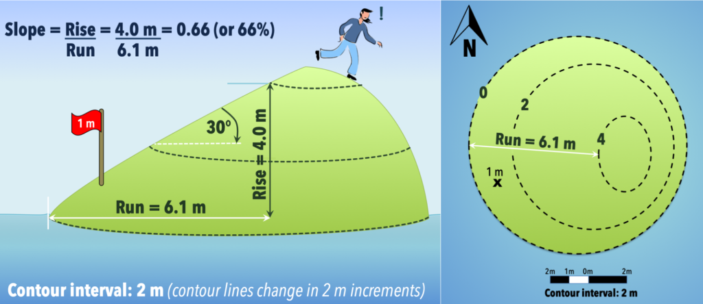
The slope of a surface (also described as the gradient or grade) is the change in elevation (the rise) divided by the horizontal distance over which the change in elevation happens (the run). You can calculate the slope of a hill or any region on a topographic map if you know the change in elevation between two points, and if you know the distance between those same two points (Figure 6.9). Slopes can be expressed as fractions, as angles above the horizontal, and may also be reported in meters per kilometer (m/km). In civil engineering contexts, such as describing the slope of a road, the slope may be expressed as a percent (rise/run x 100%).
If you are calculating the slope of a hill from a topographic map, remember to use the contour lines to determine the elevation difference, and the bar scale on your map to measure the separating distance.
In addition to contour lines, topographic maps will also have benchmarks (surveyed points) located at various locations on the map. These points are exact elevations above sea level that surveyors have measured, and they are commonly used to mark the elevations of mountains, hilltops, road intersections and airport runways. These benchmarks are rarely located on a contour line and instead are usually identified by a black “x” or identified with the letters “BM”. The benchmark also shows the specific elevation at the point, often in black (in contrast to the generally brown numbers on index contours). Benchmark locations will normally be found in the area between contour lines. For example, in Figure 6.9, which has a contour interval of 2 m, a benchmark of 1 m is present between the 0 m and 2 m contour lines.
A Note About Elevations Between Contour Lines
If you need to know the elevation of a point between two contour lines, and the point is not a benchmark, there are two ways to go about it:
1. Upper and lower bounds: If the point is not on a contour, then look at the adjacent contours. The elevation of that point will be greater than the lower contour, but less than the higher contour. For example, a point between a 10 m contour and a 20 m contour would have an elevation of greater than 10 m, but less than 20 m (sometimes written 10 m < elevation < 20 m).
2. Assume a linear slope: If you assume that the slope is linear between two contours (i.e., like the segment in Figure 6.9 between the 2 m and 4 m contours, rather than the shape of the hill in Figure 6.8), then you can use the distance from the contours to estimate the elevation. For example, a point half way between the 10 m and 20 m contours would have an elevation of approximately 15 m.
The span of the third dimension (elevation) represented by contour lines on a topographic map is called the relief. To calculate the relief of a topographic map,
- Find the highest and lowest contour line elevations on the map; then
- Subtract the two values.
For example, if the highest contour is 500 m, and the lowest contour is 100 m, then the relief is 400 m.
The hardest part of calculating the relief is finding these highest and lowest elevations on the map. You may need to find either the highest or lowest contour, and then count by contour intervals to find the other. For example, in Figure 6.3, the highest contour line is the line that runs through the letter “r” in Fort (of Fort Garrett Point). This contour line circles back and goes through the letter “o” in Fort. The elevation of this line is 6360 ft (based on the contour interval of 40 ft).
Using Water Features to Find the Uphill Direction
On the map in Figure 6.3, some of the index contours appear to be missing their identifying elevation numbers, however they are still easy to identify because all index contours are in bold (heavier lines). To find the lowest elevation on the map, find the lowest index contour line and continue counting lines in the downhill direction. An easy way to determine which way is downhill is to find a water feature such as a stream on the map; water is coloured blue on topographic maps, and lines representing flowing water such as rivers or streams are coloured blue. A dashed blue line such as that shown in Figure 6.3 implies that the stream is dry part of the year (this is called an intermittent or ephemeral stream).
Since water collects in low spots, such as a basin (where ponds, lakes, or oceans are found) or valleys (such as a stream or river valley), then the contour lines should represent decreasing elevation as you move towards a water feature on a map. Referring back to Figure 6.3, if you examine the contours you will see that the highest portion of the map is the central portion where Fort Garrett Point is located, and that any point west, south and east of this is a downhill direction. Note that the streams are flowing away from this Fort Garrett Point region. The lowest elevation will be a contour line that is crossing the stream just before leaving the map area.
Returning to the relief calculation, close examination of the contour lines reveals that the lowest contour line is in the lower right corner of the map. The contour line crossing the stream in this portion of the map represents an elevation of 4560 ft. So, for the map area shown in Figure 6.3, the relief of the map region is 6360 ft (highest contour) – 4560 ft (lowest contour) = 1800 ft.
The Rule of Vs for Contour Lines
There is a feature worthy of special note that occurs on topographic maps where flowing water such as streams and rivers erode the landscape and create valleys. Contour lines on a topographic map are deflected as they cross the valley, causing contour lines to form a “v” shape as they cross the water. The narrow end of the “v” points in the upstream direction. You can think of the “v” like an arrow that points uphill. This is known as the rule of Vs for contour lines. Notice in Figure 6.3 that the contour lines that cross the streams are pointing toward the central hill (Fort Garrett Point), which means that the streams are all flowing away from the central portion of this map and towards the edges of the map region.
Contour Lines for Depressions
Another feature you might see on topographic maps is a localized low spot, called a depression. Depressions could be features like sinkholes or volcanic craters, and lakes occur in depressions. If we drew contour lines for a sinkhole feature on a map, and the contours for the sinkhole didn’t capture an index contour, the sinkhole depression could be misinterpreted by a map reader as a hilltop. To prevent our hypothetical map reader from having a nasty unexpected fall, we need to provide the map reader with a different contour line feature to indicate that there is a depression in the landscape. Contour lines with small perpendicular lines (called hachure marks; Figure 6.10) are used for such depressions on a topographic map. Hachures are directed inwards towards the centre of the depression.
The contour interval for the map is still obeyed when contouring a depression. The difference is that hachure marks on the contour lines indicate that you should count down in elevation, not up, as you move towards the center of the hachured contour circles. A special case is if the depression is at the top of a hill or mountain (e.g., a volcanic crater). In that case, the first contour line that is hachured must be the same elevation of the closest contour line that is not hachured. The reason for the repeat is that a person climbing the hill will reach the highest contour line, and walk a little higher still, before descending into the depression (crater), and will therefore encounter the same elevation line again while descending (Figure 6.10, bottom).

Drawing Contour Lines and Topographic Profiles
Rules for Drawing Contour Lines
Constructing a topographic map is simple if you remember the following rules as you draw in contour lines on a map:
- Contour lines represent lines connecting points of equal elevation above sea level. You can think of contour lines like fences separating lower elevations from higher elevations.
- Contour intervals must be obeyed, therefore the contour line elevations can only be multiples of the contour interval. E.g., If the contour interval is 20 m, you can have contour lines at 20 m, 40 m, and 60 m, but not at 10 m, 30 m, and 50 m.
- Contour lines never cross, split, or end abruptly. They may appear to stop at the edge of the map area, but in reality if we had a map of the adjacent region, we would see that they continue. Note: Contour lines may appear to overlap if there is a vertical or overhanging cliff. In the case of a vertical cliff, the contour lines will appear to merge because they are right on top of each other when viewed from above.
- Contour lines make a “v” pattern as they cross streams and rivers (the rule of Vs for contour lines). The “v” always points towards the upstream (uphill) direction. Think of the “v” as an arrow pointing uphill.
Topographic Profiles
When working with topographic maps, sometimes it is useful to examine the landscape in profile. A topographic profile is a vertical cross-section or side image through a map that allows us to see how the topography varies along a line through the map. In Figure 6.11, the upper part shows a topographic map of a hill that contains two separate hill tops, and the bottom picture shows a topographic profile representing the profile along the line A-B on the map.
Notice that the topographic profile contains horizontal elevation lines at the same intervals as the contour lines on the topographic map. The elevation lines are spaced an equal distance apart as you move up the vertical axis. If you draw lines from the positions on the topographic profile where the contour lines reach the surface of the hill up to the same positions along the line A-B through the topographic map, they align with the contour intervals on the topographic map. This pattern is a key relationship we can use to construct topographic profiles.
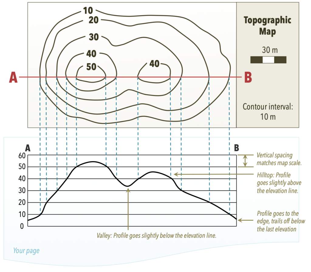
How to Draw a Topographic Profile
To construct a topographic profile, you need a blank piece of paper, a ruler, a pencil, and a topographic map. As you read the steps below, refer back to the topographic profile in Figure 6.11 as an example.
- Draw or select a line across the topographic map through a region of interest to you (e.g., through a hill) that you will use to draw your topographic profile. In Figure 6.11 the line is labelled A-B.
- Draw a parallel line the length of this line horizontally near the top of the blank paper. This is the x-axis of your profile.
- Draw y-axis lines on either size of the horizontal line. Make sure the y-axis lines are perpendicular to the horizontal line.
- Draw elevation lines by adding horizontal lines joining the two y-axes at the same intervals as the contour intervals. Include one elevation line below the lowest contour, and one above the highest. Unless you are told otherwise, draw the elevation lines at the same scale as the map. E.g., If the topographic map has a scale of 1:100,000, then use a scale of 1 cm per 10 m.
- Align your page with the x-axis parallel to the line on the topographic map. Using a ruler, transfer the elevation points from where the contour lines intersect the line on your topographic map straight down onto your paper at the corresponding elevation lines. Note: Only plot elevations that are at the intersection of the contour line with line A-B.
- Once the elevations are transferred to the elevation lines on your profile, connect the points with a smooth curve. You will have to estimate the position of the line between the points on the profile as best you can, so your line may differ slightly from other students’ lines.
- Check: Make sure hilltops are slightly rounded to represent the crest of the hill but be careful not to draw the hilltop too high or the profile will intersect the next elevation line. For example, the first hill on the left of Figure 6.11 has a top contour line of 50 m. Because there isn’t a 60 m contour line on this hill, we know that the hill’s highest point is some elevation between 50 and 60 m. Similarly, notice the elevation of the valley floor between the two hills: according to the topographic map the elevation is below 40 m, but not as low as 30 m.
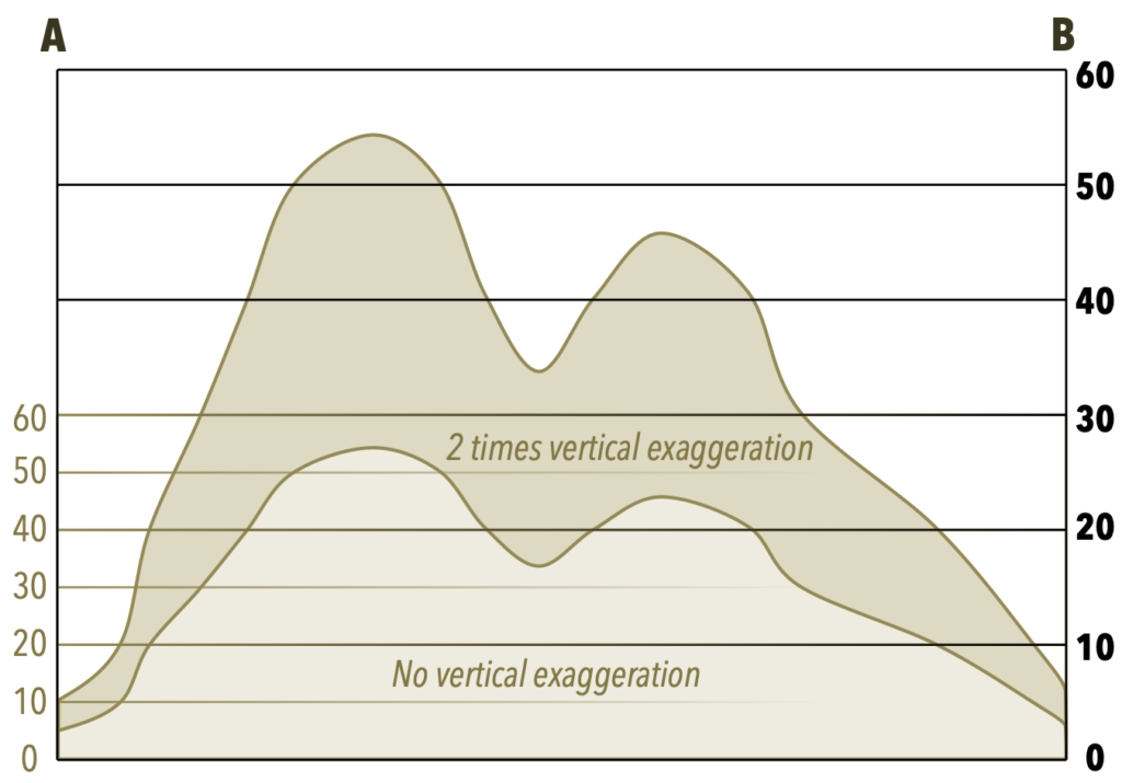
Vertical Exaggeration
Examine the topographic profile in Figure 6.11 and imagine what would happen to the profile if we changed the spacing for the elevation lines along the y-axis. When the vertical scale of the graph is larger than the horizontal scale on the map (for example, if we stretched the profile in Figure 6.11 in the vertical direction), the result is vertical exaggeration, and the features of Earth represented by your topographic profile will become distorted. You can compare the shapes of the profiles in Figure 6.12, and see the difference when the profile is stretched to twice its original height (i.e., 2 times vertical exaggeration). Vertical exaggeration is useful for illustrating features that might be too small to see with equal horizontal and vertical scales, such as small hills.
If you draw a profile with vertical exaggeration, you should note the exaggeration so that readers will understand that the landscape they are looking at is distorted. The vertical exaggeration is the ratio of the profile scale (vertical scale) to the map scale (horizontal scale). For example, let’s say your map scale (horizontal scale) is 1 cm = 50 m, and you draw a topographic profile for that map with a vertical scale of 1 cm = 25 m. You would calculate the vertical exaggeration as follows:
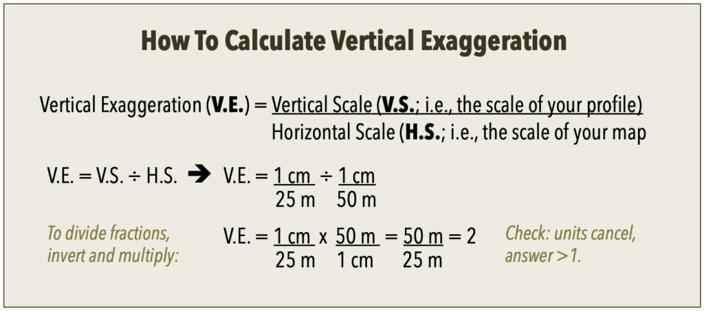
If done correctly, any units in your ratios should cancel out, and the answer should be greater than 1. (If the answer is less than one, that implies your profile has a shrunken y-axis, not an exaggerated one.)
