Michael Pidwirny
LABORATORY 6: CLIMATE CHANGE – PART 1
LEARNING GOALS
In this laboratory, we will examine the nature of past and future predicted climate change on the Earth.
Upon completion of this laboratory you will be able to:
- Understand some of the mechanisms responsible for climate change.
- Interpret data used in the investigation of the Earth’s past, present, and future climate.
- Examine and interpret the output from climate simulation models.
CLIMATE CHANGE
For the climatologist, climate consists of many different variables that vary both spatially and temporally. Of these variables, the fluctuations of temperature and precipitation receive the most attention.
Climatologists have concluded that fluctuations in climate, at any time scale, are produced by a complex array of external (i.e. from extraterrestrial systems) and internal (i.e. from ocean-atmosphere feedbacks) factors. The best-known long-term fluctuations are those that resulted in rhythmic glacial-interglacial periods during the last two million years. Common short-term fluctuations include the role of sunspots, volcanic eruptions, and El Niño – La Niña.
Figure 6.1 summarizes the basic components of the Earth’s climatic system. An example of external climate forcing is the change in the Sun’s luminosity or the Earth-Sun distance, either of which would vary the amount of solar radiation received at the top of the Earth’s atmosphere. Examples of internal climate forcing are changes in the concentrations of atmospheric gases, mountain building, volcanic activity, and changes in surface or atmospheric albedo.
VARIATIONS IN THE EARTH’S ORBIT
The Milankovitch theory suggests that normal cyclical variations in three of the Earth’s orbital characteristics is probably responsible for some climatic change. The basic idea behind this theory assumes that over time these three cyclic events vary the amount of solar radiation that is received on the Earth’s surface.
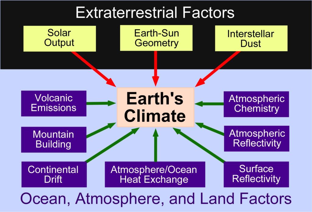
Figure 6.1. Major components of the Earth’s climatic system. Image Copyright: Michael Pidwirny.
The first cyclical variation is the Earth’s orbital eccentricity – the orbit changes from being elliptical to being nearly circular and then back to elliptical over a period of ~100,000 years (Figure 6.2). The greater the eccentricity of the orbit, the greater the seasonal variation in solar energy received by the Earth. Currently, the Earth’s orbit is one of relatively low eccentricity, which makes the difference in the Earth-Sun distance between perihelion and aphelion responsible for only ~6% variation in the amount of insolation at the top of the atmosphere. When the difference in the Earth-Sun is at its maximum (~9%), the difference in solar energy received is ~20%. (At this point you should recall the relevant material that you dealt with in Lab 1.)
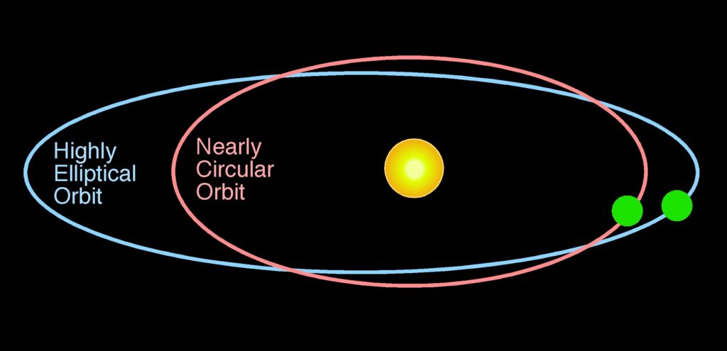
Figure 6.2. The Earth’s orbit around the Sun changes from being nearly circular to highly elliptical. The period of this cycle is about 100,000 years. Image Copyright: Michael Pidwirny.
The second cyclical variation results from the fact that, as the Earth rotates on its axis, it wobbles like a spinning top changing the orbital timing of the equinoxes and solstices (Figure 6.3A). This is known as the precession of the equinox and has a cycle of ~23,000 years. Presently, the Earth is closer to the Sun in January and farther away in July (Figure 6.3B). Because of precession, the reverse will be true in 11,500 years and the Earth will then be closer to the Sun in July (Figure 6.3B). This means, of course, that if everything else remains constant, 11,500 years from now seasonal variations in the Northern Hemisphere should be greater than at present (colder winters and warmer summers) (Figure 6.3C).
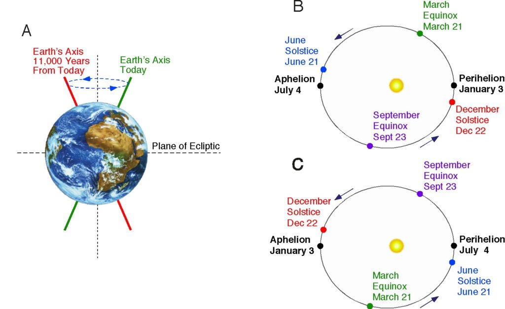
Figure 6.3. Precession of the Equinoxes: diagram B describes the present situation; diagram C illustrates what to expect 11,500 years into the future. Image Copyright: Michael Pidwirny.
The third cyclical variation is related to the changes in the tilt (obliquity) of the Earth’s axis of rotation over a 41,000-year cycle. The tilt varies from about 22.0° to 24.5° (Figure 6.4). At the present time, the tilt of the Earth’s axis is approximately 23.5°. When the tilt is small there is less climatic variation between the summer and winter seasons in middle and high latitudes. Winters tend to be milder and summers cooler. Warmer winters allow for more snow to fall in the high latitude regions (because warmer air allows for greater amounts of water vapour to be moved by the atmosphere). Cooler summers cause snow and ice to accumulate on the Earth’s surface because less of this frozen water is melted. Therefore the net effect of a smaller tilt would be more extensive formation of glaciers in the polar latitudes. Periods of a larger tilt result in greater seasonal climatic variation in the middle and high latitudes. At these times, winters tend to be colder and summers warmer. Colder winters produce less snow because of lower atmospheric temperatures. As a result, less snow and ice accumulates on the ground surface. Moreover, the warmer summers produced by the larger tilt provide additional energy to melt and evaporate the snow that fell and accumulated during the winter months. Consequently, glaciers in the polar regions should be generally receding, with other contributing factors constant, during this part of the obliquity cycle.
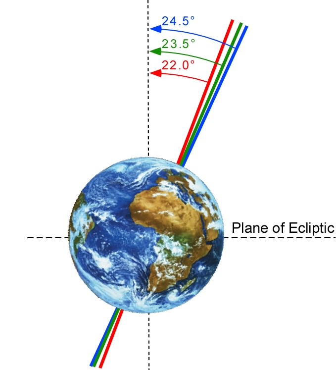
Figure 6.4. The tilt of the Earth’s axis can vary from a minimum of 22.0° to a maximum of 24.5°. Image Copyright: Michael Pidwirny.
VARIATIONS IN SOLAR OUTPUT
Until recently, many scientists thought that the Sun’s output of radiation only varied by a fraction of a percent over many years. However, recent measurements made by satellites equipped with radiometers show that the Sun’s energy output may be more variable than was once thought. Measurements made during the early 1980s showed a decrease of 0.1% in the total amount of solar energy reaching the Earth over an 18 month time period. If this trend were to extend over several decades, it could influence global climate. Numerical climatic models predict that a change in solar output of only 1% per century would alter the Earth’s average temperature by between 0.5 to 1.0°C.
Scientists have long tried to link sunspots to climatic change. Sunspots are large magnetic storms that appear as dark, cooler areas on the Sun’s surface. The number and size of sunspots show several cyclical patterns, reaching a maximum every 11, 80, and 200 years. The decrease in solar energy observed in the early 1980s corresponds to a period of maximum sunspot activity based on the 11-year cycle. In addition, measurements made with a solar telescope from 1976 to 1980 showed that during this period, as the number and size of sunspots increased, the Sun’s surface cooled by about 6°C. Apparently, the sunspots prevented some of the Sun’s energy from leaving its surface. However, these findings tend to contradict observations made on longer time scales. The middle of a cool period known as the Little Ice Age (approximately from 1650 to 1750) correlated to a time of very few sunspots (the Maunder Minimum), something that scientists believe repeats every 80 to 90 years (Figure 6.5).
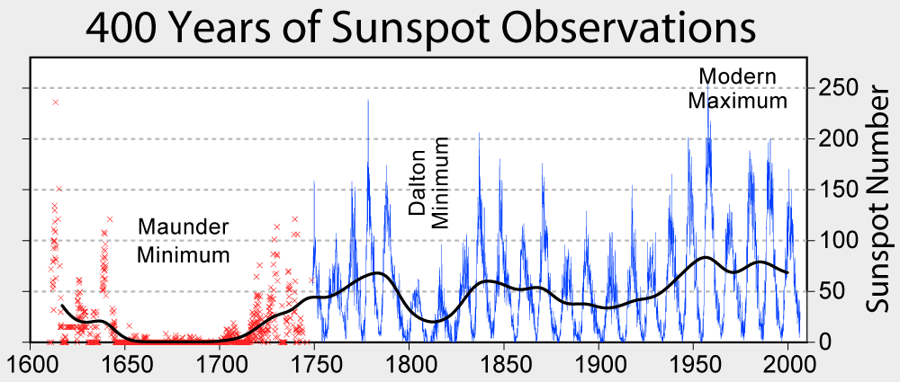
Figure 6.5. Variations in monthly average sunspot numbers for about 400 years. Data from 1749 is continuous. Data before 1749 is sporadic and individual observations are marked with an X. Image Source: Wikimedia Commons, Robert A. Rohde. This image is licensed under the Creative CommonsAttribution-Share Alike 3.0 Unported license.
During periods of maximum sunspot activity, the Sun’s magnetic field is strong, and vice versa. The magnetic field of the Sun also reverses every 22 years, during a sunspot minimum. Some scientists believe that the periodic droughts on the Great Plains of the United States are in some way correlated with this 22-year cycle.
GREENHOUSE ENHANCEMENT
Over the past three centuries, the concentration of carbon dioxide has been increasing in the Earth’s atmosphere because of human influences. Human activities like the burning of fossil fuels, conversion of natural prairie to farmland, and deforestation have caused a net release of carbon dioxide into the atmosphere. From the early 1700s, carbon dioxide has increased from 280 parts per million to 380 parts per million as measured in 2005. Most scientists believe that higher concentrations of carbon dioxide in the atmosphere will enhance the greenhouse effect making the planet significantly warmer. Most scientists believe that the average temperature of the Earth has increased by about 0.6°Celsius over the last century because of the enhancement of the greenhouse effect. Further, most computer climate models suggest that the average temperature of the planet will warm up by another 1.5 to 4.5°Celsius if carbon dioxide reaches the predicted level of 600 parts per million by the year 2050 to 2100.
RECONSTRUCTING PAST CLIMATES
A wide range of evidence exists to allow climatologists to reconstruct the Earth’s past climate. This evidence can be grouped into two general categories: direct measurements and indirect measurements. Direct measurements include the various instrumental measurements done at meteorological stations. These instrumental meteorological records have been very important in detecting recent global warming due to greenhouse effect enhancement. Indirect measurements of climate can be made from a number of natural processes that in some way record temporal fluctuations in some climatic variable. It is very important to realize that indirect measurements of this sort are just a surrogate or proxy of the climate variable of interest.
METEOROLOGICAL INSTRUMENT RECORDS
Common climatic elements measured by instruments include temperature, precipitation, wind speed, wind direction, and atmospheric pressure. However, many of these records are temporally quite short as many of the instruments used were only created and put into operation during the last few centuries or decades. Another problem with instrumental records is that large areas of the Earth are not monitored. Most of the instrumental records are for locations in populated areas of Europe and North America. Very few records exist for locations in Less Developed Countries (LDCs), in areas with low human populations, and the Earth’s oceans. Over the last 50 years many meteorological stations have been added inland areas previously not covered. Another important advancement in developing a global record of climate has been the recent use of remote satellites to gather climate data.
BIOLOGY PROXY DATA – TREE RINGS
It is well known that the age of a temperate forest tree can be calculated by counting the number of annual growth rings from center to bark. The last complete ring before the bark usually represents the tree growth that occurred the previous year. On closer observation of a series of such rings it becomes obvious that the width of these yearly rings varies. This variation has been correlated to changes in some climatic variable that affects the tree’s growth. Andrew E. Douglass, working in Arizona, was one of the first scientists to examine the causes of variations in tree ring widths. Douglass suggested that the variance in ring widths was caused by sunspot activity that in turn had an influence on climate at the Earth’s surface. Today, the science of dendroclimatology is a well-established method of deriving proxy climate data.
(a) Underlying principles and concepts of dendroclimatology
Tree rings have unique properties that make them an important source of past climate information:
- The width or density of tree rings can be measured for sequential years, and these measurements can be calibrated with climatic data; and
- Tree rings can be easily dated to the particular year in which they were formed.
Both of these properties are directly related to the principle of uniformitarianism that was first proposed in 1785 by James Hutton. Uniformitarianism can be simply defined by the statement “the present is the key to the past”. Uniformitarianism suggests that the physical and biological processes that link today’s environment with today’s tree growth must have been in operation in a similar fashion in the past. It also implies that the year-to-year variations seen today in climatic variables (e.g. temperature and precipitation) have also occurred in the past. However, it does not infer that the climate of the past was identical to that of the present, just that climate will affect the physical and biological processes of a tree in the same way.
(b) Tree rings and limiting factors
Tree rings are usually the result of a single annual burst of growth, which begins in the spring and ends in the late summer or autumn. During this growth, the tree forms large thin walled cells, while at the end of the growth period smaller cells with thicker walls are formed. This process results in the visually apparent tree-ring. The process of tree ring growth is controlled by limiting environmental factors. Such factors include temperature, water, sunshine, and nutrients. The number of limiting factors affecting any particular tree depends on its specific spatial location and genetic make-up. Growth in most trees is commonly controlled by the one most limiting factor (according to the Law of the Minimum), and changes in this factor result in predictable corresponding changes in the tree’s growth. In dendroclimatology, the researcher tries to find specimens that have readily identifiable limiting factors that enable them to obtain precise information about environmental conditions in the past.
(c) Measurement of tree ring densities
Throughout this discussion, the generalization has been made that trees only display ring-width changes when there is a change in the most limiting factor. However, in the last few decades, scientists have found that a change in environmental conditions may also cause changes in the density of tree rings. Changes in a ring’s density are caused by the changes in the proportions of early-wood to late-wood. Early-wood has a low density because it consists of cells that have thin walls and large vacuole spaces. Late-wood has a high-density value because late in the season cells become smaller, have thicker cell walls, and smaller vacuole spaces. Overall, each tree ring consists of a seasonal gradation of low to high-density wood when measured. The nature of this gradation, however, varies because of variations in the climate of the growing season. Years that have an extremely good growing season cause the annual ring to be composed mainly of low-density wood. Years that have a poor growing season cause the annual ring to be composed mainly of high-density wood. Thus one can correlate a change in ring density with a change in climate.
CLIMATE SIMULATION MODELS
Climate simulation models are often used to investigate the many processes that act to produce the Earth’s weather and climate. This form of simulation modelling is done by describing dynamic climate systems in terms of basic mathematical laws that describe cause and effect relationships occurring in nature. Thus, climate simulation models contain numerous equations that represent the physical and chemical processes operating in the atmosphere. Climate modelling is limited by our level of scientific understanding and by computing power available for performing the simulations.
The following factors are important in constructing a simulation of our planet’s climate:
Radiation Dynamics – this factor simulates the dynamics that exist between input and output of short and long wave radiation to the creation of heat energy at the Earth’s surface and within the atmosphere.
Energy Dynamics – this factor reproduces the transfer of sensible and latent heat energy generally from low to high latitudes and vertically in the atmosphere.
Surface Properties – this factor models the effect of land cover and ocean dynamics on surface and atmospheric albedo, radiation dynamics, and surface-to-atmosphere transfers of energy in the climate system.
Chemical Dynamics – this factor models the influence that the chemical composition of the atmosphere has on our planet’s weather and climate.
Spatial and Temporal Resolution – climate models can resolve processes operating in the atmosphere at different spatial and temporal scales. Finer scale resolutions of the Earth’s climate system generally require more computing power. Coarser model resolutions generally have higher prediction error.
MODELING AS THE SIMPLIFICATION OF NATURE
Climate models are a simplification of the real world. Because of this fact, all climate models have some level of limitation associated with how well they simulate the processes that run the climate system. Atmospheric processes can also interact with each other, producing feedbacks that need to be properly explained and simulated. Further, the output produced by a climate model is dependent on starting with some initialized state. Errors in the initialized state will of course create errors in the output. The environmental conditions associated with this initialized state are usually established from observational data. Often, the observation data are incomplete or lacking in accuracy. As a result, the output needs to be interpreted with this problem in mind.
Global-scale climate models, built to simulate the climate of the entire planet, must take into account many influencing interacting factors. This fact can create modeling problems, because the interacting factors may operate on different time or spatial scales. For example, the effects of deep-ocean circulation currents may be very important when considering climate averaged over decades to centuries, while local changes in wind direction may be unimportant on this time scale. However, if weekly or monthly time scales are the focus of the simulation, the relative importance of these two factors would be reversed.
Global-scale simulations of climate normally produce output that describes average conditions for specific time periods. For example, researchers often specify output as an annual average or average conditions in January and July.
For models to run smoothly, a number of simplifications must be made to the laws governing climatic processes. This simplification can be done in a variety of ways. As a result, there are a number of different global-scale climate models available that produce the same output using different mathematical techniques. In general, there are two types of simplifications found in global-scale climate models. The first type of simplification modifies the complexity of known processes for the purpose of computation efficiency. The second type of simplification arises because of imperfect understanding.
RESOLUTION IN TIME AND SPACE
The reliability of the model output is normally controlled by the spatial and/or temporal resolution of the simulation. Thus, finer resolutions generally produce more accurate output. Researchers are limited to how fine they can make the simulation by both data availability and computational power and time. Most computational processes in climate simulation models require a ‘time-step’ approach to produce their desired output. In the model, the processes are calculated for a certain length of time until a new set of conditions is determined. The computation process is then repeated using the newly generated values. This process continues until the model equilibrates itself and the desired output is produced.
Many climate simulation models are designed to predict future climates. However, their performance at doing this task correctly is not easily evaluated. Often the accuracy of these models is verified by running the simulation to produce a known past or present climate state. Yet, the future climate may produce a new set of unexpected cause and effect processes to operate in the climate system. Because these processes are unexpected the simulation will fail in producing reliable output. One way to find these unexpected processes is to use the past as a key to the future. There are a number of climate researchers examining various types of fossil evidence to develop explanations of how the Earth’s climate worked in the past.
TYPES OF CLIMATE MODELS
There are four basic types of model:
Energy Balance Models (EBMs): These models operate in the horizontal dimension. Often they are used to predict the variation of the surface temperature with latitude based on changes in the Earth’s energy balance dynamics.
One-dimensional Radiative-Convective Models: These simulation models operate in the vertical dimension. They are used to produce temperature profiles (usually global averaged) by modeling the radiative and convective processes in the atmosphere.
Two-dimensional Statistical Dynamical Models: These climate models simulated horizontal and vertical dimensions in the atmosphere at the same time. They involve calculations dealing explicitly with surface processes and dynamic climate processes operating in the vertical.
Global Circulation Models (GCMs): These climate models simulate the three-dimensional nature of Earth’s climate system. Besides simulating processes in the atmosphere, they can also replicate the effect of ocean circulation and ocean heat transfer on the planet’s climate. GCMs make an effort to simulate most of the physical processes believed to be important in generating the Earth’s climate system (Figure 6.6). The spatial resolution of these models has been getting progressively finer because of improvements in the computational power of computers.
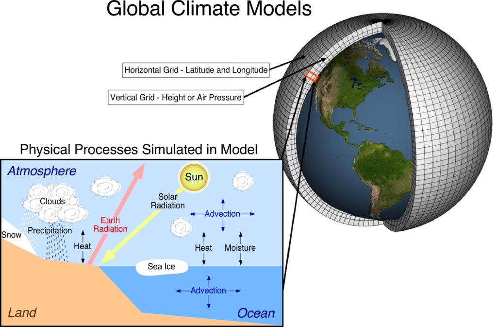
Figure 6.6. Climate models consist of a number of differential equations that describe the physical and chemical processes operating in the atmosphere to create weather and climate. These equations operate within a three-dimensional grid that extends from the Earth’s surface up into the atmosphere where weather occurs and from the surface of our planet’s oceans, and deep within these water bodies. When the computer simulation model is run with the entered input, numerous iterations of calculations occur within and between the cells of the grid. These calculations can take days to weeks to months to complete depending on the complexity of the model and the power of the computer. From the completion of these calculations, output is produced in the form of wind speed, wind direction, atmospheric pressure, air temperature, ocean temperature, atmospheric pressure, and so on within the various cells that occur in the model. Image Copyright: Michael Pidwirny.
LABORATORY 6 QUESTIONS
QUESTION 1
Parker et al. (1981) collected tree-ring samples from living white spruce (Picea glauca) in 1979 at Cri Lake, Quebec for dendroclimatological analysis. In total, they collected samples from 16 trees, with each tree being cored twice for verification of ring changes. The density of each annual ring was derived using X-ray densitometry. Table 6.1 shows the results:
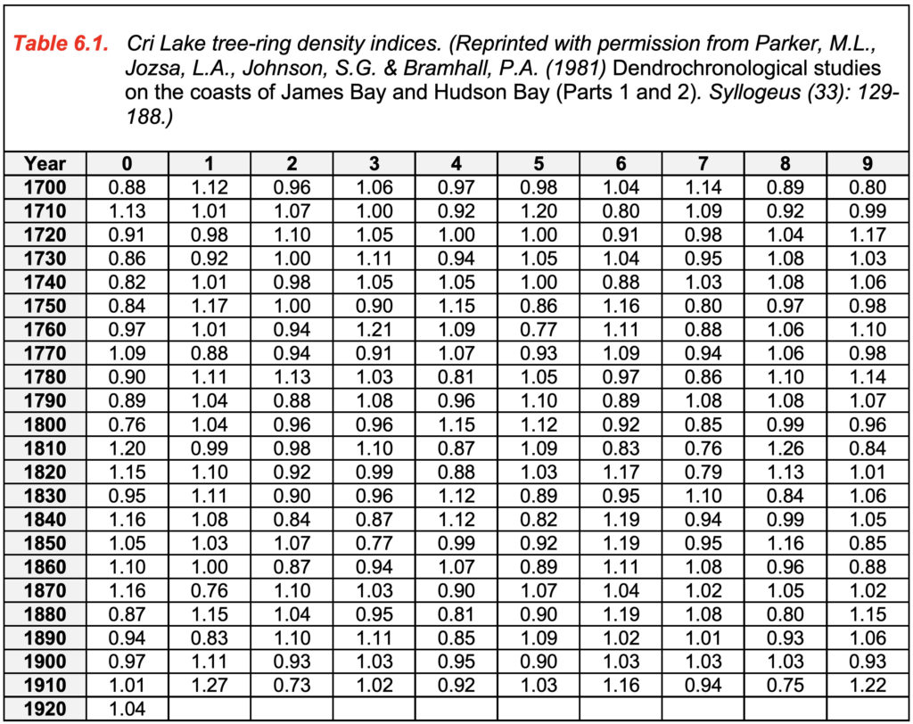
A portion of the raw data time series was then statistically regressed in a step-wise multiple regression analysis against 41 mean summer temperatures (May to October) recorded at a nearby weather station. The analysis suggested that there was a strong positive correlation between tree-ring density and the mean summer temperatures at the meteorological station (r = +0.77). Also, from the analysis, a simple mathematical model was constructed for the calculation of mean summer temperature using tree-ring density. The model is expressed as:

where Ty is the temperature (in °C), Dy is the tree-ring density measurement for year y, and Dy – 1 is the density in year y – 1 (the year before y).
1.1) Using the data in Table 6.1 and the equation given above, calculate the mean summer temperatures at Cri Lake for the period 1916 to 1920 and fill in the blanks in the first row of the table below.
| Year | 1911 | 1912 | 1913 | 1914 | 1915 | 1916 | 1917 | 1918 | 1919 | 1920 |
| Temp
(°C) |
10.1 | 3.8 | 5.5 | 5.2 | 6.3 | ? | ? | ? | ? | ? |
1.1a) The calculate the mean summer temperatures (°C) at Cri Lake for 1916 is ______°C.
1.1b) The calculate the mean summer temperatures (°C) at Cri Lake for 1917 is ______°C.
1.1c) The calculate the mean summer temperatures (°C) at Cri Lake for 1918 is ______°C.
1.1d) The calculate the mean summer temperatures (°C) at Cri Lake for 1919 is ______°C.
1.1e) The calculate the mean summer temperatures (°C) at Cri Lake for 1920 is ______°C.
The following graph plots the mean summer temperatures at Cri Lake for the period 1800 to 1920. Answer the questions that follow the graph.
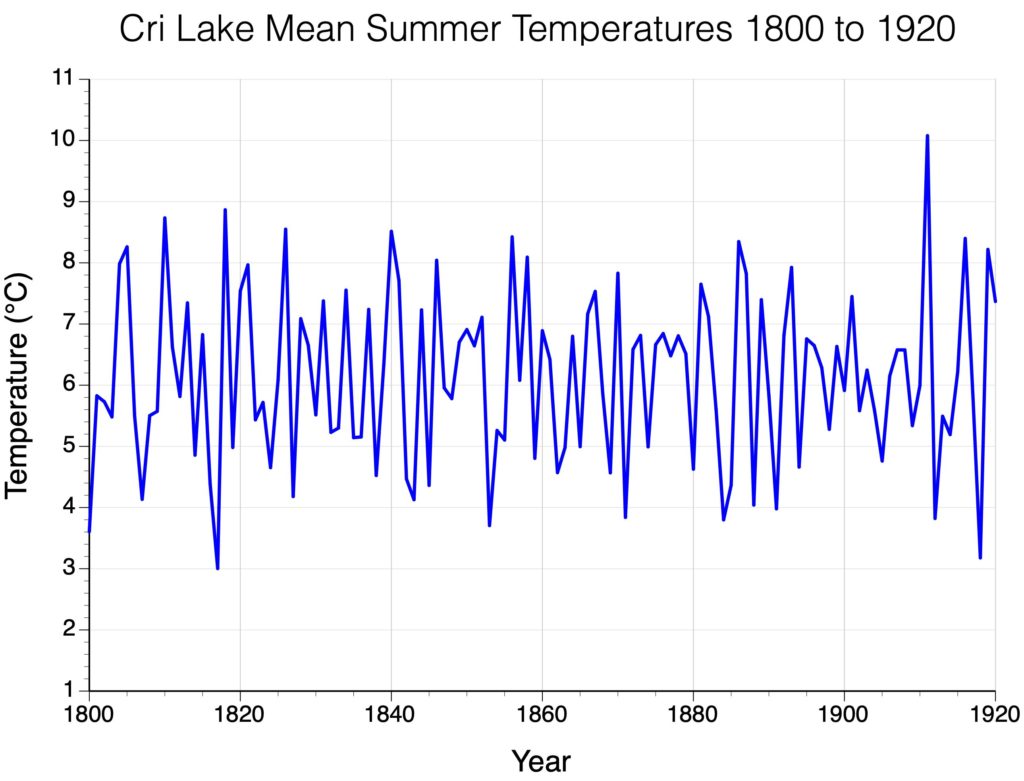
1.2) What does the graph show you about the interannual variability of summer temperature in the first part of the 20th century (i.e., compared to pre-1900)?
1.3) In the regression equation a lag variable was used – this means that one year’s temperature is influenced by last year’s tree ring density. How might the previous year’s growth affect the present year’s growth?
1.4) Research suggests that major explosive volcanic eruptions may cause a cooling of the Earth’s atmosphere for about two to three years after the event. The Cri Lake data series includes two major volcanic events, Tambora in 1815 and Krakatoa in 1883. What type of temperature change occurred at Cri Lake as a result of these events? Examine this question by calculating the average mean summer temperature for the two-year period before and after these eruptions.
Tambora:
1.4a) The average for 1813-14 in °C was?
1.4b) The average for 1816-17 in °C was?
Krakatoa:
1.4c) The average for 1881-82 in °C was?
1.4d) The average for 1884-85 in °C was?
1.4e) For both comparisons, what pattern is suggested from your calculations?
QUESTION 2
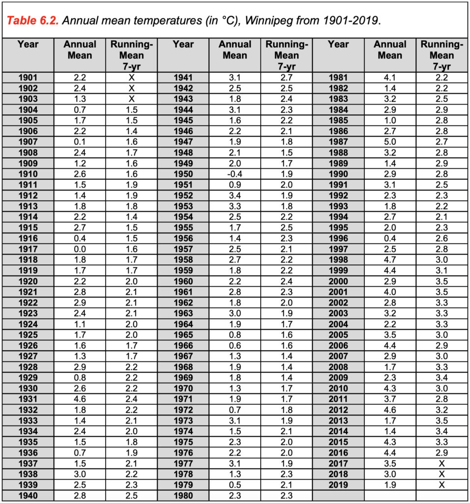
Average annual temperatures in Winnipeg, Manitoba, Canada (Latitude 49.89°, Longitude -97.15°) for the years 1901-2019 are presented in Table 6.2 and can be found in the Microsoft Excel file Lab 6 Winnipeg_Temps.xlsx.
Using this data, answer the following questions:
2.1) Calculate the missing climate normals using the Microsoft Excel spreadsheet for the time periods 1961-1990, 1971-2000, and 1981-2010 (“normal” in climatology refers to the mean for a standard 30-year period):
1911-1940: 1.8°C
1921-1950: 1.9°C
1931-1960: 2.1°C
1941-1970: 2.4°C
1951-1980: 2.0°C
2.1a) 1961-1990: ______°C
2.1b) 1971-2000: ______°C
2.1c) 1981-2010: ______°C
2.1d) What is happening to the climatological normal over the eight consecutive 30-year periods?
2.2) Climate data is typically “noisy” – that is, there is a lot of interannual variability. A commonly used technique used to depict smoother trends is the running mean or moving average. This involves the calculation of a mean of a specified number of consecutive years. For example, in Table 6.2 a 7-year running mean has been calculated for this time series. For example, for the year 1904, the average annual temperatures for 1901, 1902, 1903, 1904, 1905, 1906, and 1907 were summed and then divided by 7 (note that 1904 is the middle year). The graph below shows the year-to-year change in Winnipeg’s annual mean temperature (red line) and a 7-year running mean (dark grey heavy line). Notice how the running mean is less variable than the raw data, providing a clearer picture of the trends in this time series.
2.2a) According to the 7-year mean, which of the periods listed show trends of increasing temperatures?
A 1901-1940
B 1940-1950
C 1950-1960
D 1960-1970
E 1970-1990
F 1995-2000
G 2000-2015
2.2b) According to the 7-year mean, which of the periods listed show trends of decreasing temperatures?
A 1901-1940
B 1940-1950
C 1950-1960
D 1960-1970
E 1970-1990
F 1995-2000
G 2000-2015
2.2c) According to the 7-year mean, annual temperatures (°C) in Winnipeg have increased by how much since 1970?
A 0.5
B 1.0
C 1.5
D 3.0
QUESTION 3
Researchers have constructed a number of historical climate datasets for the purpose of examining recent climate change on our planet. The following table describes SIX datasets that are most commonly used to research how recent global surface temperatures have changed over our planet’s terrestrial and ocean surfaces.
| Name of the Dataset | Organization Responsible | Time Coverage | Spatial Resolution | Ocean Surface Coverage |
| Global Surface Temperature Analysis (GISTEMP) | NASA Goddard Institute for Space Studies (GISS) | 1880 – Today | 2 x 2 degrees | Yes |
| HadCRUT4 and CRUTEM4 | University of East Anglia / UK Met Office Hadley Centre | 1850 – Today | 5 x 5 degrees | Yes |
| Berkeley Earth Surface Temperatures (BEST) | University of California, Berkeley | 1701 – Today | 1 x 1 degrees | No |
| Merged Land-Ocean Surface Temperature Analysis (MLOST) | National Oceanic and Atmospheric Admin.(NOAA) | 1871 – Today | 5 x 5 degrees | Yes |
| Global (land) Precipitation and Temperature: Willmott & Matsuura, University of Delaware | University of Delaware | 1900 – 2014 | 0.5 x 0.5 degrees | No |
| TerraClimate | John Abatzoglou, University of Idaho | 1958 – Today | ~4 km (1/24th degree) | No |
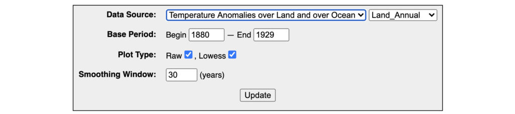
We are going to use NASA’s Global Surface Temperature Analysis (GISTEMP) climate database to examine variations in mean temperature over time as calculated for various parts of Earth’s surface/atmosphere system. This climate database can be accessed at the following website:
https://data.giss.nasa.gov/gistemp/graphs_v4/customize.html
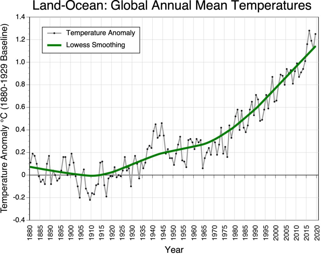
For all of the questions that follow, we are going to use 1880 to 1929 (50 years) as the baseline for our comparisons. During this period, little additional warming of the Earth’s climate system should have taken place because of the increasing concentration of greenhouse gases in the atmosphere. From 1880 to 1929, carbon dioxide concentrations in the atmosphere increased by about 16 parts per million (ppm) (from 290 to 306 ppm). In comparison, carbon dioxide concentrations in the atmosphere by 88 ppm in the last 50 years (from 326 to 414 ppm, see NOAA’s Trends in CO2 website). The concentration of atmospheric carbon dioxide before the onset of industrialization (around the year 1700) is estimated to be about 280 ppm.
3.1) Use the following web link to go to NASA’s Global Surface Temperature Analysis (GISTEMP) climate database.
https://data.giss.nasa.gov/gistemp/graphs_v4/customize.html
Create a graph showing yearly change in global annual mean temperature for combined land and ocean surfaces for the period 1880-2019. See the settings in the graphic below.

3.1a) According to the Lowess Curve how much global warming has occurred relative to the 50-year baseline 1880-1929?
A 0.3°C.
B 0.8°C.
C 1.2°C.
D 1.6°C.
3.1b) When did global warming start increasing at a rapid rate?
A 1930.
B 1950.
C 1970.
3.2) Create a graph showing yearly change in global annual mean temperature for just land surfaces for the period 1880-2019. See the settings in the graphic below.
3.2a) According to the Lowess Curve how much global warming has occurred over land surfaces globally relative to the 50-year baseline 1880-1929?
A 0.3°C.
B 0.8°C.
C 1.2°C.
D 1.6°C.
3.3) Create a graph showing yearly change in global annual mean temperature for just ocean surfaces for the period 1880-2019. See the settings in the graphic below.

3.3a) According to the Lowess Curve how much global warming has occurred over ocean surfaces globally relative to the 50-year baseline 1880-1929?
A 0.3°C.
B 0.8°C.
C 1.2°C.
D 1.6°C.
3.4) Create a graph showing yearly change in annual mean temperature for combined land and ocean surfaces in just the Northern Hemisphere for the period 1880-2019. See the settings in the graphic below.

3.4a) According to the Lowess Curve how much global warming has occurred over land and ocean surfaces in the Northern Hemisphere relative to the 50-year baseline 1880-1929?
A 0.3°C.
B 0.8°C.
C 1.2°C.
D 1.4°C.
3.5) Create a graph showing yearly change in annual mean temperature for combined land and ocean surfaces in just the Southern Hemisphere for the period 1880-2019. See the settings in the graphic below.

3.5a) According to the Lowess Curve how much global warming has occurred over land and ocean surfaces in the Southern Hemisphere relative to the 50-year baseline 1880-1929?
A 0.3°C.
B 0.8°C.
C 1.2°C.
D 1.4°C.
3.5b) Why has the Southern Hemisphere less global warming than the Northern Hemisphere?
QUESTION 4
The graph below plots yearly change in global annual mean temperature for combined land and ocean surfaces for the period 1880-2019 based on the dataset available from NASA’s Global Surface Temperature Analysis (GISTEMP) (same data plotted in Question 3.1). The graph indicates that the yearly rise (black dots connected by grey line) in global temperatures between 1880 and 2019 has not been incrementally steady but variable. Scientists have found that this short-term variability is internal to Earth’s climate system. Two factors seem to account for most of these short-term temperature fluctuations: volcanic emissions that block incoming solar radiation for 1 to 2 years and atmosphere-ocean oscillations that vary the transfer of heat energy from the ocean surface to the lower atmosphere.
The most important atmosphere-ocean oscillation responsible for short-term temperature fluctuations in Earth’s global mean temperature is the El Niño–Southern Oscillation (ENSO). El Niño–Southern Oscillation is produces cyclical changes in the Trade Winds and sea surface temperatures in the Pacific Ocean. It involves three phases: Neutral, La Niña or El Niño.
In an El Niño year, air pressure drops over a large region of the central Pacific and along the coast of South America (Figure 6.7). The normal low-pressure system is replaced by a weak high in the western Pacific (the Southern Oscillation). This change in pressure pattern causes the Trade Winds to be significantly reduced in wind speed. This reduction allows the equatorial counter current (which flows from west to east) to strengthen and to send a pulse of warm ocean water to the coastlines of Peru and Ecuador (Figure 6.8). Since 1935, particularly strong El Niños have developed in 1941, 1958, 1966, 1973, 1978, 1983, 1987, 1992, 1998, 2003, 2010, and 2016.
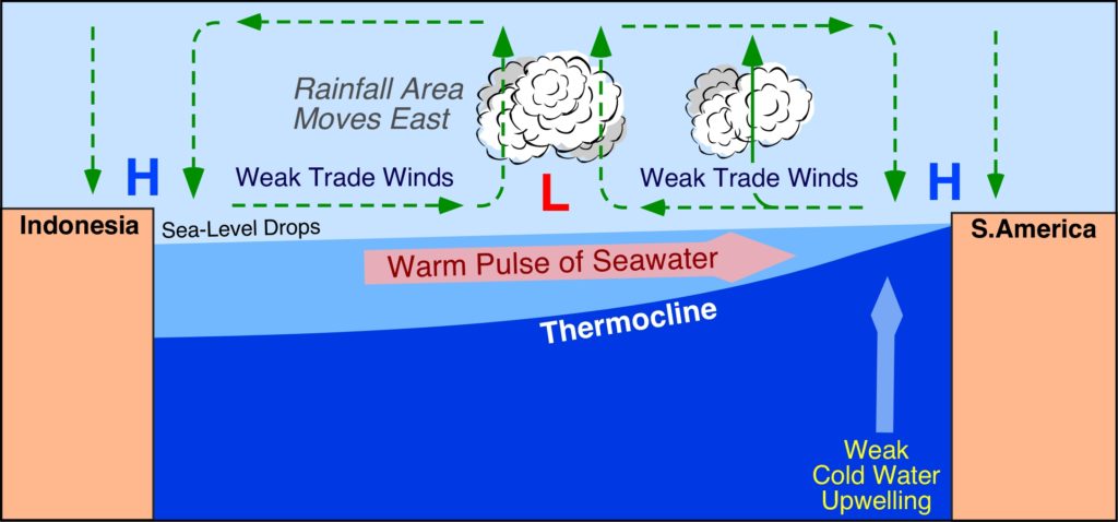
Figure 6.7. This cross-section of the Pacific Ocean, along the equator, illustrates the pattern of atmospheric circulation that causes the formation of the El Niño. Note how the cold water upwelling is reduced, the position of the thermocline moves eastward, and how the warm equatorial ocean current switches direction. Image Copyright: Michael Pidwirny.
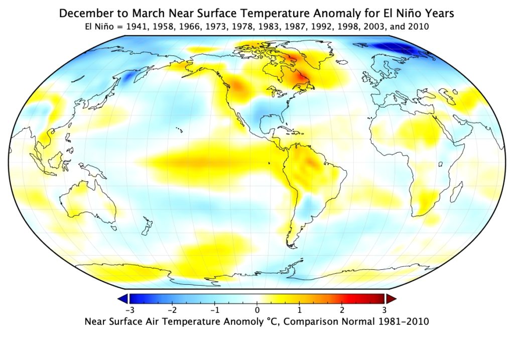
Figure 6.8. Global surface temperature effects of El Niño during December to March. This map describes the average temperature anomaly of eleven significant El Niño events (1941, 1958, 1966, 1973, 1978, 1983, 1987, 1992, 1998, 2003, and 2010) from the 30-year average 1981-2010. Image Copyright: Michael Pidwirny.
After an El Niño event weather conditions usually return back to normal (neutral state) or they can change into a condition known as La Niña. La Niña form when the Trade Winds become very strong and cause an unusual accumulation of cold water along the equator in the central and eastern Pacific Ocean (Figure 6.9). Strong La Niña’s have occurred in 1939, 1951, 1955, 1971, 1974, 1976, 1989, 1999, 2000, 2008, and 2011 (Figure 6.10).
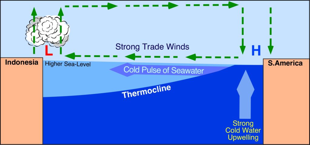
Figure 6.9. This cross-section of the Pacific Ocean, along the equator, illustrates the pattern of atmospheric circulation that causes the formation of the La Niña. Note how the cold water upwelling has intensified, the position of the thermocline has moved westward, and how the equatorial ocean current is now cold (compare with Figure 6.7). Image Copyright: Michael Pidwirny.
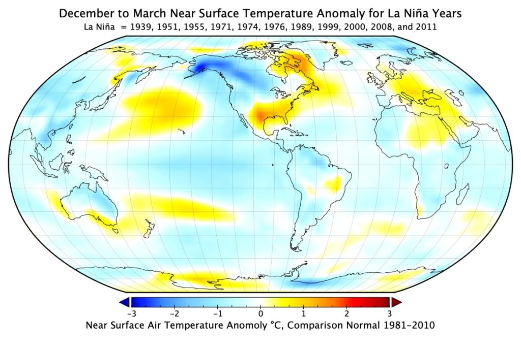
Figure 6.10. Global surface temperature effects of La Niña during December to March. This map describes the average temperature anomaly of eleven significant La Niña events (1939, 1951, 1955, 1971, 1974, 1976, 1989, 1999, 2000, 2008, and 2011) from the 30-year average 1981-2010. Image Copyright: Michael Pidwirny.
The graph below once again plots global annual mean temperature for combined land and ocean surfaces and identifies significant El Niño (red dots) and La Niña (blue diamonds) event years.
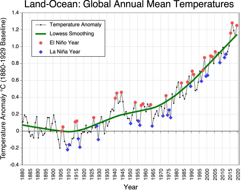
4.1) Based on the graph, would you suggest that El Niño and La Niña events might be responsible for some of the fluctuations seen in Earth’s global temperature record? Explain.
QUESTION 5
Three climate simulations were run using the publicly available EdGCM global circulation model. The EdGCM model is available to run on a Windows or Mac computers.
The source code for this desktop computer simulation model is identical to NASA’s GISS Model II which was used for climate change research in the 1980s and early 1990s.
The three climate simulations produced output for the following climate change scenarios:
- The climate the Earth experience in 1958 – Modern SST Climate
- The climate that would be produced by increasing carbon dioxide concentrations in the atmosphere to 630 ppm – Doubled CO2 Climate
- The climate that would be produced by lowering current solar output by 2% – Decreased Solar Climate
The output produced for each of these simulations consists of global maps of the following climate variables: average annual surface air temperature and annual precipitation (Figures 6.11 to 6.16). Figures 6.17 to 6.20 depict the difference between modeled future conditions and the Modern SST Climate. Examine this output and answer the following questions.
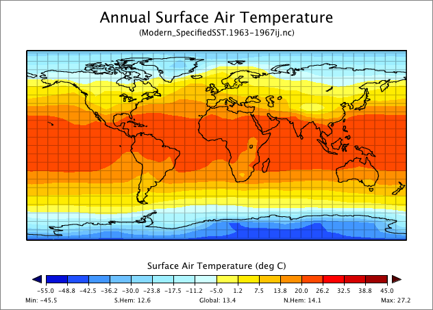
Figure 6.11. Global average annual surface air temperature – Modern SST simulation scenario. Image Copyright: Michael Pidwirny. Data Source: EdGCM model output.
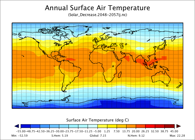
Figure 6.13. Global average annual surface air temperature – Solar Decrease simulation scenario. Image Copyright: Michael Pidwirny. Data Source: EdGCM model output.
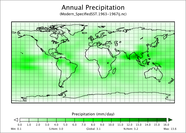
Figure 6.14. Global annual precipitation – Modern SST simulation scenario. Image Copyright: Michael Pidwirny. Data Source: EdGCM model output.
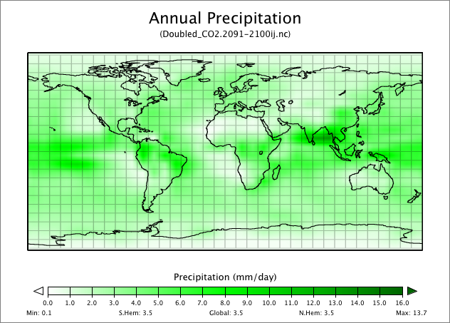
Figure 6.15. Global annual precipitation – Doubled CO2 simulation scenario. Image Copyright: Michael Pidwirny. Data Source: EdGCM model output.
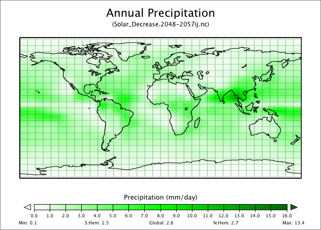
Figure 6.16. Global annual precipitation – Solar Decrease simulation scenario. Image Copyright: Michael Pidwirny. Data Source: EdGCM model output.
Examine Figure 6.17 carefully and answer the following questions.
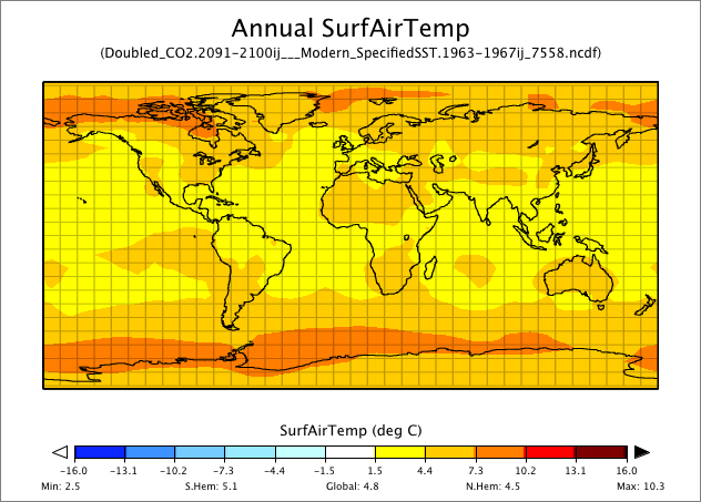
Figure 6.17. Difference between Doubled CO2 and Modern SST annual surface air temperatures. Image Copyright: Michael Pidwirny. Data Source: EdGCM model output.
5.1) How would average annual surface air temperature change if the concentration of CO2 doubled in the atmosphere?
5.2) List the locations of greatest temperature change.
5.3) List the locations of least temperature change.
Examine Figure 6.18 carefully and answer the following questions.
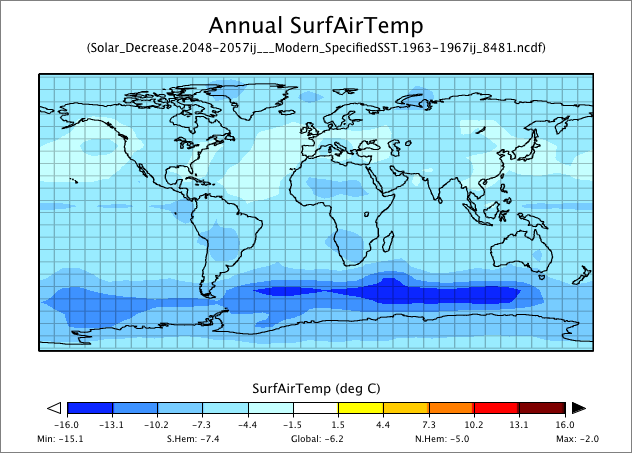
Figure 6.18. Difference between Solar Decrease and Modern SST annual surface air temperatures. Image Copyright: Michael Pidwirny. Data Source: EdGCM model output.
5.4) How would average annual surface air temperature change if solar output decreased by 2%?
5.5) List the locations of greatest temperature change.
5.6) List the locations of least temperature change.
Examine Figure 6.19 carefully and answer the following questions.
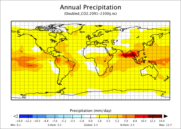
Figure 6.19. Difference between Doubled CO2 and Modern SST annual precipitation. Image Copyright: Michael Pidwirny. Data Source: EdGCM model output.
5.7) How would annual precipitation change if the concentration of CO2 in the atmosphere doubled?
5.8) List the locations that will have the greatest increase in precipitation.
5.9) List the locations that see no change or a decrease in precipitation.
Examine Figure 6.20 carefully and answer the following questions.
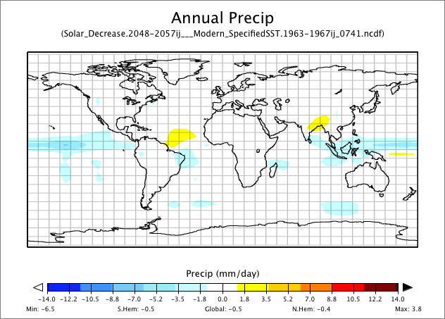
Figure 6.20. Difference between Solar Decrease and Modern SST annual precipitation. Image Copyright: Michael Pidwirny. Data Source: EdGCM model output.
5.10) How would annual precipitation change if solar output decreased by 2%?
5.11) List the regions on our planet that will have an increase or decrease in precipitation.
IMAGE CREDITS
Figure 6.1: Image Copyright Michael Pidwirny.
Figure 6.2: Image Copyright Michael Pidwirny.
Figure 6.3: Image Copyright Michael Pidwirny.
Figure 6.4: Image Copyright Michael Pidwirny.
Figure 6.5: Image Source: Wikimedia Commons, Robert A. Rohde. This image is licensed under the Creative Commons Attribution-Share Alike 3.0 Unported license.
Figure 6.6: Image Copyright Michael Pidwirny.
Figure 6.7: Image Copyright Michael Pidwirny.
Figure 6.8: Image Copyright Michael Pidwirny.
Figure 6.9: Image Copyright Michael Pidwirny.
Figure 6.10: Image Copyright Michael Pidwirny.
Figure 6.11: Image Copyright Michael Pidwirny. Data Source: EdGCM model output.
Figure 6.12: Image Copyright Michael Pidwirny. Data Source: EdGCM model output.
Figure 6.13: Image Copyright Michael Pidwirny. Data Source: EdGCM model output.
Figure 6.14: Image Copyright Michael Pidwirny. Data Source: EdGCM model output.
Figure 6.16: Image Copyright Michael Pidwirny. Data Source: EdGCM model output.
Figure 5.16: Image Copyright Michael Pidwirny. Data Source: EdGCM model output.
Figure 6.17: Image Copyright Michael Pidwirny. Data Source: EdGCM model output.
Figure 6.18: Image Copyright Michael Pidwirny. Data Source: EdGCM model output.
Figure 6.19: Image Copyright Michael Pidwirny. Data Source: EdGCM model output.
Figure 6.20: Image Copyright Michael Pidwirny. Data Source: EdGCM model output.
QUESTION ANSWER SHEET
MICROSOFT EXCEL DATA FILES
This Laboratory Exercise is Licensed Under Attribution-NonCommercial-NoDerivatives 4.0 International (CC BY-NC-ND 4.0).
Updated April 4, 2021
Theory proposed by Milutin Milankovitch in the 1940s that suggests changes in the Earth's climate maybe explained by variations in solar radiation received at the Earth's surface. Further, these variations are due to the combined effects of three different cyclical changes in the geometric relationship between the Earth and the Sun. These three factors include changes in timing (precession) of the equinoxes and solstices, alterations in the tilt of the Earth's rotational axis (obliquity), and variations in the shape of the Earth’s obit around the Sun (eccentricity).
Term that describes the geometric shape of the Earth's orbit. This shape varies from being elliptical to almost circular.
The point in the Earth's orbit when it is closest to the Sun. This distance is about 147.3 million kilometers (91.5 million miles). Perihelion occurs on the 3rd or 4th of January. Compare with Aphelion.
The point in the Earth's orbit when it is farthest from the Sun. This distance is about 152.1 million kilometers (94.5 million miles). Aphelion occurs on the 3rd or 4th of July. Compare with Perihelion.
The wobble in the Earth's polar axis. This motion influences the timing aphelion and perihelion over a cyclical period of 23,000 years.
The tilt of the Earth's polar axis as measured from the perpendicular to the plane of the Earth's orbit around the Sun. One cycle of obliquity takes on average 41,040 years. Over the last 5 million years, the angle of the Earth’s tilt has varied from 22.0 to 24.5°. Current obliquity is 23.4°, however, a value of 23.5 is commonly used for simplicity.
General name for an instrument used to measure electromagnetic radiation over a specific wavelength range.
Dark colored region on the Sun that represents an area of cooler temperatures and extremely high magnetic fields.
A climatically defined period roughly from 1550 to 1850 AD. During this period, global temperatures were at their coldest since the beginning of the Holocene.
The period from 1645 to 1715 during which the Sun had very little sunspot activity.
Data that measures the cause and effect relationship between two variables indirectly.
Is a theory that rejects the idea that catastrophic forces were responsible for the current conditions on the Earth. The theory suggested instead, that continuing uniformity of existing processes were responsible for the present and past conditions of this planet.
A principle developed initially in agricultural science to explain the fact that most crops seem to be limited in growth by a single nutrient (like nitrogen, phosphorus or potassium). This principle suggests that organisms are typically limited by only one single physical factor that is in shortest supply relative to demand. Originally proposed by Carl Philipp Sprengel in 1828 but latter popularized by Justus von Liebig.
