Michael Pidwirny
LABORATORY 7: CLIMATE CHANGE – PART 2
LEARNING GOALS
In this laboratory, we will examine the nature of past and future predicted climate change on the Earth.
Upon completion of this laboratory you will be able to:
- Describe trends in historical climate data as they relate to human-caused global warming.
- Examine and interpret the output from climate simulation models.
- Understand the possible climate change outcomes in the future under the best-case and worst-case greenhouse gas emission scenarios.
HUMAN CAUSED CLIMATE CHANGE
An examination of climate data from meteorological measurements across our planet’s land and ocean areas over the last 119 years reveals obvious patterns of climate change (Figure 7.1). In North America, South America, Europe, Asia, and Africa annual temperatures at most meteorological stations were appreciably colder at the beginning of the 20th century. From the 1920s to the 1950s temperatures became warmer. Colder temperatures returned once again in the 1960s, and continued until the mid-seventies. A warming trend followed these cooler years, and has continued ever since with some of the warmest years in the 20th and 21st century being recorded in just the 30 years. Interestingly, these patterns mirror trends found in the annual mean global temperature record (Figure 7.2).
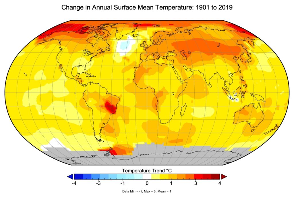
Figure 7.1. Historical trend in annual mean surface temperatures over the period 1901 to 2019 (119 years). Areas in grey have insufficient data. Image Copyright: Michael Pidwirny. Date Source: NASA – Goddard Institute for Space Studies – Surface Temperature Analysis. Land Data from GISS Analysis, Ocean Data from Hadl/Reyn_v2: SST 1880-Present.
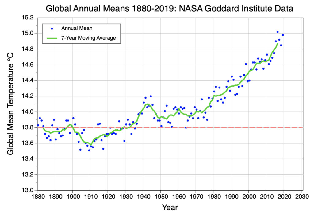
Figure 7.2. Global mean annual temperature measurements from 1880 to 2019. Green line represents 7-year moving average. The red dashed line shows the average global mean for the period 1880-1950. Image Copyright: Michael Pidwirny, Data Source: http://data.giss.nasa.gov/gistemp/graphs_v4/.
Over longer periods of time, non-instrumental climate data also indicates that weather has been quite variable in North America and across the Earth. For example, over the past 800,000 years, there have been several great ice ages during which 30% of the continental surface of the Earth was covered by glacial ice several kilometers (miles) thick. Each glacial period lasted about 100,000 years and was followed by a warmer interglacial period persisting for roughly 10,000 to 12,500 years.
For the past 10,000 years, the Earth has been enjoying the warm temperatures of the latest interglacial period. During this period the Earth’s average global temperature fluctuated up and down by about 2°C (3.6°F) over short periods of time (less than 500 years). These moderate and relatively slow fluctuations in climate have not led to drastic changes in the Earth’s environment. Today’s annual mean global temperature is about 15°C (59°F).
HUMAN ENHANCEMENT OF THE GREENHOUSE EFFECT
The chemical nature of the atmosphere is an important factor in determining the Earth’s climate. Heat energy from the Sun is trapped in the Earth’s lower atmosphere by a natural process called the greenhouse effect. The amount of heat trapped depends primarily on the concentrations of the various greenhouse gases, such as carbon dioxide, water vapor, ozone, methane, and nitrous oxide. The two greenhouse gases with the largest concentration in the troposphere are carbon dioxide and water vapor. Over the past 160,000 years, estimated levels of water vapor in the lower atmosphere have remained fairly constant while the levels of carbon dioxide have fluctuated in-sync with the warming and cooling of the Earth.
Starting about 300 years ago, humans began significantly altering the concentration of carbon dioxide in the atmosphere. Measurements indicate that from that time (about 1700) to today, carbon dioxide increased in concentration by about 45% (Figure 6.3). Much of this increase was caused by human-driven activities such as the burning of fossil fuels, the conversion of natural habitats into agricultural fields, and deforestation. By the year 2050, scientists predict that carbon dioxide content in the atmosphere may increase by about 100% when compared to values before human industrialization. This increase will occur because of the continued human participation in activities that release the greenhouse gases carbon dioxide (CO2), methane (CH4), and nitrous oxide (N2O) into the atmosphere.
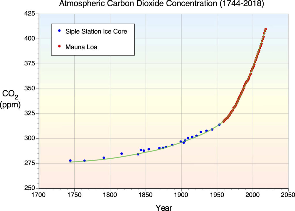
Figure 7.3. The following graph illustrates the rise in atmospheric carbon dioxide from 1744 to 2018. Note that the increase in carbon dioxide’s concentration in the atmosphere is exponential in nature. An extrapolation into the immediate future would suggest continued annual increases. Image Copyright: Michael Pidwirny. Data Source: Neftel, A., et al. 1994. Historical carbon dioxide record from the Siple Station ice core. pp. 11-14. In T.A. Boden, D.P. Kaiser, R.J. Sepanski, and F.W. Stoss (eds.) Trends’93: A Compendium of Data on Global Change. ORNL/CDIAC-65. Carbon Dioxide Information Analysis Center, Oak Ridge National Laboratory, Oak Ridge, Tenn. USA and Dr. Pieter Tans, NOAA/ESRL (http:// www.esrl.noaa.gov/gmd/ccgg/trends/) and Dr. Ralph Keeling, Scripps Institution of Oceanography (http://scrippsco2.ucsd.edu/).
Since 1750, the atmospheric concentration of the greenhouse gas methane (CH4) has increased by more than 150% (Figure 7.4). The primary sources for the additional methane added to the atmosphere (in order of importance) are rice cultivation, domestic grazing animals, termites, landfills, oil and gas extraction, and coal mining.
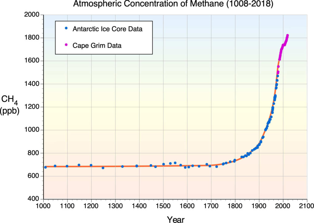
Figure 7.4. The following graph illustrates the rise in atmospheric methane from 1008 to 2015. Note that the increase in methane’s concentration in the atmosphere is exponential in nature. An extrapolation into the immediate future would suggest continued annual increases. Image Copyright: Michael Pidwirny. Data Source: D.M. Etheridge, L.P. Steele, R.J. Francey, and R.L. Langenfelds. 2002. Historical CH4 Records Since About 1000 A.D. From Ice Core Data. In Trends: A Compendium of Data on Global Change. Carbon Dioxide Information Analysis Center, Oak Ridge National Laboratory, U.S. Department of Energy, Oak Ridge, Tenn., USA. and NOAA Earth System Research Laboratory, Trends in Atmospheric Methane, http://www.esrl.noaa.gov/gmd/ccgg/trends_ch4/.
The average concentration of nitrous oxide (N2O) is now increasing at a rate of 0.2 to 0.3% per year (Figure 7.5). Nitrous oxide is another greenhouse gas. Its part in the enhancement of the greenhouse effect is minor relative to the other greenhouse gases already discussed. Nitrous oxide also contributes to the artificial fertilization of ecosystems. In extreme cases, this fertilization can lead to the death of forests, eutrophication of aquatic habitats, and species die-offs. Sources for the increase of nitrous oxide in the atmosphere include land-use conversion, fossil fuel combustion, biomass burning, and soil fertilization. Most of the nitrous oxide added to the atmosphere each year comes from deforestation and the conversion of forest, savanna, and grassland ecosystems into agricultural fields and rangeland.
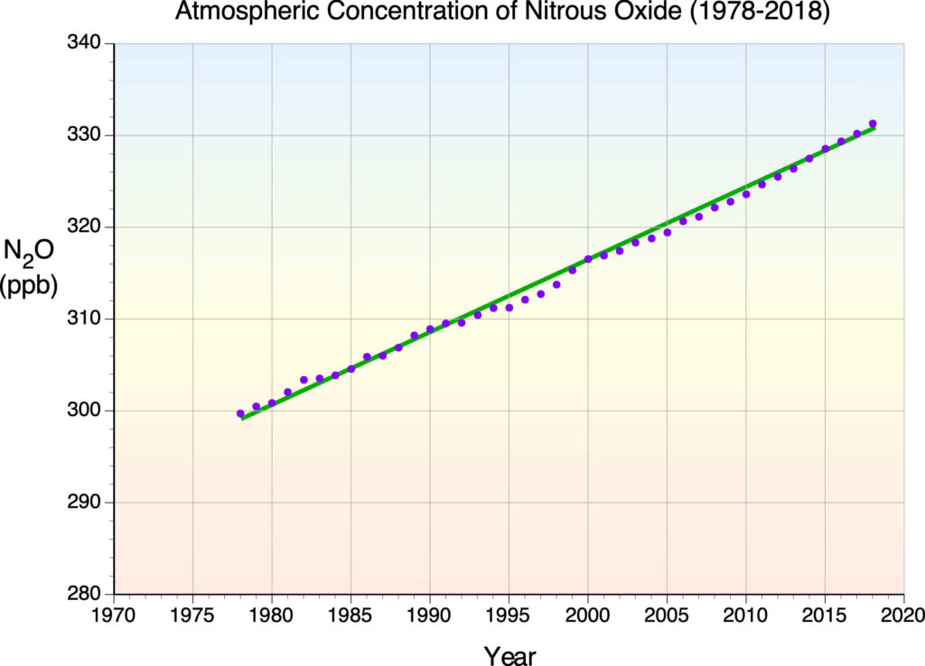
Figure 7.5. The following graph illustrates the rise in atmospheric nitrous oxide from 1978 to 2015. This increase appears linear. An extrapolation into the immediate future would suggest continued annual increases. Image Copyright: Michael Pidwirny. Data Source: National Oceanic and Atmospheric Administration’s (NOAA) Climate Monitoring and Diagnostics Laboratory, http://www.esrl.noaa.gov/gmd/hats/combined/N2O.html.
REPRESENTATIVE CONCENTRATION PATHWAYS
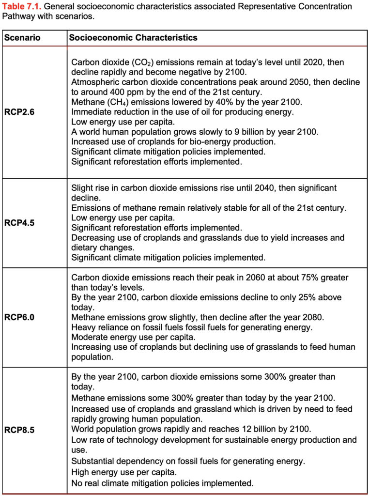
The most recent Intergovernmental Panel on Climate Change 5th Assessment Reports use four different future emission scenarios of greenhouse gases to model future climate conditions on our planet. These emission scenarios are called Representative Concentration Pathway 2.6 (RCP 2.6), 4.5 (RCP 4.5) 6.0 (RCP 6.0), and 8.5 (RCP 8.5) and are based on four assumptions of how future human population growth and socioeconomic development will unfold during the 21st century. The general socioeconomic characteristics associated with each of these scenarios are described in Table 7.1.
Many scientists believe RCP 4.5 (best-case scenario) is a most likely outcome than can occur with reasonable future efforts in climate change mitigation by our planet’s various nations. RCP 8.5 (worst-case scenario) represents what would happen if very little mitigation took place in the future to tackle climate change. Figure 7.6 shows the predicted future change in the atmospheric concentration of the greenhouse gases carbon dioxide (CO2), methane (CH4), and nitrous oxide (N2O) from the year 2000 to 2100 for these two Representative Concentration Pathways.
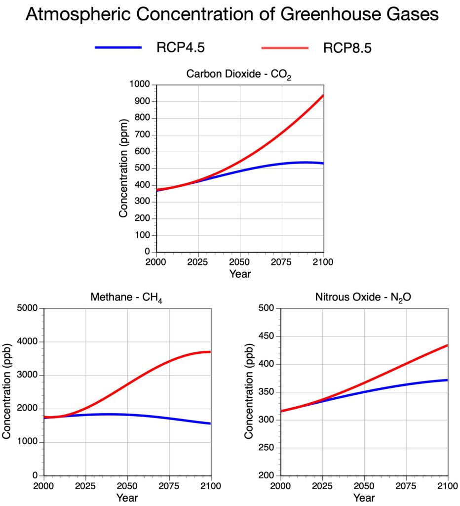
Figure 7.6. Estimated carbon dioxide, methane, and nitrous oxide atmospheric concentrations for the period 2000 to 2100 according to the RCP4.5 and RCP8.5 emission scenarios used in the 5th IPCC Assessment Reports. Image Copyright: Michael Pidwirny. Data Source: RCP Database Website – http://tntcat.iiasa.ac.at:8787/RcpDb/ .
LABORATORY 7 QUESTIONS
QUESTION 1
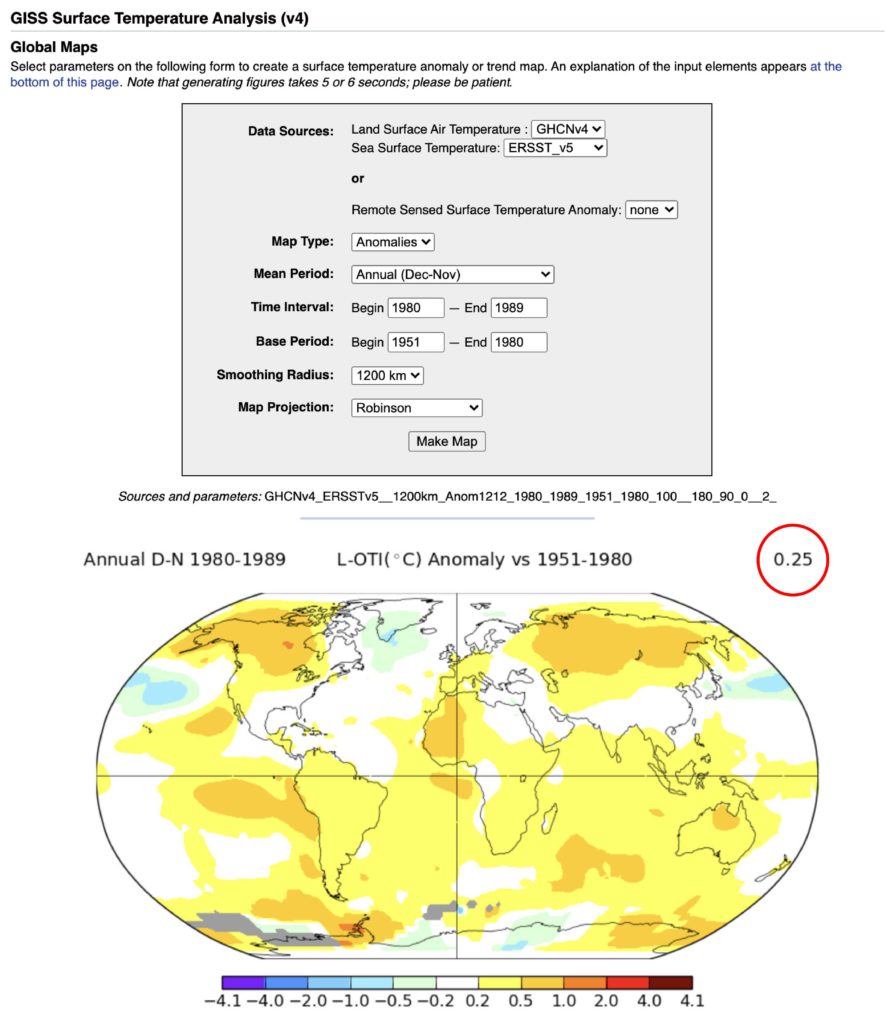
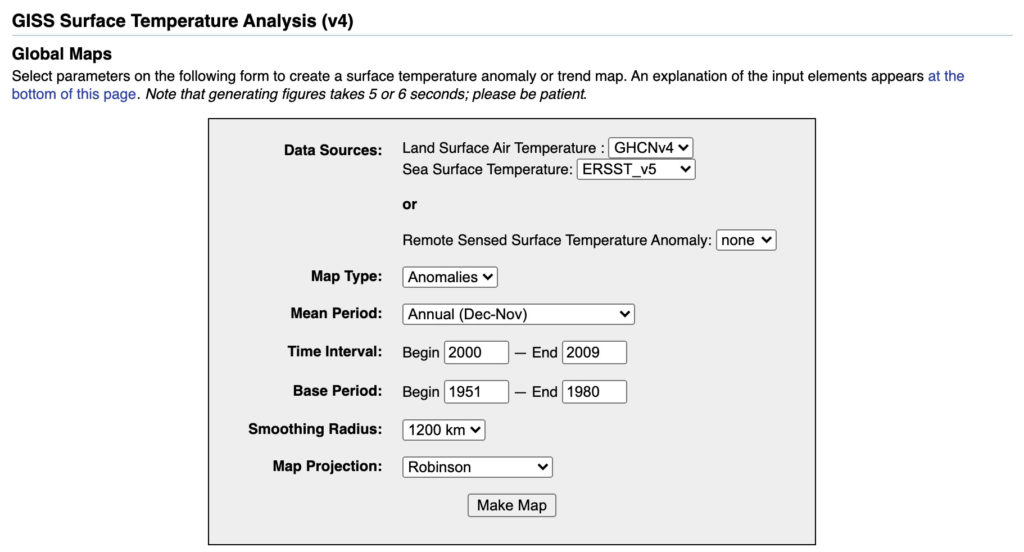
NASA maintains a dataset of land-based weather station (Global Historical Climatology Network – GHCN Version 4) and sea surface temperature (Extended Reconstructed Sea Surface Temperature – ERSST Version 5) measurements that are commonly used to calculate our planet’s annual mean global temperature. Using this dataset, NASA has been able to determine annual global mean temperatures back to 1880. You can access this dataset and do some simple comparative analyses using a utility that creates global maps at the following web address:
https://data.giss.nasa.gov/gistemp/maps/index_v4.html
The screen capture below shows a comparison of average annual (Dec-Nov) global mean temperature for the decade 1980 to 1989 to a baseline thirty-year period from 1951-1980 (NASA’s preferred climate normal). The map produced shows the temperature difference or anomaly between the two periods. This web tool also calculates the global temperature difference between the averages of these two periods for the entire surface of our planet. In this comparison, it tells us that the average of the ten-year period 1980-1989 was 0.25°C warmer than the 1951-1980 thirty-year average (see red circle).
Careful examination of the map indicates that the warming during the decade 1980-1989 was not spatially homogeneous. The warming in the Southern Hemisphere was quite similar over land and ocean surfaces measuring about 0.2 to 0.5 °C. There are some smaller areas where the warming was a bit higher reaching between 0.5 to 1.0 °C. A few areas over the oceans show no change and a couple of spots along the edge of Antarctica actually show a cooling trend. In the Northern Hemisphere, warming seems to be greater on land surfaces. There is a large area of warming in central North America and Siberia measuring between 0.5 to 1.0 °C. Most of the ocean surfaces in the Northern Hemisphere show no change in surface temperature. There are two areas of colder temperatures occurring over the middle of the North Pacific Ocean and around the bottom of Greenland.
Using NASA’s climate dataset and mapping website described above, answer the following questions.
1.1) Generate a map showing the difference between the decade 1990-1999 and the 1951-1980 thirty-year climate normal using the input values shown below.

1.1a) Globally, how much warmer was the average of the decade 1990-1999 than the 1951-1980 climate normal in °C?
1.1b) Describe the patterns of warming and/or cooling seen in the generated anomaly map of 1990-1999 vs the 1951-1980 climate normal. What is the relationship of the warming with latitude? Is there greater warming over land or over ocean surfaces? Is one hemisphere warming differently than the other?
1.2) Generate a map showing the difference between the decade 2000-2009 and the 1951-1980 thirty-year climate normal using the input values shown below.
1.2a) Globally, how much warmer was the average of the decade 2000-2009 than the 1951-1980 climate normal in °C?
1.2b) Describe the patterns of warming and/or cooling seen in the generated anomaly map of 2000-2009 vs the 1951-1980 climate normal. What is the relationship of the warming with latitude? Is there greater warming over land or over ocean surfaces? Is one hemisphere warming differently than the other?
1.3) Generate a map showing the difference between the decade 2010-2019 and the 1951-1980 climate normal using the input values shown below.

1.3a) Globally, how much warmer was the average of the decade 2000-2009 than the 1951-1980 climate normal in °C?
1.3b) Describe the patterns of warming and/or cooling seen in the generated anomaly map of 2010-2019 vs the 1951-1980 climate normal. What is the relationship of the warming with latitude? Is there greater warming over land or over ocean surfaces? Is one hemisphere warming differently than the other?
1.4) Generate a map showing the difference between the year 2016 and the 1951-1980 climate normal using the input values shown below. Climatologist has identified 2016 as the warmest year in the historical record dating back to 1880.

1.4a) Globally, how much warmer was the year 2016 than the 1951-1980 climate normal in °C?
1.4b) Describe the patterns of warming and/or cooling seen in the generated anomaly map of 2016 vs the 1951-1980 climate normal. What is the relationship of the warming with latitude? Is there greater warming over land or over ocean surfaces? Is one hemisphere warming differently than the other?
QUESTION 2
Use the following link to go to Climate Reanalyzer, Monthly Reanalysis Maps.
https://climatereanalyzer.org/reanalysis/monthly_maps/
One very interesting dataset available for analysis on the Monthly Reanalysis Maps webpage is climate simulation model forecasts for individual years from 2005 to 2100. This output was produced by the Community Climate System Model version 4 (CCSM4) Global Climate Model (GCM) developed by the University Corporation for Atmospheric Research (UCAR) at Boulder, Colorado, USA. Output is available for all four greenhouse gas emission scenarios: RCP 2.6, RCP 4.5, RCP 6.0, and RCP 8.5.
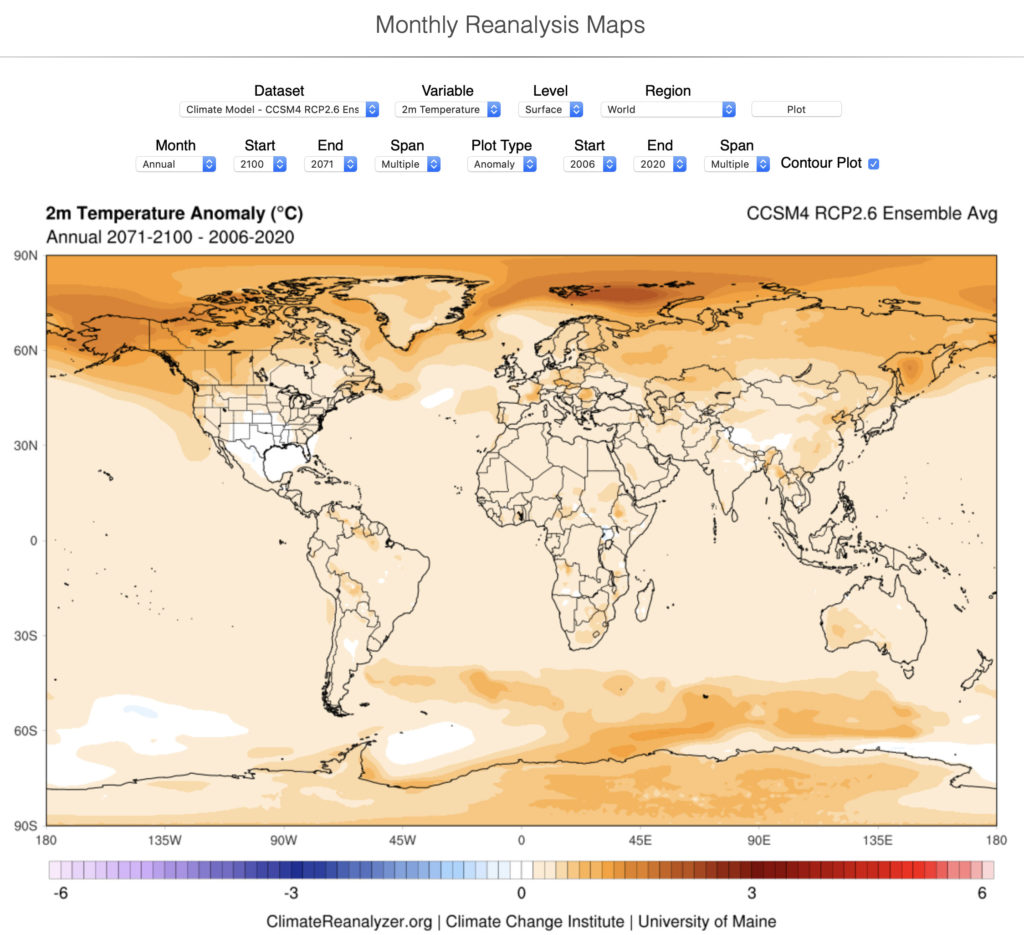
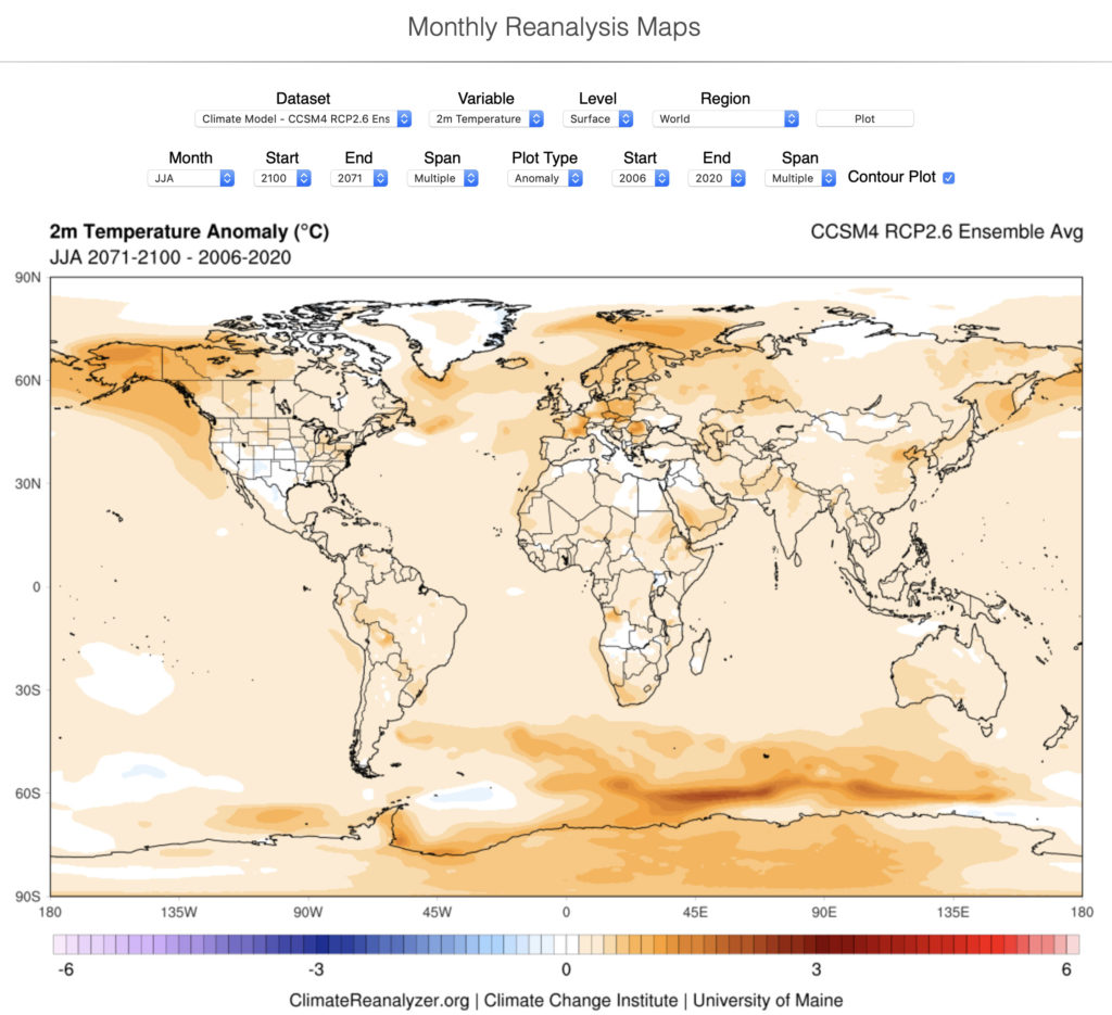
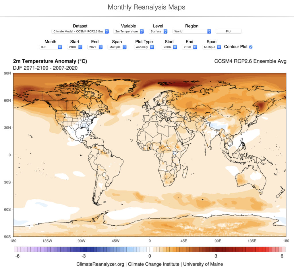
The next three maps were produced to examine the spatial change in surface mean temperatures (2 meters above ground level) under the RCP 2.6 greenhouse gas emission scenario annually, for summer (June, July, and August), and for winter (December, January, and February). In these three maps, the forecasted average conditions for 2071-2100 are compared to a 15-year base period of 2006-2020.
The RCP 2.6 greenhouse gas emission scenario assumes that we begin our path to lowering emissions of greenhouse gases starting in the year 2020 and eventually reaching zero emissions by 2100. This scenario also assumes that humans invest heavily in technologies to remove carbon dioxide from the atmosphere.
The first map compares the forecasted annual mean temperature in 2071-2100 to the base period of 2006-2020. The first thing to recognize on this anomaly map is that the predicted temperature change is not uniform across Earth’s surface. In general, warming increases in strength as we move from the equator to the poles. Regional hotspots (> 1 °C) occur over Alaska and in the Arctic Ocean north of Scandinavia. No or little warming occurs around northern Mexico and Texas, the Himalayas, and two patches in the ocean surrounding Antarctica.
The second map (below) compares forecasted summer mean temperature in 2071-2100 to the base period of 2006-2020. It differs from the annual map in that the degree of warming occurring in the Northern Hemisphere is muted. Much of the Arctic Ocean and the edge of Greenland show little or no warming. Hotspot areas in Antarctica and in the ocean between South America and Australia are somewhat greater than what was seen in the annual map.
The third map (below) compares forecasted winter mean temperature in 2071-2100 to the base period of 2007-2020. It differs from the annual map in that the degree of warming occurring in the Northern Hemisphere is much greater especially at higher latitudes. Hotspot areas on Antarctica and in the ocean between South America and Australia is somewhat less than what was seen in the annual map.
2.1) From the Climate Reanalyzer, Monthly Reanalysis Maps website, create a map that compares the forecasted annual mean temperature in 2071-2100 to the base period of 2006-2020 using the best-case RCP 4.5 greenhouse gas emission scenario (see image below for input settings). Answer the question that follows.

2.1a) Describe the patterns of warming and/or cooling seen in the map produced for the comparison of annual mean temperatures forecasted for 2071-2100 to the base period 2006-2020. How does the RCP 4.5 emission scenario compare to RCP 2.6?
2.2) From the Climate Reanalyzer, Monthly Reanalysis Maps website, create a map that compares the forecasted summer mean temperature in 2071-2100 to the base period of 2006-2020 using the RCP 4.5 greenhouse gas emission best-case scenario (see image below for input settings). Answer the question that follows.

2.2a) Describe the patterns of warming and/or cooling seen in the map produced for the comparison of summer mean temperatures forecasted for 2071-2100 to the base period 2006-2020. How does the RCP 4.5 emission scenario compare to RCP 2.6?
2.3) From the Climate Reanalyzer, Monthly Reanalysis Maps website, create a map that compares the forecasted winter mean temperature in 2071-2100 to the base period of 2007-2020 using the RCP 4.5 greenhouse gas emission best-case scenario (see image below for input settings). Answer the question that follows.

2.3a) Describe the patterns of warming and/or cooling seen in the map produced for the comparison of winter mean temperatures forecasted for 2071-2100 to the base period 2006-2020. How does the RCP 4.5 emission scenario compare to RCP 2.6?
2.4) From the Climate Reanalyzer, Monthly Reanalysis Maps website, create a map that compares the forecasted annual mean temperature in 2071-2100 to the base period of 2006-2020 using the worst-case RCP 8.5 greenhouse gas emission scenario (see image below of input settings). Answer the question that follows.
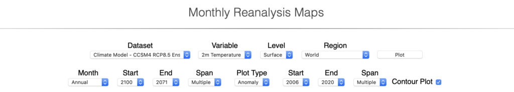
2.4a) Describe the patterns of warming and/or cooling seen in the map produced for the comparison of annual mean temperatures forecasted for 2071-2100 to the base period 2006-2020. How does the RCP 8.5 emission scenario compare to RCP 2.6?
2.5) From the Climate Reanalyzer, Monthly Reanalysis Maps website, create a map that compares the forecasted summer mean temperature in 2071-2100 to the base period of 2006-2020 using the worst-case RCP 8.5 greenhouse gas emission scenario (see image below for input settings). Answer the question that follows.

2.5a) Describe the patterns of warming and/or cooling seen in the map produced for the comparison of summer mean temperatures forecasted for 2071-2100 to the base period 2006-2020. How does the RCP 8.5 emission scenario compare to RCP 2.6?
2.6) From the Climate Reanalyzer, Monthly Reanalysis Maps website, create a map that compares the forecasted winter mean temperature in 2071-2100 to the base period of 2007-2020 using the worst-case RCP 8.5 greenhouse gas emission scenario (see image below for input settings). Answer the question that follows.

2.6a) Describe the patterns of warming and/or cooling seen in the map produced for the comparison of winter mean temperatures forecasted for 2071-2100 to the base period 2006-2020. How does the RCP 8.5 emission scenario compare to RCP 2.6?
QUESTION 3
ClimateNA is a computer database that can downscale North American climate data to the local level. From this climate database, we can generate historic (1901 to 2019) and future climate data for any location in North America. Future forecasts are based on the output generated from a number of global circulation models programmed with a variety of different greenhouse gas emission scenarios.
The ClimateNA computer model can be run from an Internet browser like Google Chrome, Firefox or Safari. To begin this process, you must go to the following URL:
At this URL you will see the following web page:
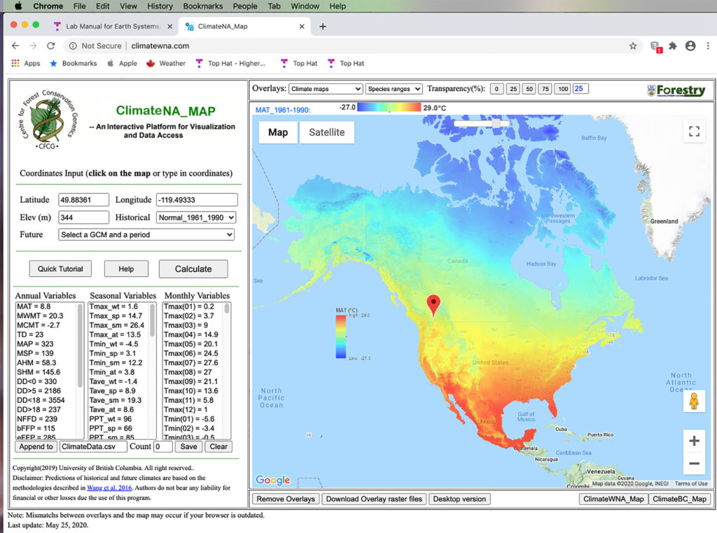
The ClimateNA model input window above shows the Normal 1961-1990 output for Kelowna. To run the ClimateNA model four pieces of information must be entered: latitude and longitude of the location, the location’s elevation, and the select period (Historical or Future).
For the output shown above the period selected was Normal 1961-1990 from the historical drop-down button. Note that a variety of different options can be selected to produce Historical output. Historical output can be generated for a single year between 1901 to 2015, or an average for a 10-year period, or an average for a 30-year period.
To generate Future output, we need to select the drop-down button labeled Future. Once again, a number of options are available. These options include the outputs of three different computer models, three different future greenhouse gas scenarios, and three different future time periods. The following information describes some of the specifics related to these model inputs.
Computer Models
- CanESM2 – a fourth-generation coupled general circulation model (GCM) developed by Environment Canada’s Centre for Climate Modelling and Analysis.
- CNRM-CM5 – an earth system model (ESM) developed by Météo-France and the Centre Européen de Recherche et de Formation Avancée en Calcul Scientifique.
- HadGEM2-ES – a second-generation general circulation model (GCM) developed by the United Kingdom’s Met Office Hadley Centre.
Future Greenhouse Gas Scenarios
- RCP2.6 – this scenario assumes that the equivalent quantity of carbon dioxide in the atmosphere reaches 490 ppm and that the amount of radiative forcing added to the Earth’s climate is equal to 2.6 Wm2 by the year 2100.
- RCP4.5 – this scenario assumes that the equivalent quantity of carbon dioxide in the atmosphere reaches 650 ppm and that the amount of radiative forcing added to the Earth’s climate is equal to 4.5 Wm2 by the year 2100.
- RCP8.5 – this scenario assumes that the equivalent quantity of carbon dioxide in the atmosphere reaches 1370 ppm and that the amount of radiative forcing added to the Earth’s climate is equal to 8.5 Wm2 by the year 2100.
Future Period
- 2025 (average 2010-2014)
- 2055 (average 2040-2070)
- 2085 (average 2070-2100)
Output from the model is located in three columns on the web page. In the Annual Variables column, data for the following calculated variables are shown:
- MAT Mean annual temperature (°C)
- MWMT Mean warmest month temperature (°C)
- MCMT Mean coldest month temperature (°C)
- TD Temperature difference between MWMT and MCMT, or continentality (°C)
- MAP Mean annual precipitation (mm)
- MSP Mean annual summer (May to Sept.) precipitation (mm)
- AHM Annual heat: moisture index (MAT+10)/(MAP/1000))
- SHM Summer heat: moisture index ((MWMT)/(MSP/1000))
- DD<0 Degree-days below 0°C, chilling degree-days
- DD>5 Degree-days above 5°C, growing degree-days
- DD<18 Degree-days below 18°C, heating degree-days
- DD>18 Degree-days above 18°C, cooling degree-days
- NFFD The number of frost-free days
- FFP Frost-free period
- bFFP The Julian date on which FFP begins
- eFFP The Julian date on which FFP ends
- PAS Precipitation as snow (mm)
- EMT Extreme minimum temperature over 30 years
- EXT Extreme maximum temperature over 30 years. For an individual year, the EXT is estimated for the 30-year normal period where the individual year is centred
- Eref Hargreaves reference evaporation
- CMD Hargreaves climatic moisture deficit
In the Seasonal Variables column, data for the following calculated variables are shown:
- TAV_wt Winter mean temperature (°C)
- TAV_sp Spring mean temperature (°C)
- TAV_sm Summer mean temperature (°C)
- TAV_at Autumn mean temperature (°C)
- TMAX_wt Winter mean maximum temperature (°C)
- TMAX_sp Spring mean maximum temperature (°C)
- TMAX_sm Summer mean maximum temperature (°C)
- TMAX_at Autumn mean maximum temperature (°C)
- TMIN_wt Winter mean minimum temperature (°C)
- TMIN_sp Spring mean minimum temperature (°C)
- TMIN_sm Summer mean minimum temperature (°C)
- TMIN_at Autumn mean minimum temperature (°C)
- PPT_wt winter precipitation (mm)
- PPT_sp spring precipitation (mm)
- PPT_sm summer precipitation (mm)
- PPT_at autumn precipitation (mm)
In the Monthly Variables column, data for the following calculated variables are shown:
- Tave01 – Tave12 January – December mean temperatures (°C)
- Tmax1 – Tmax12 January – December maximum mean temperatures (°C)
- Tmin01 – Tmin12 January – December minimum mean temperatures (°C)
- PPT01 – PPT12 January – December precipitation (mm)
- DD_0_01 – DD_0_12 January – December degree-days below 0°C
- DD5_01 – DD5_12 January – December degree-days above 5°C
- DD_18_01 – DD_18_12 January – December degree-days below 18°C
- DD18_01 – DD18_12 January – December degree-days above 18°C
- NFFD01 – NFFD12 January – December number of frost-free days
- PAS01 – PAS12 January – December precipitation as snow
- Eref01 – Eref12 January – December Hargreaves reference evaporation
- CMD01 – CMD12 January – December Hargreaves climatic moisture deficit
3.1) Using the web-based ClimateNA model, generate the missing monthly and annual (Tave &MAT) temperature and precipitation (Prec & MAP) data associated with the 1961-1990 Normal and the CanESM2 Model (CGCM) and with the RCP8.5 greenhouse gas emission scenario for the period 2085 for Kelowna, British Columbia, Canada. Also, calculate the difference between this future climate state and the 1961-1990 Normal period. Use the Microsoft Word file found in Top Hat called Lab_7_Question_3.doc to enter your answers for the table. Send this completed file to your TA or Instructor.
Note that ClimateNA requires that the user hit “calculate” every time the model is rerun.
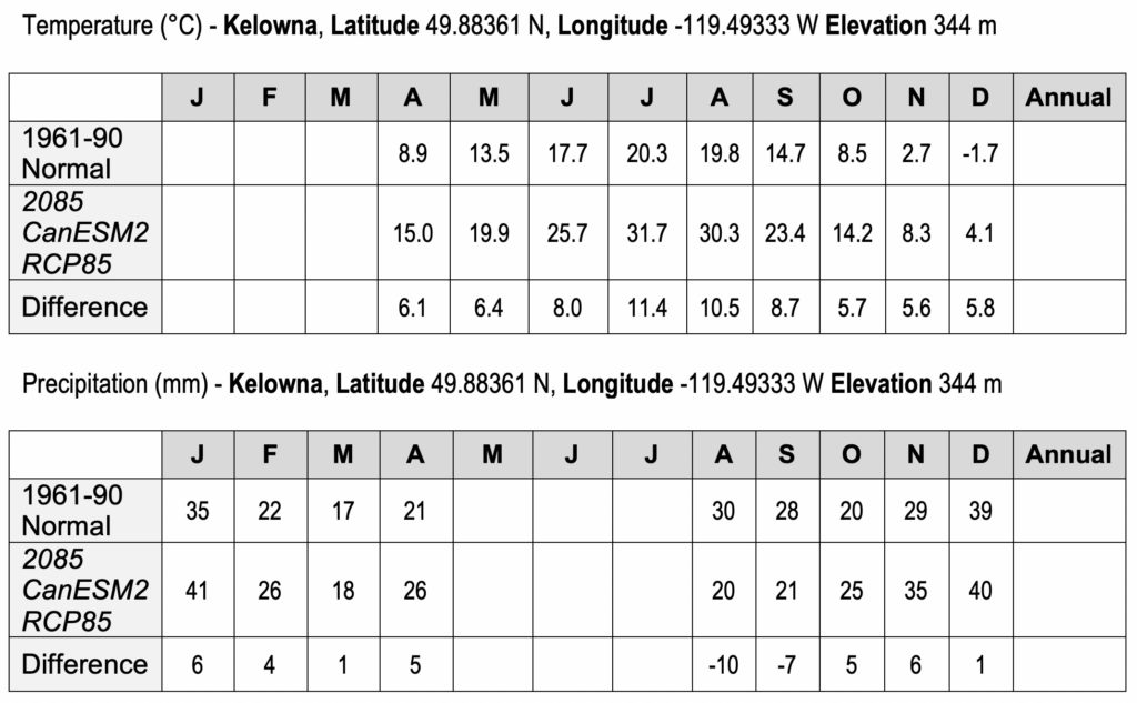
3.1a) How much snow (PAS) falls annually in Kelowna according to the 1961-1990 output in mm water equivalent?
3.1b) How much snow (PAS) will fall in Kelowna according to the 2085 future forecast in mm water equivalent?
Growing degree days (DD>5) are a measure of the heat available for growing crops. Forage and cereal crops do not grow well at temperatures less than 5 degrees Celsius, so this value is often used as a threshold. Other crops thrive at higher temperatures.
3.1c) How many growing degree days (DD>5) did Kelowna have during the 1961-1990 Normal?
3.1d) How many growing degree days (DD>5) will Kelowna have according to the 2085 future forecast?
Frost-free period (FFP) is calculated as the consecutive number of days between the last day the minimum daily temperature is below 0°C in spring to the first day the minimum daily temperature drops below 0°C in the fall.
3.1e) How long was Kelowna’s frost-free period (FFP) during the 1961-1990 Normal?
3.1f) How long will Kelowna’s frost-free period (FFP) be according to the 2085 future forecast?
3.2) Using the web-based ClimateNA model, generate the missing temperature and precipitation values forecasted by the CanESM2 Model (CGCM) and with the RCP8.5 greenhouse gas emission scenario for the period 2085 for Fresno, California, USA. Calculate the difference between this future climate state and the 1961-1990 Normal period and use the annual data to answer the questions that follow. Use the Microsoft Word file found in Top Hat called Lab_7_Question_3.doc to enter your answers for the table. Send this completed file to your TA or Instructor.
Note that ClimateNA requires that the user hit “calculate” every time the model is rerun.
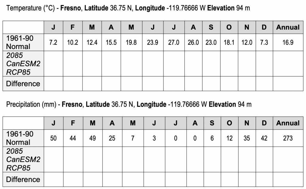
3.2a) How many growing degree days (DD>5) did Fresno have during the 1961-1990 Normal?
3.2b) How many growing degree days (DD>5) will Fresno have according to the 2085 future forecast?
Cooling degree days (DD>18) are a measure of how much energy may be required to cool homes and buildings. Let us examine how the 2085 forecast will affect the need for air conditioning in Fresno.
3.2c) How many cooling degree days (DD>18), degree days above 18 degrees Celsius, did Fresno have during the 1961-1990 Normal?
3.2d) How many cooling degree days (DD>18), degree days above 18 degrees Celsius, will Fresno have according to the 2085 future forecast?
Heating degree days (DD<18) are a measure of how much energy may be required to warm homes and buildings. Let us examine how the 2085 forecast will affect the need for home heating in Fresno.
3.2e) How many heating degree days (DD<18), degree days below 18 degrees Celsius, did Fresno have during the 1961-1990 Normal?
3.2f) How many heating degree days (DD<18), degree days below 18 degrees Celsius, will Fresno have according to the 2085 future forecast?
IMAGE CREDITS
Figure 7.1: Image Copyright Michael Pidwirny.
Figure 7.2: Image Copyright Michael Pidwirny. Date Source: NASA – Goddard Institute for Space Studies – Surface Temperature Analysis. Land Data from GISS Analysis, Ocean Data from Hadl/Reyn_v2: SST 1880-Present.
Figure 7.3: Image Copyright Michael Pidwirny. Data Source: Neftel, A., et al. 1994. Historical carbon dioxide record from the Siple Station ice core. pp. 11-14. In T.A. Boden, D.P. Kaiser, R.J. Sepanski, and F.W. Stoss (eds.) Trends’93: A Compendium of Data on Global Change. ORNL/CDIAC-65. Carbon Dioxide Information Analysis Center, Oak Ridge National Laboratory, Oak Ridge, Tenn. USA and Dr. Pieter Tans, NOAA/ESRL (http:// www.esrl.noaa.gov/gmd/ccgg/trends/) and Dr. Ralph Keeling, Scripps Institution of Oceanography (http://scrippsco2.ucsd.edu/).
Figure 7.4: The following graph illustrates the rise in atmospheric methane from 1008 to 2015. Note that the increase in methane’s concentration in the atmosphere is exponential in nature. An extrapolation into the immediate future would suggest continued annual increases. Image Copyright: Michael Pidwirny. Data Source: D.M. Etheridge, L.P. Steele, R.J. Francey, and R.L. Langenfelds. 2002. Historical CH4 Records Since About 1000 A.D. From Ice Core Data. In Trends: A Compendium of Data on Global Change. Carbon Dioxide Information Analysis Center, Oak Ridge National Laboratory, U.S. Department of Energy, Oak Ridge, Tenn., USA. and NOAA Earth System Research Laboratory, Trends in Atmospheric Methane, http://www.esrl.noaa.gov/gmd/ccgg/trends_ch4/.
Figure 7.5: The following graph illustrates the rise in atmospheric nitrous oxide from 1978 to 2015. This increase appears linear. An extrapolation into the immediate future would suggest continued annual increases. Image Copyright: Michael Pidwirny. Data Source: National Oceanic and Atmospheric Administration’s (NOAA) Climate Monitoring and Diagnostics Laboratory, http://www.esrl.noaa.gov/gmd/hats/combined/N2O.html.
Figure 7.6: Estimated carbon dioxide, methane, and nitrous oxide atmospheric concentrations for the period 2000 to 2100 according to the RCP4.5 and RCP8.5 emission scenarios used in the 5th IPCC Assessment Reports. Image Copyright: Michael Pidwirny. Data Source: RCP Database Website – http://tntcat.iiasa.ac.at:8787/RcpDb/ .
QUESTION ANSWER SHEET
This Laboratory Exercise is Licensed Under Attribution-NonCommercial-NoDerivatives 4.0 International (CC BY-NC-ND 4.0).
Updated April 5, 2021
Warming of the Earth's average global temperature because of an increase in the concentration of atmospheric greenhouse gases. A higher concentration of greenhouse gases in the atmosphere is believed to enhance the greenhouse effect., producing more heat energy.
Normally, it is the annual mean temperature value calculated from all of Earth’s surface (terrestrial and ocean) meteorological stations for a particular year. The World Meteorological Organization (WMO) calculated the annual mean global temperature for 2011 to be 14.41°C (57.94°F). This value can also be calculated for a specific number of years. For the 30-year period 1961 and 1990, the annual mean global temperature was about 14.0°C (57.2°F). NASA uses the period 1951-1980 for comparative purposes and suggests the average annual mean global temperature for this 30-year period was 14.0°C. Also called annual average global temperature.
A time when glaciers dominate the landscape of the Earth. The last major Ice Age was the Pleistocene Epoch.
A time during an ice age when glaciers melted and retreated because of milder temperatures.
The greenhouse effect causes the atmosphere to trap more heat energy at the Earth's surface and within the atmosphere by absorbing and reemitting longwave radiation. Of the longwave energy emitted back to space, 90% is intercepted and absorbed by greenhouse gases. Without the greenhouse effect the Earth's annual mean global temperature would be -18°C (-0.4°F), rather than the present 15°C (59°F). In the last few centuries, the activities of humans have directly or indirectly caused the concentration of the major atmospheric greenhouse gases to increase. Scientists predict that this increase may enhance the greenhouse effect making the planet warmer. Some experts estimate that the Earth's annual mean global temperature has already increased by 0.3 to 0.6°C (0.5 to 1.0°F), since the beginning of this century, because of this enhancement.
The various gases responsible for a greenhouse effect to operate in a planet's atmosphere. On Earth, these gases include water vapor (H2O), carbon dioxide (CO2), methane (CH4), nitrous oxide (N2O), chlorofluorocarbons (CFXClX), and tropospheric ozone (O3).
Common gas found in the atmosphere. Carbon dioxide can selectively absorb radiation in the longwave band. This absorption causes the greenhouse effect. The concentration of this gas has been steadily increasing in the atmosphere over the last three centuries due to the burning of fossil fuels, deforestation, and land-use change. Some scientists believe higher concentrations of carbon dioxide and other greenhouse gases will result in an enhancement of the greenhouse effect and global warming. The chemical formula for carbon dioxide is CO2.
Carbon-based remains of organic matter that has been geologically transformed into coal, oil, and natural gas. Combustion of these substances releases significant amounts of energy. Currently, humans are using fossil fuels to supply much of their energy needs. However, the use of fossil fuels is creating a number of environmental problems including acid deposition, air and water pollution, and climate change.
Methane is very strong greenhouse gas found in our planet’s atmosphere. Methane concentrations in the atmosphere have increased by more than 140% since 1750. The primary sources for the additional methane added to the atmosphere (in order of importance) are: rice cultivation, domestic grazing animals, termites, landfills, coal mining, and oil and gas extraction. Chemical formula for methane is CH4.
A gas produced by bacterial action in the soil and by high temperature combustion. Nitric oxide is a component in the production of photochemical smog. This colorless gas has the chemical formula is NO.
Is an intergovernmental scientific body created by the World Meteorological Organization (WMO) and the United Nations Environment Programme (UNEP). The purpose of this group of scientists is to produce scientific assessments of scientific, technical, and socio-economic information regarding the risk of human-mediated climate change. Further, the body determines the potential environmental and socio-economic consequences of human caused climate change and suggests options for adapting to these consequences or mitigating its effects. See the following website for more information: http://www.ipcc.ch.
