Lab 03: Atmospheric Structure and Pressure Systems
Leonard Tang
This lab is designed for you to gain an understanding of the basic structure of our atmosphere using real data. In addition, you will also learn the different types of pressure systems, how to identify them, and their relationships with atmospheric circulation, the phenomena you may be more familiar with calling by the name of wind.
Learning Objectives
After completion of this lab, students will be able to
- Identify the different temperature layers in the lower atmosphere.
- Produce a sounding (temperature profile) using an Excel spreadsheet.
- Understand and calculate the Environmental Lapse Rate.
- Identify high- and low-pressure systems.
- Relate pressure systems and wind.
Pre-Readings
In order to complete this lab, you will need some background on the structure of the atmosphere, pressure systems and circulation, and calculating lapse rates.
Atmospheric Structure
Although it may not be visible to us from Earth, the atmosphere surrounding Earth has a number of layers that have different characteristics and perform different functions in supporting life on Earth. Key features of the lower atmosphere are the troposphere, the tropopause, and the stratosphere.
Quick reviews of atmospheric structure are provided in
- Atmospheric Structure Part 1: the troposphere and tropopause; and
- Atmospheric Structure Part 2: the stratosphere and beyond, and the functional layers of the atmosphere.
Pressure Systems and Circulation
Atmospheric pressure is the weight of air exerted on a surface. Wind is a direct result of the difference in atmospheric pressure between two places, that is, the pressure gradient between two locations. This means that if we know the spatial distribution of pressure systems over a certain area, we can determine the wind patterns in that same area.
For example, the EarthWindMap website provides a visualization of wind patterns. Open the website to see the wind represented by the animated white lines. These wind patterns can help us identify where the major high- and low-pressure systems are located. Recall that winds blow outward from high-pressure systems in a clockwise direction, whereas winds blow inward to low pressure systems in a counterclockwise direction. Can you use the animation to help you identify high- and low-pressure systems? Figure 3.1 provides a static example.
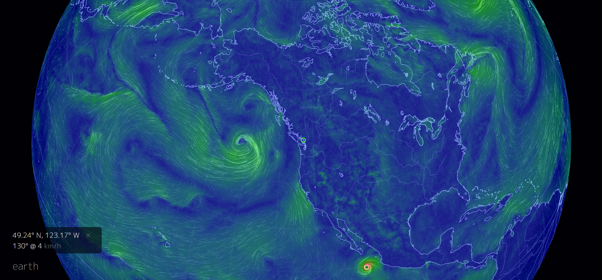
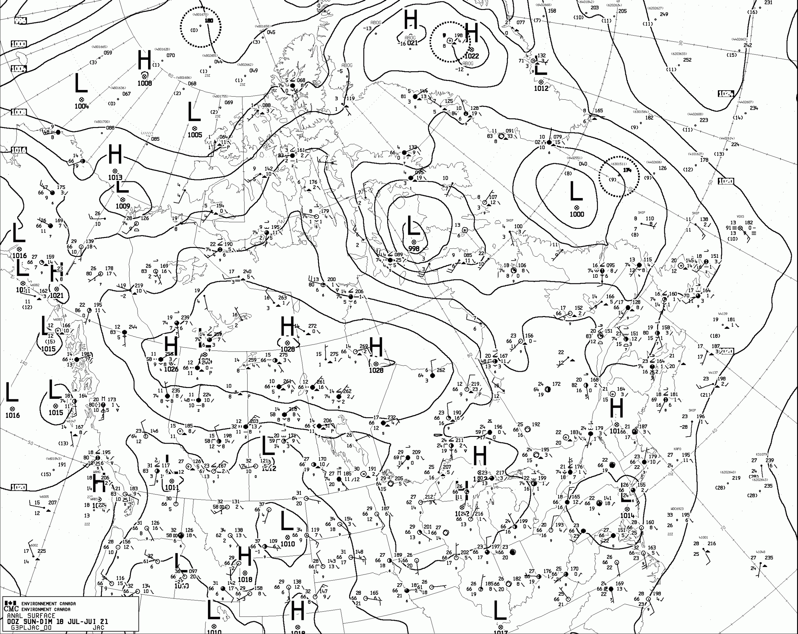
Another common method to look at pressure systems is to look at an actual weather map. Figure 3.2 is a surface weather map produced by Environment Canada. Notice the isobars drawn on the map, as well as the high-pressure (H) and low-pressure (L) systems. Recall that isobars are lines of equal pressure.
For a more detailed explanation, please review Atmospheric Circulation. Please note that when you visit this website a video (drought_88_winds_reduced (MOV) may download. This is the animation referred to in the first paragraph on the page. To watch it, open the file in your default video player.
EarthWindMap Website
One of the exercises in this lab requires you to use the EarthWindMap website. This website allows you to visualize earth conditions by animating the wind, currents, or waves with a range of overlays, including wind, temperature, and relative humidity at a range of heights, with data provided by a number of sources. In this lab we will use the wind animation with the temperature overlay.
In the earth menu, the height of the atmosphere is provided in hectopascals (hPa). For reference, pascal (Pa) is the SI unit of measurement for pressure. One hectopascal is equivalent to 100 pascals or 0.1 kilopascals (kPa). The average sea-level pressure is 1013.25 hPa. The approximate heights (in kilometres, km) that correspond to the different pressures are presented in Table 3.1.
This website presents wind direction as an azimuth. Azimuth refers to the compass direction expressed in degrees as a number between 0 and 360. Directions expressed as an azimuth do not include cardinal directions (north, south, east, west and their derivatives). For example, northwest has an azimuth of 305⁰.
Calculating Environmental Lapse Rates
The lapse rate is the rate of change of temperature with altitude in the atmosphere. The lapse rate of the troposphere is technically called the Environmental Lapse Rate (ELR). To calculate the ELR, we need to know the temperature at the surface, assumed to be equal to 1000 hPa (T1) and the temperature at the tropopause (T2), and the altitude of the surface at mean sea level (z1) and the altitude of the tropopause (z2).
With this information, the ELR can be calculated using Equation 3.1:
[latex]\text{ELR} (^{\circ} C/km) = -1 \left( \dfrac{\Delta T}{\Delta z} \right) = -1 \left( \dfrac{T_{2} - T_{1}}{z_{2} - z_{1}} \right)[/latex]
where
- Δ = delta symbol, represents the change in the variable it precedes (for example, the change in temperature)
- T = air temperature (normally in °C)
- z = altitude (normally in km)
- T1 , z1 = the measurement taken at the lower point in the atmosphere
Let us assume that the temperature at 1000 hPa is 19.7°C and the temperature at the tropopause is -56.3°C. For simplicity, assume the tropopause is at 12 km above sea level. In actuality, the height of the tropopause varies with latitude and time of year. The ELR is calculated using Equation 3.1 as
[latex]\text{ELR} (^{\circ} C/km) = -1 \left( \dfrac{T_{2} - T_{1}}{z_{2} - z_{1}} \right) = -1 \left( \dfrac{-56.3^{\circ} C - 19.7^{\circ} C}{12 \text{ km} - 0 \text{ km}} \right) = 6.33 ^{\circ} C/km[/latex]
The ELR is 6.33°C/km, meaning the temperature drops by about 6°C for each kilometre we go up in the troposphere.
Lab Exercises
In this lab you will:
- Construct a sounding of the lower atmosphere and identify the layers present in the lower atmosphere.
- Calculate the Environmental Lapse Rate of the troposphere.
- Identify pressure systems and wind direction on weather maps.
You will need a web browser (Chrome or Firefox preferable), Excel, and a calculator to complete the lab assignment.
EX1: Construct a Sounding (Temperature Profile) of the Lower Atmosphere
In this exercise, you will obtain temperature data and plot them on a graph to produce a sounding.
Step 1: Go to Vancouver on EarthWindMap. The green circle on the map is the approximate location of Vancouver (Figure 3.3). At the bottom left of the map, you will see the coordinates of Vancouver (49.24°N 123.17°W), the wind direction (145°, expressed as azimuth), wind speed (5km/h), and air temperature (16.6°C) at the surface.
Step 2: Click on earth at the bottom-left of the screen and the menu will expand. In this exercise we will use the temperature data at different heights. For example, in Figure 3.4 the temperature in Vancouver at the surface is 16.6°C, on August 18th, 2020 at 20:00 local time.
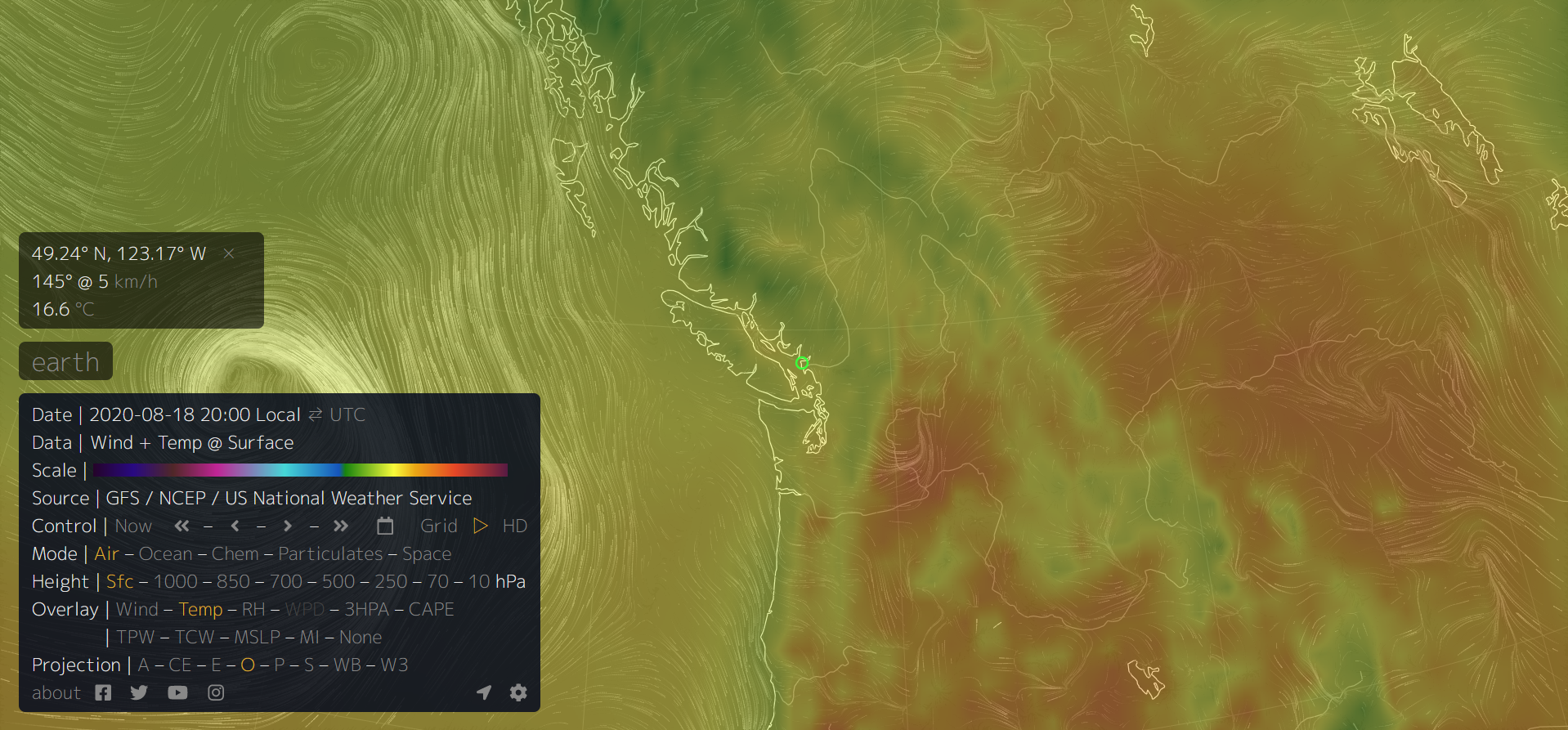
Step 3: Open an Excel spreadsheet and set up a table similar to Table 3.2. Starting at 1000 hPa, obtain temperature data at each available elevation by clicking on the heights one by one in the Height option in the menu. The temperature (and other data) will change in the values box located above the menu box on your screen. Record the values in your table. Also record the date and time from the Earth Wind map at which you obtain your values.
| Pressure (hPa) | T (°C) |
|---|---|
| 1000 | 19.7 |
| 850 | 12.7 |
| 700 | 4.2 |
| 500 | -12.1 |
| 250 | -48.3 |
| 70 | -56.3 |
| 10 | -38.6 |
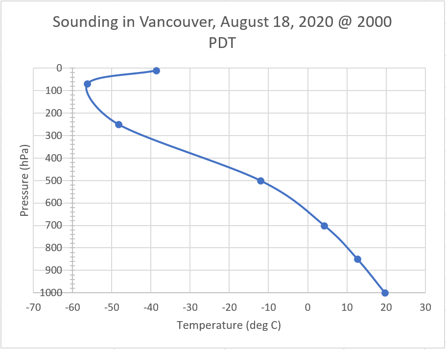
Step 4: Plot the data. Reverse the columns so that temperature is the left column and pressure is the right column. Then select all the data including the column headings. Click Insert to open the Insert tab. Click a Scatter chart with smooth lines and markers. A chart will appear on your spreadsheet. Hopefully, it will show a line with pressure values on the vertical axis and temperature values on the horizontal axis.
We need to make two modifications to make our data easier to understand:
- We want the pressure values to be the highest at the bottom, to correspond to the high pressures at the bottom of the atmosphere. To do this, double click on the numbers in the vertical axis and a Format Axis box will appear to the right of your screen. Click Axis Options at the top and open the detailed Axis Options options by clicking on the triangle to the left of the title. Scroll down and click on the check box for Values in reverse order. To move the axis to the bottom of the graph, scroll up to Horizontal axis crosses and select Maximum axis value.
- We don't want the vertical axis to interrupt our view of our data. Double click on the numbers in the horizontal axis and a revised menu will appear in the Format Axis box. Scroll down to Vertical axis crosses, select Axis value and type the value in the box to the right that is a little lower than your lowest temperature reading.
Step 5: Complete your graph by adding a title and labeling the axes. Include the location, date and time in your title, and units in the axis labels. The resulting graph shows the vertical temperature variation of the lower atmosphere, also known as a sounding. An example is shown on Figure 3.5.
EX2: Identifying Temperature Layers of the Atmosphere
On the sounding you plotted in EX1, label these three important locations:
- troposphere
- tropopause
- stratosphere
Use textboxes to put labels on your graph. Use arrows to show the extent of the troposphere and stratosphere.
EX3: Calculating the Environmental Lapse Rate
Using the data collected, calculate the lapse rate of the troposphere, also called the Environmental Lapse Rate. Obtain the required temperatures from the graph you created in EX1 and EX2. Convert the altitude in pressure (hPa) to km using Table 3.1.
Show your calculation and answer in a text box next to the sounding. Enter your working as an equation using the Equation editor. Note that the Equation editor will only become available after you insert a text box.
The concept and the importance of lapse rate is examined in Lab 08 under the topic of Atmospheric Stability.
EX4: Pressure Systems and Their Relationships With Wind
- Your instructor will provide you with a map similar to Figure 3.1. Annotate the map by adding H and L where the main pressure systems are located.
- Obtain the Surface Analysis Map from Worksheets. Draw arrows on the map to indicate the wind directions based on where the high- and low-pressure systems are located. Draw 3-4 arrows for each pressure system on the map.
Reflection Questions
- Using the data you collected in EX1, briefly explain why temperature varies in the troposphere. For example, if you climb a mountain 3 km tall at the location you chose, how and why would the temperature change?
- If the temperature variation in the troposphere is reversed (i.e. temperature increases with elevation) what phenomenon is it?
- In your own words, explain how pressure systems and wind are related. How and why are the spacing of isobars on a weather map important?
Worksheets
Surface Analysis Map. Note that this is a live link. The map updates on a regular basis.

![Surface Analysis Map [GIF]](https://weather.gc.ca/data/analysis/jac12_100.gif)