10. Correlation and Regression
10a. Correlation
This chapter marks a big shift from the inferential techniques we have learned to date. Here we will be looking at relationships between two numeric variables, rather than analyzing the differences between the means of two or more experimental groups.
Correlation is used to test the direction and strength of the relationships between two numerical variables. We will see how scatterplots can be used to plot variable X against variable Y to detect linear relationships. The slop of the linear relationship can be positive or negative, which reveals systematic patterns in how the two variables co-relate. We will also look at the theory of correlational analysis, including some cautions around interpreting the results of correlational analyses. Thanks to the third variable problem, correlation does NOT equal causation, a mantra that should be familiar from your introductory psychology courses. And finally, we will try calculating correlation by partitioning covariance, and put it all into practice in a hypothesis test. Later in the chapter, we will build in regression, which allows us to predict the future from the past.
Just like a bar graph is helpful to examine visually the differences among means, a scatterplot allows us to visualize the pattern that represents the relationship between two numeric variables, X vs. Y.
If the trend line that best indicates the linear pattern in the scatter plot has an upward slope, we consider that a positive directionality.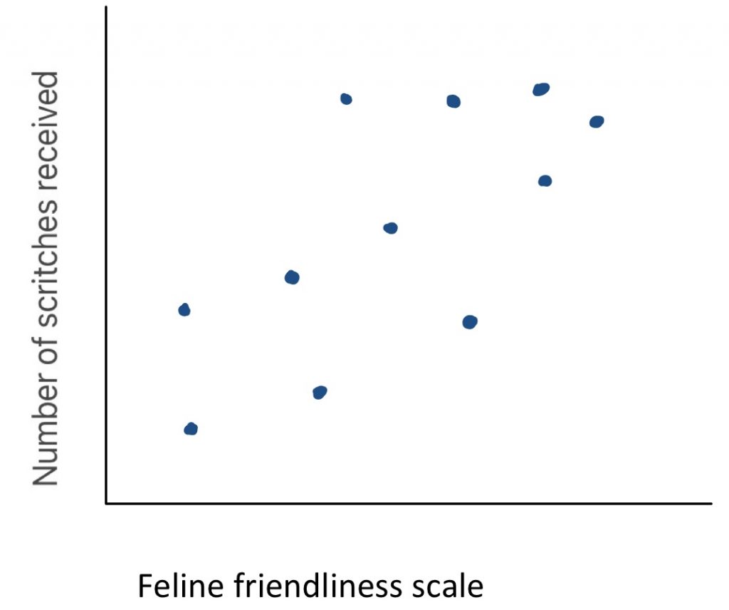
To find out if there appears to be a positive correlation, you can ask yourself “are those that score high on one variable likely to score high on the other?” Here we see an example: what is the relationship between feline friendliness and number of scritches received? As you can see, when cat friendliness is high, the cuddles received is also high. There is a clear positive trend line. This make sense – people may be more likely to offer cuddles to a cat that solicits them.
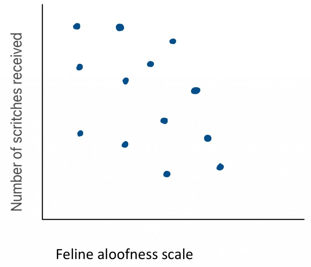
A downward slope indicates a negative directionality. To find out if there appears to be a negative correlation, you can ask yourself “are those that score high on one variable likely to score low on the other?” Here you can see an example: what is the relationship between feline aloofness and the number of scritches received? There is a clear negative trend line. This makes logical sense, because people may be less likely to offer cuddles to a cat that keeps to itself.
When we look at a scatter plot, we want to ask ourselves two questions: one about the apparent strength of the relationship between the variables, and the other about the direction of the relationship. Let us take a look at a few examples.
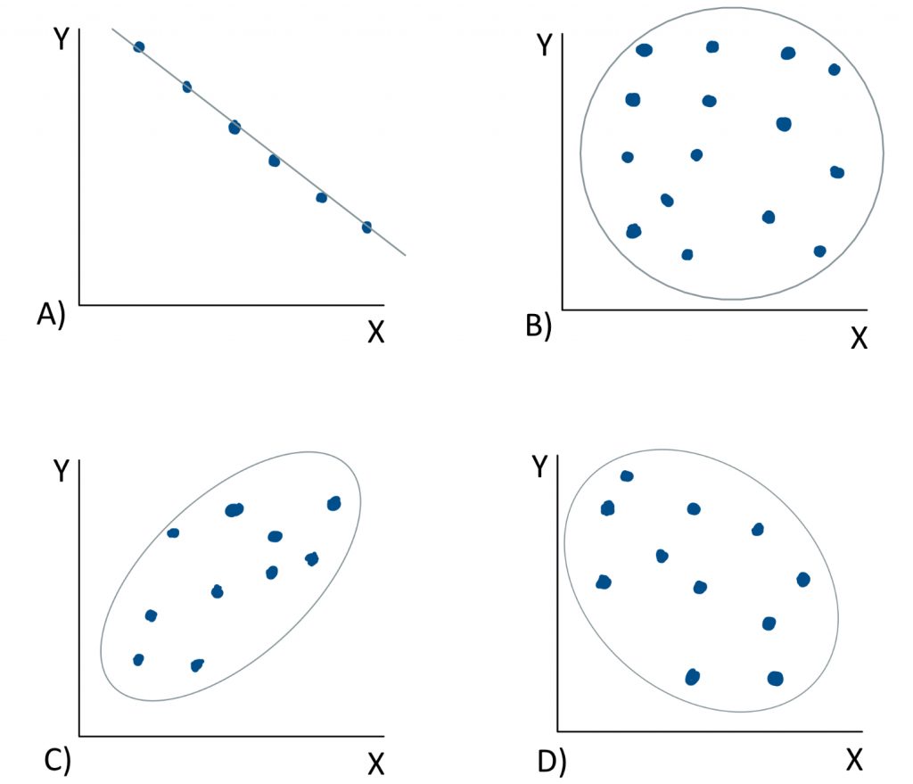
In graph A), if we ask “are variables X and Y strongly or weakly related?” We would say strongly related. This is because the points on the scatter plot are in a perfect line. There is no distance between the points and the trend line. It is a perfect correlation. If we ask “is the trend line positive or negative in slope?” We would say that it is negative in slope. As scores on variable X increase, scores on variable Y do the opposite – they decrease. We might expect such a relationship if we plotted speed against time. The faster something is, the less time it takes. In the next example, graph B), if we ask “are variables X and Y strongly or weakly related?” We would say weakly related. There is no clear linear trend that can be visually discerned – it just looks like a random scatter of dots. With no trend line, the question about directionality is irrelevant. This correlation is close to zero, so it is neither positive nor negative as a directional relationship. If we look at example C), the strength is not quite as perfect as in the first example, but the dots would not be very distant from a trend line through them, so this would be a fairly strong correlation. As scores on variable X go up, so do those on variable Y, making this a positive correlation. Now it is your turn. In example D), would this be a strong relationship or weak? Or somewhere in between? And do you see a positive or a negative slope to a trendline that runs through the cloud?
Correlational analysis seeks to answer the question “how closely related are two variables.” This is a very useful analytical approach when we have two numeric variables and we wish to analyze the patterns in how they co-vary. However, correlational analyses have limitations that it is vital to be aware of.
First, the correlational method we will cover in this course is only capable of detecting linear relationships. Patterns that have a curve to them will not be captured by the correlation formula we will use.
Secondly, correlation does not equal causation. Correlational research designs do not allow for causal interpretations, because the third variable problem renders correlational analyses vulnerable to spurious results. When we measure two variables at the same time and plot them against each other, what we can do is describe their relationship. We can even test whether the strength of their relationship is significantly different from zero. However, we cannot determine whether X causes Y.
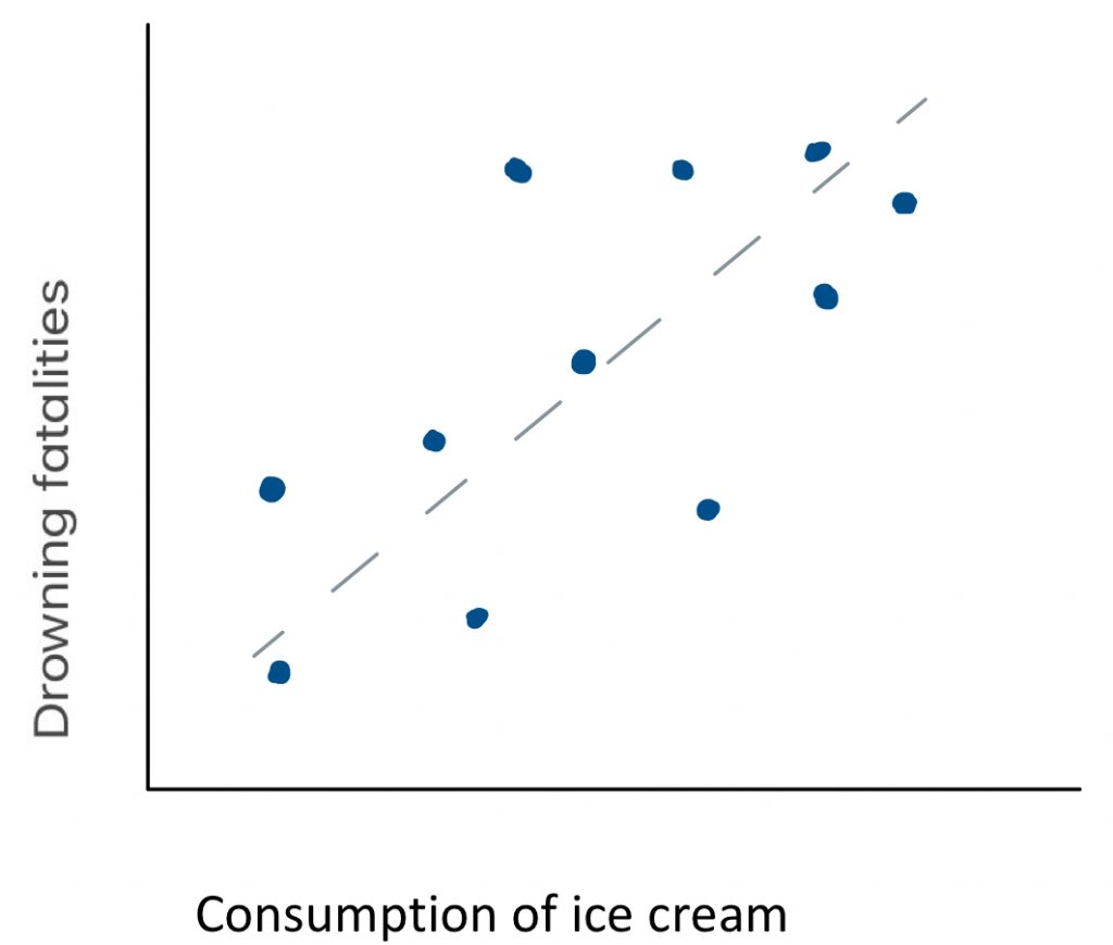 For example, if we measured the consumption of ice cream as well as drowning deaths on a sample of days throughout the year, we might determine that there is a strong positive relationship between the two variables. Consumption of ice cream and drowning deaths are apparently closely related phenomena. But does consumption of ice cream cause drowning deaths? That seems a little far fetched. Could there be another explanation for the pattern? Is there a third variable that could in fact explain the trends in each of the two variables measured here? What might cause people to consume more ice cream as well as put themselves at greater risk for drowning? Warm weather perhaps? If we were to plot temperate against ice cream and drowning deaths, would we see positive correlations with each? Very likely. With this third variable connecting the two, it would be a logical fallacy to interpret the apparent correlation shown here as meaningful. But then again, is it possible that consuming ice cream could be a risk factor for drowning? Did an elder ever tell you that you should not eat right before swimming, because you might cramp up and drown? Maybe there is some truth to that.
So how could we find out whether there is a true causal relationship between two variables? In order to make cause-effect conclusions, we must use an experimental design. Two major features of experimental research designs eliminate the logical fallacies associated with correlations. First, an experiment makes use of random assignment of participants to conditions, because that controls for extraneous variables like the third variable of temperature in this example. And secondly, an experiment manipulates the independent variable, to establish a cause, and then measure effects.
Requirements for cause-effect conclusions
A true experiment requires the following elements in order to control for extraneous variables and establish cause-effect directionality:
- random assignment of participants to conditions (or randomization of order of conditions in repeated measures designs)
- manipulation of the independent variable
In our ice cream and drowning study here, how could we make it into an experiment, to allow for causal conclusions? First we would have to assign our participants randomly into the experimental and control groups. There must be no systematic bias in who is given ice cream and who is not. Second, we would have to manipulate independent variable – we would have to have those participants in the experimental group eat ice cream. Then we would put all participants in water, at the same temperature, and see how many of them drown. We would calculate the average number of drowning events in the ice-cream-eating vs. the control group, and run a t-test or ANOVA to find out if they are significantly different from each other.
Of course, you might be thinking, “would this be ethical?” At least I hope you are thinking that. Of course not! It would not make sense to allow people to drown, just to answer this empirical question. In fact, that is exactly why correlation exists.
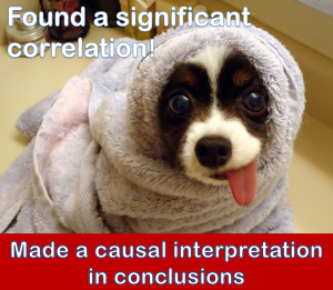
Often, practical or ethical limitations make an experiment prohibitively difficult or impossible. If we are limited to correlational techniques in a particular research study, then we simply cannot draw cause-effect inferences.
So, a major take-home point of this lesson is… don’t be like this guy.
Okay, so how do we go about calculating correlation? Well, similar to ANOVA, we can think of the process conceptually as the partitioning of variance. But this time, what counts as good variance is covariance. This is the systematic variance that both variables X and Y have in common. Because it is variance that is explained by the co-relation of the two variables, we will put covariance in the “good” bucket. The random variance that is unexplained by the relationship between X and Y, the distance between the dots and the trend line, that is the variance that we will put in the “bad” bucket. A conceptual formula for the correlation coefficient r would be covariablity of X and Y divided by the variability of X and Y separately.

Once we find r, another statistic that provide helpful information is r squared. r2 is the proportion of variability in one variable that can be explained by the relationship with the other variable. Make note of this fact, because the proportion of variability explained by a correlation is a very helpful metric.
Now we can examine what form a hypothesis test would take in the context of a correlational research design. Such a hypothesis test asks the question, “how unlikely is it that the correlation coefficient is actually zero?”
In step 1, in order to keep the hypothesis in a form similar to what we did before, we can identify the populations in a particular way. Population 1 will be “people like those in the sample,” and population 2 will be “people who show no relationship between the variables.” That way, the research hypothesis can be set up as “The correlation for population 1 is [greater than/less than/different from] the correlation for population 2. The null hypothesis can be “The correlation for population 1 is the same as the correlation for population 2.”
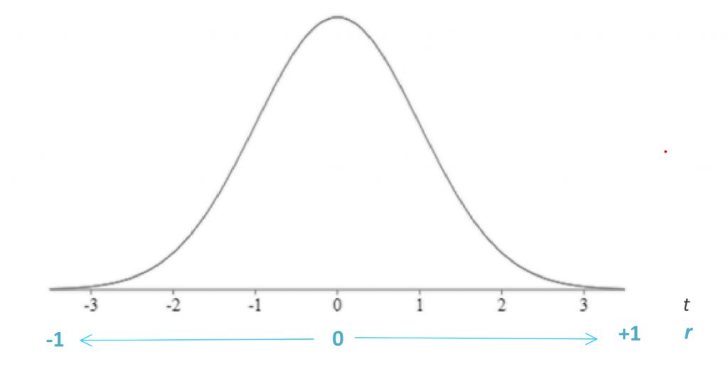
In step 2, we need to find the characteristics of the comparison distribution, and in this case we need the correlation coefficient r, which can range from -1 to 1. An r value of 0 indicates there is no correlation whatsoever between the two measured variables. An r of 1 is a perfect positive correlation, and an r of -1 is a perfect negative correlation. Most correlations in real life fall closer to 0 than to 1 or -1.
![\[r=\frac{\sum (Z_{X}\times Z_{Y})}{N}\]](https://pressbooks.bccampus.ca/statspsych/wp-content/ql-cache/quicklatex.com-676b2fb961e34f77a42f21b945ea32bc_l3.png "Rendered by QuickLaTeX.com")
This correlation coefficient formula makes use of Z-scores, which is a great way to review these standardized scores covered in an earlier chapter. Recall that
![\[Z=\frac{X-M}{SD}\]](https://pressbooks.bccampus.ca/statspsych/wp-content/ql-cache/quicklatex.com-9ff4a1c7099641ee0b6856dfdc537f34_l3.png "Rendered by QuickLaTeX.com")
, where
![\[SD=\frac{\sum (X-M)^{2}}{N}\]](https://pressbooks.bccampus.ca/statspsych/wp-content/ql-cache/quicklatex.com-a3f3c5866e26173b6cd1a9ec6c9a7971_l3.png "Rendered by QuickLaTeX.com")
For each variable, X and Y, we must calculate the mean and standard deviation of the variable, so each score can be translated to Z-scores. Only then can they be cross-multiplied and then summed in the r formula.
Once we calculate the r value for a correlation, we can test the statistical significance of this value, based on how extreme it is on the t distribution. An r of 0 is placed in the centre of the t distribution, as the comparison distribution mean, and positive one and negative one are placed at either tail of the distribution.
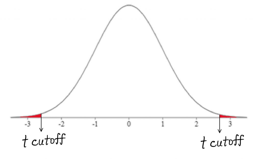
The further out we get into the appropriate tail, the better our chance of rejecting the null hypothesis of a zero correlation. The bad news is, we are back to the t-test, which means we have to think about directionality. The good news is, this is a great opportunity to refresh ourselves on how the t-test works.
In step 3, we find the cutoff score using the t tables. For correlation degrees of freedom will be N-2, where N is the number of people in the sample. This is so, because we have two measured (numeric) variables, each of which has N-1 scores that are free to vary.
In step 4, the t-test is calculated as r divided by Sr, where Sr quantifies the unexplained variability.
![\[t=\frac{r}{S_{r}}\]](https://pressbooks.bccampus.ca/statspsych/wp-content/ql-cache/quicklatex.com-7b6465ff49e4c2e1bbe5176921054181_l3.png "Rendered by QuickLaTeX.com")
Step 5 is the decision: we reject the null hypothesis if the t-test result falls in the shaded tail beyond the cutoff.
We could express our hypothesis test results on the relationship between income and grades in the following manner:
“We found that there was a significant positive correlation between family income and student grade average (r = 0.65, t11 = 2.97, p < 0.05).”
Notice that our interpretation is not that we found higher family income results in a higher grade average. Why not? Well, as we said before, causal conclusions require experimental design. To draw such a conclusion regarding the relationship between family income and student grade average, we would need to randomly assign students into family income conditions, wealthy or poor, then measure the effects of that manipulation on their grades. Just like our drowning example, this seems not only logistically challenging, but also rather unethical. So, we are limited to correlation here for a reason, and thus we simply need to characterize our findings as a relationship or pattern, rather than a statement of cause and effect.
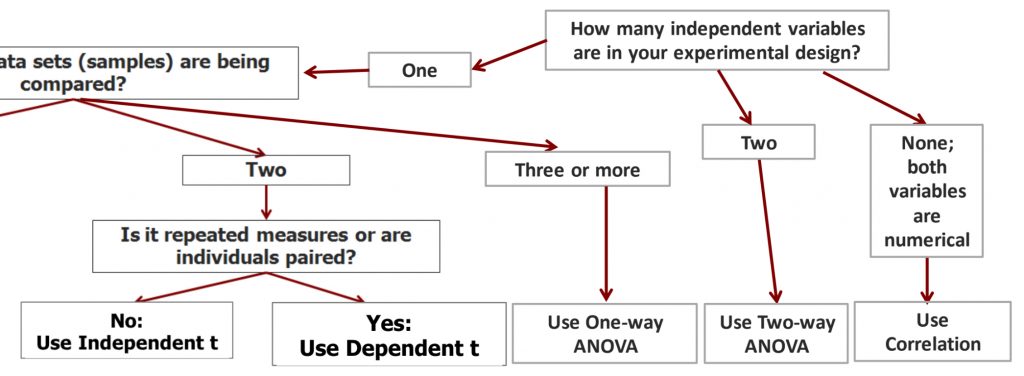
As we put the final branch to our decision tree, we now have a decision flow for the situation of no independent variables. If both variables are numerical, you must use correlation to test their relationship.
10b. Regression
In the next part of the chapter, we will examine the statistical technique of regression. Regression allows us to extend the findings of a correlation to predict the future from the past.
Once we have calculated a correlation, a regression allows us to predict how an individual would perform on one variable based on their performance on another variable. In an example of a correlation between income and grades, the regression would allow us to see what grade level would be achieved by an individual with a family income level that was not actually collected in our dataset. We could also identify the income level based on a given grade level.
The regression line is a line through our scatter plot that can be described with an equation. The equation has two components: slope and intercept. The slope says how many units up (or down) the line goes for each unit over. The intercept says where the line hits the y axis.
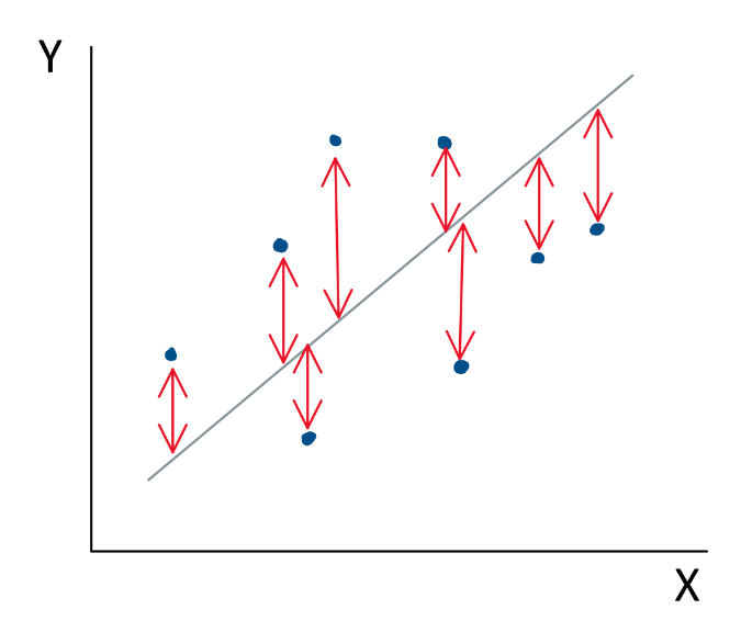
The regression line is a line that “best fits” the data points that we have collected. Mathematically, it is the line that minimizes the squared deviations (i.e. error) of the individual points from the line.
To find the equation for the regression line, you can calculate slope b and then intercept a using the formulas shown.
![\[b=\frac{(X-M_{X})(Y-M_{Y})}{SS_{X}}\]](https://pressbooks.bccampus.ca/statspsych/wp-content/ql-cache/quicklatex.com-fad54e7221f432eb7198066835ee491f_l3.png "Rendered by QuickLaTeX.com")
Steps to find b, slope of regression line
-
For each individual, find the deviation of the X score from the mean.*
-
For each individual, find the deviation of the Y score from the mean.*
-
For each individual, multiply the deviation of X by the corresponding deviation of Y
-
Add together the products from step 3 for all individuals.
-
Divide this sum by SSx.*
*These calculations should already be completed for correlation.
![\[a=M_{Y}-(b)M_{X}\]](https://pressbooks.bccampus.ca/statspsych/wp-content/ql-cache/quicklatex.com-f8f6f55d596e9ddb0554b59795c4668d_l3.png "Rendered by QuickLaTeX.com")
Once a and b are calculated, we can plug these numbers into the regression line equation.
![\[\widehat{Y}=a+b(X)\]](https://pressbooks.bccampus.ca/statspsych/wp-content/ql-cache/quicklatex.com-b9d6cc6a283d4133c43f98841b993e3d_l3.png "Rendered by QuickLaTeX.com")
Here I will show you the regression line equation for our family income vs. grade example.
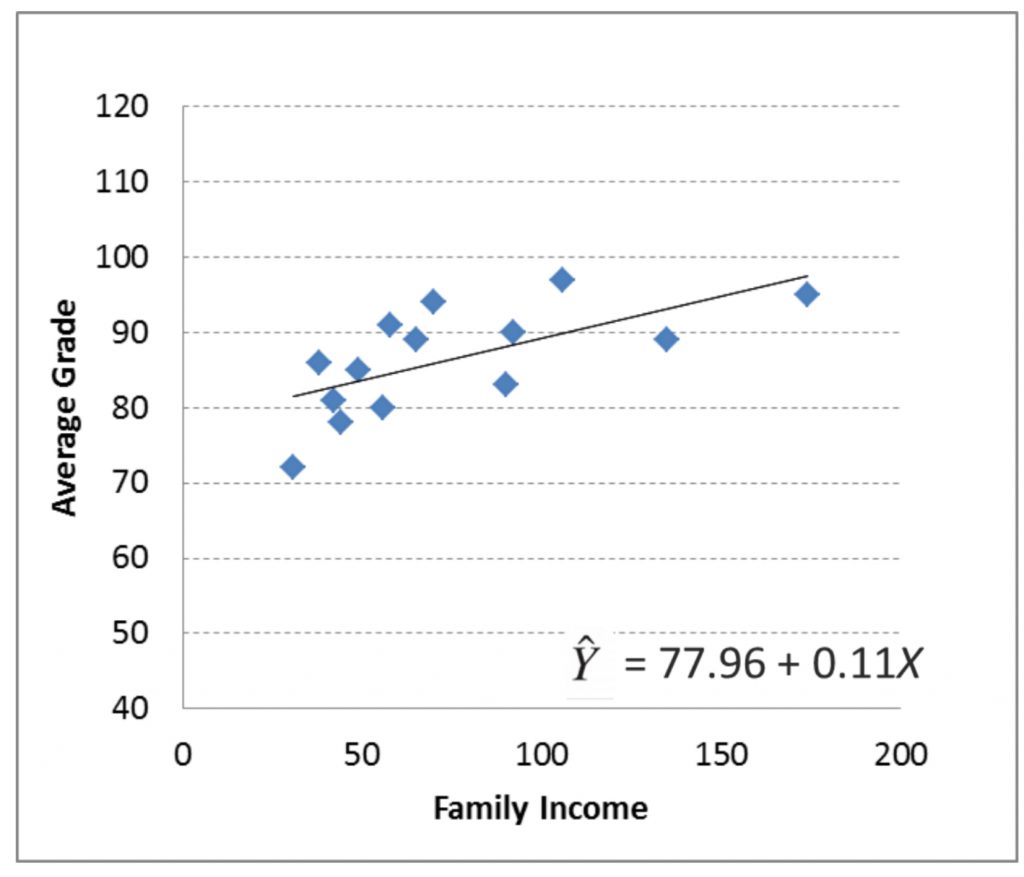
b is 0.11, which means that for every one unit of Family Income, the line goes up 0.11 unit of Average Grade. a is 77.96, which means that the line meets the y axis at a height of 77.96.
The line equation allows us to plot the precise regression line on the scatter plot. To plot a regression line, pick two X values that are on the low and the high end of the scale. Plug those into the line equation to find the corresponding Y values that are on the line.
Using the regression line, you can predict X value from Y values and Y values from X values. This means that even if you did not have someone in your dataset with a family income of 105, you can figure out what a student’s average grade would have been if they had that family income. Likewise, if you had no one in your dataset with an average grade of 75, you can figure out what their family income would have been if they had that grade. Note that these are just predictions. They are imperfect, and do not take into account other factors or individual variability.
Here we will try try predicting the average grade (Y) for a student who has a family income of 200. To do this, we will plug 200 in for X in the regression line equation (as shown here).
![\[\widehat{Y}=77.96 +0.11(X) \]](https://pressbooks.bccampus.ca/statspsych/wp-content/ql-cache/quicklatex.com-64c4fb675275e705fe7a5636fb29c8ae_l3.png "Rendered by QuickLaTeX.com")
![\[\widehat{Y}=77.96 +0.11(200) \]](https://pressbooks.bccampus.ca/statspsych/wp-content/ql-cache/quicklatex.com-c2c25c175e908e3bfb940e2445190358_l3.png "Rendered by QuickLaTeX.com")
![\[\widehat{Y}=100.55 \]](https://pressbooks.bccampus.ca/statspsych/wp-content/ql-cache/quicklatex.com-5478805838c4dba007da6a15222b98fb_l3.png "Rendered by QuickLaTeX.com")
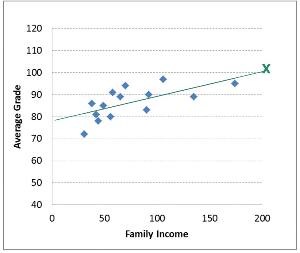
The result is a grade of 100.55. Of course getting a grade average above 100% is impossible (at least at many institutions). In this case, our prediction shows a “ceiling effect”. This means that there is a maximum average grade that we hit before we hit a maximum family income. Therefore, the regression line equation becomes useless above a family income of around 190.
Now, we can try predicting family income (Y) for a student with an average grade of 60 (X). To do this, you must plug in 60 for Y in the equation, then solve for X.
![\[60=77.96 +0.11(X) \]](https://pressbooks.bccampus.ca/statspsych/wp-content/ql-cache/quicklatex.com-4fef94388fd2f75d95be6efca47c809e_l3.png "Rendered by QuickLaTeX.com")
Notice that to rearrange the equation to solve for X, you first have to move intercept (a) over:
![\[(60-77.96)=0.11(X) \]](https://pressbooks.bccampus.ca/statspsych/wp-content/ql-cache/quicklatex.com-db378e98cfb097f4c271595350a253e9_l3.png "Rendered by QuickLaTeX.com")
Then you have to divide by the slope:
![\[\frac{(60-77.96)}{0.11}=X\]](https://pressbooks.bccampus.ca/statspsych/wp-content/ql-cache/quicklatex.com-2b9344f36249d6767b62e35e67fb99b7_l3.png "Rendered by QuickLaTeX.com")
Now you are ready to solve for X: -159. The result of finding X for the Y of 60 is a negative income! This is, of course, impossible (or very unlikely). Here we can see the floor effect.
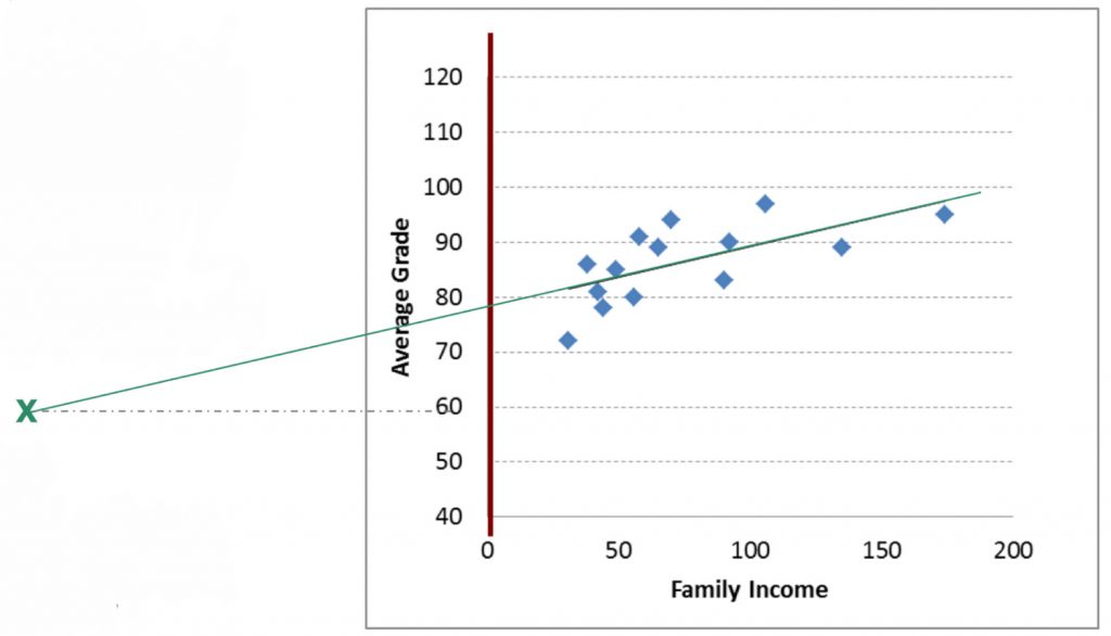
This means that there is a minimum family income that we reach before reaching the minimum grade. So the regression line becomes useless below an average grade of 77.96 (the Y intercept). Floor and ceiling effects are common problems for regression, and you should watch out for these problems when you use this technique. We can see that the regression line for this particular dataset is useful to make predictions for the grade of 80-100 average grade and the range of 0-190 income level.
Now of course, predictions are not perfect. Regression allows for a prediction of one variable from another variable. As we can see in our scatterplots, not every real data point is exactly on the regression line. The actual data point might be different. Why is that? Because, unless it’s a perfect correlation, some variability in the real data is not accounted for by the regression equation. We can estimate just how accurate our predictions are by looking at r squared. r2 is the proportion of variance in one variable explained by its relationship with the other variable. The rest is the amount that is not accounted for.
Just as we can include multiple factors in ANOVA, we can also include multiple predictive variables in a regression. We will not attempt that in this course, but if you take more advanced statistics course you will see that the more variables you include, each explaining a piece of the variability in the criterion variable, the more precise your regression model will become. Here, we are using just one predictive variable, and our r2 is likely to be well shy of 100% explained variance. So in that case, we can expect our regression to be only modestly accurate.
Chapter Summary
This chapter introduced you to the statistical techniques of correlation and regression. We saw how we can detect and describe the strength and direction of the relationship between two numeric variables, and to run a hypothesis test to find out if the correlation is significantly different from zero. Finally, we saw that regression can generate a linear model allow for the prediction of one variable from the other. A key reminder: correlation does not equal causation. These techniques suit research designs that do not meet the requirements of experimental design, and as such, our conclusions regarding the statistical findings must avoid cause-effect language.
Key terms:
| correlation | regression | r squared |
| covariance | r |
statistical analysis of the direction and strength of the relationships between two numerical variables
the variability that two numeric variables have in common
a statistical model that allows for prediction based on a trend line that “best fits” the data points that we have collected. Mathematically, a regression line is one that minimizes the squared deviations (i.e. error) of each point from the line.
correlation coefficient that describes the strength and direction of the relationship between two numeric variables. Can be between -1 and 0 and between 0 and +1.
proportion of variability in one variable that can be explained by the relationship with the other variable. Can be between 0 and 1.
