1. Why We Need Statistics and Displaying Data Using Tables and Graphs
1a. Why we need statistics
video lesson
One of the first things I think we need to accomplish in this course is to understand why statistics are important. Our objective in this first part of Chapter 1 is to be able to articulate the purpose of a course introducing statistical principles and techniques, and to be able to supply examples of situations in which the techniques you will learn in such a course may be necessary to use.
First, let us establish that this is not a math course. This is a course that is primarily about decision making. Not just any decision making, but decisions that are made after analyzing data in order to make objective decisions that are guided by empirical evidence. Of course, we use some simple calculations in the course in order to process the data into a form that aids our decision making. However, the math is a necessary means to an end, not an end in itself.
In some situations this kind of decision making is not needed. When the decision can be made based on intuition and subjective personal preference, we do not need rigorous data-driven systems. For example, if I am trying to decide whom to date, or what style of clothing I like to wear that suits my personality, I likely am not going to conduct research and a formal data analysis to come to those decisions. Maybe you can think of another situation, in which a good decision can be made without empirical evidence.
On the other hand, sometimes a decision that you need to make is one that affects others, or is so high stakes that you want to make an informed decision that is objective and based on empirical evidence. In this kind of decision making, you should check your intuition at the door, and walk in with an open mind, letting the data be your guide. Examples of situations in which an objective decision making process might be necessary would be when you are trying to decide whether a medical treatment is safe, or whether a proposed intervention is actually effective. Perhaps you need to find out if a crime prevention program is effective for urban and rural communities alike. Can you think of another kind of decision that should be made objectively based on data? What these scenarios have in common is that they are professional decisions, or are high stakes. In the professional workplace, we are often in situations where, if we just operated based on our intuition, we may make serious mistakes, because we have not considered whether the course of action we decide on is the best choice for all people, all situations, or over time. The techniques you will learn in this course will help you apply data analysis, so that you can set up a decision making framework that is objective and rigorous, and so that the decision you come to will be generalizable, to suit other people, situations, or time frames.
Why does a student in your field of study require statistics? Regardless of your field of study, I bet you are asked to be a critical thinker. If we look at the list of critical thinking guidelines below that make for good science, I bet you can see the value of these guidelines for your own program of study.
Critical thinking guidelines
- Ask Questions: Be Willing to Wonder
- Define Your Terms
- Examine the Evidence
- Analyze Assumptions and Biases
- Avoid Emotional Reasoning
- Don’t Oversimplify
- Consider Other Interpretations
- Tolerate Uncertainty
from Wade, Tavris & Swinkels. (2017). Psychology. Boston: Pearson.
Statistics represents a tool for examining evidence and allowing us to use data effectively. However, it is also important to realize that statistics can help us avoid emotional reasoning. Instead of relying on our intuitions about whether a drug is effective, or whether one choice is significantly better than another, statistical analysis allows us to make an objective decision.
In statistics, N stands for sample size. In other words, how many data points did you measure. Very often, in everyday life, we are tempted to make assumptions and derive conclusions from single data points. In the world of statistics, we call these situations, “an N of one”. These are situations scientists are extremely wary of, because they are vulnerable to bias.
For example, let’s say my friend has a really bad experience in one neighborhood. After that, even if there are no objective reports of comparative neighborhood safety that support this conclusion, I am likely to say to others that that’s a bad neighborhood – one to avoid. We are always overly influenced by our own experiences and the experiences of those close to us. In such moments we should always remind ourselves that until we have asked many individuals who have been in that neighborhood what their experiences were, we only have one observation, and it may not be typical or representative. If my friend’s experience in the neighborhood were the one bad experience in 1000 experiences, would we still be tempted to consider it a “bad” neighbourhood? Next time you face a situation like this in your daily life, just take a moment to pause and think to yourself… what information should I have to make the right decision?
Concept Practice: Intuition
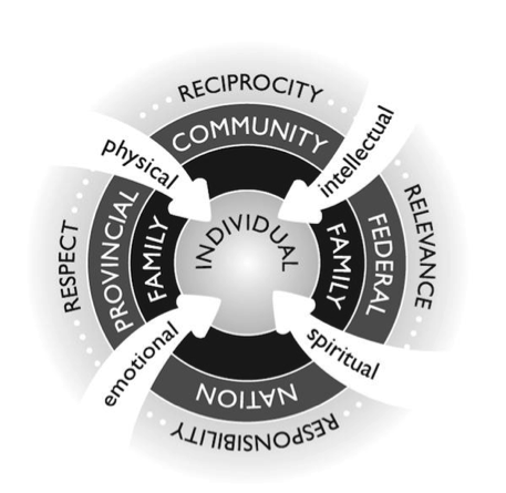
Fig. 2.2 from Pulling Together: A Guide for Front-Line Staff, Student Services, and Advisors by Ian Cull, Robert L. A. Hancock, Stephanie McKeown, Michelle Pidgeon, and Adrienne Vedan
In this course, we will be focusing on only one aspect of one way of knowing. Let us acknowledge the fact that various cultures and systems place particular value on various ways of knowing. For example, if we refer to the indigenous ways of knowing framework shown above, we might see this entire course as being one element of “intellectual” ways of knowing. Its contribution might be to contribute to responsibility and relevance by enhancing the generalizability of decision making as we discussed before. However, no one should mistake statistics for a holistic system of knowing.
I encourage you to think of what you learn in this course as one tool in the toolbox. The reason many academic disciplines require a statistics course is that this is a tool most people do not get in other areas of their lives. We tend not to learn statistics from our parents or by volunteering in the community. In fact, most of us are very bad at this form of decision making until we learn to use these tools.
By requiring you to learn statistics, disciplines like Psychology are not suggesting it is the only important decision-making tool. It is one we think you need to understand to be a good scientist and to better interpret some types of evidence to which you will have access in your professional life. I encourage you to learn more about holistic ways of knowing and to reflect on the place that formal, data-driven decision-making practices have in your own ways-of-knowing framework. I think we could all gain some insight by looking at such a model with an eye toward acknowledging areas in which we are weaker, because of our own individual experiences or because of the society in which we have grown up.
1b. Displaying Data Using Tables and Graphs
video lesson
Have you ever heard the saying, “a picture is worth a thousand words”? That is what the rest of this chapter is all about. First, we need to cover some basic concepts and definitions, including the differences between descriptive and inferential statistics, and the meaning of the terms variable, value and score. We will then need to learn to distinguish among levels of measurement to be able to choose the appropriate techniques for summarizing different types of data.
Finally, I will demonstrate how to generate frequency tables and to graph a dataset, because the first step in data analysis is always to look at it. Just as a picture is worth a thousand words, it is also worth a thousand numbers.
At first we will focus on descriptive statistics. These are ways to summarize or organize data from a research study – essentially allowing us to describe what the data are.
A little later in the course, we will move into the realm of inferential statistics. These are analytical tools that allow us to draw conclusions based on data from a research study. In other words, we go beyond just saying what the data are, and make a statement about what they mean. Inferential statistics are used in research and policy as a tool to make decisions.
Concept Practice: inferential statistics
Concept Practice: descriptive statistics
Three basic terms are essential jargon in statistics. A variable is a quality or a quantity that is different for different individuals. A variable could be a quality, like ethnicity, for which each person might have a different characteristic. Or it could be a quantity, like temperature, that could be different each time you take a reading, and is measured on a number scale. A value is just any possible number or category that a variable could take on. So for ethnicity you might have 6 categories in which you place individuals. Or for temperature there might be a numeric range from -100 to +100. Those would be the full set of values for that variable. A score is a particular individual’s value on the variable. For ethnicity, you would identify yourself as one particular category, and that would be your score. For temperature, if you check your weather app and see that it is 7 degrees outside, that is the score for that time and place.
Concept Practice: variable, value, score
Measurement is the assignment of a number to the amount of something., or assigning labels for categories. This is often obvious (for example, we might measure time as number of seconds or number of minutes). Sometimes, however, it can be a bit more arbitrary. We might assign numbers to signify a category, for example 1 for male and 2 for female.
Based on how we measure them, there are two major types of variables in statistics, and these will be important to keep in mind as we go through the semester. The type of variable determines how we can use it.
| Type of variable | Characteristics | Examples |
|
Nominal/ Categorical
|
•Label and categorize
•If numbered, numbers are arbitrary
|
•Gender
•Diagnosis
•Experimental or Control
|
|
Numeric/ Quantitative
|
•Numerical data
•Numbers reflect size or amount of something
|
•Temperature
•IQ
•Golf scores (above/below par)
•Number of correct answers
•Time to complete task
•Gain in height since last year
|
The first type of variable is nominal or categorical (also called qualitative). Nominal variables label or categorize something, and any numbers used to measure these variables are arbitrary and do not indicate quantity or size. For example, if male is scored as 1 and female is scored as 2, that does not indicate that females are twice as good or double the size of males. It is just a code.
Numeric or quantitative variables are ones for which numbers are actually meaningful. They indicate the size or amount of something.
Examples of Numeric variables
- Temperature, in which 10 degrees is warmer than 0
- Golf scores, in which 2 below par means you did well
- IQ, in which 100 is average intelligence
- Number of correct answers, in which 4 correct answers is twice as many as 2 correct answers
When we calculate statistics, we will see that we can calculate an average IQ in a group of people, or an average temperature across several days. But we cannot calculate an average gender. What we will do is use groupings or categories as a basis for comparison of other variables; for example, does the experimental group have a higher number of correct answers than the control group?
Now, a quick side note: If you take a course in research methods, you learn that measurement is a really tricky thing in practice, particularly when you want to measure something internal about a person. The process of operationally defining something so that you can measure it numerically or in discrete categories is a real challenge. This is beyond the scope of this course, but just to give you a sense, try brainstorming a way in which you could measure aggression? Think of at least one way that would create a nominal variable, and one way that would create a numeric variable.
If you give that example some thought, you will quickly find that a relatively simple variable like aggression can be fiendishly difficult to measure, and in the field of psychology a lot of effort is put into developing good ways to measure mental constructs. In experimental psychology, we often prefer to measure things as numbers, because then we can use statistical methods to summarize and to make inferences about the thing we measured.
We should return to our discussion of experimental research design. A variable is something that has different values for different individuals, and that we can measure. As an example, we can measure how fast someone is at completing a puzzle, and get those scores for a bunch of people. This variable would be speed. We can also assign each of those people into categories or conditions: a high-stress vs. low-stress condition, for example. Research is the study of the relationship between variables. Therefore, there must be at least two variables in a research study (or there is no relationship to study). Typically an experimental study in psychology has one (or more) independent variables and one (or more) dependent variables.
An independent variable is one you manipulate — most often it is categorical, or nominal (e.g. experimental group vs. control group). A dependent variable is one you measure to detect a difference/change as a result of the manipulation — most often it is numeric (e.g. time to complete a puzzle).
Example of Experimental Design
Do members of your experimental group (who were required to give a speech in front of a group of people) solve a puzzle in a shorter or longer amount of time than members of your control group (who were allowed to browse magazines)?
In the example above, the independent variable would be the manipulation: whether people are required to give a speech or are allowed to browse magazines. Note that is a nominal variable. The dependent variable is what you measure after the manipulation: how it takes the participants to solve a puzzle. Note that would be a numeric variable.
Now that you have some basic definitions and concepts down regarding types of data and how to measure them, we need to learn how to deal with numeric data.
Example of Numeric Dataset
First… what can you say about this data set from the list of numbers above? How would you describe the findings to someone?
Perhaps you want to summarize a dataset in table form, to organize the data and make it easy to get an overview of the dataset quickly. A frequency table does just that. To create a frequency table, you just ask yourself: for each possible value on this variable, how many individuals have a particular score? That gives you the frequency of each value – or how often it occurred in the dataset. Let’s look at an example. We measure the stress levels of 10 students, on a scale of 1 to 10, and above are their scores. Hard to make any sense out of that list, right? By following the steps below, we can create a frequency table.
Steps for Making a Frequency Table
- Label the first row: Values, Frequency, and Percentage.
- In the first column, under the heading Values, list all the possible values the variable could take on. In this case, we have 10 possible values, so there should be 10 rows in the data portion of the table.
- Make a list down the page of each score, from lowest to highest, to make it easier to count them.
- Go one by one through the scores, making a mark for each next to its value on the list (e.g., how many 1’s are there? 0. … How many 4’s are there? 1. … How many 7’s are there? 2. Repeat that question for every value from 1 to 10. Write those frequencies, or counts, in the Frequency column.
- Figure the percentage of scores for each value. To calculate a percentage you take the frequency, divide by how many scores you have in the dataset (here we have 10 students, so 10 scores), and multiply that by 100 to move the decimal to the right two places. So for the value of 7, with frequency of 2, that becomes 2 divided by 10 times 100 or 20%. Calculate and list all the percentages.
Here is what the table should look like once you are done with those steps:
| Values | Frequency | Percent |
| 1 | 0 | 0% |
| 2 | 0 | 0% |
| 3 | 0 | 0% |
| 4 | 1 | 10% |
| 5 | 0 | 0% |
| 6 | 1 | 10% |
| 7 | 2 | 20% |
| 8 | 3 | 30% |
| 9 | 2 | 20% |
| 10 | 1 | 10% |
Now you can scan down the table and quickly see where most of the scores fall within the range of possible values. Now that you have an organized summary of the data, you can clearly see that the majority of students are reporting fairly high stress scores. By looking at the percentages, you have a quick way to report the proportion of students that are highly stressed. For example, just by doing some quick addition, you can say that 60% of surveyed students report stress levels 8 or higher.
Most people find graphs easier to interpret at first glance than tables. What can you say about the dataset after looking at this graph?
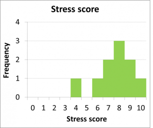
I bet you were able to say that most scores pile up at the upper end of the graph, at the higher end of the range of stress score values.
The graphical version of a frequency table is a histogram. The X axis on a histogram should have the values of the variable listed, from lowest to highest. The Y axis should represent the frequencies of each value in the dataset. In other words, the histogram is a frequency table that has been turned on its side. The added benefit comes from the visual representation of the frequency as the height of the bars in the graph, rather than just a number. You can thus see a clear shape in the dataset.
In some circumstances, a frequency table is not an effective way to summarize a dataset. This is the case if the range of values is too large. For example, what if you were summarizing temperature scores, which can range from 0-100? This would mean more than 100 rows in the table. That is not so helpful. In such a case, a grouped frequency table is a much better option.
A grouped frequency table defines ranges of values in the first column, and reports the frequency of scores that fall within each range. In this example, we have surveyed 30 students’ stress levels on a scale of 1-10:
Example of Numeric Dataset
If we wanted to get the table into the ideal format of 4-8 rows, we could create grouped frequencies, with two values in each row.
By following these steps, we can create a grouped frequency table:
Steps for Making a Grouped Frequency Table
- Label the first row: Values, Frequency, and Percentage
- Decide on the ranges of values you need. You want to choose ranges that will leave you with 4-8 rows in the table
- In the first column, under the heading Values, list all the possible value ranges the variable cold take on. In this case, we grouping by twos, so there should be 5 rows in the data portion of the table.
- Make a list down the page of each score, from lowest to highest, to make it easier to count them.
- Go one by one through the scores, making a mark for each next to its value range on the list (e.g., how many 1’s and 2’s are there? 3. … How many 3’s and 4’s are there? 3. … and so on. Repeat that question for every value range. Write those frequencies, or counts, in the Frequency column.
- Figure the percentage of scores for each value range. To calculate a percentage you take the frequency, divide by how many scores you have in the dataset (here we have 30 students, so 30 scores), and multiply that by 100 to move the decimal to the right two places. So for the value range of 1-2, with frequency of 3, that becomes 3 divided by 30 times 100, or 10%. Calculate and list all the percentages.
Here is the completed grouped frequency table for the dataset of 30 students:
| Values | Frequency | Percent |
| 1-2 | 3 | 10% |
| 3-4 | 3 | 10% |
| 5-6 | 6 | 20% |
| 7-8 | 12 | 40% |
| 9-10 | 6 | 20% |
Note that we can and should double check our work. Simply add up all the frequencies and make sure the sum is 30. Also add up all the percentages and make sure they add up to 100%.
Here is a histogram of the grouped frequency table we just generated:
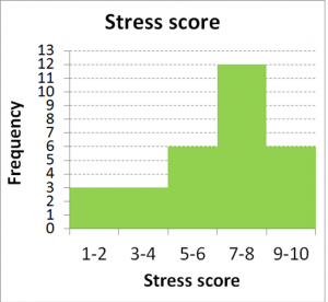
Note that histograms are appropriate for plotting numeric datasets. The X axis should be labeled with numbers, rather than with categories. That is how a histogram differs from your typical bar graph. The other difference is the width of the bar. In histograms, because the data are numeric or continuous, the bars should appear to touch – with no break in between the bars. This gives a unitary appearance to the shape of the graph. If you were to draw a smooth line over the shape of the distribution, or overall pattern of the data, you would get the impression of a curve.
If you drew a smooth line over the shape of the dataset in a histogram, you could describe the shape that is generated with two types of descriptors:
Describing a Distribution
- How many peaks there are
- How symmetrical the shape is
Skewness is the term for describing symmetry: is the distribution of data symmetrical (or very close) – meaning a mirror image from left to right, or is it skewed right/positively, or left/negatively? To determine the direction of skew, you need to check the direction of the “tail”. If the tail points right, it is right skewed. In this case, the tail points left, so it is left skewed.
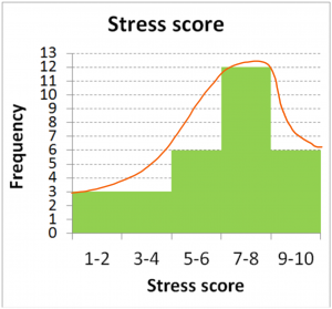
How many peaks the distribution contains is described as unimodal or bimodal. Unimodal distributions show one single collection of scores, whereas bimodal distributions look more like a camel’s back, with two clear lumps. Do not jump to a bimodal description unless the two peaks are clear and distinct, with some low frequency bins in between. The peaks should also be fairly similar in size to be considered bimodal. This histogram above clearly displays just one peak, so we would describe it as unimodal.
How would the shape of our stress scores distribution look if I measured stress scores once early in the semester and then again late in the semester? One could speculate that the distribution could become bimodal, with the early-in-semester scores piling up on the low end of the stress scale, and late-in-semester scores piling up on the high end of the stress scale (as exam and assignment “crunch time” has set in).
Concept Practice: distribution shape
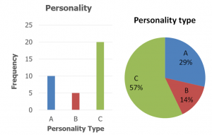
Frequency tables and histograms are useful for summarizing numeric datasets. What about qualitative data, from nominal variables? Bar graphs and pie charts are excellent ways to summarize those types of data. Note the gap between bars in a bar graph, as opposed to the touching bars in a histogram. This indicates the arbitrariness of the categories. We are still portraying how many of the measured individuals fall into each category, but those categories are not associated with numeric values, so no continuity should be implied. Pie charts are excellent for highlighting the relative proportion of scores that fall into each category.
Chapter Summary
In this chapter, we reviewed why we need statistics. We also introduced some key terms, listed below. We then saw how to summarize data effectively using tables and graphs and describe the patterns the distributions of data make.
Key terms:
| descriptive | nominal | independent variable |
| inferential | numeric | dependent variable |
| variable | frequency table | right skewed |
| value | histogram | left skewed |
| score | grouped frequency table | unimodal |
| bimodal |
Note: concise definitions of all key terms can be found in the Key Terms List at the end of the book.
Concept Practice
Return to text
Return to text
Return to text
Return to text
Return to 1a. Why we need statistics
Download Worksheet 1a.
Return to 1b. Displaying Data Using Tables and Graphs
Try interactive Worksheet 1b. or download Worksheet 1b.
video 1b2
ways to summarize or organize data from a research study – essentially allowing us to describe what the data are
analytical tools that allow us to draw conclusions based on data from a research study -- essentially allowing us to make a statement about what the data mean
a quality or a quantity that is different for different individuals
any possible number or category that a variable could take on
a particular individual’s value on the variable
a way to summarize a dataset in table form, to organize the data and make it easy to get an overview of the dataset quickly
variables that label or categorize something, and any numbers used to measure these variables are arbitrary and do not indicate quantity or size
variables for which numbers are actually meaningful -- they indicate the size or amount of something
a variable you manipulate -- most often it is categorical, or nominal
a variable you measure to detect a difference/change as a result of the manipulation -- most often it is numeric
a graph for summarizing numeric data that essentially is a frequency table that has been turned on its side, with the added benefit of a visual representation of the frequency as the height of the bars in the graph, rather than just a number
a frequency table that defines ranges of values in the first column, and reports the frequency of scores that fall within each range
a descriptor of a distribution that indicates asymmetry, specifically with a low frequency tail leading off to the right
a descriptor of a distribution that indicates asymmetry, specifically with a low frequency tail leading off to the left
a descriptor of a distribution indicating that there is one peak, or a single collection of scores
a descriptor of a distribution indicating that there are two peaks, or two collections of scores
