9. Factorial ANOVA and Interaction Effects
9a. Factorial Analysis

In factorial analysis, just like the fractals we see in nature, we can add multiple branchings to every experimental group, thus exploring combinations of factors and their contribution to the meaningful patterns we see in the data.
In this chapter we will tackle two-way Analysis of Variance and explore conceptually how factorial analysis works. To understand when you need two-way ANOVA and how to set up the analyses, you need to understand the matching research design terminology. We will also need to define and interpret main effects and interaction effects, both of which can be analyzed in a factorial research design. Later we will approach the detection and interpretation of interaction effects, specifically, which will really help you see the extraordinary complexity of information factorial analyses can offer.
 Factorial analyses such as a two-way ANOVA are required when we analyze data from a more complex experimental design than we have seen up until now. Specifically, when an experiment (or quasi-experiment) includes two or more independent variables (or participant variables), we need factorial analysis.
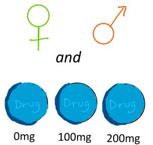
 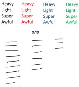 Examples of designs requiring two-way ANOVA (in which there are two factors) might include the following: a drug trial with three doses as well as the sex of the participant, or a memory test using four different colours of stimuli and also three different lengths of word lists.
As we saw in the chapter on Analysis of Variance, the total variability among scores in a dataset can be separated out, or partitioned, into two buckets. The first bucket, often called between-groups variance or treatment effect, refers to the systematic differences caused by treatments or associated with known characteristics. 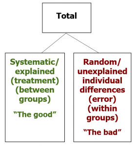 These are the differences among scores we are hoping to see — the explained differences — and thus I casually refer to this as the “good” bucket of variance and colour code it in green. The other bucket, often called within-groups variance or error, refers to the random, unsystematic differences that cannot be explained by the research design. These are the unexplained individual differences that represent the noise in the data, obscuring the signal or pattern we are looking for, and thus I casually refer to it as the “bad” bucket of variance and colour code it in red.
We can revisit our visual example from before, in which the goal is to separate colour swatches according to some factor, such that the colours within each grouping (or level) is more uniform. If we first sort the colours according to the factor of hue, let’s say into green or blue hues, then we explain some of the overall variability. But if we add a second factor, brightness, then we can explain even more of the differences among the colour swatches, making each grouping a little more uniform.
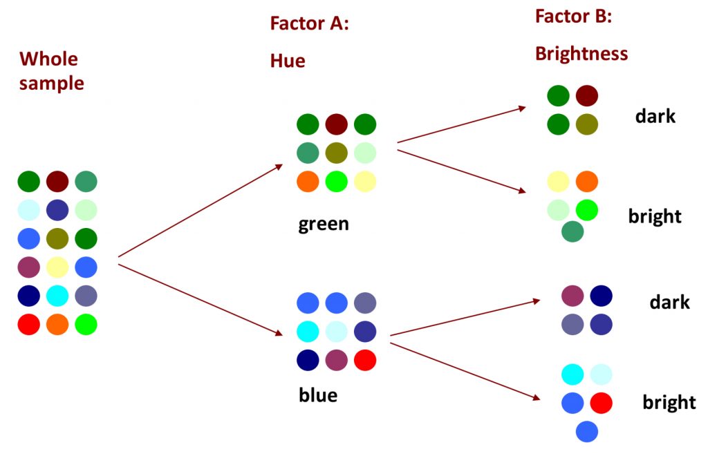
Clearly there is still some work to be done, and if in factor A we could have included a third level of “red”, the uniformity would have been much improved. And with factorial analysis, there is technically no limit to the number of factors or the number of levels we can employ to explain away the variability in the data. The more variance we can explain, through multiple factors and/or multiple levels, the better! This is what we will be able to do with two-way ANOVA and factorial designs.
You will recall the jargon of ANOVA, including factors and levels. To grasp factorial research designs, it becomes even more important to develop comfort with these concepts, so that you can identify and describe the design and thus the requisite analysis setup. Let us suppose that we have a research study that measures the effect of a placebo, a low dose and a high dose of the drug, and also takes into account whether the participants were male or female. The first factor could be succinctly identified as “drug dose”, and the second factor as “sex”. In another example, perhaps we show participants words in black, red, blue or green, and we also take into account whether the word list presented is long, medium, or short. What would you call each of those two factors?
What if, in a drug study, you notice that men seem to react differently than women? If you have that information (male/female), you can use it in your ANOVA and see if you can put more variance in your “good” bucket.
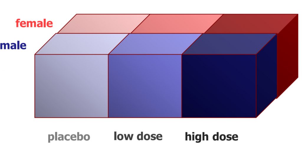
In the design illustrated here, we see that it is a 3 x 2 ANOVA. There are three levels in the first factor (drug dose), and there are two levels in the second factor (sex). This notation, that identifies the number of levels in each factor with a multiplier between, helps us see clearly how many samples are needed to realize the research design. In this example, we would need six samples in total, each of which would need to have a good enough sample size to allow for the central limit theorem to justify the normality assumption (N=30+). That is a lot of participants! However, we could learn much more by including both factors, if indeed the sex of the participant is associated with a different response to the drug.
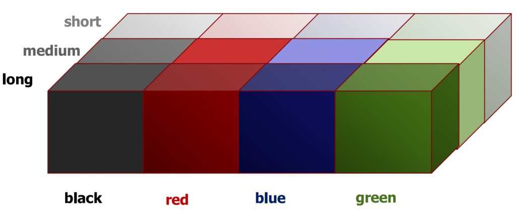 We can see an example of a 4×3 two-way ANOVA here, with our example of word colour and length of list. Altogether, this design would require 12 samples.
And just for the sake of showing you the potential of factorial analyses, you could also impose a third factor on the design: the age of the participants. In this case, you have a 4x3x2 design, requiring 12 samples. At 30 participants each, that would be 30×12=360 people! You can appreciate how each factor exponentially increases the practical demands (costs) of the research study. For this reason, a cost-benefit analysis must be carefully applied in factorial research design, such that the minimum complexity is used to answer the key research questions sufficiently.
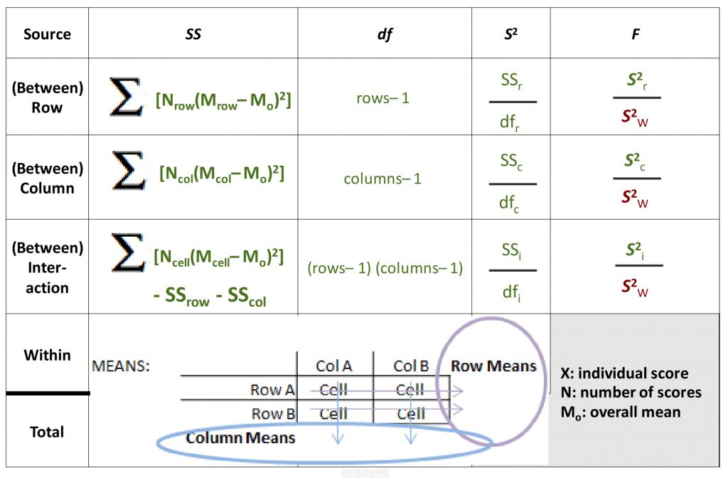
In a two-way ANOVA, just as in a one-way ANOVA, we calculate various flavours of Sums of Squares (SS).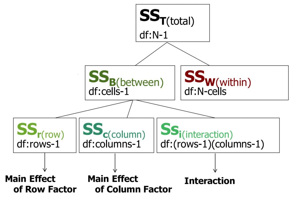 The SS total is broken down into SS between and SS within. However, with a two-way ANOVA, the SS between must be further broken down, because there are now two different factors that can have a main effect (i.e., can explain some of the total variance). Also, with more than one factor, there can be an interaction between the two that itself uniquely accounts for some of the variance. So now, we can SS row (the first factor), SS column (the second factor) and SS interaction. For each SS, you can also see the matching degrees of freedom.
Here is the full ANOVA table expanded to accommodate the three subtypes of between-groups variability.
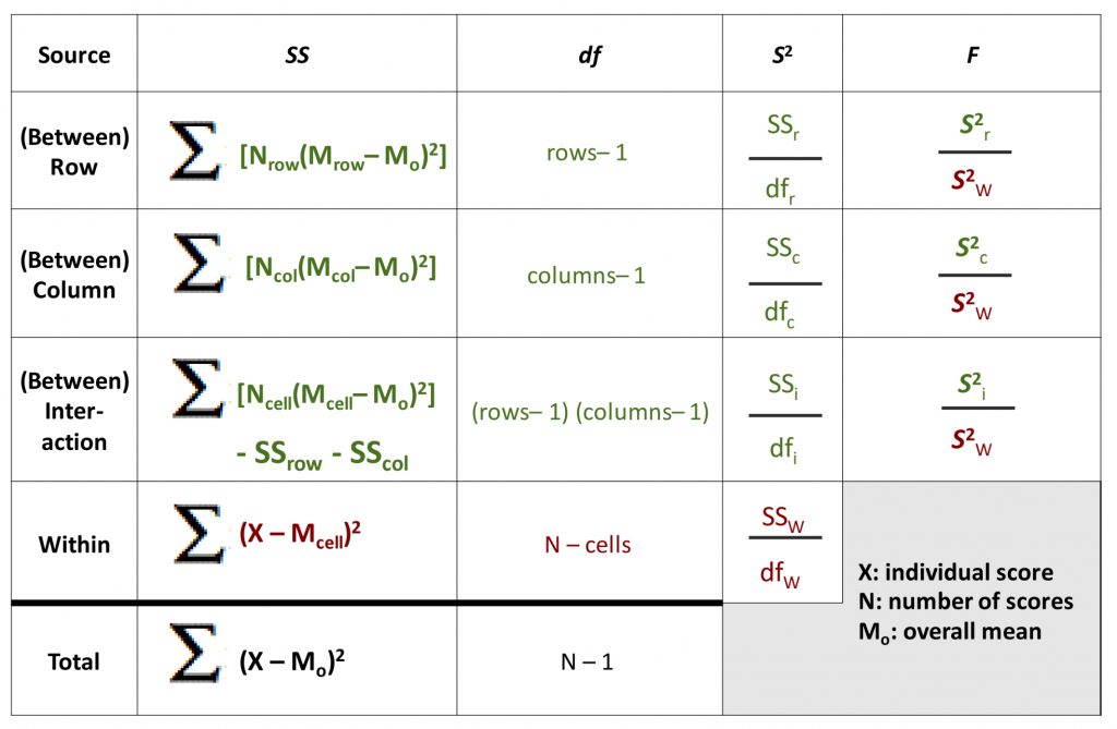
Note that all of the Sums of Squares and degrees of freedom still should add up to the total. As you can see, there will now be three F-test results from this one omnibus analysis, one for each of the between-groups terms. Each can be compared to the appropriate degrees of freedom to determine the statistical significance of the degree to which that factor (or interaction) accounts for variance in the dependent variable that was measured in the study.
To help you interpret the formulas as they reference row means, column means, and cell means, I have added a diagram here to help you see how to locate these numbers in a 2×2 two-way ANOVA scenario.
The row and column means, the averages of cell means going across or down this matrix, are often referred to as marginal means (because they are noted at the margins of the data matrix).
When it comes to hypothesis testing, a two-way ANOVA can best be thought of as three hypothesis tests in one. For each factor, and also for the interaction of the two, you need to identify populations and hypotheses, cutoffs, calculate the SS between, degrees of freedom, variance between, and F-test results. All three will share the same error terms, the SS, degrees of freedom, and variance within groups. As you can imagine, the complexity of calculating such an analysis could be daunting, but a systematic, organized approach and the use of the ANOVA table keeps it well under control.
As with one-way ANOVA, if any factor has more than two levels, you may need to calculate pairwise contrasts for that factor to determine where exactly a significant difference among group means lies. Even with a 2×2 ANOVA, the interaction effect has four possible pairwise comparisons to investigate, and that would require a planned contrast or post-hoc test. The same rules apply to such analyses as before: they may only be conducted if there is a significant overall ANOVA result, and the experimentwise risk of Type I error must be controlled.
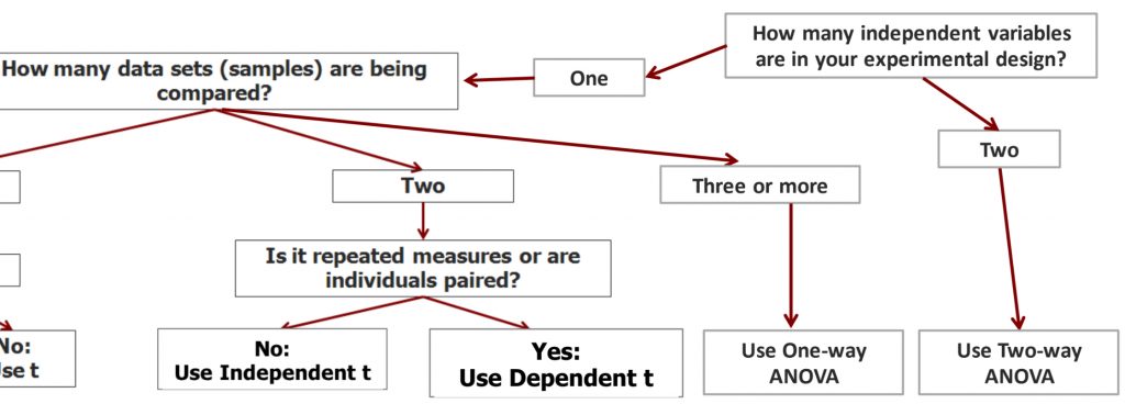
We can continue building our statistical decision tree to help us decide which test to use when we examine a research question/design. If we have two independent variables (factors) in the experimental design, then we need to use a two-way ANOVA to analyze the data.
Before we move on to detecting and interpreting main effects and interactions, I would like to bring in two cautions about factorial designs. Many researchers new to the trade are keen to include as many factors as possible in their research design, and to include lots of levels just in case it is informative. This is an understandable impulse, given how much effort and expense can go into designing and conducting a research study. We want to gather as much information as possible from that effort! However, as we saw before, the more factors we add in, the more participants we need to ensure a decent sample size in each cell of our data matrix. There is another important element to consider, as well. For each factor we add in, we add interaction terms. If we were ambitious enough to include three factors in our research design, we would have the potential for interaction effects among each pair of the factors, but we would also potentially see a three-way interaction effect.
Interactions for a three-way ANOVA
In a three-way ANOVA involving factors A, B, and C, one must analyze the following interactions:
- A x B
- B x C
- A x C
- A x B x C
The interpretation of all these interactions becomes very challenging. For this reason, solid advice to researchers is to limit ourselves to two factors for any given analysis, unless there is a very strong hypothesis regarding a three-way interaction.
9b. Interaction Effects
In this part of the chapter, we will dig into interaction effects and how to detect and interpret them alongside main effects in factorial analyses. We will see that main effects can be detected using group means tables, and interactions can be detected using the tools of bar graphs and interaction plots.
We will also look at how to interpret three major scenarios: when we have significant main effects but no significant interaction; when we have a significant interaction, but no main effects and when we have both interactions and main effects that turn out significant.
A main effect means that one of the factors explains a significant amount of variability in the data when taken on its own, independent of the other factor. You can tell (roughly) whether a main effect is likely to exist by looking at the data tables. Specifically, you want to look at the marginal means, or what we called the row and column means in the context of a two-way ANOVA above.
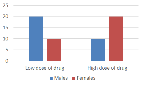
Let us look at the first example.
| Male | Female | Row means | |
| Low dose of drug | 20 | 10 | 15 |
| High dose of drug | 10 | 20 | 15 |
| Column means | 15 | 15 |
Going across the data table, you can see the mean pain score measured in people who received a low dose of a drug, and those who received a high dose. The marginal means are 15 vs. 15. This indicates there is clearly no difference between the two, so there is no main effect of drug dose. Now look top to bottom to find the comparison between male and female participants on average. 15 vs. 15 again, so no main effect of education level.
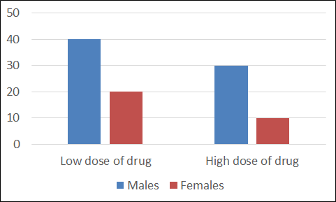
Now look at the second example.
| Male | Female | Row means | |
| Low dose of drug | 40 | 20 | 30 |
| High dose of drug | 30 | 10 | 20 |
| Column means | 35 | 15 |
Going across, we can see a difference in the row means. People who receive the low dose have less pain that those who receive the high dose: this could be a significant main effect. Going down, we can see a different in the column means as well. Males report more pain than females. Another likely main effect. So in this example there is an apparent main effect of each factor, independent of the other factor.
Now, detecting interaction effects in a data table like this is trickier. But if you can see a clear X-pattern in the group means table (the four cell means), such that similar numbers connect in an “X”, then that is a sign that there is probably an interaction. If not, there may not be.
In the first example, it is clear that there is an X pattern if you connect similar numbers (20 with 20 and 10 with 10). Probably an interaction.
| Male | Female | Row means | |
| Low dose of drug | 20 | 10 | 15 |
| High dose of drug | 10 | 20 | 15 |
| Column means | 15 | 15 |
In the second example, it is not so clear. Ask yourself: if you take one row at a time, is there a different pattern for each or a similar one?
| Male | Female | Row means | |
| Low dose of drug | 40 | 20 | 30 |
| High dose of drug | 30 | 10 | 20 |
| Column means | 35 | 15 |
People with a low dose have lower pain scores if they are female. A similar pattern exists for the high dose as well. This similarity in pattern suggests there is no interaction. You can do the same test with the columns and reach the same conclusion.
It is far easier to tell at a glance whether an interaction exists if you graph the data. In a bar graph, look for a U- or inverted-U-shaped pattern across side-by-side bar graphs as an indication of an interaction.
In the top graph, there is clearly an interaction: look at the U shape the graphs form.
In the bottom graph, there is no such U shape. When you look at each set of bars in turn, the pattern displayed is similar – just a little higher overall for the older people. Clearly, there is no hint of an interaction.
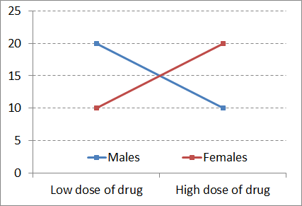
Interaction plots make it even easier to see if an interaction exists in a dataset. If you were to connect the tops of like-coloured bars of the graphs on the previous bar graphs, you would get line plots like those shown here.
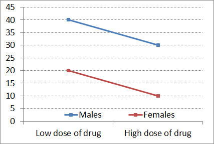
If the two resulting lines are non-parallel, then there is an interaction. On the other hand, if the lines are parallel or close to parallel, there is no interaction.
Now you have seen the same example datasets displayed in three different ways, each making it easy to see particular aspects of the patterns made by the data.
More challenging than the detection of main effects and interactions is determining their meaning. Learning to interpret main effects and interactions is the most challenging aspect of factorial analyses, at least for most of us. Now we will take a look systematically at the three basic possible scenarios.
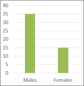
The first possible scenario is that main effects exist with no interaction. This can be interpreted as the following: each factor independently influenced the dependent variable (or at least accounted for a sizeable share of variance).
| Row means | |||
| Low dose of drug | 30 | ||
| High dose of drug | 20 | ||
| Column means |
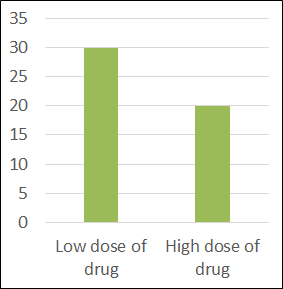
In other words, if you were to look at one factor at a time, ignoring the other factor entirely, you would see that there was a difference in the dependent variable you were measuring, between the levels of that factor.
| Male | Female | Row means | |
| Column means | 35 | 15 |
The second possible scenario is that an interaction exists without main effects. We can interpret this as follows: each factor did not, in and of itself, influence the dependent variable.
| Male | Female | Row means | |
| Low dose of drug | 20 | 10 | 15 |
| High dose of drug | 10 | 20 | 15 |
| Column means | 15 | 15 |
Here you can see that neither dose nor sex marginal means differ – no main effects. But the non-parallel lines in the graph of cell means indicate an interaction.
The best way to interpret an interaction is to start describing the patterns for each level of one of the factors. First we will examine the low dose group. They have lower pain scores only if they are female. Now look at the high dose group: they have a lower pain scores only if they are male – the opposite pattern. This means that the effect of the drug on pain depends on (or interacts with) sex.
The third possible basic scenario in a dataset is that main effects and interactions exist. This means each factor independently accounted for variability in the dependent variable in its own right. But also, they interacted synergistically to explain variance in the dependent variable. Together, the two factors do something else beyond their separate, independent main effects.
In this example, at both low dose and high dose of the drug, pain levels are higher for males.
| Male | Female | Row means | |
| Low dose of drug | 40 | 20 | 30 |
| High dose of drug | 20 | 15 | 17.5 |
| Column means | 30 | 17.5 |
For both sexes, the higher dose is more effective at reducing pain than the lower dose. But there is also an interaction, in that the difference between drug dose is much more accentuated in males. Just look at the difference in the slope of the lines in the interaction plot.
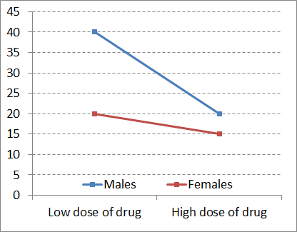
The lines are certainly non-parallel. So drug dose and sex matter, each in their own right, but also in their particular combination.
You can probably imagine how such a pattern could arise. Perhaps males are more sensitive to pain, and thus require a high dose to achieve relief. Or perhaps the higher body mass in males means a higher dose of drug is required to be effective. For females, both doses are similar in their efficacy.
Chapter Summary
In this chapter we introduced the concept of factorial analysis and took a look at how to conduct a two-way ANOVA. We further examined ways to detect and interpret main effects and interactions.
Key terms:
| main effects | interactions | participant variables |
the degree to which one of the factors explains variability in the data when taken on its own, independent of the other factor
the degree to which the contribution of one factor to explaining variability in the data depends on the other factor; the synergy among factors in explaining variance
variables used like independent variables in (quasi-)experimental research designs, but which cannot be manipulated or assigned randomly to participants, and as such must not generate cause-effect conclusions
