3. Z-scores and the Normal Curve
3a. Z-scores
video lesson
In this chapter, we will address the topic of Z-scores, one type of what are commonly called standard scores.
Before we begin, we will examine a real world example of why standardizing scores is useful and important. Have a look at these images:
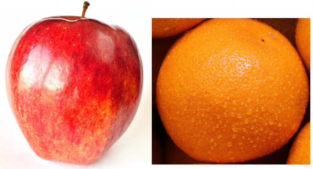
“Oranges” by Dious is marked with CC PDM 1.0
How sweet are these fruits? Is an apple sweeter? Or is an orange sweeter? What do you think? Is it difficult to say? Usually when I survey people with this question, there is a pretty even split, with half saying an apple is sweeter, and the other half saying the orange is sweeter. Why? When we think about it, it is tough to directly compare them in terms of the property of sweetness. One is more tart, the other quite mild in flavour, so it is difficult to compare oranges and apples. In fact, if you are a native speaker of English, you might have heard before “that’s like comparing oranges to apples,” meaning it’s impossible to compare. The same is true of trying to compare numbers from different datasets.
In this chapter, we will learn how to use the statistics of the mean and standard deviation to generate standard scores, or Z-scores. This will allow us to transform scores in any numeric dataset, using any scale, into a standard metric. This allows for precise comparison of a particular score to the rest of the scores in a dataset, and even across different datasets.
A Z-score is just a raw score expressed in terms of its position relative to the mean and in terms of standard deviations. A negative Z-score means that raw score is below the mean. A positive Z-score means that raw score is above the mean. In addition to its position above or below the mean, a Z-score also communicates that score’s distance from the mean in terms of how many standard deviations away it is.
For example, with a mean of 65 and standard deviation of 3, the raw score 59 can be converted into a Z-score.
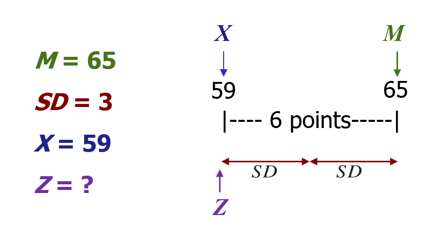
The Z-score tells you how many standard deviations away from the mean the raw score is. How many? … 2. It also tells you if it is above (greater than) or below (less than) the mean. Is it below or above the mean? … below. Thus the Z-score is -2, because it is 2 standard deviations below the mean.
Z-scores can also be useful for comparing scores across two different variables. For example, let’s say two students, Jagdeep and Jasmine, are in both a Statistics class and an English class.
| Raw scores | Jagdeep | Jasmine |
| Statistics | 20 | 38 |
| English | 30 | 45 |
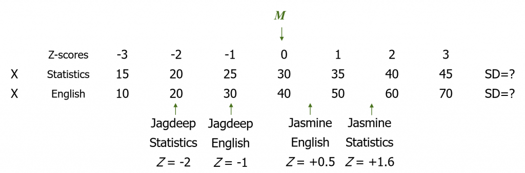
Notice that in statistics, the mean grade is a raw score of 30. From the distance between Z-scores, we can surmise that the standard deviation in statistics is 5. In English, however, the mean grade is a raw score of 40, and the standard deviation is 10. It would not make sense to directly compare Jagdeep’s test score of 20 in statistics with Jasmine’s test score of 45 in English. These were entirely different tests, so some translation to standard scores is needed. With Z-scores, we can take their grades from those two different classes and figure out their performance relative to the mean in each class. Then we can compare Jagdeep’s performance in statistics to their performance in English, and we can also compare their performance to Jasmine’s performance.
Concept Practice: define Z-score
So how do we actually calculate a Z-score? It’s a simple formula:
![\[Z=\frac{X-M}{SD}\]](https://pressbooks.bccampus.ca/statspsych/wp-content/ql-cache/quicklatex.com-7b3a09c27e1c0340f00458eb448bd91d_l3.png "Rendered by QuickLaTeX.com")
For any given raw score (X) that we want to translate, we subtract off the mean. Then we take that result and divide by the standard deviation. Note that if the result is a negative number, the score is below the mean. If the result is positive, the score is above the mean.
We can also rearrange the Z-score formula to go backwards from a Z-score to a raw score.
![\[X=(Z)(SD)+M\]](https://pressbooks.bccampus.ca/statspsych/wp-content/ql-cache/quicklatex.com-e6970024d369f07bc8ee5b8c555990e5_l3.png "Rendered by QuickLaTeX.com")
You might wish to do this if you want to figure out a cutoff score, for example in the context of grading. If you are grading a class on a curve, you may decide that anyone who falls 2 or more standard deviations below the mean will be given a failing grade. So you could figure out what the test score is, below which students will be assigned an F. To do this, you take the Z-score, in this case -2, and multiply it by the standard deviation. Then add the mean. This will get you to the test score that would serve as the cutoff, below which students would be assigned a grade of F. Note that if the Z-score is negative, essentially you are subtracting some amount from the mean.
Concept Practice: calculate Z-score
Concept Practice: calculate raw score from Z-score
Z-scores can be very helpful for figuring out whether a score is extreme relative to a comparison distribution. We’ll see that this is what we typically wish to do in inferential statistics: if I give a new medicine to a sick patient, does that patient do better than most of the other patients treated with a standard remedy?
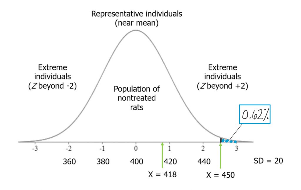
In this example, we will test the hypothesis that rats fed a grain-heavy diet become unusually overweight. We have a group of rats, and their average weight is 400 grams, with a standard deviation of 20 grams. We start feeding the rats a grain-heavy diet, and measure each one after a few weeks on that new diet. The question is, how heavy should they be for us to conclude that they are unusually overweight?
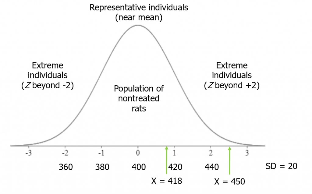
A good rule of thumb is that more than 2 standard deviations from the mean (in either direction) is considered fairly extreme. Beyond 3 standard deviations is very extreme.
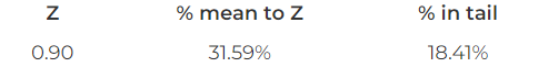
Suppose we measure the first rat after the grain-heavy diet, and it weighs 418 grams. This is less than 1 standard deviation from the mean: Z = (418-400)/20 = 0.9. Therefore, we cannot be sure whether the diet made rats unusually heavy.
Next, though, we measure rat number 2. It weighs 450 grams. That is 2.5 standard deviations from the mean, so more than 2: Z = (450-400)/20 = 2.5. Thus, rat number 2 qualifies as extreme on my distribution.
As we measure rats, if more of them end up in the extreme region on the distribution, then we will have a strong basis for concluding that the grain-heavy diet made for unusually heavy rats.
Now we can take a closer look at our example with Jagdeep and Jasmine and their performance in two different classes. By converting their raw scores, shown here, into Z-scores, we can directly compare them to their classmates, each other, and between classes.
| Raw scores | Jagdeep | Jasmine |
| Statistics | 20 | 38 |
| English | 30 | 45 |
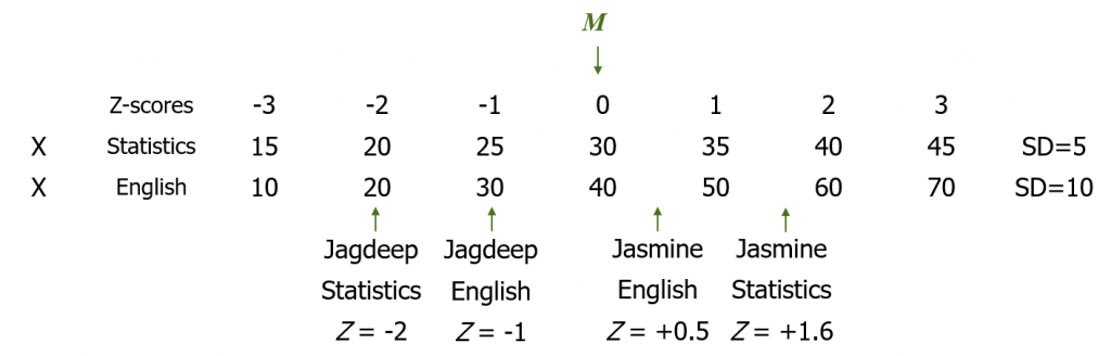
Note that the statistics class has a different mean and standard deviation than does the English class. For statistics, the mean score is 30 and the standard deviation is 5. Given this, with a grade of 20, Jagdeep’s Z-score in statistics is Z = (20-30)/5 = -2. They are two standard deviations below the mean. In English, the mean score is 40 with a standard deviation of 10. So Jagdeep, with a score of 30, has a Z-score of Z = (30-40)/10 = -1, because they are one standard deviation below the mean.
Jasmine, on the other hand, is above the mean in both classes. They are .5 standard deviations above the mean in English: Z = (45-40)/10 = .5. Their Z-score in statistics is Z = (38-30)/5 = 1.6.
Note that we can compare all these scores against each other only once converted to Z-scores. In statistics, if a student had a score of 40, that would be a very good grade! But in English it would be just average. Once converted in to Z-scores we can see that Z = +2 in statistics is clearly a higher grade than Z = 0 in English.
3b. Normal Curve
video lesson
In this part of the chapter, we will be discussing the normal curve, as a model distribution, and taking a look at how Z-scores relate to the normal curve.
First, consider a real-life situation that you can likely relate to. What if I told you this class would be graded on a bell curve? What would your reaction be?
Usually, when I ask that question of students, they have a negative reaction. But why? In highly traditional educational systems, there is a concept of gatekeeping that suggests only a particular proportion of students should receive a particular grade. Typically, the bell curve is used in situations where a program wants to make progression through the program competitive, to “weed out” students who perform less well than their peers on exams. Using the normal curve, or bell curve, as a model upon which to map student scores, the instructor can determine precisely how many students will receive A’s, B’s, C’s, and so on.
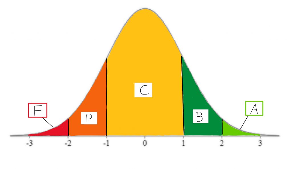
If, for example, only about 2% of students should receive the highest grade, then, the instructor will set the minimum standard for that grade as a Z-score of +2. Only students who receive a calculated course score that is at least 2 standard deviations above the mean will get the coveted A grade. Using areas under the normal curve, the instructor can relate that to the percentage of students who will receive a particular grade, and can map that onto which Z-score forms the criterion for that grade.
So why is grading on a bell curve unpopular among students? It assumes that, regardless of who is in the class, only the top few students should be awarded a high grade. The bell curve model assumes that most students show a mediocre level of mastery. In effect, this assumption means that students compete directly against one another for their grades. By helping another student in the class, you could be risking losing your place in the rankings to them. This can create a high-stress environment, and it can distort the reality of how many students in the class do actually understand the material quite well.
Now that you have a sense of what the normal curve looks like and one of its common uses, let us take a broader view of the basic concepts involved. A normal curve is a theoretical distribution that is sometimes called a Z distribution. The normal curve has very distinct set of properties that make it a useful model for data analysis. In real life, few distributions actually match this theoretical model, so when you are describing the shape of a distribution, even if it looks pretty nice and symmetrical like this, you should refrain from describing it as a normal curve.
Concept Practice: define normal curve
Another important concept we will address is that of a percentile. A percentile is a score on a distribution that corresponds to a certain area under the curve. It’s often used as a means to rank scores – for example, if you take a standardized test like the GRE, they will report your percentile ranking as well as your actual score.
The standard normal distribution is a theoretical distribution that should usually be approximated if a dataset is large enough. For example, if I were to measure the IQ score of millions of people, or measure the heights of all the people currently alive in the world, or make a histogram of all the scores of all students who could ever take a test, these distributions would likely look pretty close in shape to this theoretical distribution.
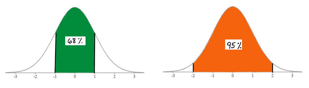
For this reason, and because it has very predictable set of properties, it is commonly used as a model for data analysis. As you can see here, using this model you can easily identify what percentage of scores in a standard normal distribution fall between Z score landmarks.
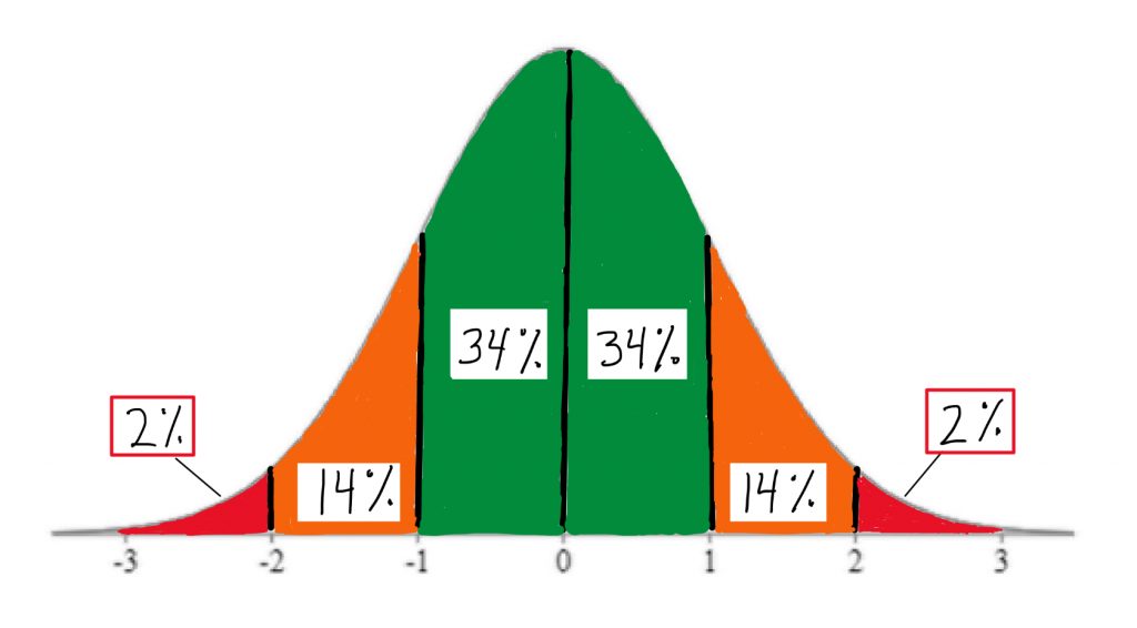
In fact, you should memorize these handy area-under-the-curve landmarks: the 2-14-34 rule. These come in very helpful for quick visual estimation, when we are working with the normal curve model.
Concept Practice: area under normal curve
In addition to the handy 2-14-34 percentage estimates, the standard normal curve also can be used to determine a score’s exact percentage probability of occurring within this theoretical distribution. In our interactive exercises, we will see how to work with tables to look up the exact area under the curve associated with any Z-score, not just the landmarks shown on these illustrations. We will also be able to work backwards from percentiles, which are often used as a measure of relative standing in a distribution.
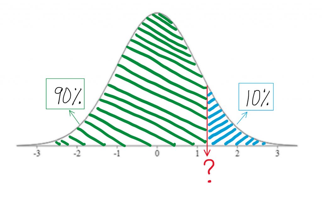
Percentiles can be a tricky concept at first. Let’s take a closer look. A percentile is the score at which a given percentage of scores in the distribution fall beneath. To visualize the percentage, we always sketch the normal curve, and shade the area under the curve starting from the left end up to the relevant proportion. The 90th percentile is the score at which 90% of individuals scored lower than that. So you start from the left end of the curve and shade up until you have shaded in 90% of the area under the curve. Clearly that would be the vast majority of the area.
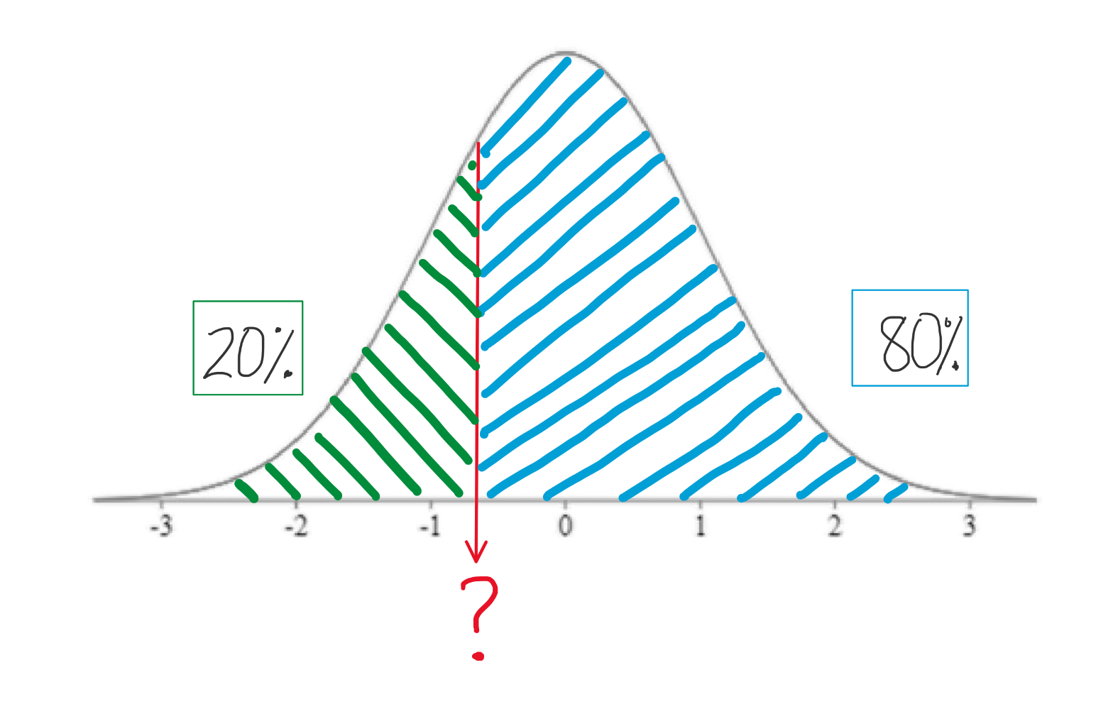
The 20th percentile is the score at which only 20% of individuals scored lower. So you are only shading a pretty small area under the curve, starting from the left end.
Note that the 50th percentile would be shading the lower half of the curve, so the 50th percentile is always right in the middle of the curve, and thus it always a Z-score of 0, otherwise known as the mean of the distribution.
If you ever find yourself getting confused about the concept of the percentile and how it works, think about this. New parents frequently report on their baby’s achievements in these terms: little Doneil is in the 80th percentile for weight, and the 99th percentile for height! They are mentioning these things because they are above average. Baby Doneil is heavier and longer than most babies that age! You do not hear people bragging too often about their babies being in the 30th percentile for anything. Why? Because that would mean their baby is below average in that characteristic. So with percentile rankings, you are always starting from the bottom of the distribution and seeing what percentage of the distribution of scores you are outranking with the score in question.
Recall our experiment with the rats being fed a grain-heavy diet. We saw that the rat who weighed 418 grams after eating the diet was a bit heavier than the average of non-treated rats, but that was not even a full standard deviation higher than the mean. The Z-score was 0.9, when we calculated it. If we were to look up in a table the area under the curve to the right of that Z-score, we would see that the area in the tail of the distribution associated with that Z-score is 18.41%.
So when we ask ourselves, “how unusual is that score?” or “what percentage of scores are more extreme?” we have a precise answer, if we use the normal curve as our model. We can say that there is about an 18% probability that any rat drawn at random from the normal rat weight distribution will be at least that heavy. That does not seem too unusual.
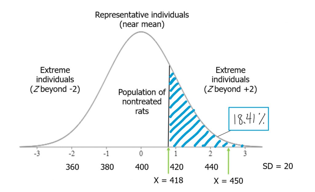
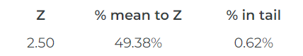
On the other hand, if you recall, the second rat in our experiment, who ate the grain-heavy diet, weighed quite a bit more. In terms of Z-scores, his weight was 2.5, or 2-and-a-half standard deviations above the mean. Such a score is far less probable under our normal curve model. If we look up the area under the curve in a table, we will see that the area in the tail of the distribution associated with that Z-score is 0.62%.
There is less than a 1% chance that any rat drawn at random from the normal rat weight distribution will be at least that heavy. That is far more unusual as a rat weight.
Concept Practice: find area from Z-score
Concept Practice: area as probability
These are lots of puzzle pieces I have tossed together, just to give you a preview of how they all fit together, and how we might be able to use them for inferential data analysis. A raw score can be translated to a Z-score, which can be mapped onto the normal curve. If it’s a normal curve, then a known proportion of the distribution is associated with that Z-score, and that allows us to connect scores to probabilities. That is where we are headed with the next chapters, and soon we will be getting into full-on inferential statistics techniques.
Chapter Summary
In this chapter, we introduced the concepts and utility of standardized scores like Z-scores and the normal curve. We saw that combining those tools offers the opportunity to rank scores using percentiles and to estimate the probability of a particular score occurring within a distribution, from which we can make inferences about how unusual a score is.
Key terms:
| Z-score | normal curve | percentile |
Concept Practice
Return to text
Return to text
Return to text
Return to text
Return to text
Return to text
Return to text
Return to 3a. Z-scores
Try interactive Worksheet 3a or download Worksheet 3a
Return to 3b. Normal Curve
Try interactive Worksheet 3b or download Worksheet 3b
standard scores that allow us to transform scores in any numeric dataset, using any scale, into a standard metric
a theoretical distribution, sometimes called a Z distribution, has a very distinct set of properties that make it a useful model for data analysis (e.g. 2-14-34% area rule)
the score at which a given percentage of scores in the normal distribution fall beneath
