Accessibility FAST
Accessible Colour
1 in 12 men and 1 in 200 women have some kind of colour vision deficiency (Colour Blind Awareness, 2010). To create inclusive content foreground information must have sufficient colour contrast against background colours. Additionally, it is essential that colour is not the only means to convey or emphasize information.
On this page:
Accessible Colour
Consider that good colour practices aren’t just for those who see colour differently. Better practices are
Essential for
- Readers with a colour vision deficiency.
- Readers with low vision.
- Readers on an electronic paper screen, like an e-reader.
But also benefit
- All readers, regardless of access means.
- Readers that customize appearance and style.
- Effective use of colour ensures information looks similar regardless of device and user settings, such as dark or night mode or other custom contrast settings.
- Readers that print content in black and white.
- Content that relies on colour or lacks sufficient contrast will lose meaning in black and white.
- Readers experiencing eye fatigue.
- When viewing content in poor lighting or when there is glare from the sun.
Colour Contrast
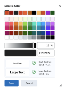
 For proper colour contrast, aim for at least a 4.5:1 ratio. To (over)simplify that ratio, that means the text is 4.5 times brighter than the background. Large text (size 18 point or greater) or bold 14 point or greater, requires only a 3:1 ratio to be accessible. Logos and decorative images have no colour requirements.
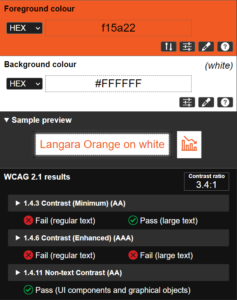
As an example of an accessible contrast ratio, black text on a white background has a ratio of 21:1. Orange text on a white background (or vice-versa) has a ratio of 3.37:1 and does not provide sufficient colour contrast.
Colour combinations to avoid:
- Red and green
- Green and red or blue or brown or black
- Light green and yellow
- Blue and purple of grey
Use dark font colours on light backgrounds (black text on a white page for example) and light font colours on dark backgrounds (for example white text on a black background)
Use of Colour
Further, don’t rely on colour alone to convey information or emphasize importance. Accessible practice is to add visual or text equivalents to colour, for example:
- Use colour, shapes, and text in charts and diagrams.
- Add text indicators to highlighted table cells.
- Include reminders like “important” or “required” in addition to using bold or a specific font colour.
If you rely on colour alone, readers with colour vision deficiency, using screen readers or text to speech software, or those viewing in black and white will miss the meaning.
Digital Colour
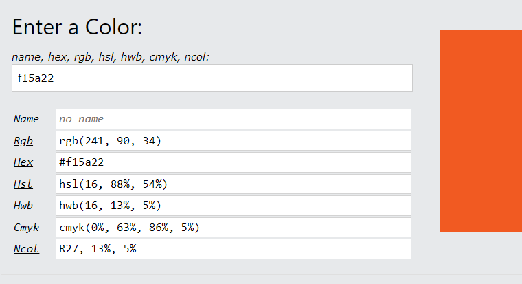
Digital colours are specified using colour codes. The most common colour codes are Hexadecimal (hex), RGB, and HSL. Each of these colour codes express colours using different values. Try entering a colour in this Color Converter tool to see how colours can be coded.

Hex values are referred to in this guide, but the principles are applicable to any colour code system.
Colour Code Tools
Browser Tools and Extensions
There are many options for finding colour codes.
Firefox
Firefox has a built-in eyedropper tool. Navigate to Tools > Browser Tools > Eyedropper. Click on the colour you want and the hexadecimal code is copied to your clipboard.
Additionally, right-click on any webpage and select Inspect. Navigate to the Accessibility pane and select an option from the Simulate menu to see how different people may experience the colour of that page.
Chrome
ColorZilla Chrome extension allows you to easily copy colour codes from websites. Simply open the extension and use the eyedropper to select a colour. The HEX colour code is added to your clipboard.
In Chrome, you can right-click on the colour you want and select Inspect. Navigate to the Styles pane in the DevTools window. Additional options are available in the Computed tab. On a complicated page, you may wish to use the filter box to search for “color.” Click on the colour box next to the element you want to get the colour codes. This option display contrast ratios only if the colour is coded as a foreground or background colour relative to another properly coded element’s colour. That is not always the case, however, you can still use this method to find the hex codes and compare them in another tool.
macOS
Built-in to MacOS is the Digital Color Meter application. Press CMD + L to lock the meter’s position on the desired colour. Use the Color menu or press SHIFT + CMD to copy the colour code. This tool allows users to copy colour codes as RGB.
Contrast for MacOS is an excellent application to determine colours and colour contrast.
Windows
TPGi Color Contrast Analyser for Windows is an excellent option.
You can use Microsoft PowerToys to find Hex codes.
Use these tools to find colour codes and contrast checking tools to verify accessible colour contrast.
Contrast Checkers and Other Tools
WebAIM (Accessibility in Mind) is an exceptional resource that has a contrast checker (that can be added as a browser tool), a link contrast checker, and additional reading on colour contrast.
ACE (Accessibility Colour Evaluator) is an excellent tool for checking colour contrast. You can set multiple colours for multiple elements (background, text, link, hover, etc.) and see the corresponding colour contrast ratios.
tanaguru contrast finder checks contrast and offers colour combinations close to your input that are more accessible.
Consider some of these as well and find what works best for you:
Who can use this color combination?
Works Cited
Colour Blind Awareness. “About Colour Blindness.” Colour Blind Awareness, 2010.
Colour contrast is the difference in saturation, brightness, and pigment of different elements relative to one another. A contrast ratio of at least 4.5:1 between text and background is required by common accessibility standards.


