Brightspace Accessibility
Templates, Font, and Colour
On this page:
Templates
Create great-looking, responsive, and accessible content topic pages using the page layouts provided in the template package. The layouts are designed to be edited using the HTML Editor in the Learning Environment.
To access the templates, Create a File and then click on Select a Document Template menu next to the title text box.
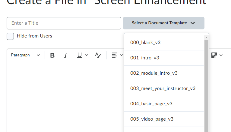
Choose the appropriate nnn_x_v3 template.
Be consistent: use the introductory template for all introductory pages, the video page for videos, etc.
Each Brightspace content page requires a title. Give each page a descriptive, unique title.
Existing Content
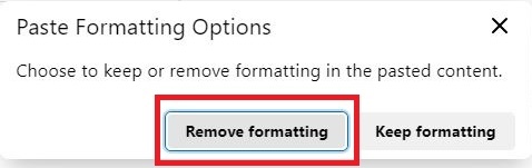
If you have existing content you would like to convert into a Brightspace webpage, you can copy and paste directly from a Word document. Select Remove formatting when prompted.
If you encounter formatting errors when copy and pasted content into Brightspace, consider using HTML Cleaner to eleminate excess code while retaining look and layout. Copy and paste the HTML Cleaner results into the Source Code view in the Brightspace editor.
Font
Use the built-in editor tools to change font. All font options are available on the Brightspace editor toolbar.
Prefer sans-serif fonts. Use a minimum font size of 16 pixels.
The Appearance chapter of this handbook has additional information on using accessible font.
Colour Contrast
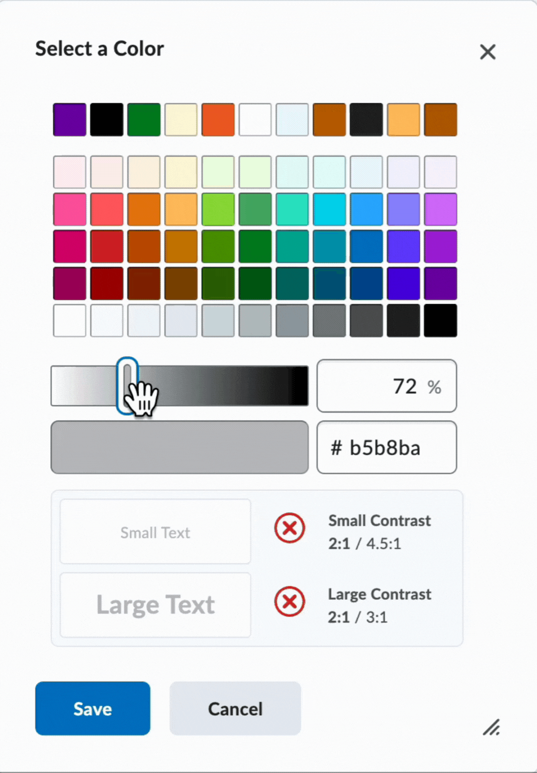
Contrast must be at least 4.5:1 for normal text (11-12 point) and 3:1 for large text (18 point +). Use the Accessibility Checker to verify.
To select font colours:
- Highlight the text
- Select the Select Color button in the toolbar
- In the Select a Color dialogue, use the sliders to change your colour until the contrast is at least 4.5:1
Remember the accessible colour best practices covered earlier in this handbook. Do not use colour alone to convey meaning or emphasis.
Preset document or file format, used for consistency without having to recreate each time
Colour contrast is the difference in saturation, brightness, and pigment of different elements relative to one another. A contrast ratio of at least 4.5:1 between text and background is required by common accessibility standards.
