PowerPoint Accessibility
Document Properties and Accessible Fonts
This chapter will introduce some first steps to making PowerPoint presentations accessible.
On this page:
Accessible Font
Choose accessible font
- Use font size 18 minimum
- Prefer sans-serif fonts. Do not sure decorative fonts.
- Left-align text
- Use built-in tools for spacing and alignment
The Appearance chapter of this handbook has additional information on using accessible font.
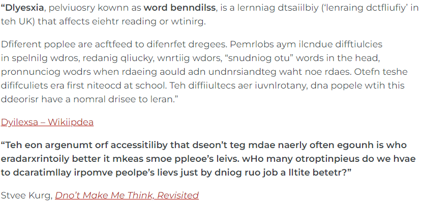
Consider this dyslexia “simulation.” More accessible font choices, particularly font and spacing, have a huge impact for readers with dyslexia.
Font Colour
- Use accessible colours.
- Font must have a contrast ratio of at least 4.5:1 against the background.
To set font colour:
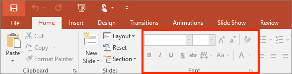
- Navigate to the Home tab.
- Select Font Colour.
- Choose a colour that contrasts well against the background, such as black text on a light background or white text on a black background.
Do not use colour alone to convey meaning or importance.
- Select View > Greyscale to see if your information relies on colour alone.
- Select Back to colour view to return to original colour scheme view.
Visit the accessible colour chapter of this Pressbook for more information.
Text Alignment
To set text alignment:
- Set alignment in the Paragraph tools on the Home tab.
- Avoid justified alignment as it can create excessive blocks of white space when zoomed and can create ‘rivers of white space’ which are gaps that appear to run through a paragraph due to coincidental alignment of spaces.
Document Properties
The document title is announced to assistive technology and is more informative (and pleasant to hear) than the file name. Adding a plain language title to the metadata allows continued adherence file naming conventions. Ensure the language code matches the language of the document. Other fields are useful but not required.
Document Title
To add a document title:
- Navigate to File > info.
- On MacOS: File > Properties > Summary tab.
- Enter a descriptive title in the Title field.
This cannot be done in Office Online.
Document Language
To set document language to match content:
- Click language on Status Bar at bottom of document screen or via Tools > Language
- You can set a different language for different parts of your document:
- Select desired text.
- Via Review tab, select Language.
- Select appropriate language.
Colour contrast is the difference in saturation, brightness, and pigment of different elements relative to one another. A contrast ratio of at least 4.5:1 between text and background is required by common accessibility standards.
