Accessibility FAST
Appearance

How content appears is an important influence on the accessibility of your content. Consider:
- Font choices
- Use of colour
Accessible appearance helps those with vision impairments, cognitive disabilities, or a colour vision deficiency. However, like many accessible design practices, following these best practices will benefit everyone.
On this page:
Accessible Font
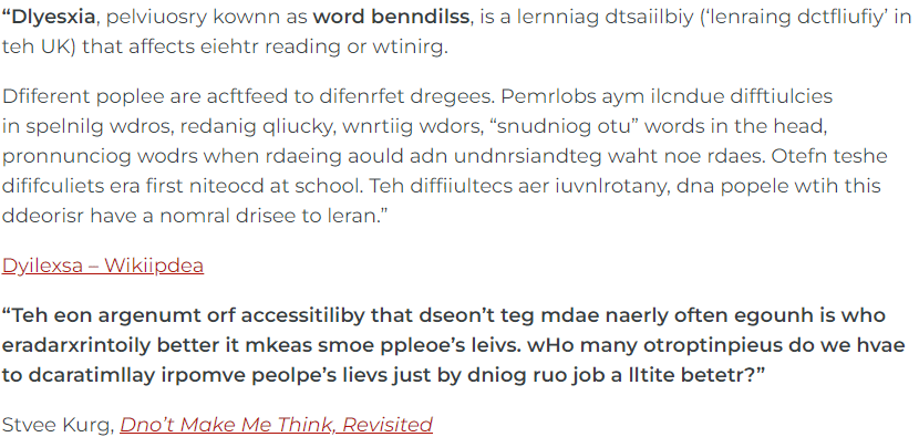
Text content needs to be readable. For people with low-vision or dyslexia, good font choices can make content easier to read. Consider the following passage:
Consider how much more difficult that is based on font choice:
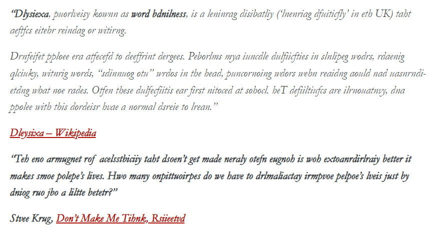
Consult footnote[1] for an unmodified version of this text.
The above animation is a brief simulation of dyslexia. Creating accessible content, including choosing readable fonts, have a great impact on people with dyslexia.
Font Better Practices
Sans-serif fonts in sizes between 12 and 14 points are shown to be the most readable styles (Morrell & Echt, 1997; Lin et al., 2013).
Prefer sans-serif and basic serifs:
- Sans-serif fonts such as Aptos, Arial, Calibri, Helvetica, or Montserrat are good choices.
- Simple serif fonts, such as Cambria, Sitka, and Times New Roman are readable.
- Avoid decorative fonts with elaborate serifs.
Use font size 12 or larger for documents, 18 or larger for presentations, and 16 pixels or larger on webpages.
Left-align text for languages that read left to right. Avoid justified alignment as that may create “rivers of white space” which are gaps that appear to run through a paragraph due to coincidental alignment of spaces and excessive blocks of white space when zoomed in.
Consider spacing.
- Line height or line spacing must be at least 1.5 times the font size.
- Spacing after a paragraph must be at least 2 times the font size.
- Letter spacing must be at least 0.12 times the font size.
- Word spacing must be at least 0.16 times the font size.
Avoid excessive use of italics, long blocks of all capitals.
Do not use images of text and avoid putting text over images.
More about Font
Font choices are part of good design and make content easier to read for everyone.
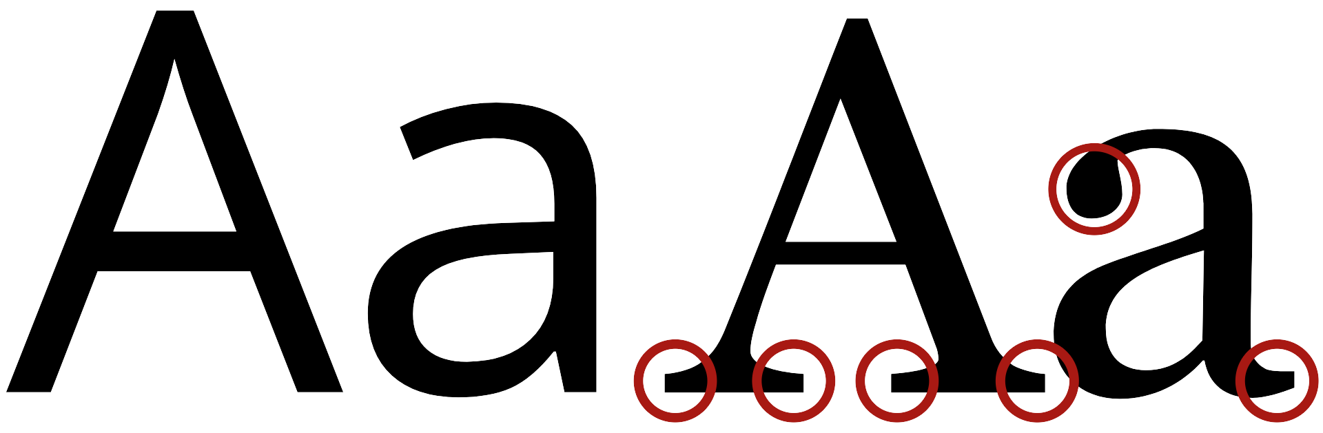
A simple test for your font choices is the Il1 test to root out imposters. When choosing a font, type a capital i, a lowercase L, and the number 1 beside each other with no spaces: Il1.[2] A good font will have obvious distinction between those characters. A harder to read font will have imposter characters that look similar and can easily be mistaken for one another. Choosing a readable font helps avoid character ambiguity which may cause confusion for readers.
Consider these examples:
Poor (Alata)

Acceptable (Roboto)

Excellent (Noto Sans)

The Il1 test is not the only factor in choosing the right font, but is a good quick test of font legibility.
Accessible Colour
Text must have a contrast ratio of at least 4.5:1 against the background colour. For example, black on white is 21:1 and orange on white is 3.37:1.
Additionally, do not use visual styling, including colour, alone to emphasize content.
These best practices are essential for readers that are colour blind, but benefit users printing in black and white, viewing in the sun with screen glare, custom contrast settings, or other vision impairments.
The next chapter examines colour in further detail.
References
Krug, S. (2014) Don’t make me think, revisited: A common sense approach to web usability (3rd ed.). New Riders.
Lin, H., Wu, F.-G., & Cheng, Y.-Y. (2013) Legibility and visual fatigue affected by text direction, screen size and character size on color LCD e-reader. Displays, 34(1), 49–58.
Morrell, R. W., & Echt, K. V. (1997). Designing written instructions for older adults: Learning to use computers. In A. D. Fisk & W. A. Rogers (Eds.), Handbook of human factors and the older adult (pp. 335–361). Academic Press.
- "Dyslexia, previously known as word blindness, is a learning disability ('learning difficulty' in the UK) that affects either reading or writing. Different people are affected to different degrees. Problems may include difficulties in spelling words, reading quickly, writing words, "sounding out" words in the head, pronouncing words when reading aloud and understanding what one reads. Often these difficulties are first noticed at school. The difficulties are involuntary, and people with this disorder have a normal desire to learn." Dyslexia - Wikipedia “The one argument for accessibility that doesn’t get made nearly often enough is how extraordinarily better it makes some people’s lives. How many opportunities do we have to dramatically improve people’s lives just by doing our job a little better?” Steve Krug, Don’t Make Me Think, Revisited ↵
- Admittedly, the default font of Pressbooks, Montserrat, is not an excellent example of best practice. ↵
The contrast ratio between the font colour and the background colour. Accessible contrast should be at least 4.5:1.
