Brightspace Accessibility

Brightspace Accessibility
Quick Start Guide
Best practices to maximize Brightspace accessibility:
Use templates
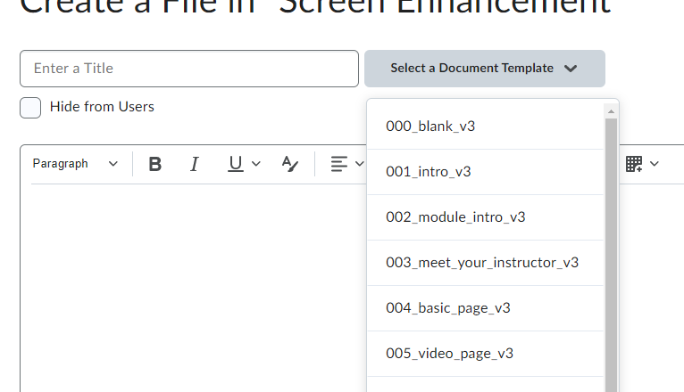
Brightspace templates include accessible colour, structure, and interactive elements. Choose an appropriate template in the Select a Document Template menu.
Write descriptive linked text
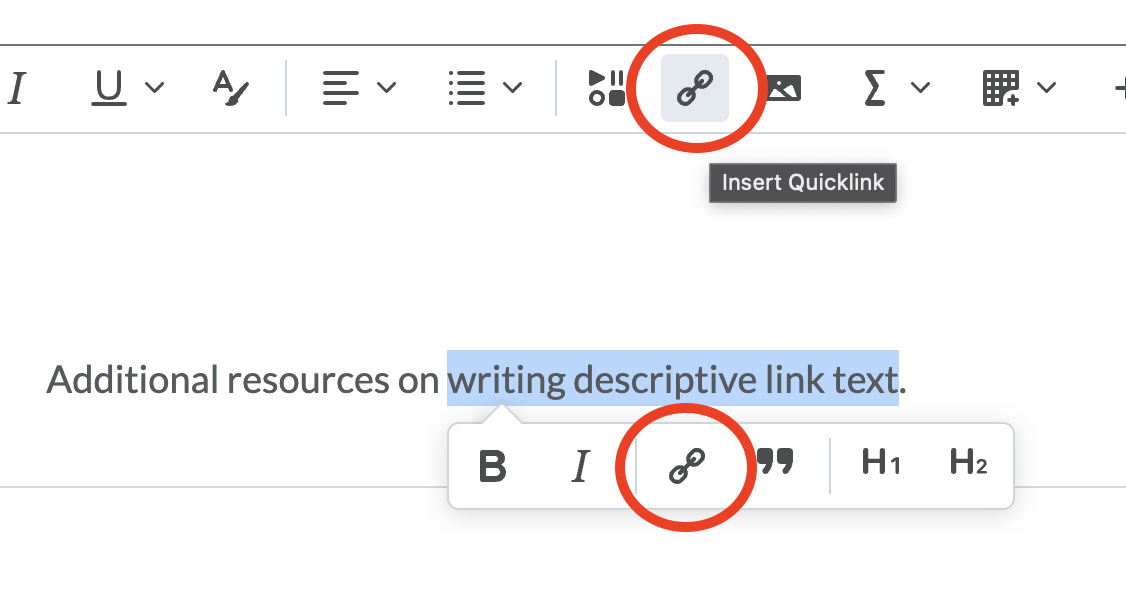
Use linked text not bare URLs. Write a description of the link destination, highlight the relevant text, and use the Insert Quicklink button to add a link.
Use tools for structure
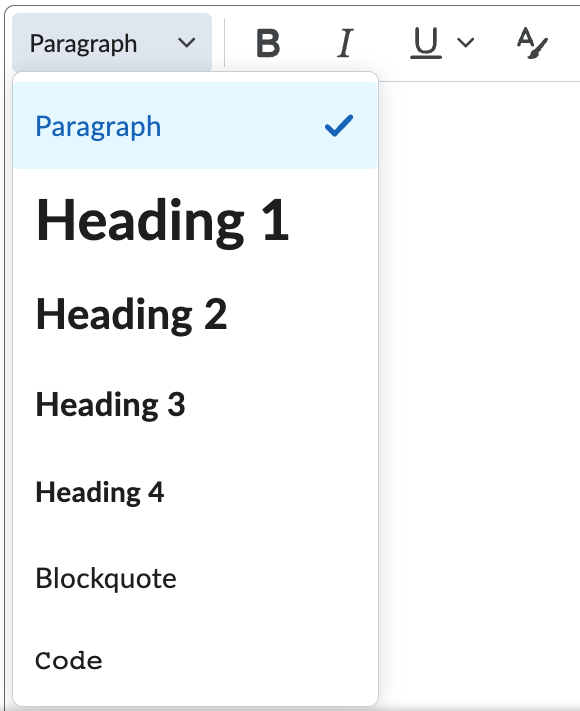
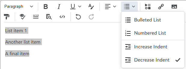
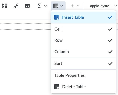
Use built-in tools for headings, lists, and tables.
Include alternative text
Add descriptions to the Alternative Text field of images that present information.
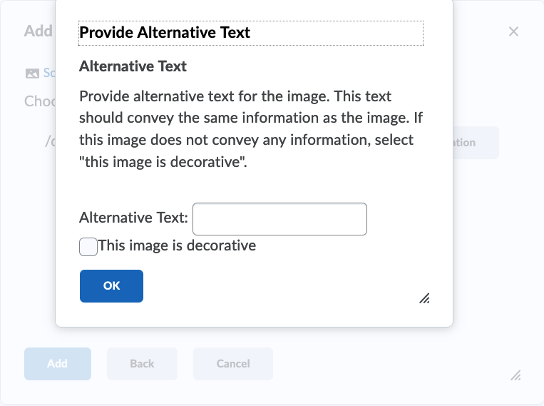
Mark decorative images using This image is decorative.
Caption and transcribe media
Ensure videos have accurate closed captions and include transcripts of audio recordings.
Run the Accessibility Checker
Use the Accessibility Checker to flag accessibility issues.

Consider Accessibility Across Your Course
To make your course as accessible as possible, ensure you:
- Communicate clearly
- Have deliberate, consistent organization
- Choose the most appropriate file types
- Ensure any uploaded documents are accessible
For more information, read General Course Accessibility later in this book and consider the following video introduction:
https://mediaspace.langara.ca/media/t/0_epcdfyfy
Moving forward…
Focus on creation and revision, not remediation. The next time you create a page or update an existing one, use the practices in this guide. Don’t focus on going back and fixing every page you have. Focus on making your new content more inclusive and accessible.
Move to the next page for step-by-step guides to making accessible Brightspace content.
Colour contrast is the difference in saturation, brightness, and pigment of different elements relative to one another. A contrast ratio of at least 4.5:1 between text and background is required by common accessibility standards.
The use of code (HTML attributes, PDF tags, XML, etc.) to distinguish content by meaning, not appearance. For example, a <h1> heading tag creates both a visual and coded navigation waypoint whereas increasing the font size and bolding simply makes regular text appear larger.
Linked text to another document or part of document that the user can follow by selecting. Effective hyperlink text should make sense independent of the content around it.
Headings are text used to organize a document. Headings are section and subsection titles used to logically separate content, build and show relationships between ideas, and explain the development of concepts. Headings must be hierarchical, not skip a level, and be semantically programmed, not merely cosmetic.
Information presented in a grid format of rows and columns, generally to show a relationship between sets of data
Alternative text is a text equivalent of graphics in a document or webpage. Alternative text is coded to be hidden visually, but read to a screen reader user.
An image that does not contain unique information or is used for visual appeal only. Decorative images must be marked as decorative or use alt=""
A text equivalent of audio content in a video, displayed synchronously. Closed captions are toggled on or off by viewers, as opposed to open captions that are burned into the video and always displayed.
Transcription is the process of converting audio into written text. A transcript is a written record of all audio in media. Captions are synced to the content.

