Word Accessibility

Word Accessibility
Quick Start Guide
Top tips for Word accessibility:
Use tools for structure
Use built-in tools for headings, lists, and tables.

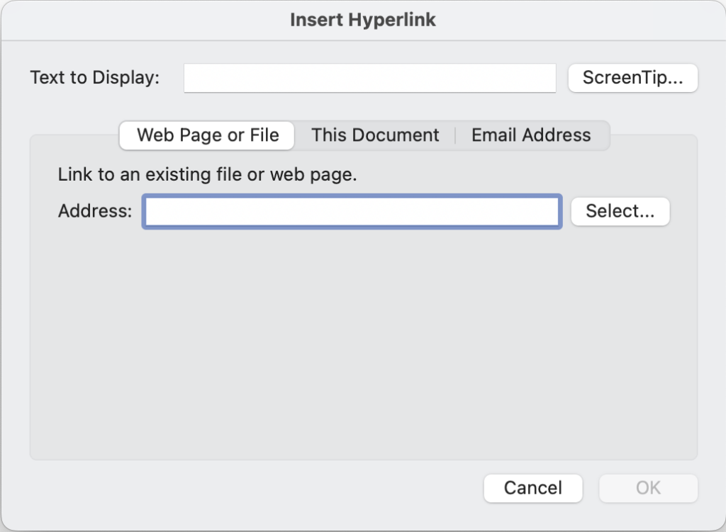
Write descriptive linked text
Insert descriptive links instead of bare URLs. 
Choose readable fonts
Use sans-serif or plain serifs, size 12 or larger.

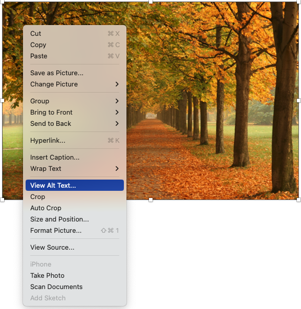
Provide alternative text
Add descriptions to the Alt Text field of images that present information.

Check Mark as decorative for images that do not contain information.
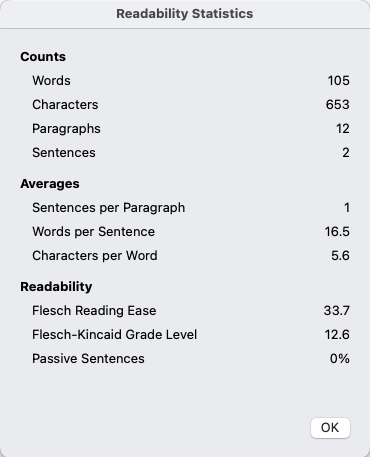
Write in plain language
Use Word’s Editor Document Stats to measure language complexity.

Use the Accessibility Assistant
On the Review tab, select Check Accessibility to flag accessibility issues.

Moving forward…
Focus on creation and revision, not remediation. The next time you create a document or update an existing one, use the practices in this guide. Don’t focus on going back and fixing every document you have. Focus on making your new documents better.
Move to the next page to continue reading about Word accessibility and learn how to make accessible Word documents.
Headings are text used to organize a document. Headings are section and subsection titles used to logically separate content, build and show relationships between ideas, and explain the development of concepts. Headings must be hierarchical, not skip a level, and be semantically programmed, not merely cosmetic.
Information presented in a grid format of rows and columns, generally to show a relationship between sets of data
Linked text to another document or part of document that the user can follow by selecting. Effective hyperlink text should make sense independent of the content around it.
Alternative text is a text equivalent of graphics in a document or webpage. Alternative text is coded to be hidden visually, but read to a screen reader user.

