PowerPoint Accessibility

PowerPoint Accessibility
Quick Start Guide
Top tips for PowerPoint accessibility:
Use structure and layouts
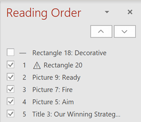
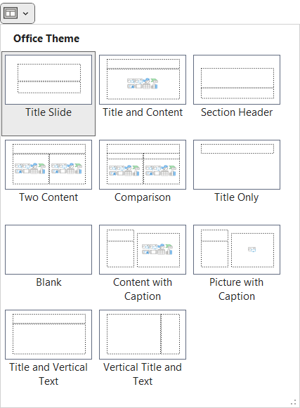
Ensure slides have titles.
Choose accessible fonts
- Use simple serifs or sans-serifs in size 18 or larger.
- Use black text on a light backgrounds (or vice-versa).
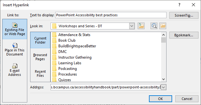
Write descriptive linked text
Create descriptive links instead of bare URLs.
Provide alternative text
Add descriptions to the Alt Text field of images that present information.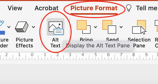
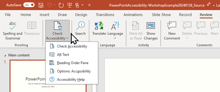
Check Accessibility
On the Review tab select Check Accessibility to flag and fix accessibility issues.
PowerPoints ≠ PDFs
Share your PowerPoint via Brightspace, OneDrive, or email. Exporting to PDF will undo much of the work done to make the presentation accessible. Additionally, PDFs are not designed to reflow to fit user screen dimensions, are no more secure than other document types, and present significant challenges regarding currency and versioning.
Moving forward…
Focus on creation and revision, not remediation. The next time you create a presentation or update an existing one, use the practices in this guide. Don’t focus on going back and fixing every presentation you have. Focus on making your new presentations better.
Move to the next page to continue reading about PowerPoint accessibility and learn how to make accessible presentations.
Linked text to another document or part of document that the user can follow by selecting. Effective hyperlink text should make sense independent of the content around it.
Alternative text is a text equivalent of graphics in a document or webpage. Alternative text is coded to be hidden visually, but read to a screen reader user.

