Chapter 2 What Data Looks Like and Summarizing Data
2.4 Graphs
A picture is worth a thousands words, they say, so in this section we will explore the most basic ways we can summarize data using graphical displays rather than tables. Unlike frequency tables which can be used to summarize variables at all levels of measurement with a a table of the same format, the types of graphs we use tend to differ depending on the variable’s level of measurement. Almost all graphs in this book are produced using SPSS.
The three most basic graphs used to summarize variables are pie charts, bar graphs (or bar charts), and histograms.
Pie charts. You have undoubtedly encountered (and likely used) pie charts before. Fig. 2.1 below presents one such simple pie chart. The size of a slice of the “pie” corresponds to the category’s size. The higher the category’s frequency (and, of course, relative frequency), the larger the slice.
Figure 2.1 Sex of the Respondent (GSS 2016)
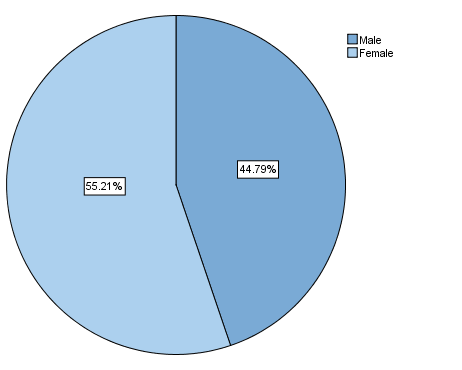
The pie chart in Fig. 2.1 corresponds to the frequency table of sex of the respondent in the previous section, namely Table 2.5.
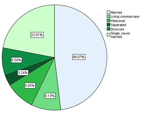
Since the binary variable sex tends to look ‘boring’, in Fig. 2.2 below you can find a bonus pie chart for marital status which tends to be more colourful as it has more categories.
Table 2.2 Marital Status of the Respondent (GSS 2016)
Pie charts can be used with both nominal and ordinal variables, though an argument can be made that the circular form of the pie chart may “hide” valuable insights about the order inherent in ordinal variables. As such, some prefer to use bar graphs for nominal variables only, and to use bar graphs for ordinal variables. Ultimately, it is a matter of preference, and both usages are correct.
You should not try to use a pie chart for an interval/ratio variable, however, as the “pie” in most cases will end up divided into far too many and far too small slices which will make “reading” the chart impossible.
Bar graphs. Fig. 2.3 below features a simple bar graph. The height of the bars corresponds to the size of the different categories. The higher the category’s frequency (and relative frequency), the taller the bar.
Figure 2.3 Workplace Size (GSS 2016)
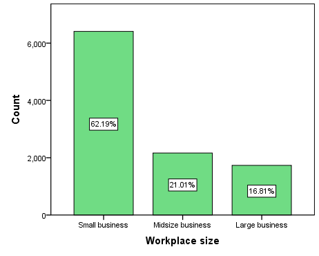
This bar graph corresponds to the frequency table for workplace size from the previous section (Table 2.6). Note that the percentages reflected in the graph are the valid percentages from the frequency table.
Again, using a bar graph with a nominal variable is allowed, and it’s up to you whether you prefer to use a pie chart instead, since the categories of a nominal variable have no order and can be “moved around” without loss of information. However, a bar chart can present the order of a ordinal variable’s categories in a more intuitive manner, so for some people bar graphs are the preferred graph of choice for ordinal variables: this way the order goes through the bars from left to right.
Like with pie charts, you shouldn’t use bar graphs with interval/ratio variables as the potential for ending up with far too many bars is quite high, making reading the graph difficult.
Histograms. Histograms are the graphical representations used with interval/ratio variables. Fig. 2.4 presents one such histogram. Once again, the height of each bar represents the frequency of a variable’s category. In this case, the histogram corresponds to Table 2.7 from the previous section which was the frequency table of the number of takeout dishes respondents purchased in the last month.
Figure 2.4 Purchasing Takeout Dishes from Grocery Stores in the Past Month (GSS 2016)
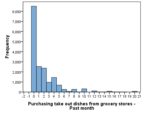
At first glance, a histogram might look similar to a bar graph – albeit usually with more bars/categories. However, the number of categories is not the only difference. Notice how the bars in the bar graph in Fig. 2.3 have space between them, wile the bars in the histogram in Fig. 2.4 do not. This difference represents the difference between discrete and continuous variables: Discrete variables[1] have separate categories, hence the distance between the bars in the bar graph. Continuous variables (typically interval/ratio variables) have continuous categories, therefore the bars representing the categories touch each other to indicate their continuous nature (i.e., their potentially infinite number of values).
In the next two chapters you will learn how you can use these graphs in greater detail (especially the histogram). Here is how to produce them in SPSS.
SPSS Tip 2.2 Basic Graphs
To get a pie chart:
- From the Main Menu, click Graphs and then Legacy Dialogs;
- From the pull-down menu of Legacy Dialogs, select Pie; a Pie Charts window will appear.
- Leave Summaries for groups of cases selected and click Define;
- Select your variable of interest from the left-hand side variable list and, using the correct arrow, move the variable into the Define Slices by empty space.
- You can change what the slices represent — the frequency (N of cases) or percentages (% of cases) in the top right section of the window called Slices Represent.
- When you are done, click OK. The pie chart will appear in the Output window.
To get a bar graph:
- From the Main Menu, click Graphs and then Legacy Dialogs;
- From the pull-down menu of Legacy Dialogs, select Bar; a Bar Charts window will appear.
- Leave Simple and Summaries for groups of cases selected and click Define;
- Select your variable of interest from the left-hand side variable list and, using the correct arrow, move the variable into the Category Axis empty space.
- You can change what the slices represent — the frequency (N of cases) or percentages (% of cases) in the top right section of the window called Bars Represent.
- When you are done, click OK. The bar graph will appear in the Output window.
To get a histogram:
- From the Main Menu, click Graphs and then Legacy Dialogs;
- From the pull-down menu of Legacy Dialogs, select Histogram; a Histogram window will appear.
- Select your variable of interest from the left-hand side variable list and, using the correct arrow, move it into the Variable empty space.
- When you are done, click OK. The bar graph will appear in the Output window.
- If you recall from Section 1.5 (https://pressbooks.bccampus.ca/simplestats/chapter/1-5-discrete-and-continuous-variables/), nominal and (typically) ordinal variables are considered discrete. ↵