Chapter 5 The Normal Distribution and Some Basics of Probability
5.1 The Normal Distribution
You might have already heard of bell curves (or bell-shaped curves), or even normal curves. If you have, you also probably know they look similar to the one in Fig. 5.1.
Figure 5.1 Body Mass Index of Respondents (CCHS 2015/2016)
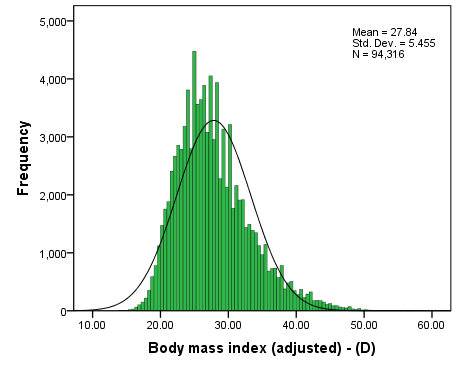
Fig. 5.1 shows a histogram with the distribution of the variable body mass index (or BMI) of respondents to the CCHS 2015/2016. Judging by the height of the bars that comprise it, the histogram illustrates the fact that most cases tend to cluster at the centre (i.e., most people’s BMI is average), while a decreasing number of cases end up in the “tails” of the distribution (i.e., the further their BMI is from the average, the fewer cases there are).
You can easily notice that the distribution (as reflected in the green bars) is not perfectly symmetric but a bit positively skewed: the right “tail” is longer than the left. Still, its shape approximates a bell well-enough (note for comparison the black curve in Fig. 5.1 which is a true bell shape). We call this type of distribution approximately normal.
A great many interval/ratio variables in the world tend to have an approximately normal distribution when plotted (true for both the social and natural sciences). That is, the majority of observations are centered in the middle of the distribution (i.e., they tend to be average); we find fewer observations just below and just above the average, and fewer still which are much below or much above the average.
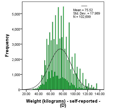
Think about height, for example. Most people are of average height (that’s why it’s called average height after all), some people are above and some below average, fewer people are much taller or shorter, and rather rarely are some people extremely short or extremely tall. Variables like age, or weight (which you can see in Fig. 5.2 below[1]) but also, say, test marks, or points scored per hockey game, or text messages sent per day, etc. are similar. There will be an average, and a continuous decrease in frequency the further one gets from that average.
Fig. 5.2 Weight of Respondents (CCHS 2015/2016)
As fascinating as all this is, you might be thinking now, why do we care about it? It’s just one type of a distribution among many.
True, but as I already mentioned, the normal distribution is special, and not just because many variables’ histograms tend to plot an approximately normal curve. To understand why, we need to start exploring the normal distribution as a theoretical concept (or, to borrow from Max Weber, as an ideal type).
- The reason you observe the "double" distribution -- one shorter (darker) while the other taller (lighter) -- is due to the self-reporting of weight. Most people tend to report their weight in whole numbers, and here some have done so, stating their weight as 65 kg or 85 kg, etc.; these are the tall bars. Others, however, may have reported it with grams and/or in pounds (which when converted to kilograms would produce a non-whole number weight), thus resulting in weights such as 65.35 kg or 85.75 kg, etc., leading to the short bars and to the histogram appearing like two histograms plotted on top of each other. Had the responses been rounded to the nearest whole kilogram, the histogram would have taken a regular, "single" normal-curve shape. ↵