Chapter 7 Variables Associations
7.2.2 Between Two Discrete Variables
Examining a potential statistical association between two discrete variables amounts to comparing groups (as per the categories of one of the variables) on the number (and proportion) of their respective members that fall in the categories of the other variable[1]. Again, this sounds far worse than it actually is, as you will see in the examples that follow.
The potential association between discrete variables can be examined both visually and numerically via a special table called cross-tabulation table (“cross-table” or “crosstab” for short) or contingency table. While a contingency table can have any number of rows and columns, too large a number of either/or both can easily make the table unreadable as it would contain too much data to contemplate at once. (This is also the reason why we chose to treat some variables as continuous — when they have too many categories — as then we can use another tool to visualize and examine them, as we will see later.) Thus, below I introduce the simplest form of a contingency table, a 2×2 crosstab (i.e., 2 rows and 2 columns).
In the general sense a KxJ cross-table would be a table containing K rows and J columns, where the categories of one variable go into the rows (a K number of them) and the categories of the second variable (a J number of them) go into the columns of the table (therefore crossing in the interior cells of the table).
Thus, a 2×2 contingency table would mean we have two binary variables, each with two categories. Before I show you an actual data exploration, Table 7.1 presents an “empty shell” of one such table which I use to introduce some needed vocabulary.
Table 7.1 A Generic Cross-tabulation Table
| Variable 1 Group 1 | Variable 1 Group 2 | Total | |
| Variable 2 Category 1 | Number A | Number B | Category 1 Total (A+B) |
| Variable 2 Category 2 | Number C | Number D | Category 2 Total (C+D) |
| Total | Group 1 Total (A+C) | Group 2 Total (B+D) | Total All (A+B+C+D) |
The first thing you should notice is that the KxJ, or the 2x2 in our case, refers to the groups/categories of the variables in questions, not to the actual number of rows and columns in the contingency table. Technically speaking, Table 7.1 contains four rows and four columns — but the ones that count are only the ones in green: two “green” rows and two “green” columns, indicating the number of groups and categories of the variables. The last row and the last column (in blue above) are called margins and are reserved for reporting totals[2]. The first column and the first row (in bold above) are simply titles.
The central cells of the table are the most important ones. In the example above, Number A indicates the number of cases (observations/individuals/etc.) that belong simultaneously to Group 1 (of the first variable) and Category 1 (of the second variable). By analogy, Number B indicates the number of cases that belong simultaneously to Group 2 and Category 1; Number C stands for the number of cases that belong to both Group 1 and Category 2; and finally, Number D is the number of cases that belong to both Group 2 and Category 2.
The margins contain the totals by row and by column, and the last cell (last row, last column) is reserved for the total N.
So what is so special about this table? I’ve seen such tables all my life! you might be saying right about now. Bear with me, we’ll eventually get to the special — and somewhat complicated — part (and likely you’ll be sorry for it). First though, let’s look at a contingency table with some actual numbers.
Example 7.3 Do You Like The Campus Cafeteria?
Imagine you are frustrated within the food options available in your campus cafeteria and you wonder if others share your thoughts on the matter (perhaps in order to gauge support for changes you’d like to see enacted, or similar type of activism). Before you devote time to do an actual random sample study (now that you know), you do a quick exploratory poll of your classmates in one of your classes. You ask 35 people whether they like the campus cafeteria, and in the process, you get the inkling that second-year students seem to have different opinion about the food options than the first-year students in the class. You plot your results:
Table 7.1(A) Do You Like The Campus Cafeteria?
| First Year Students | Second Year Students | Total | |
| YES | 7 | 5 | 12 |
| NO | 8 | 15 | 23 |
| Total | 15 | 20 | 35 |
I am certain you know how to read this: 7 first-year and 5 second-year students like the cafeteria, while 8 first-year and 15 second-year students do not. There is a total of 12[3] students who like the cafeteria and 23[4] students who do not. You talked to 15[5] first-year and 20[6] second-year students, a total of 35 students.
Can you compare the relevant numbers as they are presented in the table? And, for that matter, what are the relevant numbers?
Let’s answer both questions in turn.
Recall from Chapter 2: No, you cannot compare the numbers as stated since the two groups you have to compare are of different size. The relevant comparison is between the different year students who like the cafeteria — first-years vs. second-years — as this is what you want to know.
It’s true that 2 more first-years like the food in the cafeteria than the second year students (7>5) but at the same time you had 5 more second-year students in your sample (20>15). To take into account the differing group size, you need to compare proportions (or percentages): the proportion of first-year students who like the cafeteria against the proportion of second-year students who like the cafeteria. You therefore calculate the respective proportions, turning them into percentages at the end:
 , or 46.7% of first-years like the cafeteria
 , or 25% of second-years like the cafeteria
 , or 53.3% of first years do NOT like the cafeteria
 , or 75% of the second-years do NOT like the cafeteria
 , or 34.2% of ALL students like the cafeteria
 , or 71.8% of ALL students do NOT like the cafeteria
To summarize the information neatly, we modify our table to this:
Table 7.1(B) Do You Like The Campus Cafeteria? (Column Percentages)
| First Year Students | Second Year Students | Total | |
| YES | 46.7% | 25% | 34.3% |
| NO | 53.3% | 75% | 71.8% |
| Total | 100% | 100% | 100% |
So far so good? From Table 7.2(B) now we clearly see that your initial hunch was right: there does seem to be a difference in the opinions of your classmates based on which year they are in their studies. That is, while you do have support for anti-cafeteria activism (only 34.3% of your classmates like the campus cafeteria, while 71.8% dislike it) first-year students seem to like the cafeteria a lot (almost twice) more than second-year students do: 46.7% of first-years like the food options in the cafeteria compared to only 25% of the second-years, a difference of 21.7 percentage points.
The example above shows what you need to examine the possible association between two discrete variables: a cross-tabulation (listing percentages, not absolute numbers!), visually, and a difference in proportions (or percentages), numerically.
Again, a reminder that this is sample-only exploration. We make no predictions or inferences about a population, we just explore what the data we have at hand shows.
So far, I purposefully show you how the logic of the descriptive analysis of contingency table goes, the right way. Here comes the complication, however: why did I calculate the proportions in the example the way I did? Consider the alternative:
 , or 58.3% of the students who like the cafeteria are first-years
 , or 41.7% of the students who like the cafeteria are second-years
 , or 34.8% of students who do NOT like the cafeteria are first-years
 , or 65.2% of students who do NOT like the cafeteria are second-years
 , or 42.9% of ALL students are first-years
 , or 57.1% of ALL students are second-years
Table 7.1(C) below demonstrates this alternative.
Table 7.1(C) Do You Like The Campus Cafeteria? (Row Percentages)
| First Year Students | Second Year Students | Total | |
| YES | 58.3% | 41.7% | 100% |
| NO | 34.8% | 65.2% | 100% |
| Total | 42.9% | 57.1% | 100% |
Watch Out!! #13. . . for Choosing The Wrong Percentages in Contingency Tables
The complication regarding choosing the “right” percentage arises due to the fact that what is considered the “right” or the “wrong” percentage depends on what you actually want to know, as in, what your research question/question of interest is. The percentages in Table 7.1(C) are “wrong” only because they are not helpful to answer the question whether there is a difference in the two groups of students we compare, first-years and second-years. Had we been comparing the YES group and the NO group on how many first-year students they each contained, we’d have used Table 7.1(C). However, this doesn’t seem like the most relevant question we could ask in this hypothetical study.
Unfortunately, that’s not all. If you thought OK, then, I’ll just always use column percentages and be done with it, you’d have been too hasty. You see, the “correctness” of the percentages you need depends on where your compared-groups variable is placed. In Table 7.1(B) I placed the groups-to-be-compared (first-years vs. second-years) in the columns, and therefore I calculated the column percentages. If I had put the groups-to-be-compared in the rows, I would have calculated the row percentages (which would have resulted in a transposed Table 7.1(B))[7].
Many students faced with contingency tables have trouble deciding whether they need column or row percentages. My advice is (which you can take as a rule of thumb) to be clear what groups you compare based on your question: if you compare the groups in the columns, you need column percentages; if you compare the groups in the rows, you need row percentages. (This is also the reason why I labeled Variable 2’s attributes as categories early in this section, not to confuse them with the Variable 1’s groups.)
Another rule of thumb you might find useful: try to always put your groups-to-be-compared in the columns (as most people find comparing a left column to a right column, horizontally, easier), then you’ll always need column percentages. That said, do not assume that everyone follows this last advice: sometimes you might find a table where the relevant comparison is top row to bottom row, vertically. To orient yourself in the organization of the table, look for which margin contains the “100%”s — if it’s the horizontal margin (bottom row), you’re dealing with column percentages, if it’s the vertical margin (last column), you’re dealing with row percentages.
Finally, never try to “compare” the percentages that add to 100% (be they in the rows or in the columns) as this would not constitute a comparison at all — instead, it would be a breakdown of the groups in terms of composition (that’s why they’d add up to 100%, like the 25% of second-years who liked the cafeteria and the 75% who did not in Table 7.1(B) above). Again, what you need to compare is always the fraction of cases from one group falling in a category of interest to the fraction of cases from the other group in the same category of interest.
All of this is arguably complicated at first blush. The light at the end of the tunnel is that the more you work with contingency tables, the easier you will find constructing them and/or interpreting them correctly.
To that effect, let’s take an example with real existing data.
Example 7.4 Gender Differences in the Speaking Aboriginal Language Ability among Indigenous Canadians , APS 2012
Statistics Canada’s Aboriginal People Survey (APS) 2012 is a nationally representative survey of First Nations peoples (living off reserve), Métis and Inuit, 6 years of age and older (Statistics Canada, 2019)[8]. Language is a key element in retaining, preserving, and transmitting culture; as such, the ability of Indigenous peoples to speak their ancestral languages is of special interest given the recommendations of the Truth and Reconciliation Commission’s (TRC) final report (2015) [REFERENCE].
For the purposes of this example, I am interested in if there are gender differences in the ability to speak an Aboriginal Language among the collected sample. Table 7.2 shows the cross-tabulation of gender (called sex in the APS 2012) and speaking Aboriginal language variables. (Both variables are binary in the survey.)
Table 7.2(A) Speaking Aboriginal Language Ability by Gender, APS 2012
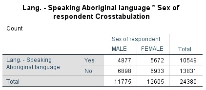
As you can see, working with real, large N data makes proportions even more indispensable for making sense of the table. We need to compare the fraction of women who speak an Aboriginal language (or languages) to the fraction of men who are able to do that.
To make things easier, I followed the rules of thumb I listed in the Watch Out!! 13 above: the groups-to-be-compared are in the columns, and we need to compare them horizontally[9]. Therefore, I need column percentages. Table 7.2(B) does just that.
Table 7.2(B) Speaking Aboriginal Language Ability by Gender, APS 2012 (Column Percentages)
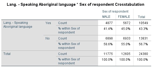
SPSS provides both the original cell count (i.e., frequency) and the respective percentage below it[10].
We can thus easily see that while only 41.4% of men in the sample can speak an Aboriginal language, 45% of women in the sample can do that; i.e., there is a gender difference of 3.6 percentage points in favour of women[11].
So far, we discussed only 2×2 contingency tables, i.e., binary variables. Of course, discrete variables can have more than two categories each. In the case of a 2×3 table (and assuming our groups to-be-compared are in the columns), we’d simply have three groups/proportions to compare. In the case of 2xJ, where J>3, we’d have J groups/proportions to compare. The proportions can be compared in two ways: one against the remaining ones together (through one difference of proportions), or each compared to each of the remaining ones (through several difference of proportions).
Matters become more complicated when we let go of binary variables altogether and have KxJ table where both K>2 and J>2 instead. This type of table can be visually complicated, the larger the K and J. However, the comparison can still be done between groups on a category of interest in the manner described above. For a brief illustration, see Table 7.3 below.
Table 7.3 Marital Status Differences in Perceived Health, CCHS 2016
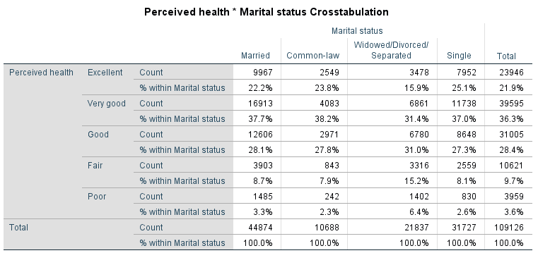
Table 7.3 is a 5×4 table and it presents data from Statistics Canada’s Canadian Community Health Survey (CCHS) 2015-2016, crosstabulating marital status (in 4 groups) and perceived health (in 5 categories). Considering that the latter is an ordinal variable, a way to mentally simplify the presented information is to focus on the extremes — the proportions of people in the different marital status groups who reported excellent or poor health.
A quick examination of the relevant percentages reveals that fewer widowed/divorced/separated respondents appear to report their health as excellent than any of the other groups (15.9% vs. 22.2%, 23.8%, and 25.1% of married, common-law, and single respondents, respectively) — a difference of 6.3 percentage points at the minimum in favour of the other groups. Correspondingly, widowed/separated/divorced respondents also report their health as poor more often than the other marital status groups (6.4% vs. 3.3.%, 2.3%, and 2.6% for married, common-law, and single individuals, respectively) — a difference of 3.1 percentage points at the minimum in favour (or rather, disfavour) of the widowed/married/separated group.
As such, it appears that while the other groups do not seem to differ much on their self-reported health, the widowed/separated/divorced group stands out by reporting lower levels of health, an observation consistent through all five health categories, an indication that the variables marital status and perceived health could be associated.
This concludes my presentation on how to analyze contingency tables data for possible discrete variable associations; the only thing left is to tell you how to produce a table with SPSS.
SPSS Tip 7.2 How to Create Contingency Tables
- From the Main Menu, select Analyze, and then from the pull-down menu, Descriptive Statistics and then Crosstabs;
- Select your pair of discrete variables of interest from the list on the left-hand side, and, using the appropriate arrows, move each to their respective slot on the right: Row(s) or Column(s);
- Click on the Cells button in the top right corner[12]; in the resultant window select Observed in Counts, and either Row or Column in Percentages[13], depending on where you put your groups-to-be-compared, and click Continue;
- Once back at the original window, click OK.
- The Output window will show the contingency table of the variables you selected.
So far, we have seen how we examine potential bivariate associations between a discrete and a continuous variable (previous Section 7.2.1) and between two discrete variable (presently). We now turn to the last bivariate combination, between two continuous variables, next.
- Since both variables are discrete, for clarity's sake I refer to the attributes of one variable as groups and to the attributes of the other variable as categories. (I have used them interchangeably until now but here it helps to distinguish the two variables by using two different words for their attributes.) ↵
- The more observant of you may notice that the horizontal margin (the last row) shows the frequency distribution of Variable 1 (i.e., the number of cases per group), while the vertical margin (the last column) shows the frequency distribution of Variable 2 (the number of cases per category). ↵
- As 7+5=12. ↵
- As 8+15=23. ↵
- As 7+8=15. ↵
- As 5+15=20. ↵
-
Table 7.1(D) Do You Like The Campus Cafeteria? (Transposed -- and still correct)
↵YES NO Total First Year Students 46.7% 53.3 100% Second Year Students 25% 75% 100% Total 34.3% 71.8% 100% - One could perhaps see the APS 2012 as an effort by Statistics Canada to address some of the voluntary NHS 2011's issues with coverage/non-response of the listed population groups. ↵
- A point to be made here is that when working with binary data, it's enough to focus on one of the categories on which you compare the groups, as the other category would be a complement of the first as we are working with proportions. That is, here we need consider only the YES category (as the NO category is it's exact opposite, i.e., "1- YES") due to the fact that we're interested in those who can speak the language, not those who don't. ↵
- Yet another useful rule of thumb: make sure that SPSS lists "% within [groups-to-be-compared]" as this indicates that the correct percentages appear in the table. In this case, SPSS tells us that it has listed "% within Sex of respondent", i.e., the ones we need in order to compare the two gender groups. ↵
- You might think it a small difference, but the magnitude of the difference is not the most important thing when establishing statistical associations. More on the topic in below. ↵
- This is important as if you fail to click on Cells and just click OK at the bottom, SPSS will produce a table with only the observed count (i.e., number of elements in each cell) which will make comparison between the groups impossible. Clicking Cells allows you to choose which percentages you want calculated and included in the table. ↵
- Avoid selecting both, and even more so, avoid selecting all three options (Row, Column, and Total). I guarantee you wouldn't want to interpret the resulting table should you choose more than one set of percentages. Again, be careful to request the percentages for the place, rows or columns, where you put your groups-to-be-compared. If they are in the rows, select Row in Percentages; if they are in the columns, select Column in Percentages. ↵