Chapter 7 Variables Associations
7.2.3 Between Two Continuous Variables
The distinctive feature of continuous variables is their large number of values. As discussed previously, typically we treat most interval/ratio variables as continuous. However, sometimes ordinal variables too can have a number of categories, large enough to justify their treatment as continuous for the purposes of statistical analysis. (Think back to the previous Section 7.2.2 and imagine crosstabulating a variable with, say, 10+ categories on another; the resulting table will be too unwieldy for meaningful examination.)
As well, continuous variables have values of different magnitudes, which can be ordered from low to high. Thus, what we will be looking for when examining two such variables for a possible association is whether a pattern exists between their values, or, alternatively, if their values do not exhibit any predictable combination. While many types of patterns can exists, for the purposes of this introductory text we’ll focus on the two simplest ones: a positive linear association and a negative linear association. The way we describe and examine such associations is visually through a graph called a scatterplot and numerically through a special indicator called Pearson’s correlation coefficient r (or Pearson’s r, or just r). I explain both below.
A positive linear association is a pattern in which low values of one variable go with low values of the other variable alongside with high values of the former going with high values of the latter. That is, in a positive linear association when the values of Variable 1 increase or decrease, so do the values of Variable 2. As its name suggests, a negative linear association is the exact opposite: low values of one variable go with high values of the other variable and vice versa. Then, as the values of Variable 1 increase, the values of Variable 2 will tend to decrease, or vice versa.
Both the positive and the negative version of this pattern are called linear because plotting the values of the two variables on a coordinate system shows the data points “congregating” in an approximately “straight” fashion, as if along an imaginary straight line with an upward (i.e., positive) or downward (i.e., negative) slope[1].
Consider the following example two figures.
Figure 7.3(A) Positive Association: Test Scores by Class Attendance (Simulated Data[2])
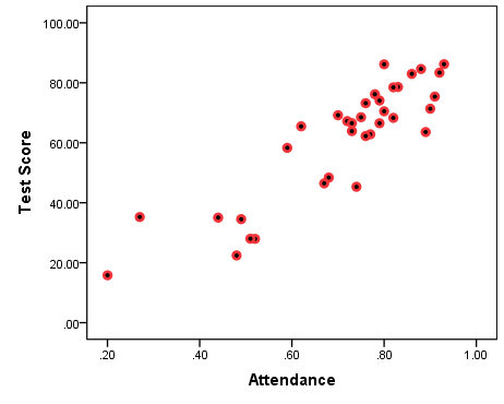
In the scatterplot in Figure 7.3(A) above, I have plotted data from 35 imaginary students on their class attendance and subsequent final test scores[3]. Both class attendance and test scores are continuous variables. (Attendance is a ratio variable measuring proportion of the class time attended while test scores is an interval variable measured in percentages.) Each point of the data represents simultaneously a student’s attendance (on the horizontal axis) and a student’s test score (on the vertical axis); e.g., the lowest/left-most data point stands for a student who attended about 20% of class time and scored less than 20% on the final exam. The data points look “scattered” all over the graph, hence the name scatterplot.
You can easily see the pattern in the data in Figure 7.3(A): lower attendance seems to go with lower test cores, and higher attendance with higher scores. The bottom right side (high attendance/low scores) and the top left side (low attendance/high scores) of the graph are empty: there seem to be no students who attended classes a lot but scored low on the test, nor students who didn’t attend much but scored high on the test. Had there been no pattern, the data points would spread all over the graph, identifying no clear “congregation” of values based on their magnitude.
Since class attendance and test scores seem to go concordantly “together” (i.e., low/low and high/high), we have indication of a positive association.
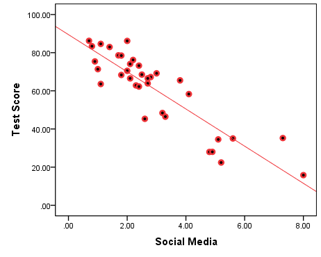
Figure 7.4(A) Negative Association: Test Scores by Time Spent On Social Media (Simulated Data)

Again, both time on social media and test scores are continuous variables, with time on social media measured in average hours per day.
The pattern in Figure 7.3(A) is the opposite of the one we had before: lower number of hours spent on social media seem to go with higher test cores, and higher social media usage with lower scores. This time, the bottom left side (low on social media/low scores) and the top right side (high on social media/high scores) of the graph are empty: there seem to be no students who spent very little time on social media but scored low on the test nor students who had high usage of social media but scored high on the test.
Since social media usage and test scores seem to go discordantly “together” (i.e., low/high and high/low), here we have an indication of a negative association.
Figure 7.3(B) and Figure 7.4(B) below make the point about linearity clearer by adding something called a line of best fit to the original graphs[4]. The slope of the line indicates the nature of the supposed association: upward/positive or downward/negative.
Figure 7.3(B) Positive Association: Test Scores by Class Attendance With Line of Best Fit
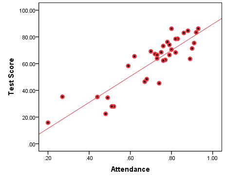
Figure 7.4(B) Negative Association: Test Scores by Time Spent On Social Media With Line of Best Fit
Compare the slopes of the lines in the figures above to the one in Figure 7.5 below.
Figure 7.5 No Association: Test Scores By Student Number in Class (Selected Scores)
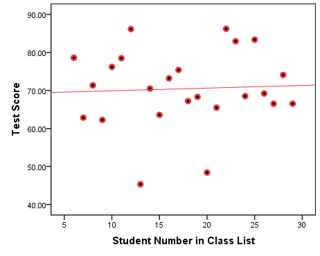
The graph in Figure 7.5 above plots the non-existent association between a student’s number in in the class and their final test score. Of course, this is a bogus “association” which I’m showing here only as an example of a flat line of best fit, an indication that the two variable have nothing to do with each other. The line in Figure 7.5 is not perfectly flat, however, so it helps to have a numerical indication of association in addition to the visual ones the scatterplots give us.
Before we get to that, a word of warning. The presumption of linearity for this type of analysis is very important and you should make sure to not impose linearity where it doesn’t exist. The caveat below explains.
Watch Out!! #14 . . . For Non-Linear Associations
Data points without a pattern produce a flat (i.e., with no linear slope) line of best fit, as shown in Figure 7.5 above. However, data points in a non-linear patter will also result in a flat (i.e., with no linear slope) line of best fit, if we insist on seeing the variables as linearly associated. This can lead to dismissing a potential association only because it’s non-linear, which would be a mistake. While this textbook doesn’t go into non-linear associations, this doesn’t mean they do not exist or they are not important: on the contrary, but they do require you to use different methods to investigate them.
My warning here is simple: When working with given data, keep an eye on potential non-linearity. Otherwise you may incorrectly assume no association when in fact a non-linear association exists. Figure 7.6 below illustrates.
Figure 7.6 Curvilinear Association: Test Scores By Student Number in Class (All Scores)
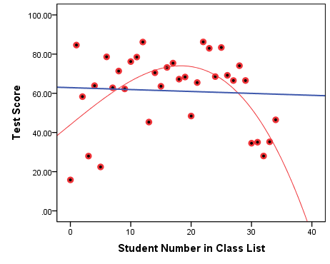
Surprisingly enough, Figure 7.6 shows that students at the beginning and at the end of the class list scored lower on their final test than their peers for whatever reason, or simply by chance (my bet would be on the latter).
Regardless of the reason or lack thereof, my goal here is to show you that imposing linearity by drawing a linear line of best fit will end up as a flat line, which one hastily may take as an indication of no association (see the straight blue line on the graph). A closer and more careful look, however, reveals the inverted-U shape pattern of the data points in the scatterplot: As the student numbers increase initially, so do the test scores. Then, as the student numbers continue to increase, the test scores start decreasing (see the curved red line following the data points much more closely that the blue flat one). This is clearly a pattern that should not be ignored in any serious, real-life study.
A visual summary of the data and any potential bivariate associations like the scatterplot is thus very useful. Scatterplots are in fact rather indispensable if one is to base their analysis on the assumption of a linear association between two continuous variables. Still, like in the previous two cases of two discrete variables and a discrete and a continuous variable, a numerical summary of the potential association can be of great help.
For discrete variables we could examine and report differences of proportions, while for a discrete and continuous variables we use differences of means (or medians). In both cases we could compare groups (on proportions, or means). In the case of continuous variables, we have neither groups, nor a convenient number to compare them on. Instead, here we have a correlation coefficient, Pearson’s r. The correlation coefficient takes all data points simultaneously and summarizes to what extent certain values of one of the variables go with certain values of the other variable (i.e., if they form a pattern or they vary independently of each other).
While we will examine the exact definition and calculation of the Pearson’s r in Chapter 10 later, for now we’ll focus on its interpretation.
The correlation coefficient r is a number between -1 and +1, indicating the strength of any possible (linear) association between two continuous variables. However, there is a catch: the strength of the association is calculated in absolute terms while the ± sign is there to indicate whether the association is positive or negative. Thus, both r=-1 and r=1 stand for the strongest possible (i.e., perfect) correlation, the former perfect negative association, the latter perfect positive association. Between them is r=0, or no association.
While perfect correlations (r=±1) are very rare (if not non-existent)[5], most variables’s associations are somewhere between 0 and ±1. The closer a correlation is to 0, the weaker it is; the closer the correlation is to -1 or +1, the stronger it is. Typically, in the social sciences a correlation of about r=±0.7 would be considered strong, a correlation of about r=±0.5 would be considered moderate, and a correlation about r=±0.3 would be considered weak. Correlations around ±0.8 or ±0.9 would therefore be very strong, while associations around ±0.2 and ±0.1 would be quite weak.
Now that you are well-equipped with knowledge about interpreting correlations, let’s see what the correlations of the associations discussed above were.
First we looked at class attendance and test scores (Figures 7.3(A) and 7.3(B)); the correlation between the two variables was a very strong r=0.881. Then, we looked at social media usage and test scores (Figures 7.4(A) and 7.4(B)), where the correlation was equally strong r=-0.882[6]. Finally, we discussed the practically non-existent linear association between student number and test scores (of selected students, Figure 7.5) whose r=0.049, while the improperly imposed linearity in Figure 7.6 from the caveat had a similar so-weak-almost-zero linear correlation of r=-0.051.
Tired of fake data? Ready to return to the real world of sociological research? Then let’s take a real example with existing data and see how it all works out.
Example 7.5 Intergenerational Reproduction of Privilege in Education in the USA (GSS 2018)
For this example I usd data from the National Opinion Research Center’s (NORC) at the University of Chicago General Social Survey (GSS) 2018. I’m interested in exploring whether father’s education and the education of the respondent are potentially correlated. Both father’s education and education of the respondent are measured in years of schooling, ranging from 0 (no education) to 20 years. As such they are discrete ratio variables which we can treat as continuous due to their number of values being quite large (twenty-one to be precise). Figure 7.7 shows the relevant scatterplot.
Figure 7.7 Respondent’s Years of Schooling by Father’s Years of Schooling (GSS, 2018)
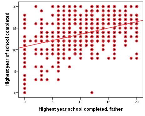
There are several thing to note in the graph above. One is that the data points look less “scattered” and more orderly arranged in neat rows and columns than would be the case, had we variables with much larger number of values. Furthermore, while N=1,687, there are much fewer data points on the scatterplot: the reason, of course, is that there are many observations “on top” of each other, i.e., most data points represent more than one person’s combination of their own years of education and their respective father’s years of education. (After all, most such combination are unlikely to be unique; we can arguably expect there to be more than one respondent and their father both having, say, 12 years of education in the dataset.)
Substantively, however, what do we see in the scatterplot above? To the extent that there are respondents with low levels of education, they seem to have fathers with low levels of education too. As well, while respondents with higher levels of education seem to have fathers with all levels of education, those with higher parental education appear to be more than those with lower parental education. (That is, both the left and the right side of the upper half of the scatterplot have many observations, but the top right area do seem to contain more observations than the top left area). Finally, and most importantly, there seem to be almost no respondents with low levels of education whose fathers had high levels of education (note the empty bottom right area of the graph).
All in all, it seems like more years of father’s education “go” with more years of respondent’s education, and fewer years of father’s education “go” with fewer years of respondent’s education — though not completely so, or the top left area of the graph (the less educated fathers with more educated offspring) would be empty too. This is reflected in the line of best fit whose slope, while positive, is not very steep.
Ultimately, the scatterplot indicates that father’s education and respondent’s education seem positively associated in the dataset but also that this association is not very strong. That is, there appears to be intergenerational reproduction of privilege in education, however, fortunately, one’s father’s lower levels of education don’t seem to completely preclude one’s own educational attainment.
The correlation coefficient provides a numerical summary of the potential association described above.
Table 7.4 Correlation between Father’s Years of Schooling and Respondent’s Years of Schooling (GSS 2018)
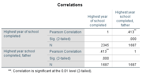
SPSS’s output provides r as “Pearson Correlation”, and here r=0.413. As suspected, this reflects positive a moderate/moderately-weak association.[7]
SPSS Tip 7.3 Scatterplot and Correlation Coefficient
For Scatterplots:
- From the Main Menu select Graphs and, from the pull-down menu, Legacy Dialogues; click on Scatter/Dot;
- Keep the pre-selected Simple Scatter option and click Define;
- In the new window, select one by your variables of interest from the list on the left and, using the arrow buttons, move them to the X-Axis and Y-Axis[8] empty spaces on the right; click OK.
- The Output window will show the resulting scatterplot; double-clicking on it will open a Chart Editor window from where you can change the text, colours, size, etc. of the graph to suit your needs.
For the correlation coefficient (Pearson’s r):
- From the Main Menu, select Analyze;
- From the pull-down menu, select Correlate and then Bivariate;
- In the resulting window, select one at a time your two variables of interest from the list on the left and, using the arrow button, move them to the Variables space on the right (the order is not important); click OK.
- The Output window will display a symmetric 2×2 table with your requested correlation coefficient.
- Other than linear associations exists, e.g., curvilinear (imagine U-shaped or inverted U-shaped curves in the data, instead of a straight line). Analyzing these is more complicated and beyond the scope of this book. The discussion hereafter will consider only bivariate linear associations associations, regardless if I mention it explicitly or not. ↵
- The simulated data used here for illustration purposes only is provided by DataBake (www.databake.io). [see terms of use 3.6, 3.7: (free) datasets can be copied, modified, stored or otherwise used for your own personal, academic, or internal business purposes"] ↵
- The data is called simulated as it's computer-generated for the purposes of the exercise. ↵
- We discuss the line of best fit (aka regression line) in Chapter 10 later. ↵
- The obvious exception here is the correlation of a variable on itself, which will produce r=1. ↵
- If you're wondering why the correlations appear to be of the same strength, the reason lies in the way I created the synthetic variable social media usage -- as an inversion of the simulated variable class attendance. I did warn you the data is made up as a heuristic. (Do not take this to mean that such associations -- between attendance and class performance and social media usage and test scores -- do not exist in real life.) ↵
- Note that SPSS's bivariate correlation tables are 2x2 tables, with the information repeated twice. Thus, while four coefficients are provided in the central cells of the table, they are actually two pairs of the same two correlations. (That is, correlations are symmetric: correlating Variable 1 on Variable 2 is the same as correlating Variable 2 on Variable 1.) As well, one of these two pairs is always equal to 1, as a variable correlated on itself is a perfect correlation. This is shown in the table as corr(Highest year school completed, Highest years school completed, father)=0.413=(Highest year school completed, father, Highest years school completed) and corr(Highest year school completed, Highest year school completed)=1=(Highest year school completed, father, Highest year school completed, father). ↵
- At this point, it doesn't really matter which one you put in the X- or Y-Axis though I would suggest placing the variable that precedes the other in time (like father'd education generally precedes offspring's education) in the X-Axis. The reasons for this will be explained in Chapter 10. ↵