Chapter 3 Measures of Central Tendency
3.6 Outliers
Out of the three measures of central tendency, the mean is the only one that takes into account the actual numerical values of the cases. As such, it is easily affected by the size of the values: a sequence of numbers such as “1, 5, 7, 10, 15” will produce a smaller mean than a sequence of numbers like “100, 50, 75, 130, 90”.
When all values to be averaged are of relatively comparable magnitude, the mean does a good job at reflecting the central tendency of a variable — that is why it is the most familiar and widely used measure. However, when a variable contains an extremely small or an extremely large value (or several values) compared to the rest of the values, the mean gets easily distorted and stops reflecting the central tendency “truthfully”, as it were. Extremely small and extremely large values are called statistical outliers.
While there is a convenient method for identifying outliers (using a concept called interquartile range which we will discuss in the next chapter), at this stage it is not necessary that you be so technical. You can visually identify outliers, albeit less precisely, by the “disturbance” in the general pattern of the data you observe. For example, if you have values like “1, 5, 7, 10, 15”, a value of 130 in that sequence would be considered an outlier. Similarly, if you have values like “100, 80, 75, 130, 90”, a value of 5 would be an outlier.
Let’s calculate the means of the two sequences, first with and then without the so-called outliers and see what happens.
The first sequence is 1, 5, 7, 10, 15 and we want to see what happens when we add 130.
![\[\frac{(1+5+7+10+15)}{5}=\frac{38}{5}=7.6\]](https://pressbooks.bccampus.ca/simplestats/wp-content/ql-cache/quicklatex.com-226c4c0f742079d284a4f5304bc561d1_l3.png "Rendered by QuickLaTeX.com")
We add 130 to the sequence:
![\[\frac{(1+5+7+10+15+130)}{6}=\frac{168}{6}=28\]](https://pressbooks.bccampus.ca/simplestats/wp-content/ql-cache/quicklatex.com-b4dbba500f0c060d45027a11a6078d10_l3.png "Rendered by QuickLaTeX.com")
Both means, 7.6 and 28, are the true averages of the sequences of values as listed. However, the addition of an uncommonly large number “pulled” the mean away from the “centre” of the original data.
How truthfully does 28 represent the “centre” of a sequence where the majority of the cases’s values (in fact, five out of the six values) are 15 and below? Not that much.[1]
To demonstrate the effect of an extremely small value, we continuing with the next sequence:
![\[\frac{(100+80+75+130+90)}{5}=\frac{475}{5}=95\]](https://pressbooks.bccampus.ca/simplestats/wp-content/ql-cache/quicklatex.com-443516d1b781dca6651080fb3273a696_l3.png "Rendered by QuickLaTeX.com")
Adding a value of 5 to the sequence produces the following:
![\[\frac{(100+80+75+130+90+5)}{6}=\frac{460}{6}=80\]](https://pressbooks.bccampus.ca/simplestats/wp-content/ql-cache/quicklatex.com-755dc260527019358c957e64e00a8936_l3.png "Rendered by QuickLaTeX.com")
Similarly as with the effect on the mean of the first sequence, the mean here gets “pulled”, but in the opposite direction, from 95 to 80. Both means are technically true averages of their respective values but the latter one is “artificially” low: after all, four out of the six values are the same or higher.[2]
What this tells you is that the mean is an unstable measure of central tendency, prone to being affected by outliers. Contrast this to what you know about the median: the median does not take the magnitude of the values into consideration, beyond their order. Thus, as explained in the previous Section 3.3 (https://pressbooks.bccampus.ca/simplestats/chapter/3-3-the-median-with-frequency-tables/), adding a value (be it extremely small or extremely large) to a sequence does not affect the median much — unlike the mean. The median of 1, 5, 7, 10, 15 is 7 (there are two values above and two below it), and whether we add 130 or 18, it doesn’t matter: it’s just an additional value in the sequence.[3]
Since the mean is prone to being affected by outliers, while the median is not, in some situations it is advisable to report the median as a more “valid” measure of the typical cases/”centre” of the data rather than the mean. Specifically, watch out for reports on average income, average age, average weight, etc. where a few outliers can skew a variable’s distribution.
Watch Out!! #8 … for Reports on Averages of Variables Prone to Skewing by Outliers
Imagine a small company advertising an open position by claiming that the average salary of their employees is 100 thousand dollars per year. For simplicity’s sake, let’s assume the company has ten employees and these are their salaries:
Table 3.8 Employee Salaries (Hypothetical Data)
| Value (in thousands) | Frequency |
| 70 | 5 |
| 87.5 | 4 |
| 300 | 1 |
| TOTAL | 10 |
You can check for yourself what the average annual salary is:
![\[\frac{\sum\limits_{i=1}^{N}{x_i}}{N}=\frac{70(5)+87.5(4)+300(1)}{10}=\frac{350+350+300}{10}= \frac{1000}{10}=100\]](https://pressbooks.bccampus.ca/simplestats/wp-content/ql-cache/quicklatex.com-f2f27c58b9bb76f63af8334702ea65ee_l3.png "Rendered by QuickLaTeX.com")
or, indeed, 100 thousand dollars. However, how representative this annual salary is for the regular employee? After all, nine out of ten employees of the company get less than that. The average annual salary reported is inflated by the very high salary of one employee (perhaps the manager), a clear outlier.
Let’s instead look at the median. We start by arrange the values in order:
70, 70, 70, 70, 70, 87.5, 87.5, 87.5, 87.5, 300
Using the formula for finding the position of the median, we have
![\[\frac{(N+1)}{2}=\frac{(10+1)}{2}=\frac{11}{2}=5.5\]](https://pressbooks.bccampus.ca/simplestats/wp-content/ql-cache/quicklatex.com-8181f1b05a93520f17b4fb14b621d567_l3.png "Rendered by QuickLaTeX.com")
I.e., we find that the median falls between the fifth and the sixth value in the order, or between 70 and 87.5. The halfway point between these two values is found by averaging them:
![\[\frac{(70+87.5)}{2}=\frac{157.5}{2}=78.75\]](https://pressbooks.bccampus.ca/simplestats/wp-content/ql-cache/quicklatex.com-3e1b7097bb8cf3561d514b91c3ea55de_l3.png "Rendered by QuickLaTeX.com")
which shows us that the median annual salary of the employees in that company is $78,750. This is a lot less than the touted average of $100,000 and a lot more reflective of what nine out of ten employees receive.
Examples like the Watch Out!! #8 above show that relying on the mean can be tricky, and in some cases can be deliberately used to “lie with statistics” (i.e., a report might be technically correct but at the same time very misleading). Thus, generally reporting all three central tendency measures is the way to go and you, as a beginner researchers should do that.
Finally, you can observe a skew in the data even visually by looking at an interval/ratio variable’s graphical representation, i.e., its histogram. Extremely high values tend to “pull” the mean to the right of the “centre”, i.e., with the majority of cases being relatively smaller, the few high values will produce a “tail” on the right side of the distribution (a.k.a. positive skew). On the other hand, extremely low values tend to “pull” the mean to the left of the “centre”, i.e., with the majority of cases being relatively larger, the few low values will produce a “tail” on the left side of the distribution (a.k.a. negative skew).
As well, since the median indicates the “centre” of the data better, a mean smaller than the median would typically indicate a negative/left skew, while a mean larger than the median would typically indicate a positive/right skew. When you observe a skew in the data, the median would typically be a the preferred measure of central tendency.
Observe the positive skew in Fig. 3.2 below.
Figure 3.1 Number of Cigarettes Smoked Per Day by Occasional Smokers (CCHS 15/16)
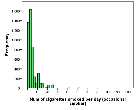
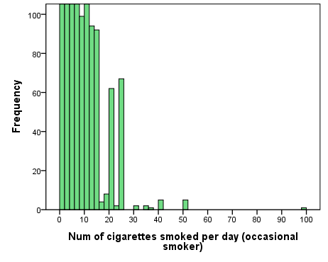
The reason the numbers on the horizontal axis reach as high as 100 despite the fact that there appears to be nothing there is because there is at least one outlier case — a respondent who said they were an occasional smoker but reported smoking 99 cigarettes per day.[4] Thus the distribution has a long right-side “tail”, as it were, which you can better see in Fig. 3.2 providing the “zoomed-in” version of the histogram above. (The “tail” is what you will have if you trace an imaginary line through the tops of all the bars in the histogram down to the single case of 99 cigarettes per day.)
Figure 3.2 Number of Cigarettes Smoked Per Day by Occasional Smokers (CCHS 15/16), Zoomed
In this case the median is 3 cigarettes smoked per day by an occasional smoker. The mean is 4.33, and as expected, it is larger than the median.
Similarly, an exceptionally small value compared to the bulk of the cases will produce a negatively-skewed histogram where the distribution has a “tail” but on the left of where most cases are. In that case the mean will be smaller than the median.
- If you believe it's not the magnitude of the value but just its addition that causes the "pulling" of the mean, consider redoing the example with adding 18, instead of 130. Then we have
 . The "pull" from 7.6 to 9.3 is much smaller than from 7.6 to 28. The value 9.3 reflects the central tendency of the data more truthfully than 28 does. ↵
 - Again, if we added a value of a comparable size to this sequence instead of 5, the mean would not be impacted as much:
 Consider the "pull" from 95 to 80 vs. from 95 to 90.8. ↵
 - The median of 1, 5, 7, 10, 15, 18 is between 7 and 10, i.e., 8.5 (since we need the half-way distance between 7 and 10, we use the average of 7 and 10, that is 7+10=17 and divide it by 2 to get 8.5). The median of 1, 5, 7, 10, 15, 130 is exactly the same -- it is still half-way between the two middle values, 7 and 10, or again 8.5. ↵
- Whether this is to be believed is not important here, just the fact that such a value exists in the data. You will learn what is to be done about outliers in statistical analysis in Chapter 4. ↵