Chapter 7 Variables Associations
7.2.1 Between A Discrete and A Continuous Variable
We can “get a sense” if a discrete and a continuous variable seem associated visually through a chart called a boxplot (discussed further below) and numerically through examining the difference of means (or medians, if one so prefers).
What type of an association do we get when we consider a discrete and a continuous variable? The easiest way to represent this type of association is when we consider a binary (two-category) discrete variable and check if a continuous variable’s statistics (like the mean, or the median) vary between the discrete variable’s categories. This sounds far more complicated than it is. A couple of examples will show you that you have probably considered questions about “comparisons of means” even in your everyday life. The first one will explain it conceptually, the second with actual data.
Example 7.1 Sex Differences in Upper Body Strength, American College Students
Research has shown that, despite similar lower body strength, women have less upper body strength than men, on average. [LIST CITATIONS FROM HERE https://health.howstuffworks.com/wellness/diet-fitness/personal-training/men-vs-women-upper-body-strength.htm AND THE FOLLOWING] One such study examined differences in upper body strength in a sample of Caucasian and East-Asian college students engaged in weight-lifting classes in American colleges (Chen, Liu and Yu, 2012) [https://content.sciendo.com/view/journals/ssr/21/3-4/article-p153.xml, pdf here https://www.degruyter.com/downloadpdf/j/ssr.2012.xxi.issue-3-4/v10237-012-0015-5/v10237-012-0015-5.pdf].
While the study examined numerous aspects of the difference in strength, I will take only one of the researchers’ findings to illustrate my point: triceps strength in arm extension. The reported means were 46.2 pounds for women versus 87.4 pounds for men in the Caucasian sample, and 39.6 pounds for women versus 82.1 pounds for men in the East-Asian sample (Chen, Liu and Yu, 2012, p.156).
Consider what we are discussing here: We have two variables of interest[1], gender and upper-body strength. Gender is a nominal discrete (and, in this study, binary) variable while upper-body strength (through various measurements in pounds) is a ratio continuous variable. The hypothesized association between the two posits that some categories of the discrete variable (e.g., men) tend to go with specific values of the continuous variable (e.g., higher values on upper body-strength). That is, if both men and women had the same means for, in this case, triceps strength in arm extension, gender and upper-body strength would be unrelated, as one’s sex wouldn’t be predictive of one’s upper-body strength at all.
In effect, we are comparing the mean values (of a continuous variable) across groups (i.e., the categories of a discrete variable). Now, as far as a numerical description of that comparison goes, we have the two means (of men and of women) and we can thus calculate the difference of means:


 (Caucasian sub-sample)
 (East-Asian sub-sample)
Thus, what we observe in this sample is a 41.2 pounds difference in the upper-body strength (as measured by triceps strength in arm extension) between Caucasian men and women and a difference in upper-body strength of 42.5 pounds between East-Asian men and women. Again, note that the fact that we see these differences in the sample does not mean they exist in the population — they may, or they might not. We wouldn’t know this unless we test if the differences are generalizable to the population[2]. We will get to testing later, for now we are only interested in the differences descriptively, i.e., that they exist in the sample.
Example 7.1 above shows that every time we compare averages of two (or indeed, more than two) groups and calculate the differences in the means, we are effectively describing associations between variables. I could have easily presented other examples like gender or race/ethnic differences in annual income, years of education, occupational prestige, test scores[3], etc., etc. The reason I chose an example about a sex-based rather than gender-based difference (that is, a kinesiological rather than a sociological study) was so that I can warn you in passing about a common mistake, called the ecological fallacy.
Watch Out!! #12 . . . for The Ecological Fallacy
Consider the findings from the study in Example 7.1 above: men’s average upper-body strength is higher than women’s. Assuming we can generalize the findings to the general population[4], the evidence suggests than when it comes to upper-body strength men are stronger than women on average. Many people take this to mean that a randomly selected man would be always stronger than a randomly selected woman . . . which does not follow at all from the difference in mean strength.
Statistically speaking, it is a matter of the dispersion around the means of the two groups, and of how big the difference in means is. It is quite possible for a lot of women to have more upper-body strength than the men’s average, as well as that a lot of men to have less upper-body strength than the women’s average.
Ultimately, the takeaway from this caveat is to not over-interpret differences in averages to mean more than what they actually are: differences in averaged values, not of the specific values of individuals belonging to the different groups that are compared. (You can find an excellent account of how common this ecological-fallacy mistake is here: https://www.americanscientist.org/article/what-everyone-should-know-about-statistical-correlation.)
With that warning out of the way, let’s take another (this time, sociologically motivated) example for examining differences of means, along with a proper visual description — boxplots.
Example 7.2 Gender Differences in Total Income, NHS 2011
Statistics Canada’s National Household Survey 2011 (NHS 2011) was designed to replace the until-that-time mandatory long form of the Census[5]. For this example, I use a random sample of about 3 percent of the NHS 2011 individual data (aka a Public Use Microdata File, or PUMF), resulting in N=22,123. I am interested in whether men and women’s income for the year preceding the survey differed, i.e., whether the variables gender (called sex in the dataset) and total income (i.e., income from all possible sources) appear associated.
With the help of SPSS, I plot the data. The resulting boxplots graph is given in Figure 7.1 below.
Figure 7.1 Gender Differences in Total Income, NHS 2011
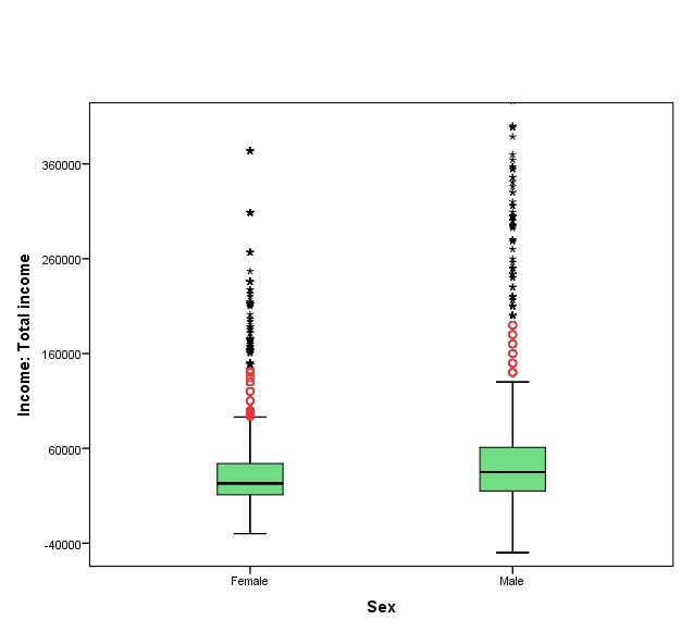
Boxplots are charts visually incorporating a lot of statistical information in one neat little package; I encourage you to make use of them when exploring your data as they can be quite useful. What do we see in Figure 7.1 in our case? Obviously, we have two groups to compare (as per the two categories in the nominal variable gender), women and men, and therefore the graph presents two boxplots. (Had we multiple categories in our discrete variable, we’d have had multiple boxplots.)
How to read a boxplot. Each boxplot consists of the eponymous “box” and two so-called “whiskers” protruding from it. The “box” (in green above) represents the middle 50 percent of the data (i.e., the two middle quartiles, or the IQR); the lower “whisker” represents the first/bottom quartile of the data, and the upper “whisker” represents the last/top quartile of the data. The dark line bisecting the box indicates the median. The two ends of the “whiskers” are the lowest and the highest values. Note, however, that the quartiles (as represented by the “whiskers”) exclude outliers as to not visually distort the “regular” spread of the data. As such, the chart plots run-of-the-mill outlier cases as small circles (above they are in red) outside of the “whiskers”; extreme outliers are indicated by stars (in black above)[6].
Now that you know how to read them, compare the two boxplots above. First, we see that the median for men is higher than the median for women (again, these are the dark lines within the boxes); as well, total income appears to be more spread out for men than for women (the “whiskers” in the men’s boxplot reach further, indicating larger range and IQR. Further, while both men and women appear to have outliers, the men’s group seems to include more extreme outliers and at higher values than those observed in the women’s group[7].
All this points to the conclusion that men in the sample had higher (median, and quite likely average) total income for 2010 than women did, despite that the individuals with the lowest incomes also appear to be men.
As useful the general information we gleaned from the boxplots, we should look at the precise numbers too. SPSS calculates the mean total income as $32,465 for women and $48,866 for men — that is, there is $16,401 difference in mean total income in favour of men. In this sample of 22,123 people, men’s average total income is $16,401 more than women’s.
We could also compare the medians (especially useful when dealing with income variables): SPSS gives the median total income of women in the sample as $23,000, while the median total income for men is $35,000 — a difference of medians of $12,000, again in favour of men.
To summarize, you can explore a potential association between a discrete and a continuous variables of interest in two ways: 1) visually — by plotting and comparing boxplots, and 2) numerically, by inspecting the means (or medians) for the groups (i.e., the categories in the discrete variable being compared) and reporting their difference.
Keep in mind that we are not estimating anything at this point and are not claiming anything about the population: we are simply describing data based on a specific, actual sample.
Figure 7.2 below shows a quick reference for interpreting boxplots.
Figure 7.2 How to Interpret a Boxplot
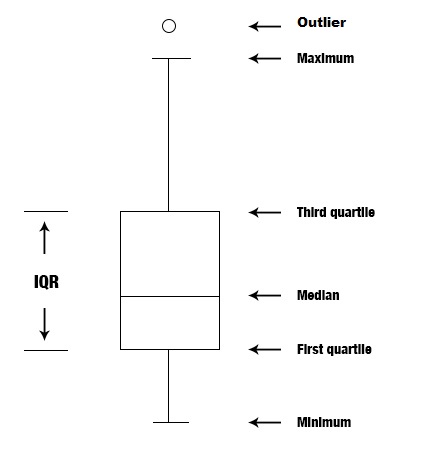
[Source: https://commons.wikimedia.org/wiki/File:Box_plot_description.jpg]
SPSS Tip 7.1 Bivariate Descriptions of Discrete and Continuous Variables: Boxplots and Comparisons of Means
This is how you can get boxplots like the ones in Figure 7.1 above:
- From the Main Menu, select Graphs, then from the pull-down menu Legacy Dialogues, and finally Boxplot;
- In the resulting Boxplot window select Simple and, keeping Summaries of groups of cases checked, click Define;
- Select your continuous variable of interest from the list on the left and, using the appropriate arrow, move it into the Variable empty space on the right (at the top);
- Select your discrete variable of interest from the list on the left and, using the appropriate arrow, move it into the Category Axis empty space on the right (below the Variable), then click OK;
- Your boxplots will appear in the Output window. (Note that the graph will appear in its default SPSS colours and specifications. Double-clicking the chart will make a Chart Editor window appear. In the Chart Editor you can change, edit, and modify the appearance of your boxplots to your heart’s content.)
This is how you can get means, medians (or any descriptive statistic really) for different groups:
- From the Main Menu, select Data and then from the pull-down menu, select Split File;
- In the new window, select Compare groups, then find your discrete variable of interest from the left-hand side, and using the arrow, move it into the Groups Based on empty space; click OK.
- You would have just placed a filter on your data. From this point on (until you switch the filter off), everything you do in SPSS will be done for each separate group (this is indicated by a message “SORT CASES BY [your discrete variable name]. SPLIT FILE LAYERED BY [your discrete variable name].” appearing in the Output window.
- Then, from the Main Menu, select Analyze, and then Frequencies, etc. to request any descriptive statistics you may like, e.g., the mean, the median, the standard deviation, etc. as discussed in the SPSS Tips in Chapter 3.
- Your output in the Output window will list the requested descriptives by the different groups (categories of the discrete variable).
- Once you are done with the comparisons, do not forget to switch the filter off (or your data file will remain split by groups): go again to Data in the Main Menu, select Split File and click Analyze all cases, do not create groups on the right-hand side; click OK.
- Your Output window will give a message of “SPLIT FILE OFF.” to indicate that the data is no longer split by group and it’s in its original condition.
Now let’s see how to “spot” and describe potential associations between two discrete variables.
- You could argue that race/ethnicity is also there. As reported in the study, however, race/ethnicity was a secondary variable bringing more detail to the study, through which the authors were able to demonstrate that upper-body strength differences based on sex exist in both race/ethnic groups considered. ↵
- If you are interested, the authors of the study did test these differences (with a t-test, discussed later) and found them generalizable to the population indeed (Chen, Liu and Yo, 2012). ↵
- For an example of a brief study on the association between race/ethnicity (a five-category discrete variable) and SAT scores of Harvard University applicants, see here: https://www.thecrimson.com/article/2018/10/22/asian-american-admit-sat-scores/. ↵
- As mentioned above, many studies support this as a real, physiological sex difference; the reason I chose this example instead of more controversial/debated issues like gender differences in IQ, or the gender pay gap, etc. ↵
- For the problematic nature of the (Harper) Government's decision in 2010 to make the survey voluntary and its related implications, see for example here: https://ocul.on.ca/node/3400. The mandatory long-form census was restored in 2016 by the Liberal Government. My usage of the data here is strictly for demonstration purposes and as such shouldn't be taken as an endorsement of the NHS 2011. ↵
- Also note that to make the boxplot readable in an appropriate size, in Figure 7.1 I cut some extremely extreme outliers off at the top of the men's boxplot. ↵
- You might have noticed that the first quartile (i.e., the bottom "whisker") includes negative values. Statstics Canada uses several income variables for which this is the case. Negative income exists as an accounting possibility: when one's annual expenses end up larger than one's annual income (e.g., like for a self-employed individual whose business hasn't been as successful, etc.). In many real-life research, negative income values are frequently dropped/removed if that course of action is justified by the study's design, research question, and purposes. In the case of this example I have no reason to do that, hence I left the negative income values in the data. ↵